|
| Group |
Round |
C/R |
Comment |
Date |
Image |
| 3 |
Sep 20 |
Comment |
Mary Ann, this is wonderful. I love the fact that you took this with your idea in mind, and then did an outstanding job reaching your goal. Well done!
I like LuAnn's edits. Making the sky a bit more interesting and removing the birds that are flying over the city-background nicely add "finishing touches" to your excellent image!
|
Sep 13th |
| 3 |
Sep 20 |
Comment |
Kieu-Hanh, some images bring a smile of amazement. This one certainly does. Well captured! I'm quite impressed that you have done no editing. The colors, the cropping, the sharpness, and the depth of field are all excellent!
I live in Silver Spring MD, just around the beltway from Andrews. After seeing your photograph, I think I'll try to attend the next time they have it.
Thank you for sharing!
|
Sep 11th |
| 3 |
Sep 20 |
Comment |
Mary Sue, I really like this photograph. The fact that it's a diagonal gives it a dynamic appeal. Also, you did an outstanding job sharpening the image and bringing out the texture of the chain. And, you're absolutely right... the blurred background works perfectly. Well done!
|
Sep 11th |
| 3 |
Sep 20 |
Comment |
LuAnn, I really like the color of your image. The first original seems too red and the second one has a bit too much yellow. You did well to obtain the color of the final one.
I can't seem to look at the mushroom/log combination without thinking that the mushroom is something thrown at the log... and stuck in it. LOL
It's a very well done photograph.
|
Sep 11th |
4 comments - 0 replies for Group 3
|
| 5 |
Sep 20 |
Reply |
Richard, I'm glad you like it.
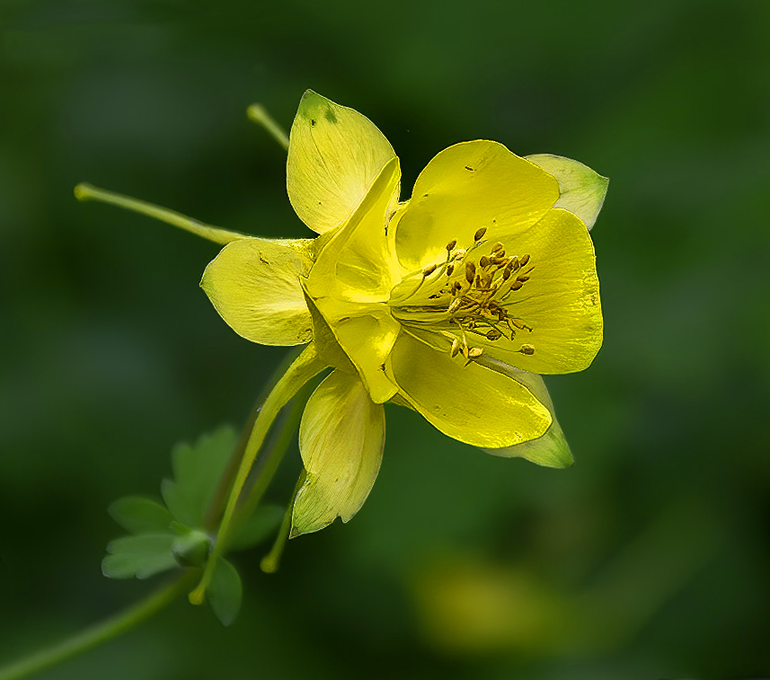
Unfortunately, I can't give you my final settings since I have no idea of what they were. I do konw that when I cropped your image, I did it so that the stem of the flower reached down to the bottom left corner. And, I used Photoshop's Select > Subject to select the flower so that I could process it separately from the background in Camera Raw.
Sorry I can't provide more specific data.
|
Sep 16th |
| 5 |
Sep 20 |
Comment |
Freddie, welcome to the group! I look forward to your images and your comments.
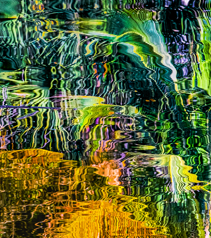
I agree with Rick about the brightness. However, something other than that didn't feel quite right to me. After returning to look at your image several times, I thought I might try a different cropping and orientation. The advantage of abstracts is that one can modify them without being concerned about being true to reality. Smiles...
Your thoughts?
|
Sep 15th |
 |
| 5 |
Sep 20 |
Reply |
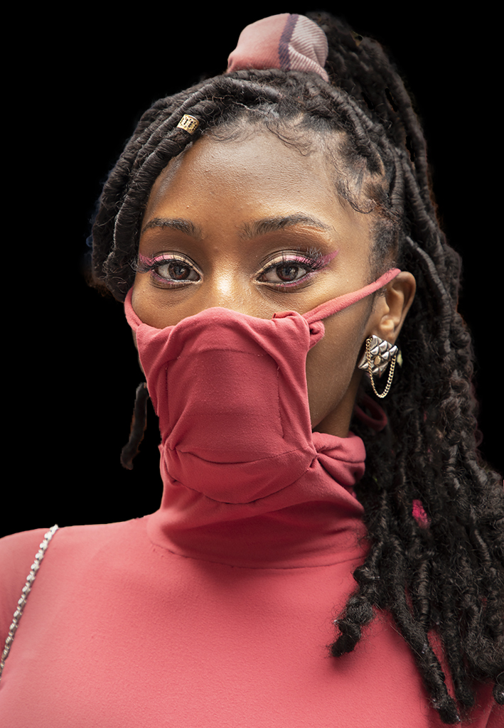
Second image with darkened BG. |
Sep 12th |
 |
| 5 |
Sep 20 |
Reply |
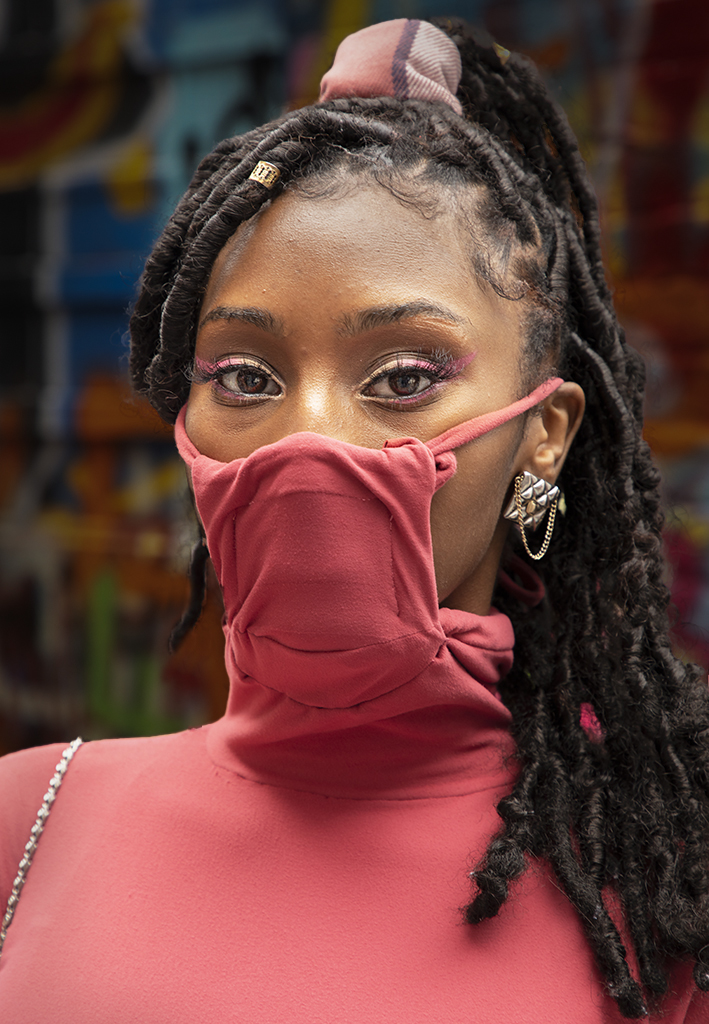
Interesting idea, Nick. I removed the BG but to me it made the image seem too artificial. So, I then darkened the BG which I find more appealing. I'll attach both. Your thoughts?
BTW, Photoshop's Select Subject command works wonders for selecting the young woman.
|
Sep 12th |
 |
| 5 |
Sep 20 |
Reply |
Wonderful. In these days of staying home, I don't mind being down the rabbit hole a bit. Thank you!
|
Sep 11th |
| 5 |
Sep 20 |
Comment |
Richard, like Mark, I think you did beautifully in capturing the detail and isolating the flower by having a perfect DOF. Nicely done.
I wanted to see how it might look with a tighter crop, including rotating the image a bit. Then, while I was in Camera Raw and Photoshop, I couldn't resist playing around a bit with the lighting, colors, etc. I'm certainly not sure that I improved ANYTHING, but here's what I came up with.
|
Sep 11th |
 |
| 5 |
Sep 20 |
Comment |
Mark, this is beautifully done! Your attention to detail is wonderful. I really like the fact that you didn't "fix" the damaged leaves. That adds authenticity to your photograph. The colors are a bit more garish that I normally like, but they work in this image.
My only quibble is not about the image. I would have liked more information about how you created this image. Hearing your technique would be fascinating.
|
Sep 11th |
| 5 |
Sep 20 |
Comment |
Nick, the virus and the politics have resulted in most people needing an occasional laugh. Your images satisfy that need! You have a wonderful sense of humor and processing skills!
My only suggestion for this wonderful image would be to switch the heads of the two Ziraffe's on the right. Currently, the head of the far animal seems larger than the one in the foreground.
Regardless of that minor nit, this is marvelous. Well done!
|
Sep 3rd |
| 5 |
Sep 20 |
Comment |
Barbara, I really like this image. I think it's one of the best that I've seen recently. Your composition is excellent and the colors are outstanding. Well done!
My only very minor suggestion is further darken the anthers on the right side and move their hue slightly more toward yellow. They seem to have a bit of a green tint.
Excellent image and quite creative!
|
Sep 2nd |
| 5 |
Sep 20 |
Comment |
Steven, I like everything about this image! The way you let your brother-in-law's hair fade into the white at the top of his head very nicely helped avoid distracting from his dark eyes. And, the decision to leave his watch as part of the photograph was a brilliant way to balance the composition. And finally, your choice of a subtle frame was perfect.
As much as I would like to be able to provide useful feedback, I can't find a single thing to suggest. Very well done!
|
Sep 1st |
| 5 |
Sep 20 |
Reply |
Thank you, Stephen. I thought the matching eye-shadow was spectacular. Naturally, she also had matching fingernail polish but my photographs showing her hands looked too contrived.
|
Sep 1st |
6 comments - 5 replies for Group 5
|
| 62 |
Sep 20 |
Reply |
I really like LuAnn's border. It's quite subtle, but it nicely deliniates the image. Well done, Emil and LuAnn!
|
Sep 14th |
| 62 |
Sep 20 |
Reply |
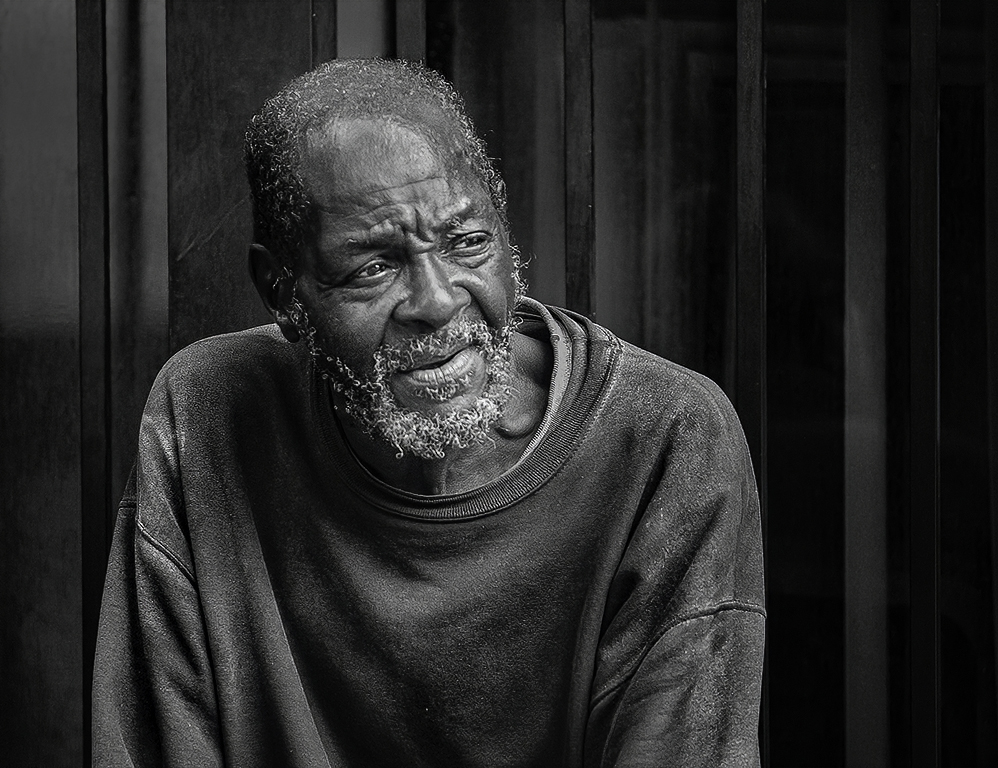
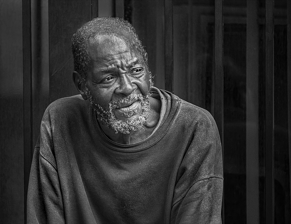
LuAnn, you did an outstanding job with your edits. I like the man with a bit less glare on his face. However, I do like a bit of shine since that seems to pull the viewers' eyes to that central point of the image. Thus, I combined our two versions -- giving less shine than mine but a bit more shine than yours.
Thank you so much for your input on this. I like the result. |
Sep 11th |
 |
| 62 |
Sep 20 |
Comment |
Gary, I love your description of the photograph AND of Nellie! Only after reading about her did I notice that your image shows where the leg is missing.
The intensity of Nellie's gaze is wonderful.
It't impressive that you're using the Mamiya 645 camera. That's one of the classics! The 6 x 4.5cm format should be great for scanning.
I really don't have any suggestions for improving the delightful image. But, the next time I'm in Fogeyville, I'll bring one of my old film cameras.
|
Sep 9th |
| 62 |
Sep 20 |
Comment |
Leah, I've come back to look at this image numerous time. And, frankly, it's grown on me! I really like it! The fact that it imparts a strong feeling of emptiness transforms it from a well done photograph into one that merits study and appreciation. Well done!
I tried playing with you image in Photoshop and found that nothing I did improved it (in my opinion). The only VERY minor edit that you might consider is to clone out the two wires over the alley that appear to be dashed lines instead of solid ones. However, that may simply be an artifact of my monitor.
|
Sep 9th |
| 62 |
Sep 20 |
Comment |
Bob, this is a fascinating image. It gives me the feeling of wind blowing the trees and making the boughs sway against each other. And, it definitely has an IR quality. Although I don't often use filters to dramatically modify an image, I certainly see the merit in doing it.... besides, it's fun!
Nice job.
|
Sep 5th |
| 62 |
Sep 20 |
Reply |
Excellent! I really like how this turned out. Well done!
|
Sep 4th |
| 62 |
Sep 20 |
Reply |
Bob, I see what you mean about the shine on his face. I did some further edits to see if I could remove it while still leaving the texture. (I think the Luminar tool made it a bit too dull.) At the same time, I made some additional changes that Leah's comments inspired.
You thoughts?
|
Sep 4th |
 |
| 62 |
Sep 20 |
Reply |
Leah, I like the idea of a tighter crop and I tried multiple variations. However, I found that I lost the context of the image. It's that context that makes the image feel more like my emotions when I saw the man. I have little doubt that he was down on his luck and thinking about his situation... or perhaps where he would get his next meal. I did try to further isolate the man by darkening his surroundings a bit (see my response to Bob Legg below). THANK YOU for your input. I truly appreciate being made to think further about my images.
|
Sep 4th |
| 62 |
Sep 20 |
Comment |
Israel, you have a really good eye for action photography. The image is captured at the perfect moment and your post-processing is excellent. I especially like your cropping. The adjustments that Emil did seem to be beneficial.
The only modifications that I suggest are quite minor. The left side of your image has a white rope that I suggest removing. Similarly, I find that the light pole on the left side is a bit distracting. Removing that might also help the viewer's attention being directed to the skiier.
Well done! I'm interested in seeing more of your sports photographs.
|
Sep 3rd |
| 62 |
Sep 20 |
Comment |
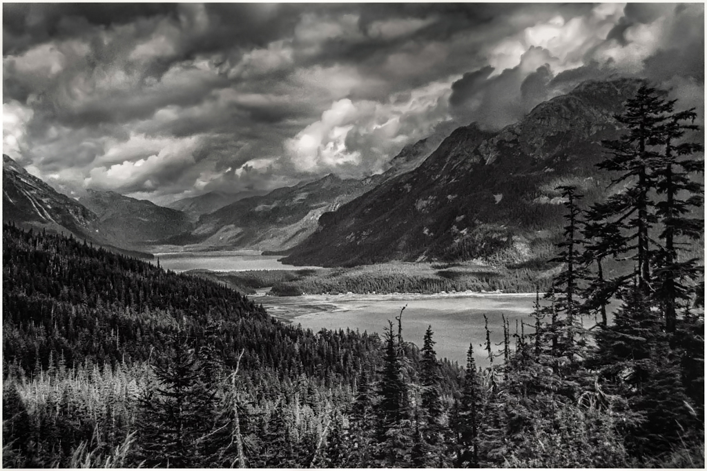
This is a wonderful scene. I love the sky and the lakes surrounded by the mountains. But, like you, it feels a bit flat to me. So, using Camera Raw I tried changing the lighting. My goal was to add more drama by making the mountains and trees significantly darker and giving more depth to the clouds. At the same time I tried to highlight the lakes. See what you think.... |
Sep 3rd |
 |
| 62 |
Sep 20 |
Comment |
Wonderful idea and very well processed. Initially I liked the color and monochrome versions equally. But, after studying them for awhile, I now think that the monochrome image is far better since it brings out the lighting on the pavement so well. Also, the reds in the original version are fairly distracting.
Emil, I really like your decisions for removing the extraneous lights in the background while leaving the car at the far end of the station.
I'm afraid I can't think of any modifications to improve this image. Very well done!
|
Sep 1st |
6 comments - 5 replies for Group 62
|
16 comments - 10 replies Total
|


