|
| Group |
Round |
C/R |
Comment |
Date |
Image |
| 5 |
Jun 20 |
Comment |
LOL... Thanks, Mark. I checked with "her" and she quit smoking years ago.
|
Jun 13th |
| 5 |
Jun 20 |
Comment |
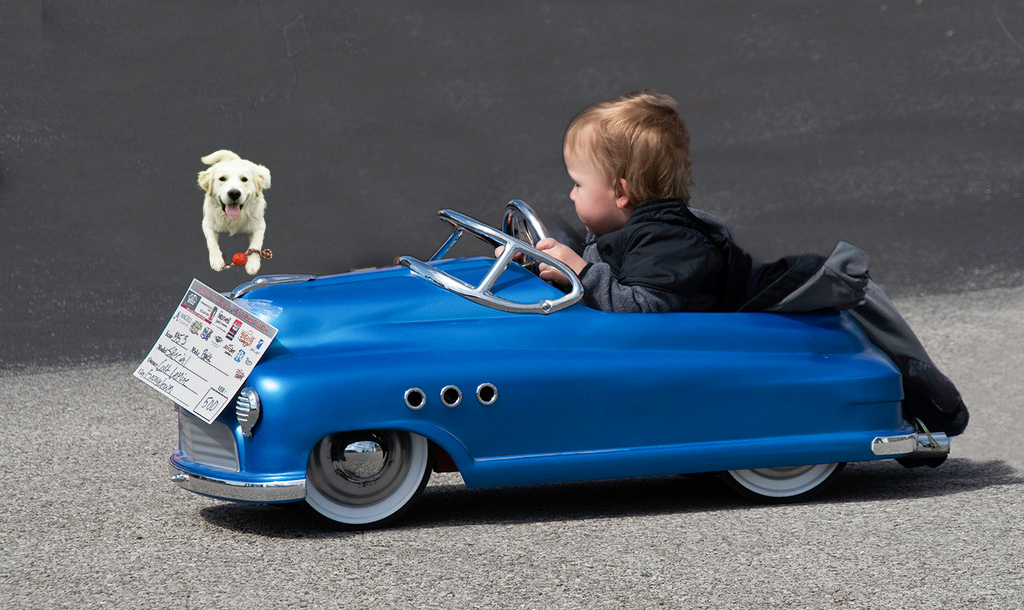
Richard, your post processing is right on target! He looks like a cute little kid and the car is wonderful. But, like Mark and Barbara, I think it would be significantly improved if he didn't have his face turned. As an alternative, you could make it a composite image and insert something for him to be looking at. Here's the kind of think I have in mind.
|
Jun 13th |
 |
| 5 |
Jun 20 |
Comment |
Nick, you never fail to amaze and amuse me! Yours is one of the submissions that I usually call my wife to come see. lol
I like everything about this image, except it would be good if there were some motion blur on the tennis ball. Your tennis fence is really well done. Nice work all around!
|
Jun 12th |
| 5 |
Jun 20 |
Comment |
Mark, this is wonderful. I completely agree with Bob that this has an "other worldly" impact. The use of duotone and the darkening of the outside of your image really draws my eyes into the photograph. I feel as though I'm walking through a mysterious tunnel. Nicely done.
|
Jun 12th |
| 5 |
Jun 20 |
Comment |
Bob, I'm delighted to have you in our study group! If this image is any indication, you will definitely contribute to our creativity, imagination and post-processing skills. I especially like how you've used colors in this image. And, the white "eyes" are excellent points of primary focus. Well done!
|
Jun 12th |
| 5 |
Jun 20 |
Comment |
Stephen, I kept coming back to your image. Frankly, it's absolutely wonderful! I love the drummer's intense expression, the extraordinary drum and the power of the stick being used to strike the drum. The more I saw your image, the more I appreciated your post-processing. And, I couldn't resist trying to take it even further by playing with it a bit myself. I tried to emphasize the three components that particularly attracted me to the photograph.
Your thoughts?
|
Jun 11th |
 |
| 5 |
Jun 20 |
Comment |
Well done photograph! The colors are wonderful and your syrup drip is excellent! I do agree that it might benefit from having a base of some type. Also, there appears to be a significant amount of noise in the peaches that are in the bowl, but that's easy to fix.
|
Jun 10th |
| 5 |
Jun 20 |
Reply |
Thank you, Gary. I'm not sure how creative my imagination is. Probably a better adjective would be weird. lol |
Jun 10th |
| 5 |
Jun 20 |
Reply |
Thank you, Richard. I used a couple of flashes for the image. Each one was a 200 WS monolight. I tried putting gels over the flashes (different colors for the two flashes), but the color of the smoke was very hard to detect. Finally, I decided that Photoshop coloring was far more practical.
I think that experimentation is the way to go with this. Since the ratio of "keepers" to shots is so low, it takes a success or two if you're going to avoid giving up out of frustration. I also found that the type of incense stick is important.... both because of the amount of smoke they produce as well as the smell (which can be pretty heavy).
|
Jun 10th |
| 5 |
Jun 20 |
Reply |
Larry, I completely agree! Smoke photography is well worth exploring.
If you feel you need to kiss my image, you certainly have my permission. Please be sure to clean your monitor's screen when you're done. Grins...
|
Jun 10th |
| 5 |
Jun 20 |
Reply |
Thank you, Bob! I agree that the final image has a bit of the "007" feeling to it. However, from what I recall, the images in the introduction to those movies were a bit more... um... risque. lol |
Jun 10th |
| 5 |
Jun 20 |
Reply |
Stephen, this was lots of fun to make. The only downside was that it required hundreds of images to find one that I felt would transform into something interesting. But, doing the transformation was very enjoyable. Thank you for your compliment!
|
Jun 10th |
| 5 |
Jun 20 |
Reply |
Thank you, Barbara. As you noted, smoke photography is really a lot of fun. And, since it is not quick, it has been perfect for these days when remaining at home is so desirable.
I like your giraffe image! The smoke has an uncanny likeness to the giraffe photograph that you included. I bet that you would impress a judge if you did a bit of smoke coloring and entered it into a competition!
|
Jun 10th |
7 comments - 6 replies for Group 5
|
| 24 |
Jun 20 |
Comment |
Sam, I was "wandering around the study groups" and saw your wonderful image. It really doesn't need ANYTHING, but when I saw the original color version I wanted to play with it in Photoshop. I decided not to delineate the horizon on the left. Please let me know what you think. |
Jun 13th |
 |
1 comment - 0 replies for Group 24
|
| 62 |
Jun 20 |
Reply |
Bob, I appreciate your honest opinion and I promise that I will provide mine as well. Of course, appreciation of an image is a very subjective thing. Photographs may appeal to some people, and not to others. Like many others, I've had a photograph thrown out of one competition and then win second prize when I entered it and there was a different judge.
All that's to say, while I will give my honest opinion, it's certainly not to indicate that one of your images is good or bad.... just that it's how it impacted me.
|
Jun 14th |
| 62 |
Jun 20 |
Reply |
Bob, I understand and appreciate your candor! Perhaps this image isn't suitable for B&W. With that in mind, I played with the color photograph a bit. I'm still not sure if it works. Your thoughts?
|
Jun 14th |
 |
| 62 |
Jun 20 |
Comment |
Israel, I find both your original submission and your edited version to be wonderfully done! This image successfully breaks one of the "standard rules" of photography in that you didn't use the rule-of-thirds to accentuate your primary focus. And, your cropping decision was perfect! (I think the "rules" should be broken!)
The wide angle lens and small aperture really did well for the sun burst (asterisk). Your photography is truly becoming professional.
There's really nothing that I can suggest for improving your photograph. Very well done!
|
Jun 7th |
| 62 |
Jun 20 |
Comment |
Bob, since I spent many years in the South, I can really identify with your image. The twisted branches, the Spanish Moss and the path toward the light at the end of the "tunnel" are absolutely wonderful. You did an incredible job capturing this. Well done!
Like LuAnn and Leah, I thought it would be interesting to darken the trees. I also wanted to brighten the path leading to the light at the end; hoping to give a feeling of moving into that direction. With those things in mind, I played with your photograph a bit. I didn't make it as dark as Leah's image, but did darken it somewhat.
Your thoughts?
|
Jun 7th |
 |
| 62 |
Jun 20 |
Comment |
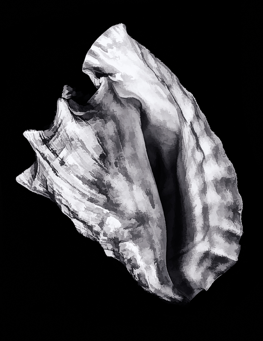
Gary, these times of isolation are perfect for experimenting with new photographic techniques and approaches. Your grandmother's conch shell makes a wonderful subject for studio work like you've done.
I've never used Photoshop's rough pastel filter option, but I'm impressed with what you've done with it. I find that your "pencil drawn" approach nicely emphasizes the lines/texture of the shell. However, I felt that a bit more contrast might be interesting. So, I used your original image and also tried a bit of playing. My thought was to increase the contrast and simplify the shell while still leaving it identifiable. Although I started with the PS filter gallery, I ended up with the Viveza 2 filter from the Nik Collection.
Your thoughts?
|
Jun 7th |
 |
| 62 |
Jun 20 |
Reply |
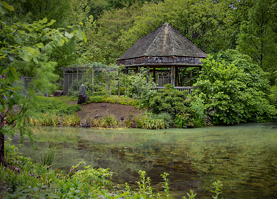
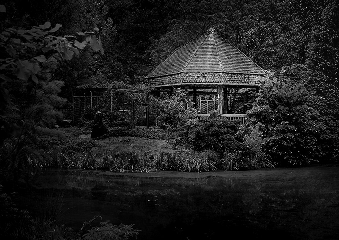
LuAnn, the whole garden area is amazingly peaceful.... which is truly appreciated in this fairly urban area.
I really like the approach you proposed, but as you suspected I find it just a bit too dark for my taste. Thus, I played with the image you showed me. Basically, I slightly lightened the area to the right of the tea house, a tiny bit of lightening on the water and cropping on the left side of the image since it seemed to be overwhelmingly dark.
What do you think of my edits of your edits? lol
|
Jun 7th |
 |
| 62 |
Jun 20 |
Comment |
Leah, as I was commenting on your image, I suddenly realized that you had sent the original in addition to your June submission. I apologize!! I neglected to add the original until just now. Hopefully, my omission is now rectified!
|
Jun 5th |
| 62 |
Jun 20 |
Comment |
Leah, this photograph yells for monochrome... and your rendering works beautifully. I like the diagonal line and how the depth-of-field makes the distant keys fade into the background. I think Emil's suggestion of removing the closest, most out-of-focus key works well. My only suggestion is really a nit. That's to slightly darken the line above the black keys. I certainly feel that the line needs to be visible; however, to me the main subject is the keys themselves and the brightness tends to pull my eyes from them.
Nice image. Well done!
|
Jun 5th |
| 62 |
Jun 20 |
Comment |
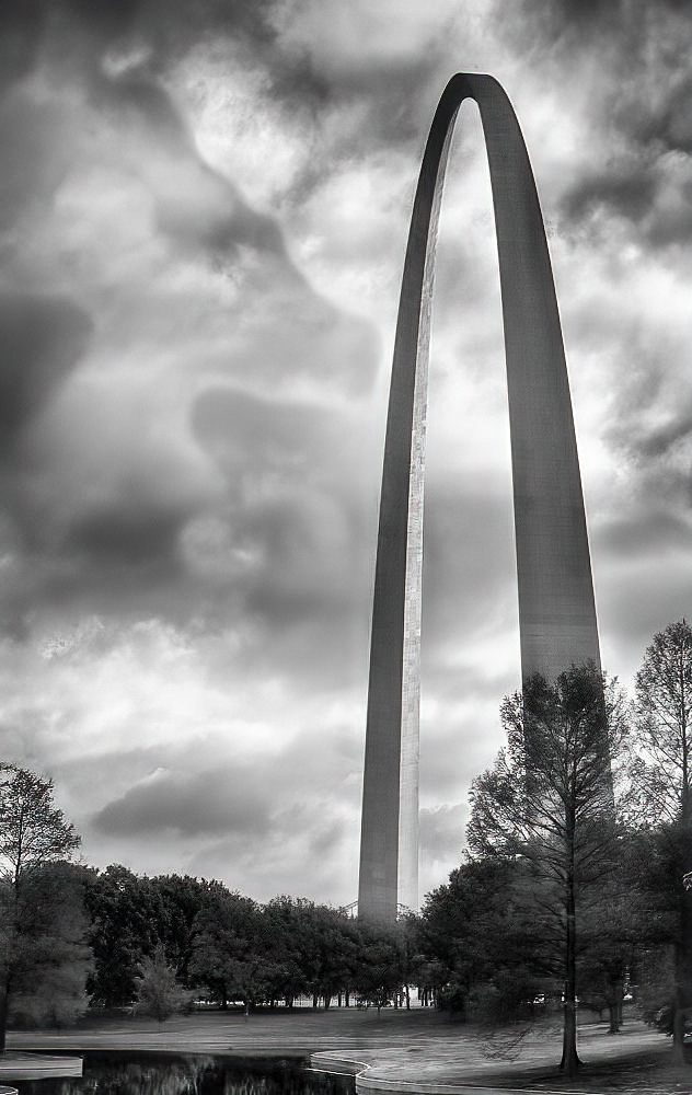
Emil, the St. Louis Arch is really shown off beautifully in your image! The way you have positioned it in the frame gives it a dominance that's amazing. Nicely done!
Although there's very little that I can suggest for modifying your image, I decided to play with it a bit. The only changes that I did were a bit of noise reduction, adding a touch more contrast (with the clarity slider in Camera Raw) and darkening a couple of small bright areas at the bottom of the photograph. See what you think.
|
Jun 4th |
 |
| 62 |
Jun 20 |
Comment |
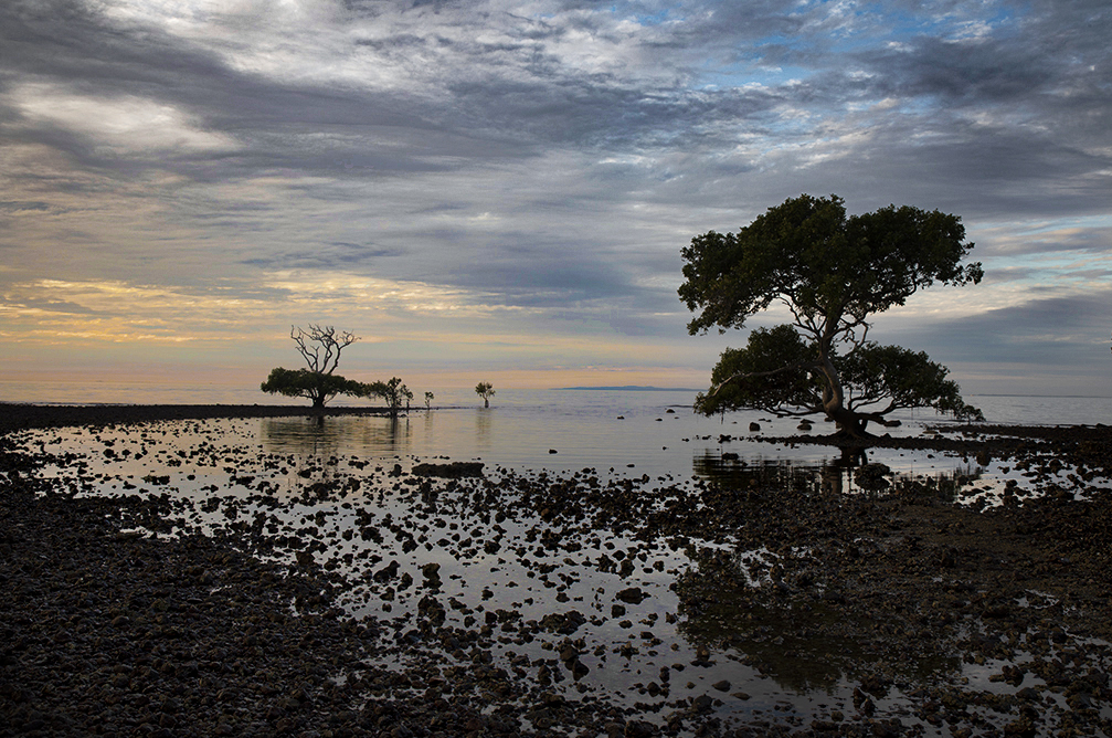
LuAnn, I find the simple beauty of your image very appealing. The near-merging of the sea and the sky adds to this feeling. I'm also quite impressed with the composition... there is perfect balance with the jetty on the right and the pier on the left. And, the vertical structures (lighthouse, boat and tree) add to the balance.
Although I like offering suggestions for the photographer to consider, I'm at a loss this time. Your image feels exactly right to me. Well done indeed!
|
Jun 4th |
| 62 |
Jun 20 |
Reply |
Thank you, Emil. You're right, I tried lots of approaches to highlight the Tea House. One of the things done was to darken the wooden structure.... it was much brighter when I first converted the photograph to B&W. With your suggestion, I'll darken it even more. Thanks again. |
Jun 4th |
7 comments - 4 replies for Group 62
|
15 comments - 10 replies Total
|


