|
| Group |
Round |
C/R |
Comment |
Date |
Image |
| 5 |
May 20 |
Comment |
These are times when we need all the uplifting images we can find and yours tops the list! Nick, your composite is well done and extraordinarily imaginative. However, no matter how good it is, it's hard to envision the expressions of my camera club if it were entered in a competition. LOL
Well done.
|
May 10th |
| 5 |
May 20 |
Comment |
Barbara, I love Snowflake's expression. She looks inquisitive, intelligent and eager. And, her tongue is a great balance to her collar color. Nice job!
I agree with others who pointed out a few possible enhancements. I also notice a bit of noise that you could easily remove. But, without doubt, it's a wonderful image and one that Elena will treasure.
|
May 10th |
| 5 |
May 20 |
Comment |
Phil, to me this is one of your most successful sports photographs. Well done.
It would be great if the background included a few kids celebrating. Of course, since the coach is the central focus, it would be best if the kids and the rest of the background were significantly less sharp than the coach.
I think you've done an excellent job catching the coach's expression!
|
May 9th |
| 5 |
May 20 |
Comment |
This is such a wonderful image! I agree with Barbara that the backlighting on the plant hairs is spectacular! And, Mark, I really love how you've used the backlighting to give a bright rim to the leaf on the bottom right. Very well done!
Your choice of cropping the sides and bottom of the photograph feels perfect. However, I might consider adding just a bit more headroom at the top of the image.
I like how you've framed this photograph. Somehow the white border seems to emphasize the flower and white hairs. Nice!
|
May 9th |
| 5 |
May 20 |
Comment |
I completely agree with Beverly. This is a wonderful image. Beautifully captured and processed. There's nothing I can offer in the way of suggestions. Well done!
|
May 3rd |
| 5 |
May 20 |
Comment |
Wonderful feedback! Getting a variety of opinions is something I really like. It's one of the reasons that I find the Study Groups so useful! Thank you all!
|
May 3rd |
| 5 |
May 20 |
Reply |
Stephen, you're absolutely right. I just looked at it and also felt that it is over sharpened. It's strange, when I was working on it in Photoshop, the over sharpening wasn't there. Perhaps the conversion to jpeg caused the issue.
|
May 2nd |
| 5 |
May 20 |
Reply |
Thank you, Barbara. The photograph is a bit of a cliche I'm afraid. Nonetheless, it's rare to see this area with no people. |
May 2nd |
| 5 |
May 20 |
Comment |
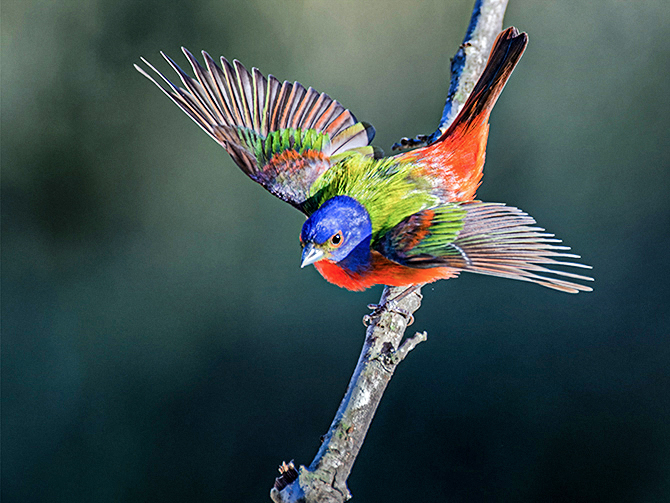
Stephen, like Barbara, I find that all three images are superb. My favorite is the one shown as "Original 2". Although I like your primary submission, the bird's pose is a bit too common. In any event, it (and the others) are extremely well done!
However, I would like the background of Original 2 to be a bit more dramatic than it currently is.... without, of course, distracting from the primary subject. Also, I love vivid colors. Thus, I would like the Painted Bunting to be even more vibrant. To that end, I played with it a bit in Photoshop. Your thoughts?
|
May 1st |
 |
7 comments - 2 replies for Group 5
|
| 62 |
May 20 |
Reply |
Thank you, Bob. I'll take a 27! |
May 20th |
| 62 |
May 20 |
Reply |
Israel, my daughter is also a teacher and my grandson (who lives with me) is in high school. Both of them are now doing online classes and so I see how difficult it can be... especially for the teacher. So, I really appreciate all that you're doing to get through this difficult time.
Nonetheless, your image this month is wonderful. It captures the essence of macro and of nature. My congratulations to you... and to your wife.
Take care and stay safe.
|
May 12th |
| 62 |
May 20 |
Comment |
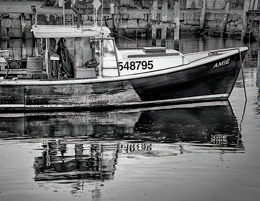
Bob, water and reflections in the water are such great photographic subjects. When I studied your image, I wanted to see how the suggestions of adding a bit more contrast would look. Also, I liked Gary's idea of cropping a little tighter on the left of the photograph. It was great fun playing with it a bit. Here's what I arrived at. Your thoughts?
|
May 10th |
 |
| 62 |
May 20 |
Comment |
Wow! Israel, you really nailed this one! Your depth of field is outstanding, providing sharp focus on the central subjects and blurring the less important background. And, I like how you've cropped the photography.
I agree with Emil about the bright area on the right-hand-side of the leaf. It pulls my eyes away from the snail and its eggs. (At least I assume they are snail eggs.)
Very well done!
|
May 10th |
| 62 |
May 20 |
Reply |
Thank you so much, Gary. It's always challenging for me to decide how far to go with post-processing. I enjoy playing with tones and all aspects of lighting. However, like you I generally try to be fairly conservative about removing portions of an image.
|
May 9th |
| 62 |
May 20 |
Comment |
Leah, like others have said, I'm delighted to have you as a member of our group!
I agree with the input that you've already received. However, it's such a compelling image that I couldn't resist playing with it a bit in Lightroom and Photoshop. When I finished, I looked at it closely and think it may be a bit "over the top". But, it may give you some additional ideas on your excellent image. Your thoughts?
|
May 9th |
 |
| 62 |
May 20 |
Reply |
Gary, I share your appreciation of David Cooke's photography. He is exceptional. Unfortunately, his life got pretty busy a few months ago and he had to drop out of the study groups. |
May 9th |
| 62 |
May 20 |
Reply |
Emil, I had not previously discovered Jack Curran; however, his tutorial is fabulous. I'll finish the hour-long video you linked to and then explore his other offerings. Thank you, I really appreciate the information!
|
May 9th |
| 62 |
May 20 |
Reply |
LOL... Emil, I knew who Guy Fieri was (I occasionally watch food shows, especially during the shutdown), but I wasn't familiar with "off the hook". So, Google to the rescue! Grins. Thank you for the compliment!
I suggest trying water drop photography and not worrying about falling short of good outcomes. Sheesh, if I worried about that, I'd probably never take a picture. I think you're absolutely right about darkening the bright areas on the right of the image. And, I'll play with the small drops at the base.
Thank you for you input! Very useful.
|
May 4th |
| 62 |
May 20 |
Reply |
LuAnn, I really like the addition of the white border. As you said, it helps balance the image. I like how you've dealt with the drops on the right. I didn't want to eliminate the "non-essential" drops since I was afraid that a change of that type might make the image seem like it was over-processed. However, your minimization of some of them feels perfect. Thank you! |
May 4th |
| 62 |
May 20 |
Comment |
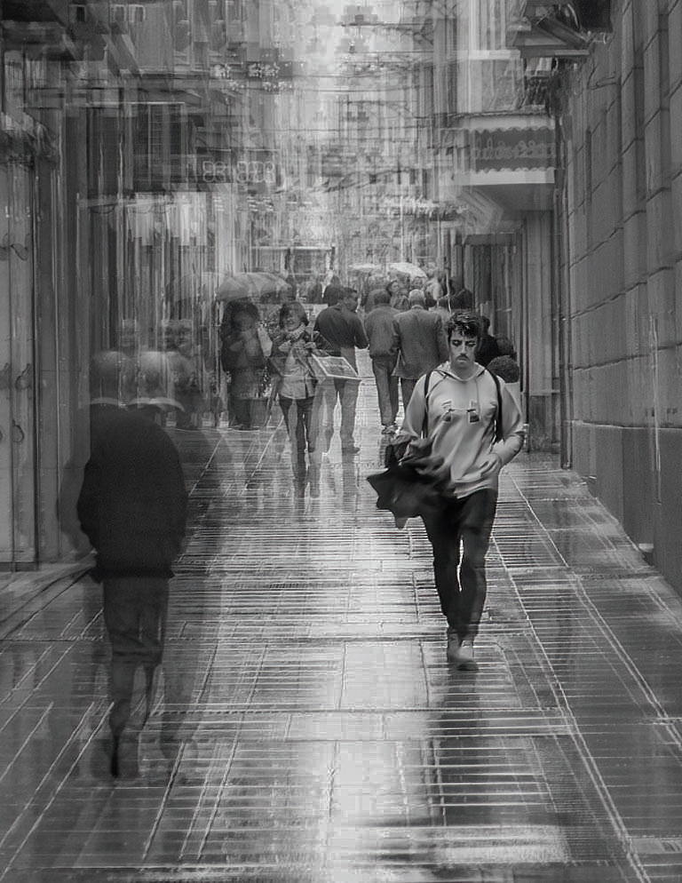
Gary, this is wonderful. You've inspired me to try your approach. Like Emil, I've "locked on" to the name Thomas Vanoost.
I really appreciate the detailed description of your approach. It not only provides enough information to try this, but also adds tremendously to my appreciation of the image. Very well done!
As with many photographs that I find especially appealing, I played with it a bit in Photoshop and Camera Raw. I tried to reduce the exposure as Emil suggested and also attempted to make the man stand out even more from his surroundings.
Your thoughts?
|
May 3rd |
 |
| 62 |
May 20 |
Comment |
Emil, welcome to group 62! I hope you find it both useful and enjoyable!
I really like this month's image. The back-lighting of the flower petals is very nicely handled and shows off their texture perfectly. Also, the shadows of the Black Eyed Susans make the image very well balanced. Well done!
There's little to find that might improve this photograph. The only nit that I can suggest is that you slightly darken the area under the left-most flower. Its brightness tends to pull my eyes from the primary point of interest.
Great job!
|
May 2nd |
| 62 |
May 20 |
Comment |
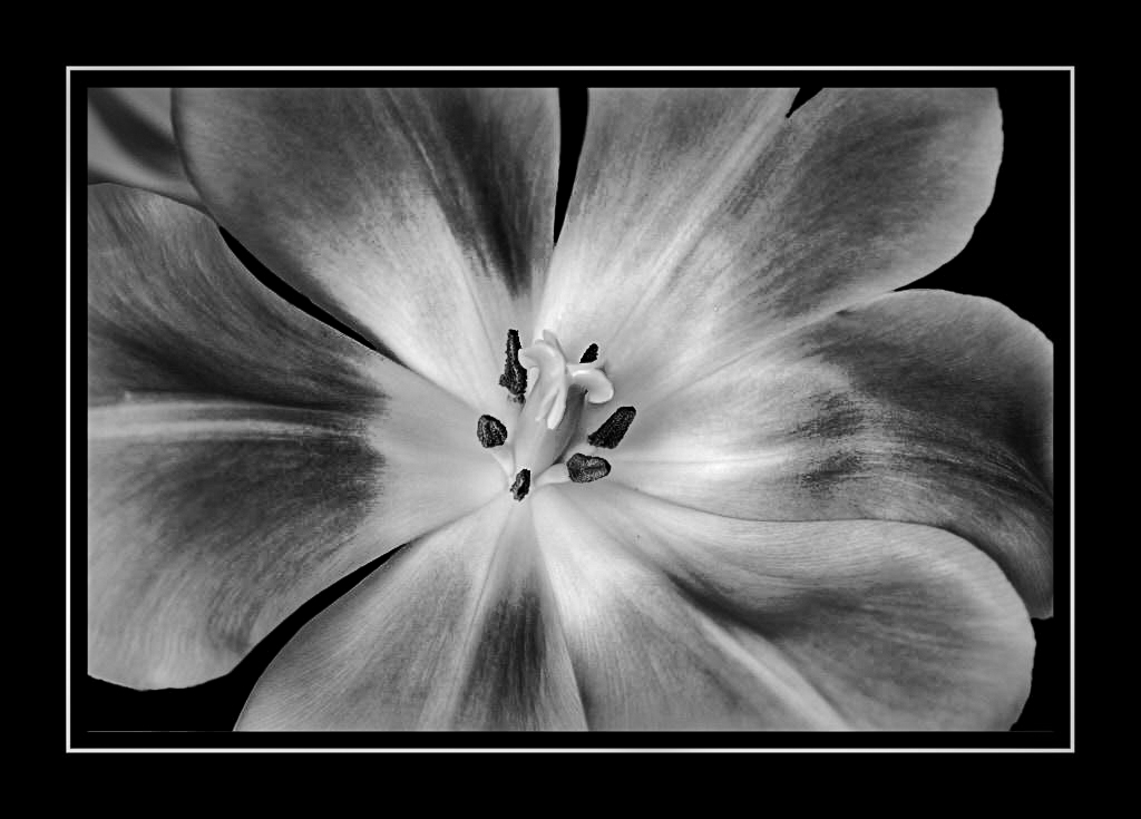
LuAnn, this is such a lovely flower and the cropping/framing is outstanding! I love flowers in monochrome. To me, the color often distracts from the tones and textures.
I'm not very knowledgeable of Capture One. Have you been using it instead of Lightroom and Photoshop?
Since I couldn't resist, I played with your photograph a bit. I wanted to see how it might look with more contrast and texture. (See below.... thoughts?)
Also, I really like the affect that backlighting can give to a flower. If it's possible to use the flash behind it and give a bit of transparency to the petals, it might be another masterpiece.
Take care and be safe, my friend. Your photography is excellent!
|
May 1st |
 |
6 comments - 7 replies for Group 62
|
13 comments - 9 replies Total
|


