|
| Group |
Round |
C/R |
Comment |
Date |
Image |
| 5 |
Jan 20 |
Reply |
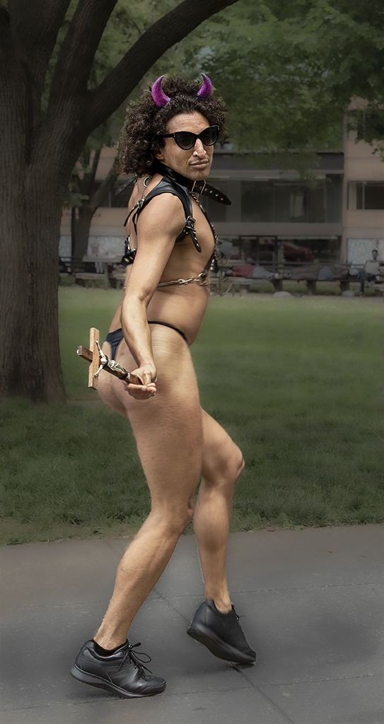
Perhaps a blindfold would be more appropriate. It's hard to imagine seeing this in a public place in the city. To put it mildly, "Life is interesting."
|
Jan 25th |
| 5 |
Jan 20 |
Reply |
Thank you, Barbara. I think I see the "sliver of white" that was mentioned. It's down on the bottom-right of the image, right against his waist.
|
Jan 22nd |
| 5 |
Jan 20 |
Reply |
LOL.... funny you should ask. I have another image in which he's wearing sunglasses. I thought about submitting it to one of my camera club's competitions but, after consulting with some friends, decided that it would cause too much... um... "discussion".
Here it is:
|
Jan 22nd |
 |
| 5 |
Jan 20 |
Reply |
Thank you, David. I hadn't noticed the bright sliver until you mentioned it. Now I can't look at the picture without having it blare out at me. (LOL) I'll definitely fix it. Thank you!
BTW, now that I'm looking in that area of the image, I notice that I did a lousy job with my mask.... also, a bit of noise at his waist. I think the unusual nature of the man kept me from seeing the photographic details.
|
Jan 11th |
| 5 |
Jan 20 |
Comment |
Rick, I agree with Mark about the neon quality and the sharpness of the eye. Not everyone is a fan of impressionistic images, but I think it's fascinating.
|
Jan 11th |
| 5 |
Jan 20 |
Comment |
Mark, when I first glanced at this image it made me think of a colorful painting that might have been done by a very talented high school student. Then, after realizing that these were kites, I began appreciating the overall feeling of your photograph. The swirls in the sky and the bright "suns" in all four corners make it quite intriguing. You've convinced me to play around with Topaz Impression.
Great imagination and very well done.
|
Jan 11th |
| 5 |
Jan 20 |
Comment |
Phil, when I see images like yours, I find myself thinking that I need to get much more creative and find new perspectives for my shooting. Then, however, I think of the effort it would be for me to stand up after lying on the ground and all my good intentions vanish.
It's an outstanding image! And, it tells a great story... or at least triggers my imagination! I agree with Mark about darkening the highlights on the sides of the photograph or, perhaps, adding a vignette. Well done and well conceived!
|
Jan 11th |
| 5 |
Jan 20 |
Comment |
I actually like the cropped version better than the original. But, I agree with Stephen that it would be interesting to see how it looks as a monochrome. I gave it a try... including a bit of toning.
What do you think?
|
Jan 7th |
 |
| 5 |
Jan 20 |
Comment |
David, I agree. This is an intriguing image. But to me, most of it's appeal is a result of your post-processing work. I like how you cropped it and omitted the roof and plants on the right side of the photograph. Also, not including the corner of the wall on the left gives the image an intimate feeling.
Your work with the lighting and texture of the photograph is brilliant. By giving the man a brighter and more vivid color while muting the rest of the image, you've made my eye go directly to him. The focus point is also emphasized by the light on the water that leads my eye to the pan and then, of course, the man. I assume that you masked out the man when you applied the texture. This further enhances the image since the grainy texture somehow seems to de-emphasize everything except the man.
Another amazing piece of work. Very impressive. |
Jan 4th |
| 5 |
Jan 20 |
Reply |
Thank you, Mark. I have to admit that it tells a story, a somewhat unusual one! My hindsight is excellent -- I totally agree with the wider angle. In fact, I considered cloning it in, but decided that it probably wouldn't be worth the effort (to me) since it wouldn't be a huge improvement. |
Jan 3rd |
5 comments - 5 replies for Group 5
|
| 27 |
Jan 20 |
Comment |
Renee, when I saw this image I immediately thought of the beautiful jig saw puzzles that my family put together many years ago. It's lovely. I really like the composition. The mill is nicely balanced by the colorful trees on the left. And, the entire image is anchored by the dam at the bottom. Very well done!
I agree with Becca that removing the bench and fence at the top might be beneficial... as well as darkening the sky a bit. Alternatively, you might consider Luminar's Sky Replacement capability if you have some rain clouds in your archives.
Excellent job and a lovely photograph!
|
Jan 11th |
1 comment - 0 replies for Group 27
|
| 45 |
Jan 20 |
Comment |
David, it's a fantastic image. I think the lighting is outstanding and your post-processing handled the background well. The blue lighting (gel) is nice. However, the bright blue area under her chin is a bit distracting to me. It's truly a nit. It's a gorgeous image!
|
Jan 11th |
1 comment - 0 replies for Group 45
|
| 62 |
Jan 20 |
Reply |
Sadly, I'm going to have to abandon the world of Apple. I simply can't find the equivalent to the PC command, "wmic path softwarelicensingservice get OA3xOriginalProductKey". Sheesh, it's so obvious on a PC. (LMAO)
|
Jan 19th |
| 62 |
Jan 20 |
Comment |
LuAnn, this is brilliant. I really like where you went with this image. You've turned it into a different photograph with a completely different feeling.
You saw this as a "soon to be born" concept, which I had totally overlooked. And, your treatment of the image, giving it a wonderful softness, matches your concept. I love it.
I will definitely play with the original photograph, going along the lines that you've shown me. I will try cropping a bit differently since your sample feels a bit cramped to me.
Thank you SO MUCH. I really appreciate AND BENEFIT from this kind of thought and input!
|
Jan 19th |
| 62 |
Jan 20 |
Reply |
Thank you, Israel. But, over the years I've learned that photography is a completely subjective art. Each person has his/her own opinion of beauty and "right".... and that's how it should be. To me, the goal is to continually enhance your own understanding of what appeals to you and to strive to create images that you feel good about.
|
Jan 11th |
| 62 |
Jan 20 |
Reply |
You're absolutely right, Bob. That brightness just below the rightmost bud is distracting. THANK YOU! I'll fix it.
I agree completely about the value of the textured leaf. Without it, I think this would be just another Lotus Bud Picture (ho hum!).
|
Jan 11th |
| 62 |
Jan 20 |
Reply |
I really like the NIK Paper Toner, but didn't try it on this image. I did, however, attempt multiple toning approaches... to no avail. Thank you for your comments, Gary, and thank you for playing with my image!
BTW, I belong to Study Group 5 and it has an amazing photographer who frequently uses Paper Toning. Take a look at few months of his work. I think you'll really like it. He's David Cooke.
|
Jan 11th |
| 62 |
Jan 20 |
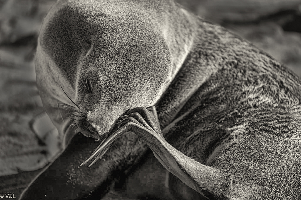
Comment |
Israel, I like how your post-processing handled the seal's fir. You've gotten a wide range of tones which is very important in a monochrome image. Like Bob said, capturing the flippers as they are "in action" was really good timing.
I wanted to play with your image myself. Not sure I improved or even significantly changed anything. Your thoughts?
|
Jan 9th |
 |
| 62 |
Jan 20 |
Reply |
I have attacked my calibration device with a sledge hammer... and then demolished my PC. It's now Mac all the way! (lol) |
Jan 8th |
| 62 |
Jan 20 |
Reply |
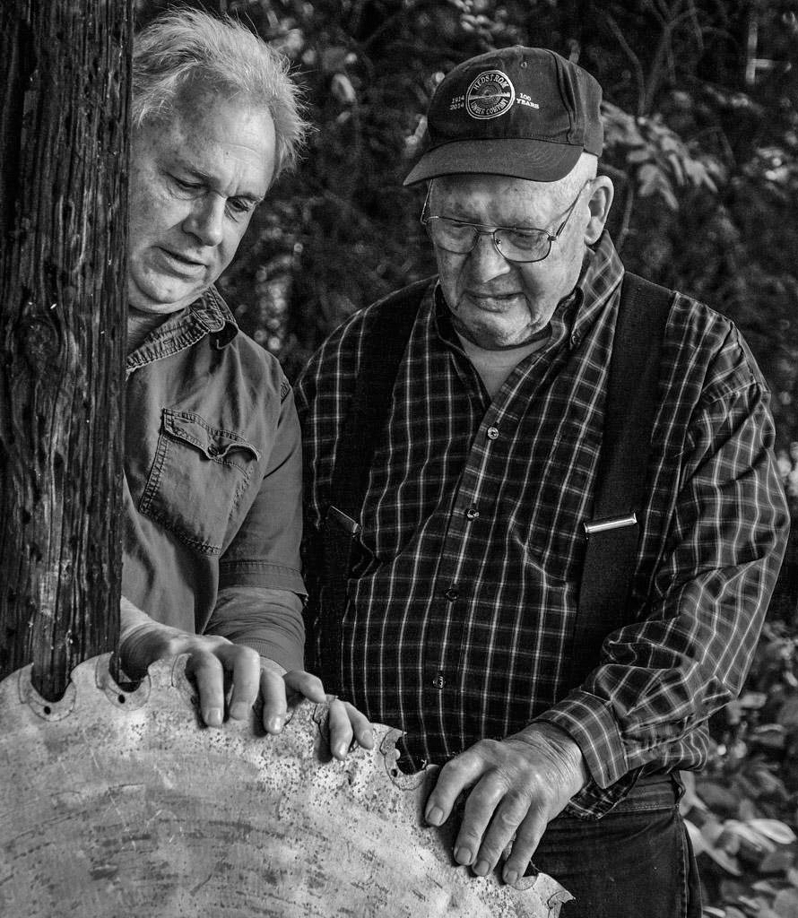
LuAnn, in the sample that I attached previously I brought down the brightness of the men's faces and hands. I don't suggest darkening any other part of the men. Perhaps the confusion is that you thought I meant darkening the men's clothing and cap.... or perhaps darkening them further than my sample.
I use the SpyderX Pro for my monitor calibration which I do about once a month.
|
Jan 6th |
| 62 |
Jan 20 |
Comment |
Gary, some photographs make you go "AWWWW". This one does. Not only for me but also for my wife.
I don't know how you did it, but Dude's eyes AND nose seem to be in focus. An outstanding depth-of-field. Nice! Also, I don't think the grain hurts a bit. In fact, it seems to fit the image. The only thing I can suggest is seeing if it would be beneficial to lighten his eyes and the area around them. This might make them even more the focus of this delightful photograph.
|
Jan 5th |
| 62 |
Jan 20 |
Comment |
Bob, I love what you did in post processing with this image. The stark contrast between the black and the light portions of the photograph really bring it to life. I don't have any suggestions for change. Well done.
|
Jan 5th |
| 62 |
Jan 20 |
Comment |
LuAnn, I find this to tell a wonderful story. And, the two men's hands on the huge saw blade give a great balance to their faces. Nicely done.
Like Bob, I think it might be beneficial to bring down the brightness on the men. Also, since Layne is mostly behind the tree, it could be useful to crop a bit off the right side. Here's what I have in mind. |
Jan 5th |
 |
5 comments - 6 replies for Group 62
|
12 comments - 11 replies Total
|


