|
| Group |
Round |
C/R |
Comment |
Date |
Image |
| 5 |
Sep 19 |
Reply |
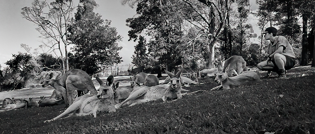
Richard, you are an amazing 97 year-old! Although I'm "only" in my mid-seventies, my father was also in WW2. I loved hearing his experiences during that time. One of my favorite stores was when he would tell me that he and the other soldiers would go on maneuvers to practice being miserable.... and that they got really good at it! LOL
|
Sep 22nd |
| 5 |
Sep 19 |
Reply |
David, thank you for your input. I agree that there's a great deal more that I need to do if I'm going to enter this image in a competition. I will work on the bright background and also see if I can tone the burned out fingers/hand so that they are a better match to his skin color. Since his hands are a key component of "the story", I'll probably leave them relatively bright.... perhaps comparable to his face.
Unfortunately, this was one of those photographs that doesn't lend itself to "re-doing". Otherwise, I'd love to ply with the original exposure.
|
Sep 22nd |
| 5 |
Sep 19 |
Reply |
Richard, I agree with you that this month's image feels like a cute and very well done snap show. However, that's not a bad thing. (I can't tell you how many photos I've done that are received with the statement, "Oh, another butterfly picture" or something like that.)
Following David's suggestion, I tried playing with your original photograph. I couldn't get to work as a color image, but B&W seemed to have more promise. Nonetheless, don't think I was able to do it justice. Here's what I came up with.....
|
Sep 10th |
 |
| 5 |
Sep 19 |
Comment |
Nick, I have a new hobby.... looking at your images and trying to decide what you added before reading your description. I guess wrong on this one. I thought you had added the whipped cream and I thought the spoon was part of the tile floor. Well done!
|
Sep 6th |
| 5 |
Sep 19 |
Comment |
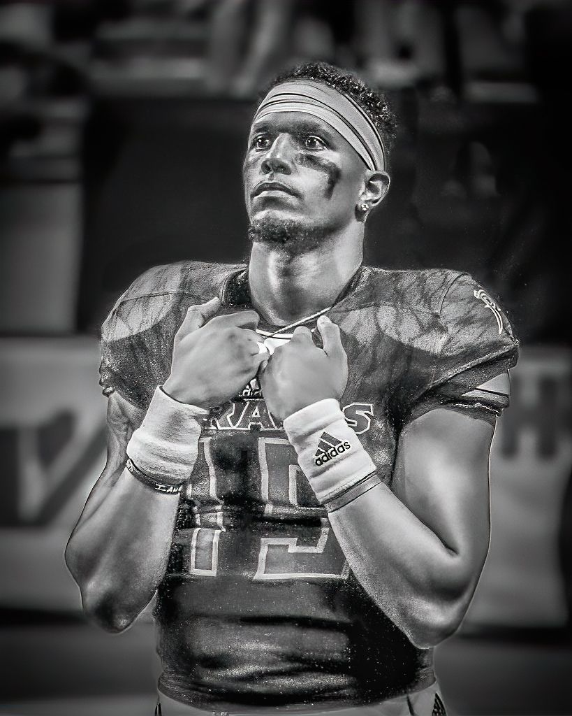
Phil, I like it! The quarterback's expression and posture is wonderful. It tells such a fascinating story. Very well done.
I wanted to see how it might look with the quarterback lit more brightly than the background, so I played with it a bit in Photoshop's camera raw filter. Since I did it fairly quickly, it's not particularly well done.
Your thoughts?
|
Sep 6th |
 |
| 5 |
Sep 19 |
Comment |
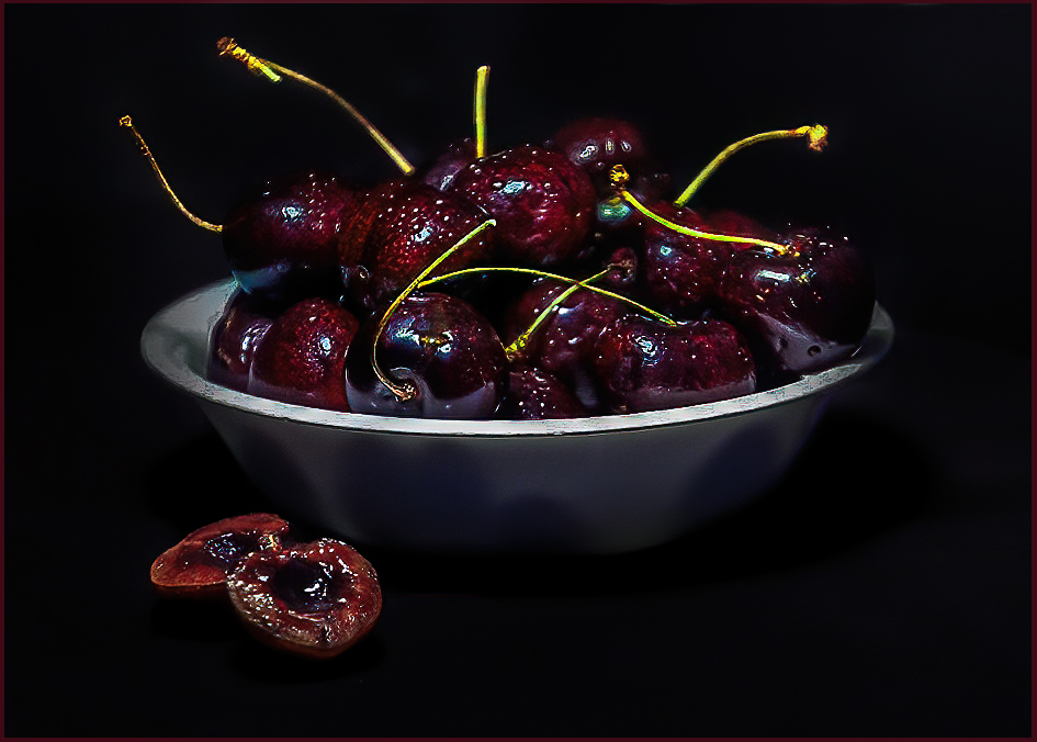
Barbara, this is lovely. And, I really like your awareness of the beauty of the bowl of cherries! The colors that you achieved with the fruit are wonderful. Very nicely done!
After looking at your image for awhile, I felt that the bowl was slightly tilted to the left and, I also wanted to see how the photograph would look if it were cropped a bit on the right. So, starting with your original, I played with the image a bit. I'm certain that some of my edits were detrimental instead of positive. Your thoughts?
|
Sep 4th |
 |
| 5 |
Sep 19 |
Comment |
David, the general blurriness doesn't bother me since it gives your image a wonderfully dreamy feeling. However, I would like the boy's face to be in sharp focus since he is the obvious focus of the photograph. Your use of selective colouring is brilliant -- it, and the brighter areas at the top of the stairs immediately draws my eyes to the boy.
Occasionally when I've examined your image, I first notice the sharp bottom stair. That works well, bringing my examination up the stairs to the boy... the same path that he took.
Very nicely done!
BTW, I absolutely share Barbara's admiration of your artistic abilities and mastery of photography.
|
Sep 2nd |
4 comments - 3 replies for Group 5
|
| 62 |
Sep 19 |
Reply |
Bob, I totally agree that Israel has captured a wonderful moment. I'm sure that it was difficult handling the lighting and depth-of-field for this image. And, it's "made in heaven" for being a mono photograph!
|
Sep 22nd |
| 62 |
Sep 19 |
Reply |
Well Gary, after agreeing with you that it's difficult for a flower/butterfly image to invoke feelings in the viewer, you "hit me" with an example that does exactly that! I especially like how the Ironweed almost seems to be blowing the butterfly off to the left of the image. And, like LuAnn, I find your use of toning to be outstanding. Finally, the light vignetting brings my eyes immediately to the butterfly.
I'm afraid I have no suggestions for modifying your image. Well done!
|
Sep 22nd |
| 62 |
Sep 19 |
Comment |
Bob, I definitely like this version since the original white-ish sky bothered me and I also like the lightened dark areas. In this second image, I find that the man on the boat at the left seems to be in focus. However, in the first version, he seemed a bit blurry to me. I like him being sharp since I found that I was eager to have an "anchor point" for the rest of your image.
I have returned to look at your image several time and, frankly, it's grown on me. (lol) Initially, I found it hard to look at for a long time. The dreaminess quality was disturbing since I'm so accustomed to seeing classic, sharp photographs. However, as I continued to visit your image I found that it was easy to "become part of the scene". A fascinating experience.
You've opened up a new avenue of photography for me to explore. Thank you! And, well done... I really like the idea of going outside the box!
|
Sep 22nd |
| 62 |
Sep 19 |
Reply |
Gary, I've always sought to make the viewer FEEL what I was feeling when I captured the photograph. Frankly, it's difficult (but not impossible) to do that with butterflies and flowers. LOL
|
Sep 22nd |
| 62 |
Sep 19 |
Reply |
Thank you, Bob. The man's eyes were haunting but captivating. Like you, I really like LuAnn's edits. It's improvements like hers that make this a valuable site. |
Sep 22nd |
| 62 |
Sep 19 |
Comment |
Since chaos is generally defined as complete disorder and confusion, I would envision an image depicting chaos as having people who do not have a clear directive (such as ordering a Rueben or beer). When I Googled "chaotic people", the image that I thought best suited the term is attached.
LuAnn, I think your image has a lot going for it since it captures the feeling of a successful and busy fair. To complete that view, I think Bob's second cropping would work nicely, especially if your cloned out the arm on the left.
|
Sep 11th |
 |
| 62 |
Sep 19 |
Reply |
LuAnn, I always look forward to your input on my images. Like Bob and Gary (below), I completely agree that darkening the bokeh is a nice enhancement. Thank you for that suggestion!
You're right about my concern for people in this man's apparent situation. The number of homeless people in our country seems to be growing. To me, this is an indication of a problem that I don't pretend to understand. As Gary mentioned below, the look in his eyes doesn't seem to reflect poverty but rather a sense of loneliness. In any event, I find it haunting.
|
Sep 11th |
| 62 |
Sep 19 |
Comment |
Hattie, I am really impressed with your visualization abilities! Capturing the seated girls emphasized the motion of the other kids. It also implied a wonderful story, leading to imagining what the girls were thinking. I also like how you cropped your image.
I played with this in Photoshop but couldn't find any way to modify your imaged that I found appealing.
Well done!
|
Sep 8th |
| 62 |
Sep 19 |
Comment |
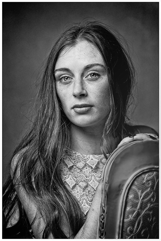
Julie, I really like this image. Georgia definitely looks vulnerable and, in spite of your ISO setting, I think the tonality is really good. Also, I'm pleased with the natural look of her skin.
About the only thing I can suggest is a slight darkening of the back of the chair. Currently, the chair's brightness pulls my eyes away from her face. I played with it a bit in Photoshop's Camera Raw filter to see how it might look with the chair back darkened and a slight lightening of the background so that her flowing hair is more obvious. Your thoughts?
|
Sep 5th |
 |
| 62 |
Sep 19 |
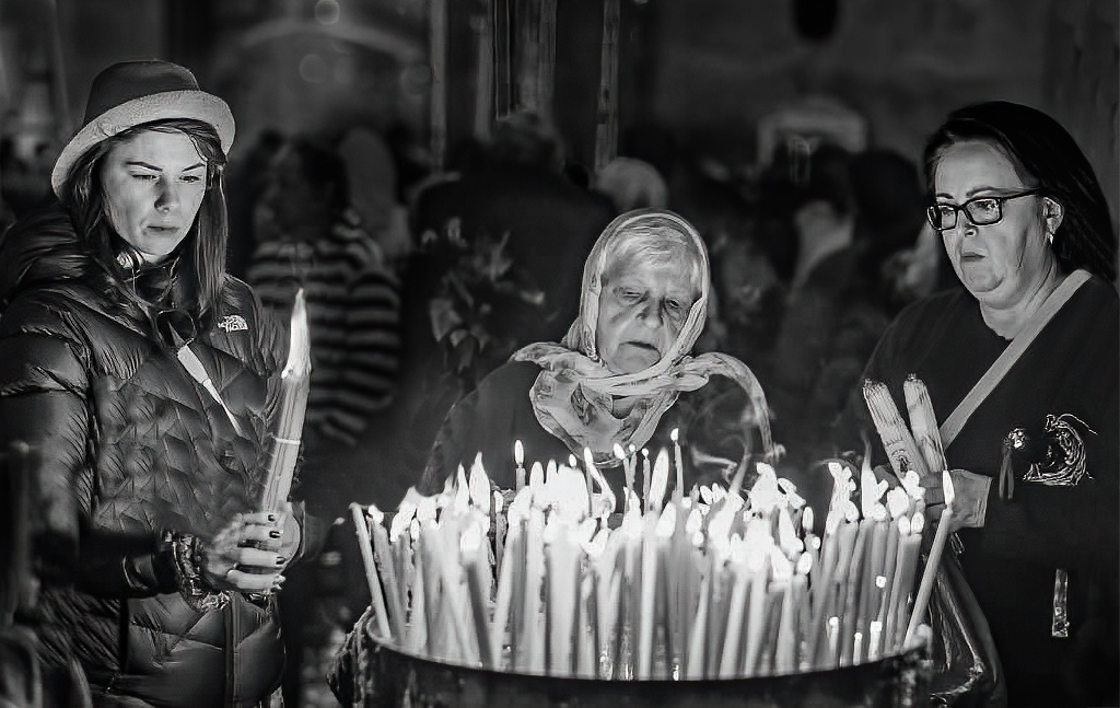
Comment |
Israel, I love photographs of people. Their faces tell stories of fascinating lives. Your image is a wonderful example of this. Each face reflects the deep and spiritual thoughts of the people. And, the bright candles immediate attract the viewer's eyes which then move to the faces. Very well done!
Since the man on the left of the image isn't sharp, I found him distracting from the wonderful faces of the women. Also, the two large flames on the left kept drawing my attention. So, I played with the photograph a bit and made a few adjustments, including adding a bit more space on the right side. Your thoughts?
|
Sep 2nd |
 |
5 comments - 5 replies for Group 62
|
9 comments - 8 replies Total
|


