|
| Group |
Round |
C/R |
Comment |
Date |
Image |
| 5 |
Jul 19 |
Comment |
Nick, I think I saw one of your wonderful giraffe photographs in the Creative Competition on the PSA home page. WELL DONE!
|
Jul 22nd |
| 5 |
Jul 19 |
Comment |
Terri, very well done! You've done an outstanding job with the background and the lighting. The man's suit stands out nicely from the dark green behind him, and the whites are bright but not blown out. Like Barbara, I think the wider cropping helps give context to your image. Nice!
|
Jul 12th |
| 5 |
Jul 19 |
Comment |
Beautifully done, Phil! I love the expression on the rider and on the horse. You really captured this at the perfect moment. I have no suggestions for modifications. Well done!
|
Jul 12th |
| 5 |
Jul 19 |
Comment |
Nick, this is not one of my favorites of your images. I find that Palmer's head appears distorted and the brush size feels too large to me since it seems like the image has lost some of the interesting shadows in his face. It almost appears featureless. Nonetheless, these are simply my personal thoughts. Others will likely find it creative and appealing!
I do really like how you've handled the BG. Also the frame is an excellent match for the photograph.
|
Jul 8th |
| 5 |
Jul 19 |
Comment |
It took awhile but I think I understand "the mysterious reflection". If I'm correct, all of the recognizable items in your original photograph are, in fact, reflections. That includes the attendant, the art on the wall in front of him and the portion of a painting behind him. The only things not reflected are the museum wall (a beige-pinkish color) and the hammered bronze metal (which shows the reflected scene). So, if I'm right about this, you've made it appear that you've taken a photograph of a painting that shows a seated man looking at a painting. Very cool!! I especially like how you've "mounted" your painting and created a shadow to give it a 3D feeling.
Very well done! And, it clearly shows your wonderful ability to see the potential of the world in front of your lens.
My only trivial suggestion would be to crop out the attendant's walkie-talkie since it doesn't add to the image. But, as I said, this is a nit!
|
Jul 7th |
| 5 |
Jul 19 |
Comment |
Excellent suggestions, Richard! Now when I look at the photograph, the blue tag stands out obscenely. And, you're definitely right about adding some texture to her face. Thank you!
The lady was serving food from steam trays in an indoor market in Baltimore.
|
Jul 7th |
| 5 |
Jul 19 |
Comment |
Barbara, this is expertly done! I agree with Mark about making the BG consistent. Your use of Topaz was outstanding and enhancing the catchlight really makes the portrait snap. Well done!
|
Jul 7th |
| 5 |
Jul 19 |
Comment |
I agree 100% with Mohan. And, I'm not sure that adding "dirt flying around the wheels" would have been a plus since I think of these old tractors as going quite slow. Excellent work!
|
Jul 7th |
8 comments - 0 replies for Group 5
|
| 7 |
Jul 19 |
Comment |
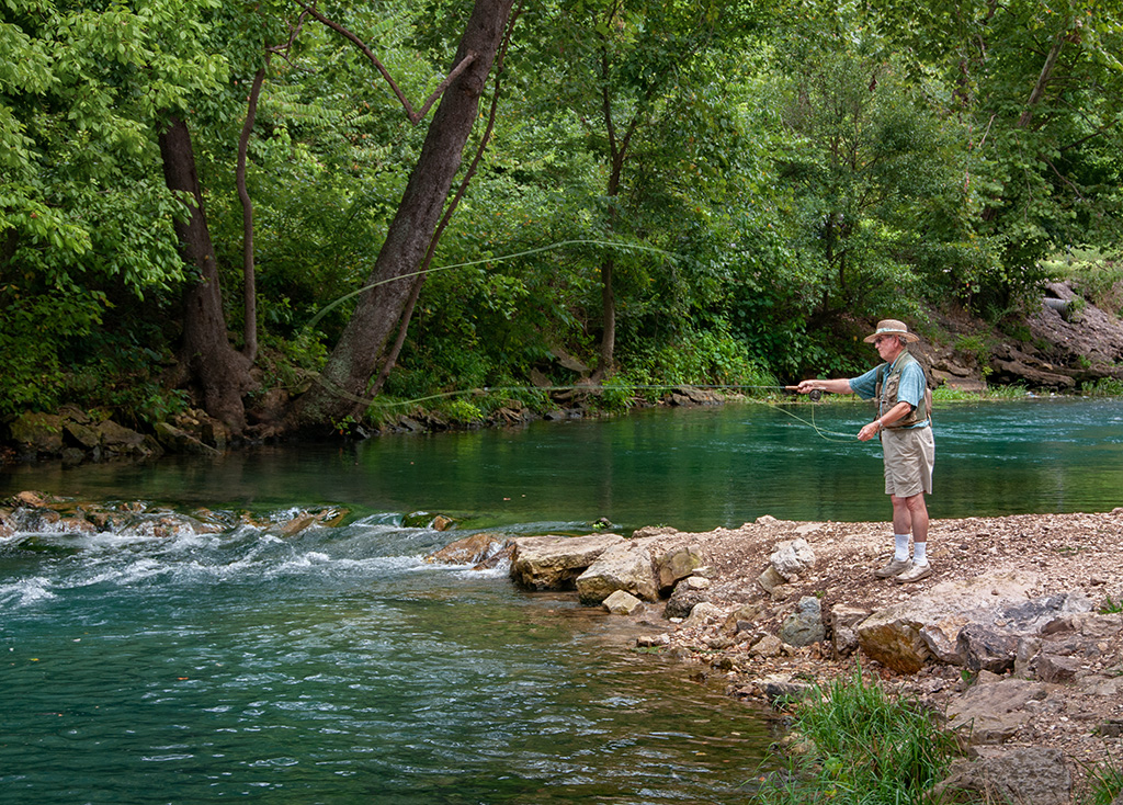
Tom, I was looking at the new Show Current Thumbnails link and saw your image. Wow, it's wonderful and brings back many old memories of fishing with my father. I love how you captured the perfect moment of the fisherman's cast. Well done!
Since I found this photograph so appealing, I couldn't help playing with it a bit. Clearly, the fisherman is the focus of the image, so I modified the lighting a bit to emphasize him. I hope you don't mind.
Again, it's really a well done photograph!
|
Jul 14th |
 |
1 comment - 0 replies for Group 7
|
| 27 |
Jul 19 |
Comment |
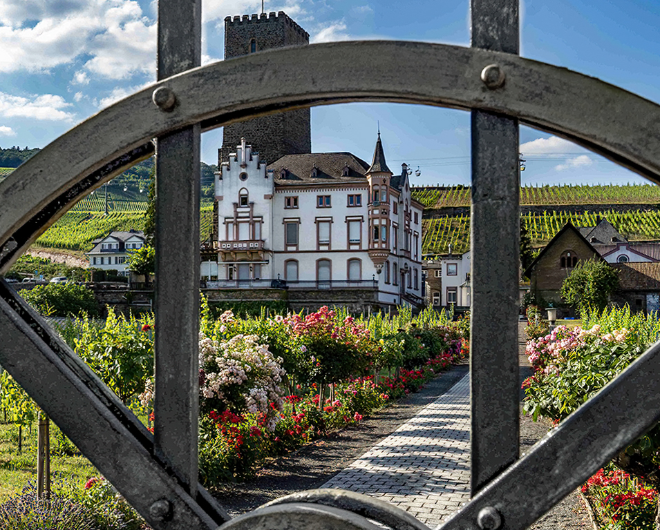
Renee, I noticed your image and found it intriguing. Your concept is great and you did a beautiful job with the depth of field. Well done!
I played with the photograph a bit after reading the comments from Becca, Brad and Jon. Cropping the image on the left seemed to remove some of the "heaviness" of the gate. Then, to further deemphasize it I lightened it a bit and lowered the texture and clarity. Then, finally, I played with the light and shadows on the scene beyond the gate. Your thoughts?
|
Jul 20th |
 |
1 comment - 0 replies for Group 27
|
| 40 |
Jul 19 |
Reply |
Catherine, I didn't do much. Mostly I brightened the shadows, added a little saturation to the sky and darkened it just a bit then did a tiny bit of cropping on the top. Since I could only work with the jpeg, it was difficult to do more. Oh, and I did some noise reduction using the relatively new Topaz DeNoise AI filter. |
Jul 17th |
| 40 |
Jul 19 |
Comment |
I'm visiting from Group 62 and noticed this delightful sunset. I think the comments you've already received are right on target. Using that input, I took the liberty of playing with your image a bit. I hope you don't mind.
Thoughts?
|
Jul 17th |
 |
1 comment - 1 reply for Group 40
|
| 56 |
Jul 19 |
Comment |
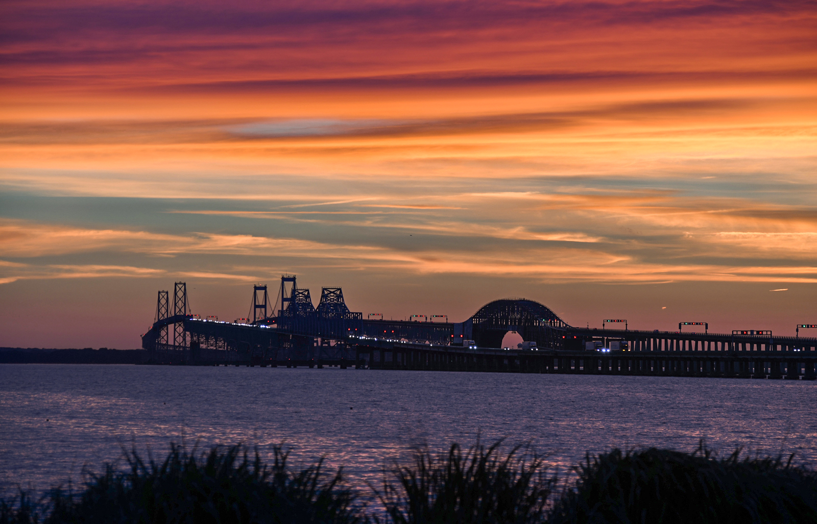
Pat, I was glancing through all the study groups using the new Show Current Thumbnails link and I saw your image. Wow! It's really spectacular and I love the simplified version. You've inspired me to explore the Topaz Simplify filter.
Since I was so taken with your photograph, I couldn't help playing with it a bit. Based on Elinor's comment, I straightened the verticals. Also modified the lighting a bit. I hope you don't mind.
Very well done!
|
Jul 14th |
 |
1 comment - 0 replies for Group 56
|
| 62 |
Jul 19 |
Comment |
Gary, Hattie and LuAnn, I absolutely agree with your cropping instead of what I did. And, LuAnn, I REALLY like removing the extraneous vertical stem. That makes the photograph so much better that I was definitely surprised.
I had previously decided that this image simply wasn't a candidate for one of my camera club competitions. You've now convinced me otherwise. THANK YOU!
|
Jul 27th |
| 62 |
Jul 19 |
Reply |
Hattie, you're absolutely right.... the vertical stem on the right detracts from the image. I may try removing it to see what I end up with. I like the added texture but, to me, the additional contrast doesn't look quite normal.
Thanks! Great input!
|
Jul 20th |
| 62 |
Jul 19 |
Reply |
Thank you, Gary. I like your cropping and will go with that in the future. It would have been nice if the shadows were a bit closer to the center of the leaf, but such is life.
|
Jul 20th |
| 62 |
Jul 19 |
Comment |
Pandula, it's a wonderful image and I really like it best as a monochrome. I especially like how you dealt with the background and how you cropped the image. Leaving a great deal of headroom works well since the woman is looking up. Also, your lightening of her face works well. Nicely done!
As Hattie mentioned, there does seem to be a slight halo around her head. But, I have no other suggestions for change.
We'll miss your monthly submissions and your interactions with the other members of our group. Good luck as the Star Rating Director. If you ever decide to leave that role, we'd be delighted to have you rejoin us.
|
Jul 12th |
| 62 |
Jul 19 |
Comment |
Israel, nice job darkening the bright "stripe of land" in the background.
If you want to see the differences between your monochrome and the one I submitted with my reply, the best way is to click on each of the images. Typically that will open each image in a different tab. Then you can just click back and forth between the two new tabs and see how they compare. Please let me know if this works for you. (I'm using the Chrome browser on a Windows 10 PC.)
|
Jul 12th |
| 62 |
Jul 19 |
Reply |
Israel, I'm more than happy to provide my input. However, please remember that it's just my personal opinion and others will likely have a different view. That's one of the advantages of being in a Study Group... you receive input from multiple people.
When I said that I did a bit to her face, I was referring to the fact that I slightly lightened it, added a touch of clarity and then sharpened it a tiny bit. These modifications didn't change her face, they simply emphasized her beauty.
If you'd like to submit a modified image, then the best way is to include it as a reply to your current entry. It's always good to see the original photograph as well as the changes that have been made later.
|
Jul 11th |
| 62 |
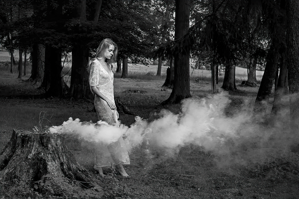
Jul 19 |
Comment |
Israel, welcome to our group! I hope you find it as useful and rewarding as I do.
This is a lovely image and I really like the monochrome version. The use of the smoke to emphasize the model's wispy clothing is outstanding. And, her downward glance and bare feet add to an intriguing story. Very well done!
I found the bright landscape behind her a bit distracting. The beautiful woman is clearly the focus of the image so I took the liberty of reducing much of the brightness (other than her) and adding a slight vignette. Then, I did just a bit to her face to give it even more character. Here's what I came up with. Thoughts?
|
Jul 11th |
 |
| 62 |
Jul 19 |
Comment |
What a wonderful capture! It's impossible to look at your photograph without smiling.
Julie, I don't notice that Scott's eyes are crossed. And, regardless, since he's laughing I don't think it matters at all. I agree that you should leave his arms as they are. My only suggestion is that you darken the slightly lighter, vertical bit on the bottom right of the image.
I definitely think you should enter this into a competition. I'd love to hear how it does and what the judge says about it.
Well done!
|
Jul 10th |
| 62 |
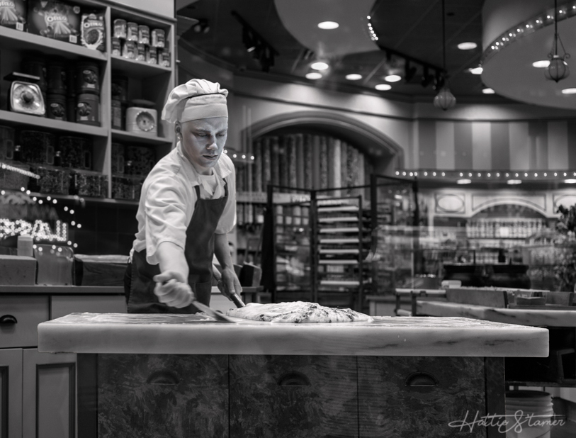
Jul 19 |
Comment |
Hattie, you have a great way of seeing interesting photographs that I would have totally missed! I totally agree with your analysis of the original image. The vibrant colors distract from the main subject. Well done!
I took the liberty of playing with your image in Photoshop and the Camera Raw filter (which is nearly identical to LR's Develop Module). To further highlight the baker, I cropped a bit, lowered some of the bright highlights and made some lighting adjustments to his face in an attempt to add some "character". What do you think?
|
Jul 9th |
 |
| 62 |
Jul 19 |
Comment |
Gary, this is such an interesting image. Your choice of toning colors really gives it an appealing moodiness. And, I love how the water and sky almost blend together.
I totally agree about the softness. It's almost as though you applied a glow filter to the image. The entire image holds together so well that it's difficult to make any suggestions. Perhaps it would be useful to show a little more detail in the darkest areas on the right since their blackness tends to pull my eye away from the boats. However, that's such a nit that I almost didn't mention it.
Well done!
|
Jul 8th |
| 62 |
Jul 19 |
Comment |
LuAnn, you handled the whites beautifully! There's good texture in the highlights and, to my eye, the tonal range is perfect. Although I'm often not a fan of frames, yours "fits" the image, especially with the black background. Even though you focused on the front of the lily, the back pedals are also reasonably sharp.
I'm not sure yet whether I like all the black space at the top of your image. But, I'll return to see it several times during the month and will see how it strikes me after a few viewings.
Well done!
|
Jul 1st |
8 comments - 3 replies for Group 62
|
20 comments - 4 replies Total
|


