|
| Group |
Round |
C/R |
Comment |
Date |
Image |
| 5 |
Feb 19 |
Comment |
Richard, your image really grabs my attention! I agree with Mike that the red eyes really "make" the image. And, I also agree with Barbara that the background is well chosen. You've created a spectacular cat!
I have two minor suggestions. First, I would like to see all of the cat's feet. Having the foot on the left cut off keeps me from feeling that the cat is completely grounded. The second suggestion is to soften the black areas of the cat's tail and right hip. I would find it more appealing to have the sharp edges of black fading into the Christmas tree lights.
An amazing transition from a "typical cat picture" into a memorable image of a cat monster.
|
Feb 11th |
| 5 |
Feb 19 |
Comment |
Mike, to me your photograph has amazing impact. The addition of the bird was an outstanding idea. With the view you've chosen of the tops of the lacy tree branches, it appears to me that they are reaching up to the bird.
I find that the monochrome image is more appealing than the color one. Somehow the silhouetted tree limbs against the gray sky really works for me. I'm also glad that you didn't add too much drama in the sky since the image already accomplishes that.
|
Feb 10th |
| 5 |
Feb 19 |
Comment |
Phil, congratulations on being a new granddad and on being such a valuable family for Vickie. The birth of a child is an amazing event to experience. I'm so glad you had this opportunity!
I like the "adult body parts" forming a frame for the newborn. Also, the moving towel somehow helps form a background. But, the point of interest is clearly the baby's crying face. It is a wonderful image and, as Mike noted, it captures a precious moment.
Well done!
|
Feb 7th |
| 5 |
Feb 19 |
Reply |
Thank you, Mike. I definitely agree with the need to have his face or eyes be a stronger focus point.
I love going to the Vietnam Memorial. There are almost always opportunities for emotionally-strong photographs. My first visit there was the most memorable. It had just been constructed. The evening was misty and the lights had not yet been installed so the guards were providing lanterns to the few visitors. The scene with the misty darkness, the lanterns and the visitors with their black umbrellas was magical. Sadly, I didn't have my camera since I had only gone down to scout the area for a later photographing visit.
|
Feb 7th |
| 5 |
Feb 19 |
Comment |
Nick, you have a mind like no other! (That's a compliment!)
I like your composite. You did a fantastic job creating it. I do agree with Dr. Nair that the shadow is missing; however, I must admit that I hadn't previously noticed.
Well done!
|
Feb 6th |
| 5 |
Feb 19 |
Comment |
Barbara, to me this image shows the kind of experimenting that I enjoy. The capabilities of Photoshop, Lightroom and third-party plugins never cease to amaze me. It appears to me that you explored a number of the possibilities of these tools to create a very pleasing photograph. I like the composition and I feel that the addition of the shadow and the third pink petal worked nicely to provide good balance to your image.
I agree with Richard that the cropping feels a bit tight since the flowers are quite close to the edge of the frame. Also, in my view, it might have been good to avoid the vignette on the flowers at the top right of the photograph. The current vignette makes me feel that those flowers are a bit blurry when, in fact, your image is in sharp focus.
Nicely done! |
Feb 5th |
| 5 |
Feb 19 |
Reply |
Thank you, Barbara. My initial Camera Raw process was to adjust the global sliders as you assumed. After that I used the adjustment brush (one of my favorite tools) to darken the man's hair which was almost blown out. Following that I use the brush on the background to darken, desaturate and blur it a bit. |
Feb 3rd |
| 5 |
Feb 19 |
Comment |
Thank you, Richard. I will definitely lower the intensity of the "FIRST TO FIRE" slogan. In fact, now that I'm looking at it, I'll try reducing the brightness of all of the sun-struck areas of his cap. |
Feb 3rd |
| 5 |
Feb 19 |
Comment |
David, I really like the colors that you chose. The hat and the man's left shoulder are a wonderful shade of yellow. But my favorite element of this image is the texture. The face, the hat, the clothes and even the background are all tied together with the texture of your old wall.
Experimenting with photographs is fun. And they are even more enjoyable when the experiment is successful as yours is. |
Feb 1st |
7 comments - 2 replies for Group 5
|
| 14 |
Feb 19 |
Comment |
It's a beautiful picture of a beautiful scene. Larry, your tones are lovely and the contrast certainly makes it an impressive image.
Very nicely done!
|
Feb 11th |
| 14 |
Feb 19 |
Comment |
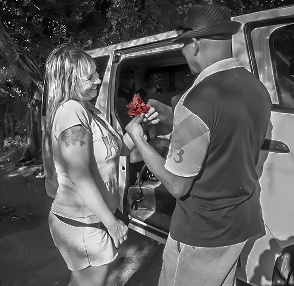
Gregory, I think you captured a very special moment. As Bobbie said, the expression says it all.
Larry and Yvonne both commented on the brightness of the van. So, with that in mind, I started with your original photograph to see what I could do. My personal feeling was also that your idea of leaving the color in the flower was excellent. But, I wanted to see how it might look with the color muted a bit. So, here's what I came up with. I really don't think it's at all better than your submission, but it is a bit different.
|
Feb 11th |
 |
| 14 |
Feb 19 |
Reply |
Larry,
I was able to remove the contrail fairly well using the Spot Healing Brush Tool with Content Aware and Replace both selected. By doing the contrail a bit at a time (3 or 4 segments), I obtained this:
|
Feb 10th |
 |
| 14 |
Feb 19 |
Comment |
Arun,
I agree with both Greg and Larry. It's a wonderful image and the slight right side vignette adds just a bit more emphasis on the man. I think the colors reflecting on the ice are marvelous. For me, your decision not to include any land or sky in the image was excellent.
Sometimes it's difficult for me to suggest any feasible change to try on an image. For this beautiful photograph the only thing that might be worth playing with (in my opinion) would be a slight darkening of the man's shadow.
Very nicely done!
|
Feb 10th |
| 14 |
Feb 19 |
Comment |
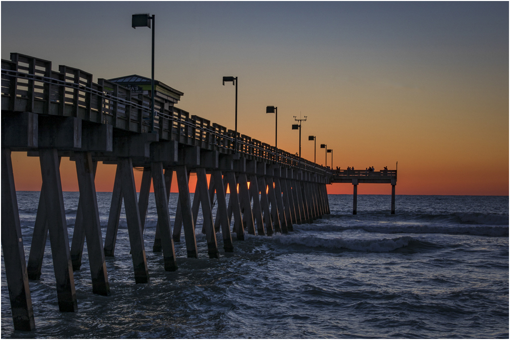
Bobbie,
So many sunset images are "just more beautiful sunset images". Yours goes far beyond that. The pier, the deep blue water, the jet's contrail all combine with the wonderful sky to make this extraordinary. At first I wondered if the contrail was too much of a distraction. But, after more consideration I've decided that for me the photograph is excellent with or without it.
Your cropping, exposure and focus are perfect. Well done!
|
Feb 10th |
| 14 |
Feb 19 |
Comment |
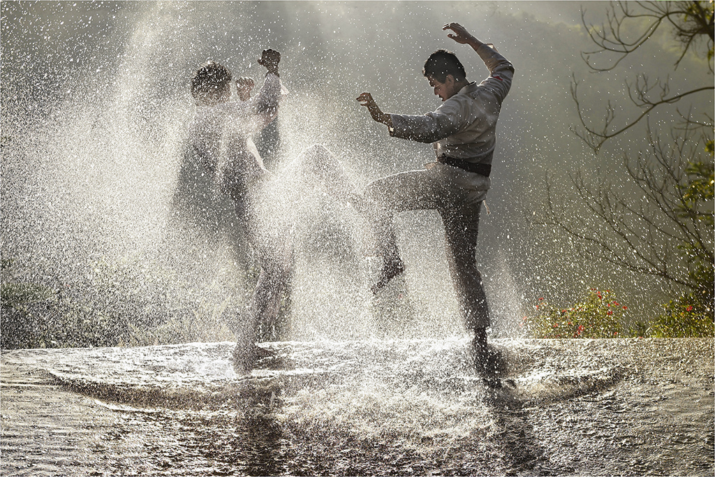
WOW!
Lyndall, this is an amazing image. I love the composition and your choice of camera settings was perfect for freezing the action and obtaining an excellent exposure.
Since I can't help playing with photographs that I feel are special, I tried a couple of very minor edits in Camera Raw. The most significant change that I tried was to remove most of the yellow cast from the water around the boys. Then I added just a tiny bit of contrast, dehaze and clarity.
I suspect that you chose to keep the yellow tint since that was probably the natural lighting and you wanted to retain the feeling of the morning. With that in mind, your version is probably more appealing. Nonetheless, here's what I came up with.
|
Feb 10th |
 |
| 14 |
Feb 19 |
Comment |
Yvonne, first I must apologize! You sent in your image on January 31st and I didn't find it in my Spam folder until a few minutes ago. I'm so sorry for posting your photograph late!
Now, the image....
Yes, it's "just" a cute puppy shot. However, you've done a beautiful job composing, focusing, cropping and processing it. And, the pup's soulful eyes are wonderful. The darker fur around them along with the strands of white fur that seem to point in their general direction really guide my eyes to them as the focus point of your image.
Nicely done!
|
Feb 10th |
6 comments - 1 reply for Group 14
|
| 62 |
Feb 19 |
Reply |
Thank you, Hattie. I struggled with the foreground since I didn't want the dark grass to dominate the photograph. I like the vignette that you used but, to me, the toning "fits" the sense of age of the image.
Thanks again!
|
Feb 24th |
| 62 |
Feb 19 |
Reply |
LuAnn, I really like how you dealt with the foreground. In fact, your photoshop skills exceed your profession of non-mastery! Very well done!
|
Feb 24th |
| 62 |
Feb 19 |
Comment |
Lance, congratulations on your new group! I hope that being the Admin is a rewarding experience. Please drop by here often. I think you'll be as impressed with the Group 62 members' photographs as I am!
I want the Group 62 members to have a chance to see some of your work. Here's the URL: http://visualizingart.com/
I'm especially fond of your seascape images. Beautifully done!
Thank you for visiting.
|
Feb 23rd |
| 62 |
Feb 19 |
Reply |
Thank you, Gary. I agree that the foreground is quite distracting. I don't think it's blurry because of the wind (the middle ground grass was frozen by the 1/2500 sec). Instead, it was simply too close for my lens to focus. It would have been a good opportunity for a small step ladder!
|
Feb 11th |
| 62 |
Feb 19 |
Comment |
Hattie, the man's gaze and pointing finger make me think that a good title might be "YOU!!".
Your composition is wonderful. To me, the image balance is perfect with the closer cropping on the right being offset nicely by moving his pointing finger just to the left of center.
I really like the way you've made the man and his book sharp while blurring the rows of books.... yet keeping them recognizable. Nice depth of field.
Personally, I would like to see his pointing finger in complete focus. The only way that I can imaging doing this would be with stacking focus, which would be very difficult with this photography.
Your concept is very appealing to me and your execution is extremely well done!
|
Feb 11th |
| 62 |
Feb 19 |
Comment |
Pandula, it's yet another of your amazing photographs. For me, this one works very well in monochrome but not in color. The tones and textures are fantastic and your posing of the model is brilliant.
At first glance I wondered why the woman was standing on stilts. However, after looking a bit longer I realized that she was wearing a long, glowing gown. That made the image really come alive.
Beautifully done.
|
Feb 9th |
| 62 |
Feb 19 |
Comment |
When I look at this image, I immediately imagine a story. To me, she is a wanna-be actress and he is the phony agent who is eager to sign her up. That's just my opinion but, like you said, the image seems to have a bit of Charlie Chaplin flavor.
I totally agree with your choice of monochrome. To my eyes, the bright colors pull my vision away from the eyes of the actors.
I find that the bright wall on the bottom right of the image is a bit distracting. Personally, I would like to see it dimmed a bit and maybe have a bit more cropping to the right of the agent's arm.
Nicely done.
|
Feb 7th |
| 62 |
Feb 19 |
Comment |
Paul, to me this is an image that has wonderful impact. I find the sky, the cactus, the man on the motorcycle and the dusty road tell an intriguing story. The fact that the motorcycle's headlight is on and its position within the frame immediately draws my eyes to him. Without the headlight, my eyes might wander a bit before settling on the man. As it is, I find that I am initially drawn to him (via the headlight) and then into the rest of the photograph.
The only suggestions that I have are minor. However, I personally would consider cropping a bit off the top of the image and slightly darkening the portion of the road at the bottom of the frame.
A fantastic image. Well done!
|
Feb 7th |
| 62 |
Feb 19 |
Comment |
LuAnn, to me this is a fascinating idea. I really like the moodiness created by the dark tones and the indistinct images. In my view, your technical approach is both creative and well done. I personally love experimenting with different photographic approaches and I find the novelty of this one quite appealing.
Naturally, I couldn't help playing with your original image myself. I don't think my attempt was as successful as yours. Your thoughts?
|
Feb 4th |
 |
6 comments - 3 replies for Group 62
|
19 comments - 6 replies Total
|


