|
| Group |
Round |
C/R |
Comment |
Date |
Image |
| 5 |
Jan 19 |
Reply |
Thank you, Nick. If you look closely I think you'll see that she does have a nose ring. Also, there seems to be a piercing on her upper cheek. (I have no idea of how that might have been done.)
Unfortunately, I've heard that removing tattoos is both painful and expensive.
|
Jan 21st |
| 5 |
Jan 19 |
Reply |
Thank you, David. I was also pleased with the woman being bounded by the picture and the writing behind her head. Her red hairband also seemed to help focus the viewer on her face.
I didn't know what to do with the pink wrist band. I considered changing it to red, matching the other prominent reds in the picture. I'm still wondering if this would work. |
Jan 21st |
| 5 |
Jan 19 |
Comment |
I agree with Barbara.... she's a lovely woman and a good capture. But, I must admit, I like your original cropping since having a bit of her dress below her gloves seems to balance the image. Your background is a bit distracting but help add the feeling of "Old Southern Mansion". It might work to blur the windows/certains a bit instead of removing them completely. Barbara's catch light is an excellent addition.
I love how you've caught her in a relaxed moment and with such a welcoming smile. Well done. |
Jan 7th |
| 5 |
Jan 19 |
Comment |
Barbara, I think that many people (mostly young) don't give much thought to the fact that tattoos are essentially permanent and that they might not want to have them later in life. I'm a strong proponent of folks changing hair styles and colors as a way to be different since those modifications aren't locking them into something that can't change. So...off our soap box. LOL
I agree about the bracelet and the pose. Although removing the bracelet, or darkening it, is certainly feasible, there's not much I can do about her pose. Surprisingly, she was just sitting that way... not consciously posing for me. Thank you for your input on this image. It's not likely to be one I'll enter into a competition.
|
Jan 6th |
| 5 |
Jan 19 |
Comment |
Thank you so much, Nick. A Happy 2019 to you as well. Your image is a wonderful way to acknowledge the new year!
|
Jan 5th |
| 5 |
Jan 19 |
Comment |
Barbara, this is such a wonderful composition. The soft, flowing background perfectly sets off the charming hat and vibrant orchid. Beautifully done!
I'm at a loss for any improvement suggestions. |
Jan 5th |
| 5 |
Jan 19 |
Comment |
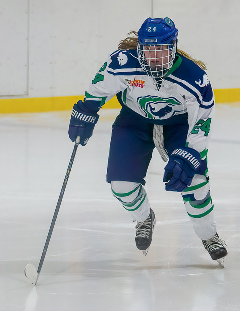
What a terrific capture! Her face shows the intensity of the hockey game and her position on the skates makes her movement seem alive. I'm sure that her aunt was absolutely thrilled! Well done!!
My only suggestion would be to remove the stand area that's above her head. Since your image benefits from the headroom above her, I suggest simply extending the white wall upwards a bit. Here's what I'm thinking.
|
Jan 3rd |
 |
| 5 |
Jan 19 |
Comment |
David, it's another incredible image. You take advantage of your obvious mastery of filters to create pictures that are all worthy of being hung in an art gallery.
You've inspired me to explore the Nik Bleach Bypass filter. It clearly worked beautifully for this image.
My only suggestion, a tiny nit, would be to darken the woman's shoes a bit. I find that they attract my attention away from her face and pose.
A wonderful image. Well done!
|
Jan 3rd |
6 comments - 2 replies for Group 5
|
| 14 |
Jan 19 |
Comment |
Yvonne, your image is a wonderful example of a photo that really works in B&W but isn't nearly as interesting in color. The foliage shows excellent detail and is perfectly visible and yet it doesn't distract from the cat.
You did a nice job cloning out the water on the deck, leaving just enough to add interest. And, your cropping is "right on".
My only suggestion, and it's really a nit, is that the deck might benefit from a slight reduction in brightness. I think that could further highlight the cat.
Well done!
|
Jan 14th |
| 14 |
Jan 19 |
Comment |
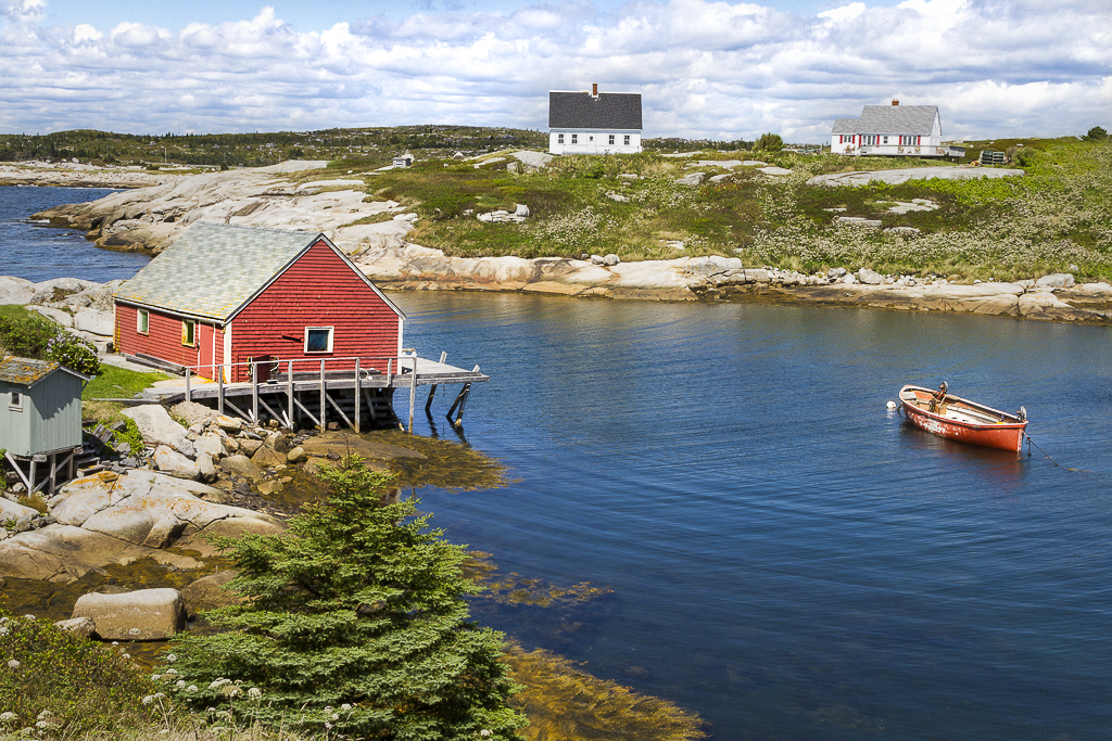
Bobbie, my wife and I enjoyed a trip to Nova Scotia many years ago and we both remember Peggy's Cove. You've done an excellent job capturing the beauty of the area. I especially like the balance of the red building and the boat. Also, removing the "extra" building was well done. Since it is such an appealing picture, I couldn't help playing with it a bit. I tried to make the clouds more prominent, added a bit more contrast to the overall image and included a very slight vignette. Your thoughts?
|
Jan 11th |
 |
| 14 |
Jan 19 |
Comment |
Arun, you're truly captured the amazing beauty of this peacock. The colors are astounding! I like how you've cropped this image. By omitting the legs you've allowed the tail feathers to completely dominate the image. Also, placing the bird's body off to one side, you've avoided the picture feeling static.
I have no suggestions for modifying this beautiful image. Well done!
|
Jan 11th |
| 14 |
Jan 19 |
Comment |
Larry, it's a lovely capture. I really like the layered effect that you've achieved with the river, the rock and trees, and the distant background. I've never been to Vancouver or Alaska but they are obviously beautiful places. Nicely done image!
|
Jan 7th |
| 14 |
Jan 19 |
Comment |
Gregory, I really like your processing of this image! The addition of the Christmas tree was a fantastic idea, as was your treatment of the rest of the background. And, your cropping makes it appear that you took the picture at the same level as "Santa and friends". Also, the fact that you were able to control the highlights and regain texture in Santa's fur is impressive. It's a fun tribute to the holidays. Well done!
|
Jan 4th |
5 comments - 0 replies for Group 14
|
| 62 |
Jan 19 |
Comment |
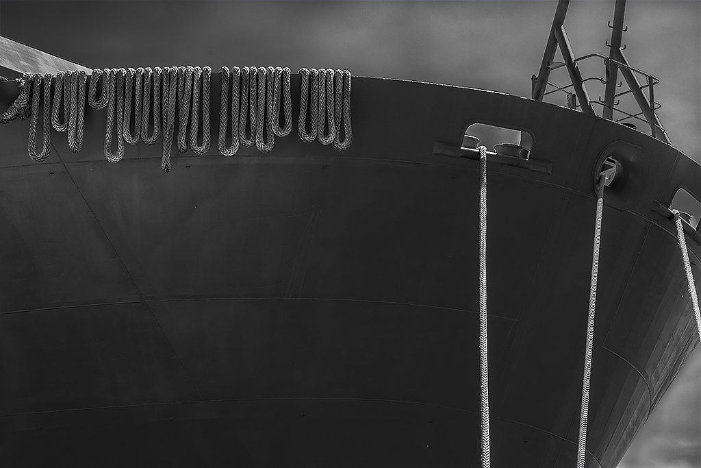
As mentioned by LuAnn and David, the dark sky may not be totally appropriate. Thus, I played with the sky a bit to see how it would affect the image to lighten it toward the bow of the ship. (I didn't go a great job on the bottom right since I'm mostly interested in seeing how the change will impact the image.) I think edits definitely change the feel of the picture and, to me, they relieve some of the "oddity" of where the light is coming from.
I found my original B&W image to have a minimalist impact. It seems to me that this impact is lessened somewhat by drawing more attention to the sky.
Your thoughts?
|
Jan 19th |
 |
| 62 |
Jan 19 |
Comment |
Gary, I love the range of tones that you've achieved in this image. The sharp edges and texture of the stones is very appealing. I agree with LuAnn about the cropping change and the warming of the image. But, in total I think you've done an outstanding job on post-processing.
With that said, I find that I would like to have a specific point of focus, or (as David indicated), a path for my eyes to comfortably follow. This certainly isn't meant to criticize your excellent work on the image.... it's just a personal preference.
|
Jan 14th |
| 62 |
Jan 19 |
Comment |
David, I agree with Gary. It's like looking into a collage of the heavens. I like the B&W version best, but the color image is nice as well.
Looking at this would never make me think of ice or rocks under the ice. Instead, it's an amazing abstract. Well done!
|
Jan 9th |
| 62 |
Jan 19 |
Comment |
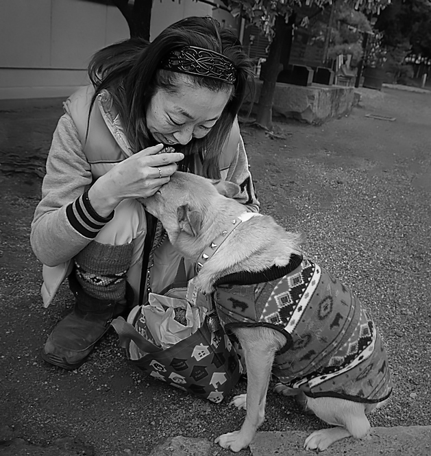
Paul, your image is a wonderful example of street photography. It is both spontaneous and filled with emotion. There is a fantastic intimacy between the woman and dog. Beautifully done!
Since I wanted to include the rest of the dog's back leg, I played with the picture... and, modified the lighting a bit while I was at it. Please let me know if you feel the edits are worthwhile, or if they spoil what you had envisioned.
|
Jan 3rd |
 |
| 62 |
Jan 19 |
Comment |
LuAnn, I love how you've made this into a gangster-era image. Your toning and grain are perfect. There's almost nothing I can suggest, although cloning out his cell phone might be worthwhile.
Beautifully done! |
Jan 2nd |
5 comments - 0 replies for Group 62
|
16 comments - 2 replies Total
|


