|
| Group |
Round |
C/R |
Comment |
Date |
Image |
| 14 |
Dec 18 |
Reply |
Thank you, Lyndall. It's an amazing group and each member has an excellent grasp of photography! (I'm currently enrolled in a judge certification program.)
|
Dec 10th |
| 14 |
Dec 18 |
Comment |
This marvelous picture makes me smile every time I look at it. Even though the boys probably cooperated, your timing was perfect.And, your camera settings were exactly what you needed to catch this image. Beautifully done!
Based on what Arun said, I played a bit with the image by desaturating the foreground water and cropping a bit off the bottom. Then I slightly modified the water lighting and also brightened the boys. Your thoughts? |
Dec 9th |
 |
| 14 |
Dec 18 |
Comment |
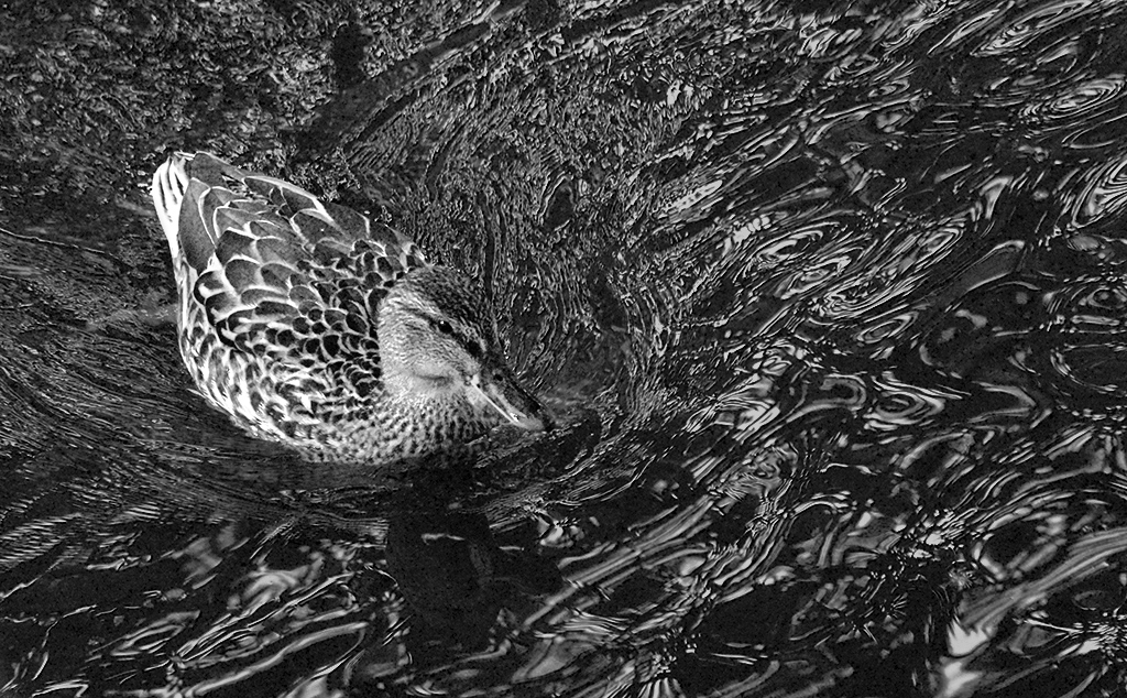
Inspired by Eleanor's comment, I decided to see how it would look converted to b&w. Using Nik's Silver Efex Pro 2, I made the change and was disappointed in the results. Basically, the duck almost vanished in the swirls of water. Then I tried brightening the duck a tiny bit and darkening the water. I'm not wild about how it turned out... and I like your original much better (with the darkened water). Here's what I came up with. |
Dec 9th |
 |
| 14 |
Dec 18 |
Comment |
I thought it might be fun to play with this image in B&W. That turned out to pose a new set of Photoshop challenges. Nonetheless, here's what I ended up with.
|
Dec 7th |
 |
| 14 |
Dec 18 |
Comment |
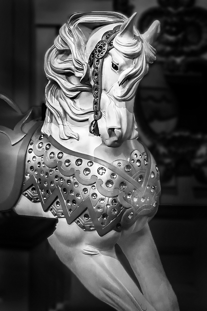
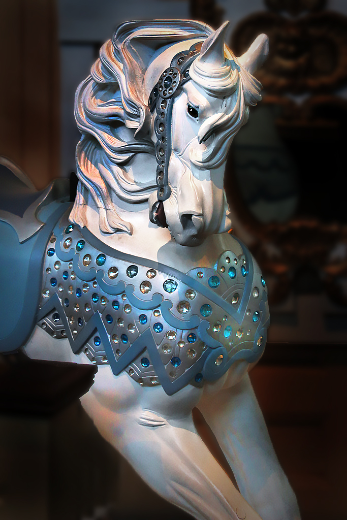
Eleanor, Merry-Go-Rounds are such wonderful places for photography. And, since I've been to the Merry-Go-Round Museum in Sandusky, I'm aware of how difficult it is to take pictures.... the lighting and the crowded nature of the museum are definitely challenging. Frankly, I think you did marvelously!
I played with your image a bit to see if I could isolate the horse and edit its lighting somewhat. While I was at it, I couldn't resist adding a vignette and a tiny catch light to its eye.
Your thoughts?
|
Dec 7th |
 |
| 14 |
Dec 18 |
Comment |
Bobbie, your edits for this image are great. I love how the branch fades out into shadow. It makes my eyes keep returning to the egret. And, the background would have been distracting. The egret is the image and the fading branch gives perfect context. Nicely done!
|
Dec 7th |
| 14 |
Dec 18 |
Comment |
Gregory, I love what you've done with this image. If I had taken the picture and seen the original, I probably would have discarded it. Yet, your post processing has turned it in to a work of art. The more I look at it, the more I see and the more I like it! The red bag makes the woman the focus of the image. Then, the color of the buildings on the right and left draws my eyes into the rest of the picture and up to the suspension bridge. Finally, I notice the spire of the building between the bridge supports and that brings me back to the woman who seems to be looking at it.
It's hard to make any suggestions for changing this image. However, it appears that the building on the left isn't perfectly vertical.
Wow! Well done. I'm going to have to revisit the capabilities of Topaz Restyle.
|
Dec 5th |
| 14 |
Dec 18 |
Comment |
Yvonne, I love this. The background is absolutely perfect and the sepia fits the image extremely well. Each time I look at it I notice something different, which makes it worth returning over and over. I don't have any suggestions for changes.
Well done!!
|
Dec 3rd |
7 comments - 1 reply for Group 14
|
| 62 |
Dec 18 |
Reply |
Hattie, I like your edits. They somehow (magically?) give the cat even more personality. Nice! |
Dec 22nd |
| 62 |
Dec 18 |
Reply |
Paul, when I edit this further I'll try "a little more pop" on the tattoos. Thank you!
|
Dec 21st |
| 62 |
Dec 18 |
Reply |
Thank you, Hattie. I like your edits very much. I hadn't noticed the over-bright highlights until you mentioned them. |
Dec 21st |
| 62 |
Dec 18 |
Comment |
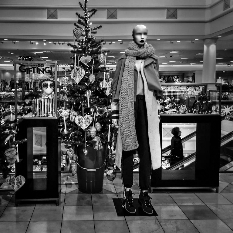
This is very intriguing. The woman in the glass box really makes this an excellent image. I also like the mannequin head on the left. It's a good balance for the woman on the escalator.
I wanted to see how your image would be with slightly different lighting. I started with your B&W version and played with the lighting so that the full mannequin's head/face is more noticeable. I'm not sure it's what you were after.... your thoughts?
|
Dec 8th |
 |
| 62 |
Dec 18 |
Reply |
Thank you, Gary. I found that the Tattoo Expo is a fun place for photography. The activity is fascinating and the people are getting tattoos because they want people to look at them. A perfect setup.
|
Dec 8th |
| 62 |
Dec 18 |
Comment |
Wow! This is a wonderful abstract. At the bottom of your image, I see a face. It's this kind of "implied figure" that makes a photograph interesting and worth returning to over and over. I like Gary's toning of your image but I prefer your orientation since it better suits the "hidden face". Very nicely done, David!
|
Dec 8th |
| 62 |
Dec 18 |
Comment |
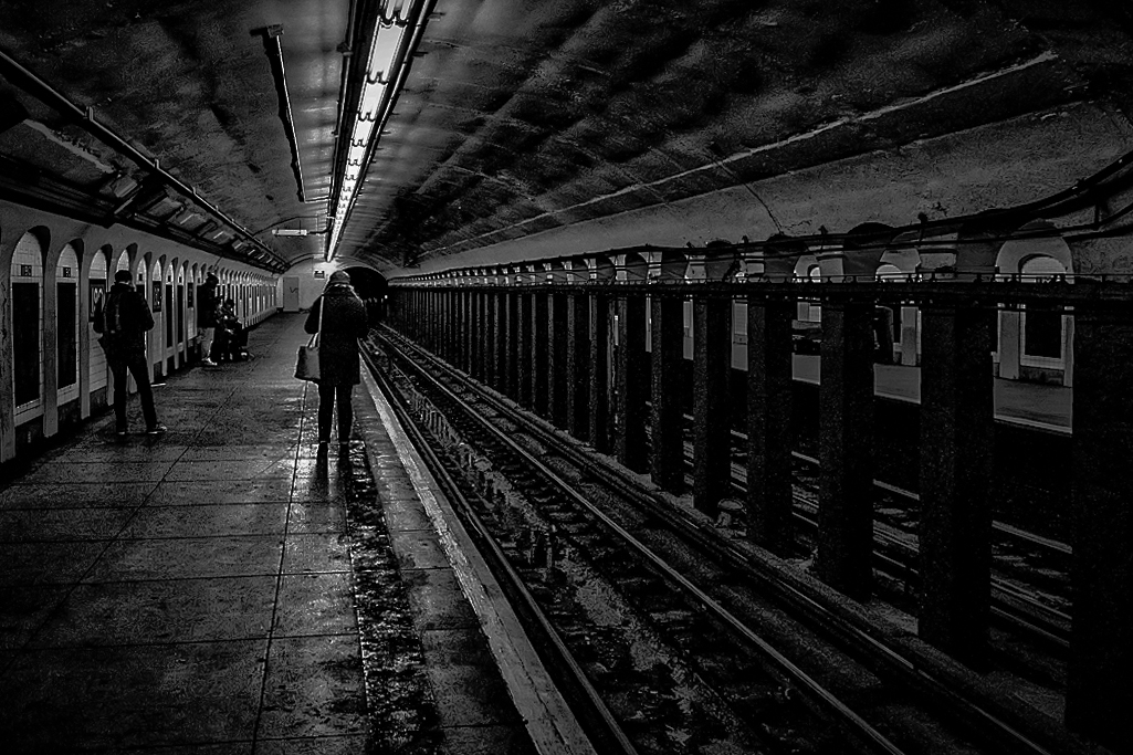
Paul, I like moody pictures but I'm not as big a fan as LuAnn is; however, I LIKE this image. As I looked at it I kept wanting the man to stand out a bit more. Thus, I removed the bicycle at the end of the station and played with the lighting. Don't know if you'll like it, but it was fun playing. |
Dec 7th |
 |
| 62 |
Dec 18 |
Comment |
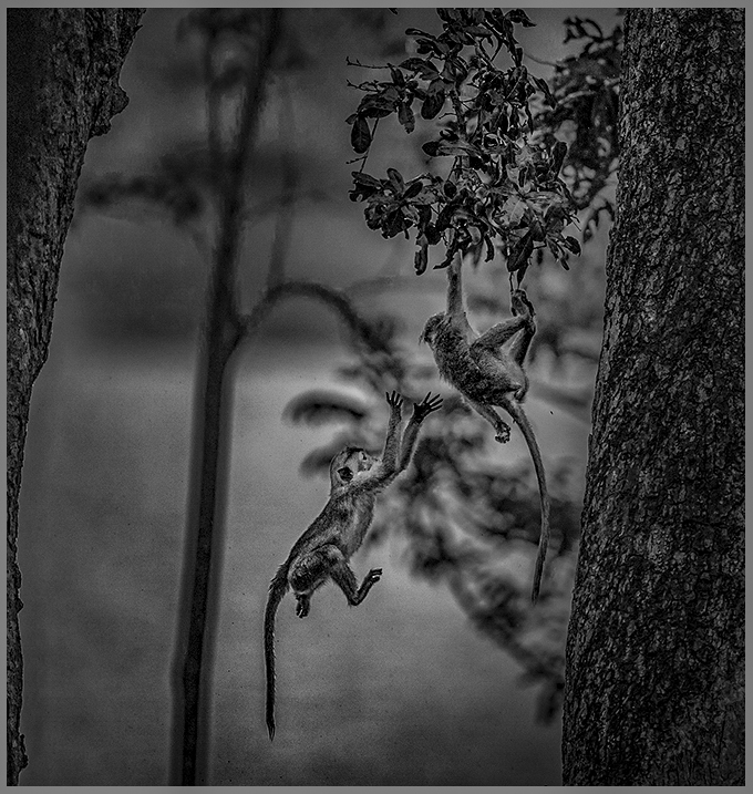
Pandula, your image inspired me to Google "Wilpattu National Park, Sri Lanka". What an amazing place. The variety and number of animals/reptiles is astounding.
You did a fantastic job capturing this action shot. Like LuAnn, I'm curious about your focal length, f-stop and shutter speed. It certainly appears that your 400mm f/2.8 lens was put to good use!
I decided to see how you image might look if it were cropped a bit on each side since the out-of-focus trees don't seem to add (in my opinion) to the image. While I was at it, I played with the lighting and added a frame. Your thoughts?
|
Dec 6th |
 |
| 62 |
Dec 18 |
Comment |
Gary, Dude is such a lovable dog and your picture really does him justice! The expression in his eyes is perfect. Interestingly, the original color image appears a bit fuzzy. But, the B&W is nicely sharp. Any idea of why?
I have very little that I can suggest to improve this wonderful picture (other than including it on a Christmas card and sending it to your friends). However, you might consider darkening the vertical strip of mortar on the left side of the picture. Also, there seems to be a thin white streak at the top left.
Nicely done. Please give Dude a pat for me.
|
Dec 5th |
| 62 |
Dec 18 |
Comment |
The eyes of your cat totally make this picture. Your use of f/22 was a perfect choice since the focus on the fir is perfect. Personally, I think the fir almost becomes a background for the eyes. There's no improvement that I can suggest.
Very well done!! |
Dec 3rd |
| 62 |
Dec 18 |
Comment |
Thank you, LuAnn. I'll definitely try modifying the tonality to add a bit of depth. I actually spent a good bit of time dodging and burning already, using Photoshop's Camera Raw. Glad you noticed the halo in the bottom right corner. That will be fixed. Thank you again.
|
Dec 3rd |
7 comments - 4 replies for Group 62
|
14 comments - 5 replies Total
|


