|
| Group |
Round |
C/R |
Comment |
Date |
Image |
| 5 |
Oct 18 |
Comment |
David, I'm a big fan of your photography!
I went to the web site you mentioned and I love how you've captured the environment and spirit of the Church of St Thomas the Martyr. This month's image is a wonderful addition to that photographic study. However, to appreciate "The Wall" I needed to see it in the context of your other images. To me, it doesn't tell a story by itself.
Naturally, the colors and lighting on The Wall are beautiful... and the nicely located graffiti adds interest. And, as usual, your technical skills shine through brilliantly. As a side note, I could not detect a difference between your original and final submission. Did I miss something?
|
Oct 16th |
| 5 |
Oct 18 |
Comment |
Richard, this is an amazing capture! I'm curious about your shutter speed. It must have been fairly high to get such a sharp image with the flying bird. And, your f/5.6 did a great job separating the bird from the background. I really like it!
Since I find the strong colors of the background a bit distracting, I tried making it into a B&W. I don't know what you'll think of it, but here it is. Smiles....
|
Oct 15th |
 |
| 5 |
Oct 18 |
Reply |
The place I use it is in the Camera Raw Filter. It's available as both an overall filter as well as a component of the adjustment filter. I believe it's also available in the Lightroom Develop module.
|
Oct 15th |
| 5 |
Oct 18 |
Comment |
John, I also visited Amsterdam a few years ago but failed to find windmills as spectacular as this one. I really like the dramatic colors in your image and the crisp lines of the buildings and windmill add to the appeal. Your work to bring out the sky is nicely done.
I have found that Dehaze is a valuable filter, especially for the sky. I use it frequently and have discovered that the combination of Dehaze, Clarity, Highlights and Exposure usually form the basis of my initial post-processing efforts.
Thank you for sharing this delightful memory of Amsterdam.
|
Oct 15th |
| 5 |
Oct 18 |
Comment |
What a wonderfully, timely creation! Barbara, your composition is perfect and the colors against the black background are striking. Halloween is a favorite time of year for me and this image sets the stage! Thank you!
|
Oct 14th |
| 5 |
Oct 18 |
Comment |
Phil, a really good action shot! The composition is great and the depth of field works well. I like seeing that there are avid spectators on the side of the field, but not having them distract me from the main characters.
The colors in this are striking. They are so vivid that I initially thought they might be over-saturated. However, I've finally concluded that they are real and simply vibrant.
Well done.
|
Oct 14th |
| 5 |
Oct 18 |
Comment |
Nick, this is great! Before reading your description I was amazed at the similarity of the twins... and very amused at their expressions while reading Playboy. It's a wonderful image and you did a beautiful job merging the two halves of the picture!
Well done.
|
Oct 14th |
| 5 |
Oct 18 |
Reply |
Thank you, Steven. I appreciate your input and will play with deeper facial shadows. However, I don't want to lose the focus on the beads of sweat which emphasize the man's expression.
Like Barbara (below), I prefer the color version. It helps "give life" to the man.
Thanks again for your comments!
|
Oct 14th |
| 5 |
Oct 18 |
Reply |
Thank you Mark. The background was a challenge in this image. I wanted to mute it but not eliminate it since it gave a bit of context to the picture. Now that I look at it again, I see some bright areas just above his head where I could have done better. Hindsight is wonderful.
|
Oct 14th |
| 5 |
Oct 18 |
Reply |
Thank you, Richard. I hadn't noticed the red spot until you mentioned it.... and now I can't NOT see it. lol The mind is a strange thing!
The man had a wonderfully happy feeling about himself. He was dancing with amazing enthusiasm. It was great to see. |
Oct 14th |
6 comments - 4 replies for Group 5
|
| 14 |
Oct 18 |
Reply |
Larry, great enhancement! For whatever reason I didn't notice your comment/image initially (attribute it to my advanced age). But, I really like how you've made the exhaust pipes the clear center of focus by having their color stand out. Nice!
|
Oct 29th |
| 14 |
Oct 18 |
Reply |
I'm glad you think the fog addition is an enhancement. Personally, I wasn't sure since I like your original image a great deal.
|
Oct 29th |
| 14 |
Oct 18 |
Comment |
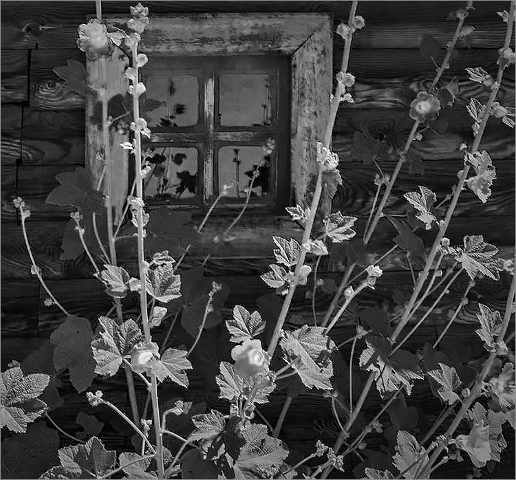
Arun, this is a very creative image. I find that the flowers in the foreground and the window in the background cause my focus to repeatedly switch between the two. At first the changing viewpoint bothered me, however the more I looked at your picture the more I was intrigued by it.
I thought it would be interesting to try cropping it on the left so that the window isn't so close to the center of the image. Then, I tried it in monochrome to see the impact of that change. What do you think?
|
Oct 29th |
 |
| 14 |
Oct 18 |
Comment |
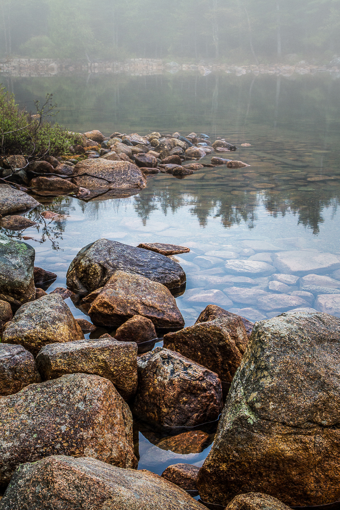
Bobbie, I really like the feeling of this image. The serenity of the pond makes it such a peaceful scene. The depth of field really adds to the image. I tried a few experiments with the Nik Efex Pro 4 Fog filter to see if it would give even more "calm mystery" to the image. Your thoughts? |
Oct 29th |
 |
| 14 |
Oct 18 |
Comment |
Yvonne, this is a wonderful image! In spite of the pleasing simplicity, it conveys an intriguing story. the exhaust pipes are clearly the focus on the image and their flowing shape gives a sense of speed. Naturally the picture makes me want to see the rest of the antique car.... which is part of the intrigue.
Beautifully done!
|
Oct 28th |
| 14 |
Oct 18 |
Comment |
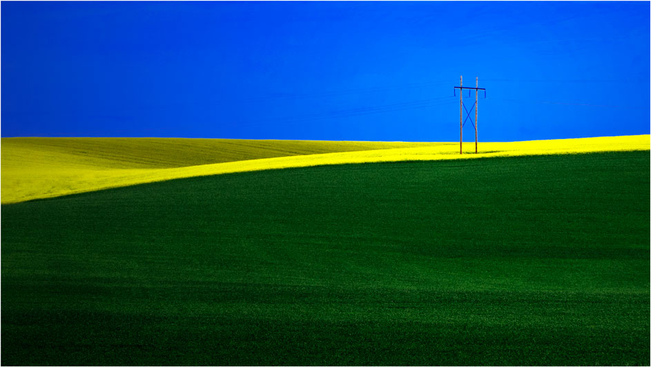
Larry, I love the simplicity of this image. Having the three vibrant colors with the yellow immediately capturing one's eye and leading it to the power pole is wonderful. Although the power pole is perfectly located on one of the "magic thirds" of the image, I found that the yellow field to the right of the pole made me continue looking to the right... and then out of the frame. I tried cropping a bit from the right to see how that would look. Your thoughts?
By the way, your use of a thin white frame seems perfect. The entire image is very well done!
|
Oct 28th |
 |
4 comments - 2 replies for Group 14
|
| 62 |
Oct 18 |
Reply |
Thank you, LuAnn! I was lazy and used the smudge tool (not warp or liquify) to give her a very slight smile.
Like you, I also noticed her left hand/fingers and that they didn't appear quite "natural". I'm sure it's from either motion or that she's stretching to reach a difficult cord. I decided not to try to change it.
|
Oct 18th |
| 62 |
Oct 18 |
Reply |
It's input like this that makes our group so useful. Everyone contributed and the final results are really nice. Thank you!
|
Oct 17th |
| 62 |
Oct 18 |
Reply |
Thank you Gary. I'm glad you liked my edits. You noticed almost all my modifications... I also did a bit with the lighting and noise on her face and, believe it or not, I did a tiny bit to the corner of her mouth to provide a hint of a smile. LOL, okay, I obsessed but it was fun.
The PSA conference was terrific. One of the things that impressed me most was the openness and friendliness of the people. Also, even though my wife and I are both in our 70's I think we lowered the average age somewhat. BUT, that does NOT mean that they were a bunch of old, over-the-hill folks! One man, for example, was up at 5:00 am photographing local wild horses. Then he gave a 1 hour presentation on iPhone photography... and in the evening, enjoyed a beer or two with us. AND, he is 84 years old! Impressive.
The tours provided by PSA were extremely well done and limited in size, which I like. Also, the various presentations were uniformly excellent. If you get an opportunity to attend one of the annual conferences, I definitely recommend it.
|
Oct 16th |
| 62 |
Oct 18 |
Comment |
Gary, LuAnn and Paul, I tried incorporating your suggestions and feel that it made a significant improvement on my image. THANK YOU for your input!
|
Oct 15th |
 |
| 62 |
Oct 18 |
Comment |
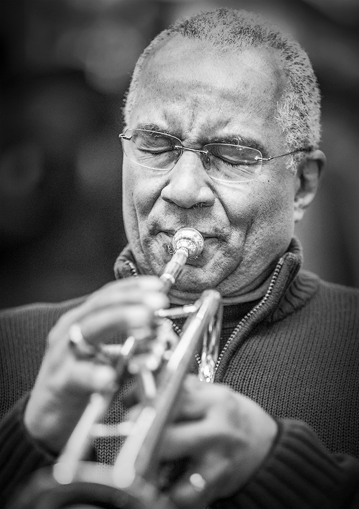
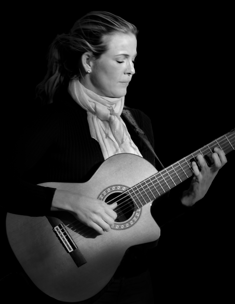
I love moody pictures like this one. You can almost feel what she's feeling as she looses herself in her music. Also, this image reminds me of my sister who's also an avid guitar player.
Since your image really struck a chord (no pun intended), I couldn't resist playing with it a bit. I spent more time in Photoshop with your original picture than my wife would approve of.... if she knew.
If you and/or LuAnn can identify the changes I made, you're doing really well, especially since it was such an appealing image when you submitted it.
In any event, WELL DONE and thank you for the opportunity to work with it.
|
Oct 15th |
 |
| 62 |
Oct 18 |
Comment |
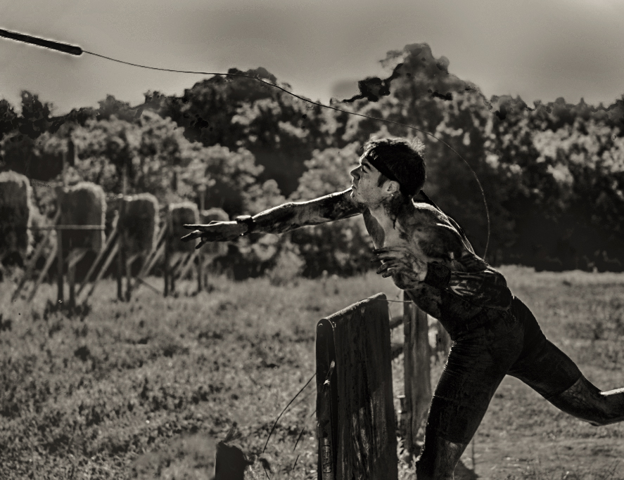
Hattie, this is a really good capture at a critical moment and it's a natural B&W. The color significantly distracted from the main focus. I like your conversion to monochrome and I somewhat agree with LuAnn that it feels a bit dark to me... but that's purely subjective. Personally, I would like a darkness level between yours and the sample that LuAnn provided. I also added a bit of toning to see how it would affect the image.
Although I like the angle of the leg trailing the javelin thrower, I tried cropping a bit of it off so that the man's face is less centered in the image.
After playing with your submission and looking at mine compared with yours and LuAnn's, I'm finding that there are components of each that appeal to me.
In each of the three sample B&W submissions the thrower seems very 3D since you did such a good job with the depth of field in the original capture.
I think your awareness of what makes a great picture is fantastic. The action, the mud/dirt and the intensity of the man create an image to be very proud of. Well done!
|
Oct 15th |
 |
| 62 |
Oct 18 |
Reply |
Personally, I am not picking up any issues with technique. However, I'm intrigued by your assertion that there's a problem.
When I studied your image a bit closer, I realized that the edge of the cypress on the left of the picture is a distraction and I think it would be good to clone it out. Nonetheless, I'm sure this isn't the "problem".... which I'm eager to hear about.
|
Oct 14th |
| 62 |
Oct 18 |
Comment |
Very impressive! Paul, this is a wonderfully atmospheric image. The lighting, particularly right above the building roofs, makes this such a distinctive image. I love it!
Like LuAnn, I felt that there seemed to be a slight tilt to the right so I did some measurements with Camera Raw's level with the fine grid lines on and tweaked the orientation a tiny bit.
Outstanding work!
|
Oct 14th |
 |
| 62 |
Oct 18 |
Comment |
LuAnn, this picture blows me away. I completely agree with Gary that the image appears very 3D. I think that's due to your use of the dark cypress against the lighter and blurrier background. Excellent!
I tried making this into a vertical but didn't like what I came up with. It will be interesting to see what Gary can do with a portrait orientation if he can find the negatives. (Good luck, Gary!)
|
Oct 14th |
| 62 |
Oct 18 |
Reply |
Gary, I actually did apply a light vignette to the image using the Vignette filter of Color Efex Pro 4. However, it's clear that I need to do a bit more in this area to focus the viewer's attention on the musician's expression. Thank you for your input on this.... it will definitely improve my image!
|
Oct 14th |
| 62 |
Oct 18 |
Reply |
LuAnn, thank you so much for your comments and compliments. I will play with the darker shadows and see how it works.
The conference was great. In the first few days there are fantastic photo tours with knowledgeable guides/photographers that are very worthwhile. Then, beginning around the middle of the week are a large number of presentations on a wide variety of subjects. I found several of these really useful. The attendees at the convention were amazing. Each one was welcoming, enthusiastic and extremely active. Even though my wife and I (both in our 70's) lowered the average age significantly, it was definitely not a stogy, old-folks gathering. One man for example, was up before dawn taking pictures of wild horses, giving presentations about iPhone photography in the afternoon and then enjoying a beer with us in the evening... and it turns out that he is 84 years old! In any event, I hope you have an opportunity to attend next year.
|
Oct 14th |
5 comments - 6 replies for Group 62
|
15 comments - 12 replies Total
|


