|
| Group |
Round |
C/R |
Comment |
Date |
Image |
| 5 |
Sep 18 |
Comment |
Hmmmm....
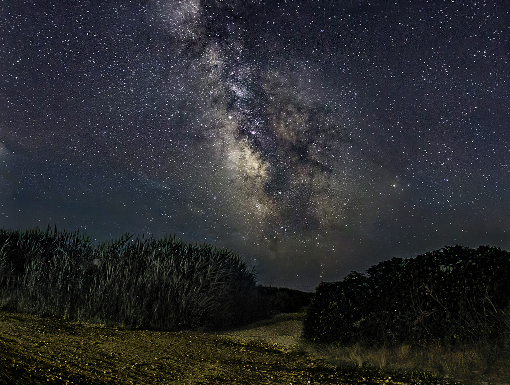
I see what you mean. Here's another attempt.
|
Sep 8th |
 |
| 5 |
Sep 18 |
Comment |
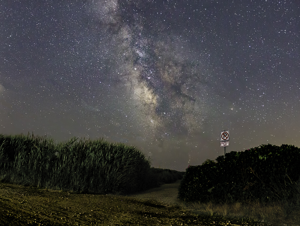
Richard, I tried removing the No Parking sign and lightening the beach path a bit. Those two changes seemed like they were working, but then something else was needed to complement them. Thus, I darkened the sky a bit to make the stars stand out more and removed some saturation from the grasses since colors aren't very intense in the dark. What do you think?
|
Sep 7th |
 |
| 5 |
Sep 18 |
Comment |
David, I have so many thoughts and feelings about this image. First, I can see why it didn't do particularly well with the judges. From my experience they favor "classic photography" --- beautiful scenes, pictures of horrific situations and even typical abstracts. When presented with something like your submission, they are often at a loss... it simply doesn't fit neatly into a category. Not any category. It's a rare judge who isn't influenced (negatively) by this.
My second thought/feeling was not immediate. I returned 4 or 5 times to look at your image. My first viewing was cursory. I saw the unusual composition, the starkness of the scene and the use of the framing. On subsequent visits I pondered further about the frame. Why didn't it have a hard inner edge? Why is the man moving into the frame and out of the image? Soon I began to understand (or THINK I understood) why the title was "Leaving". The man was leaving the picture.
After focusing on the man and the significance of the picture's framing, I began to think about the rest of the image. What was the man leaving FROM? What did the sand represent? I've thought about this several times and each time I've decided something different. Finally, I've come to the conclusion that this might have been your intent... that the sand represents whatever I want it to represent and that the image is truly about leaving anything.
David, I'm lucky enough to live close to the U.S. National Gallery of Art in Washington, D.C. When I visit this amazing museum, I find that I often stand in front of a captivating painting for a long time thinking about the picture. This is the same thing that your image evokes... thoughtful emotion.
Well done.
|
Sep 7th |
| 5 |
Sep 18 |
Reply |
Thank you, Richard! I hadn't thought of the farewell salute but, you're definitely right. I'll start telling folks that I was thinking of that the whole time. lol |
Sep 6th |
| 5 |
Sep 18 |
Reply |
Very nice, Isaac. I assume that you're also a fan of Kenilworth Aquatic Gardens. It's an incredible place early in the morning in July-August. I live in Silver Spring and fully retired (after 50 years) six days ago so I'm looking forward to lots more photography after the weather becomes more reasonable.
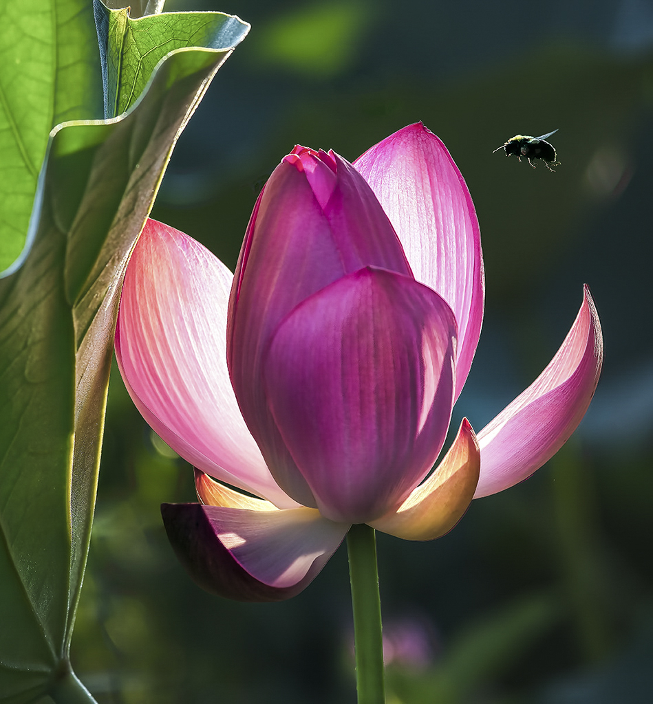
Here's my Lotus and Bee shot.
|
Sep 6th |
 |
| 5 |
Sep 18 |
Comment |
Nick, you did an excellent job capturing this Osprey. And, I'm impressed with the quality of your image since the 40D is a 10 megapixel camera. The composition is perfect and the lighting, even on the bright head and dark wings, couldn't be better. And, to top it off, the frame seems to really fit the image.
I have no suggestions for how this could be improved. Well done!
|
Sep 4th |
| 5 |
Sep 18 |
Reply |
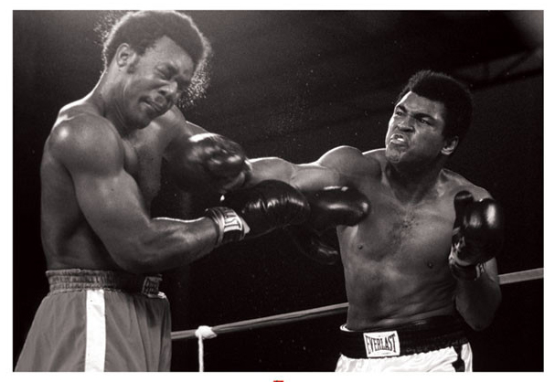
BTW, here's the Ali image that I remembered.
|
Sep 3rd |
 |
| 5 |
Sep 18 |
Comment |
Richard, this is fantastic timing! I have always wanted a shot like this. I think it's reminiscent of one of the famous Ali photos.
I wanted to see what your image would look like if it were converted to B&W. While I was at it, I also played with the contrast and lighting a bit. Your thoughts?
|
Sep 3rd |
 |
| 5 |
Sep 18 |
Comment |
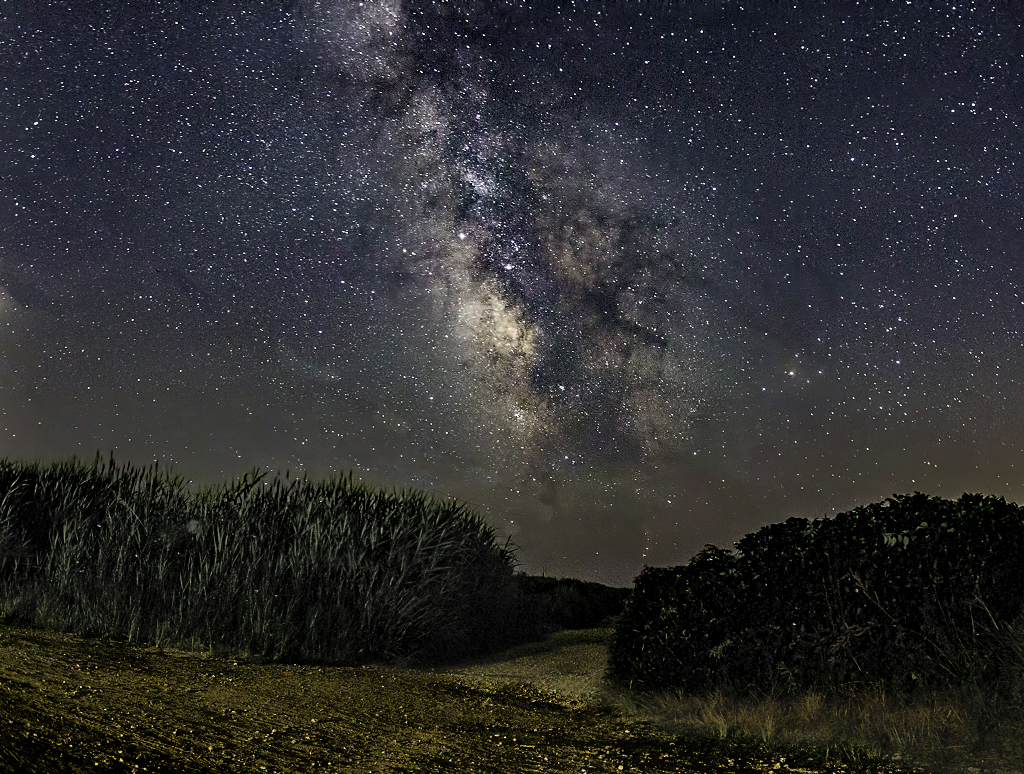
A wonderful image of the night sky! I agree with Barbara that the wires and pole in the distance detract from the image; however, I like the No Parking sign since it makes me wonder what you were saying by including it. Also, it's good to have a distinct foreground focus in a picture of the night sky to add additional interest.
Since it's such an intriguing picture, I played with it a bit in Camera Raw and Photoshop. My changes included: additional cropping on the bottom, removing the wires, deleting the sign on top of the No Parking sign, lowering the brightness of the No Parking sign, "dehazing" the bushes and lowering their saturation. I also modified the road so that it would have some small bright pebbles that would be similar to the stars.
Your thoughts?
|
Sep 3rd |
 |
| 5 |
Sep 18 |
Comment |
Barbara, I love your use of the flood filter. The final image looks like it might be some sort of strange alien spaceship that's landed on the water. lol
Seriously, you did a marvelous job with the background and with cloning out the unwanted tendril and leaf. Nicely done. I have no suggestions for improvement.
|
Sep 2nd |
| 5 |
Sep 18 |
Comment |
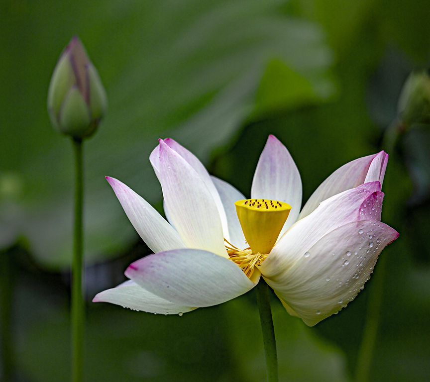
Thank you Barbara. The image is of a Lotus blossom that has almost entirely dropped its petals. They are amazing flowers which go through tremendous changes as they bloom and age. The fully open blossoms are quite large.... about 10" or so across. I've attached an image (not very good) of a blooming Lotus that hasn't yet dropped its petals so you can see it. In the background you can make out a Lotus bud that hasn't yet opened.
Thank you again for your comments.
|
Sep 2nd |
 |
8 comments - 3 replies for Group 5
|
| 27 |
Sep 18 |
Reply |
Is this the kind of thing you wanted?
|
Sep 9th |
 |
| 27 |
Sep 18 |
Comment |
Renee, this is a wonderful and imaginative idea. I really like what you did with the wine glass and the reflection in it. I also like the fact that you removed the grass at the right of the original picture. Nice!
To me, the water looks a bit artificial. It doesn't seem to have any texture and the reflection of the village no longer appears. It might be useful to "reinstate" those parts of the image.
Overall, a very well done image. The wine glass is perfect... and makes me thirsty.
|
Sep 8th |
1 comment - 1 reply for Group 27
|
| 52 |
Sep 18 |
Reply |
I'm glad you like it! |
Sep 7th |
| 52 |
Sep 18 |
Comment |
Lisa, it's a fantastic capture. I really like your composition and the vignette really helps focus on the snake's head. I agree with Mike that it might be good to play with the lighting a bit.... so I did. What do you think?
(BTW, I only live 2 or 3 miles from Brookside Gardens, so I visit frequently. In the future I'll tread a bit more carefully!)
|
Sep 6th |
 |
1 comment - 1 reply for Group 52
|
| 53 |
Sep 18 |
Comment |
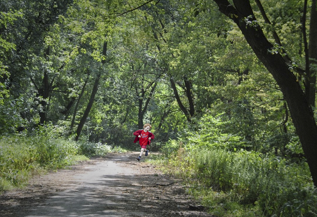
Tom, after examining the picture again, I definitely agree that the red is too intense. As I initially added the boy, it makes the image appear manipulated. Taking your idea, I reduced the red some (but not as much as yours), but I also added some structure to the greenery so that there's a better balance. What do you think? |
Sep 4th |
 |
| 53 |
Sep 18 |
Comment |
When I saw this image, I felt that it was serene and beautiful. However, finding a point of interest was difficult. Also, after looking at it for a while, I felt that it needed some additional energy. Thus, I found an old picture of my grandson Chris (he's 15 years old now) running along a track. It was a plus that he was wearing red! Thus, I cropped him out of his original picture and inserted him into Tom's lovely photo. I placed him in a darker area of the road so that I wouldn't have to deal with his shadow. Then, observing my work, I felt that the image would benefit from some light manipulation so that Chris would immediately attract the eye of the viewer. Thus, I added a slight vignette and reduced the highlights that were not focused on the boy. Next, I cropped a bit of the left side of the picture. Finally, I wanted to use the dark tree on the right as part of a frame. So, I selected a parallel group of trees on the left and darkened them a bit to provide symmetry. My work was done in Lightroom (actually Camera Raw) and Photoshop. Your thoughts? |
Sep 2nd |
 |
2 comments - 0 replies for Group 53
|
| 62 |
Sep 18 |
Reply |
David,
After reading all the comments I played around with the color version of your image. Here's what I came up with. Your thoughts?
|
Sep 27th |
 |
| 62 |
Sep 18 |
Reply |
Thank you Paul. I've taken so many flower pictures that I now look for something that will make them a bit different.
|
Sep 8th |
| 62 |
Sep 18 |
Comment |
Pandula, I'm very impressed with this image. It shows your ability to pre-visualize a way to depict a particular (and strong) emotion. I agree with LuAnn that it might be good to open the shadows a little bit so that the bottom of his chin strap and his shoulder are a little more visible.
Beautifully done photograph!
|
Sep 7th |
| 62 |
Sep 18 |
Reply |
LuAnn, I really like your idea of adding some head room at the top of the picture. And, fixing the spots on the leaves definitely removes that distraction. Although I agree that the flower would benefit by a bit of lightening, I'm not sure that I'd take it quite so far.
Thank you so much. Your input is truly useful... and appreciated.
|
Sep 7th |
| 62 |
Sep 18 |
Reply |
I think this one tells a wonderful story since the glare and the Christmas Peace sign are so conflicting.
|
Sep 6th |
| 62 |
Sep 18 |
Comment |
Hattie, this is an incredible catch. The boy's glance/glare juxtaposed with the Christmas Spirit sign is wonderful. And, the items in the shop window don't seem to contrast but, instead, add context.
It's clear to see the advantages of a high-resolution camera. A crop this severe would be very challenging (if possible) with most cameras.
There's really nothing that I can suggest that could improve this photo. Beautifully done!
|
Sep 4th |
| 62 |
Sep 18 |
Comment |
David, I keep returning to look at your image again and again. It's more appealing each time I see it. My initial thoughts were that cropping it on the bottom and left side would be an improvement.... and also that it would be useful to reduce the brightness of her face. At this point I no longer think that her face should be darkened nor that the bottom should be cropped. (I still think that cropping the left side a bit would be beneficial since the space doesn't really add to the image and cropping would move her face from the center.)
Having her face be the brightest part of the picture makes it a fascinating image. It's amazing how it draws me to her eyes, which invariably make me wonder what she's thinking.... and soon I'm enjoying the wonders of a lazy summer day right along with her.
Beautifully done!
|
Sep 3rd |
| 62 |
Sep 18 |
Comment |
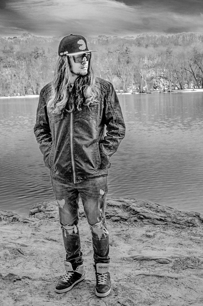
Fascinating! There's so much that can be done with this picture and B&W is clearly the way to go!
I really liked where you went with this, but I wanted to see if I could make the man even more prominent while, simultaneously keeping detail in the background. I started with the original and, like you, used Silver Efex Pro 2 to convert it to B&W. For the conversion I used some of the filters to bring out a bit of the red (e.g., his shoe laces, etc.). Then I took the image into Camera Raw and played with the background, paying particular attention to the sky.
Your thoughts?
|
Sep 2nd |
 |
| 62 |
Sep 18 |
Comment |
Paul, every time I look at this image I break out in a smile. The little girl's laughter is absolutely contagious. The textures in this picture are wonderful. The bubbles are emphasized by the presence of the polka dotted jacket on the girl behind her and the texture of the street adds even more to the image.
I find the hand on the left and the bit of the bubble machine somewhat distracting. I think cloning those out would add to an excellent image. Nicely done!
|
Sep 2nd |
| 62 |
Sep 18 |
Comment |
Gary, I love how you've processed this image. Your use of the overlay was brilliant and I'm also a big fan of NIK's Paper Toner. (David Cooke from group 5 turned me on to Paper Toner.) You've turned the image into something I might find in my grandmother's dresser drawer.
Very well done! |
Sep 1st |
6 comments - 4 replies for Group 62
|
18 comments - 9 replies Total
|