|
| Group |
Round |
C/R |
Comment |
Date |
Image |
| 5 |
Aug 18 |
Reply |
Affirmation feels good, but creating emotions in others is more fulfilling to me. I don't actually care if the emotions are positive... so long as they are reflective of strong feelings. I find it especially gratifying if the emotions I evoke in others are the same ones I feel when I look at my images. An example of this is a picture I took in Baltimore. I've included it below. I think it has some similarities to one you took that's titled "Lost".
I'm eager to see your May 2011 image. Some of my favorites of your work (other than those that you submitted to our group) are "The Encounter", "The Bartender", "In New York", "The Man on the Bus" and "Enlightened". They are extraordinary.
|
Aug 28th |
 |
| 5 |
Aug 18 |
Reply |
I've given this topic a bit more thought. This led me to realize that my goal for pictures is more complex than simply thinking that an image is good. I get pleasure from several things including 1) liking the feeling that an image gives me and 2) evoking emotions in other viewers. It's this second factor that makes me pleased when others find my images meaningful. Thus, providing something that appeals to others is important to me.... just as being personally pleased is important. I hope this makes sense. |
Aug 28th |
| 5 |
Aug 18 |
Reply |
David, at one point I had aspirations of selling my photographs. At that time it made sense to acquire awards and recognitions since they are useful in marketing. But, now that I'm strictly taking pictures for my own pleasure, I agree with you. It's time to focus on being personally pleased with my images and not try to "do art for others". Thank you for reminding me of that. |
Aug 25th |
| 5 |
Aug 18 |
Reply |
Thank you, David. Personally, I like the context provided by most of the distractions. However, I find that the tip of the leaf on the bottom right of the image bothers me a bit. Although the print that I keep for myself will have most of the "distractions", I'll probably remove most of them if I decide to submit the image to a competition. Judges seem to universally like pictures to be as simple as possible.
Thanks again!
|
Aug 25th |
| 5 |
Aug 18 |
Reply |
Thank you John. |
Aug 21st |
| 5 |
Aug 18 |
Comment |
Richard, the intensity of your image is wonderful. Your camera angle, your use of monochrome and the grain of the image all reinforce each other beautifully. I agree with Nick that it might be beneficial to clone out or diminish some of the competing items. For example, there are a few bright areas in the background (the ref's shirt and the white area under the ref's arm). |
Aug 18th |
| 5 |
Aug 18 |
Reply |
Thank you, Nick. I agree that there was unwanted flora that detracted from the image. I wasn't able to see the frame that you added. I wonder what happened.
|
Aug 18th |
| 5 |
Aug 18 |
Comment |
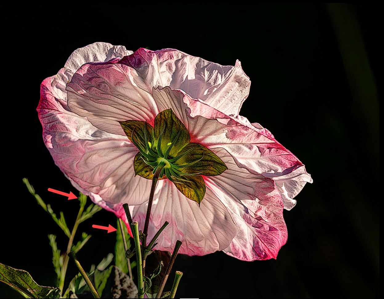
Wanda, thank you for your kind words. I also looked up your bio and saw that you are a retired RN. That's such an honorable and difficult career and one to be very proud of! I also glanced at your images and while I really like this month's butterfly, I'm especially fond of May's dandelion. The background gives it a wonderful dreamy feeling. Beautifully done!
I wasn't sure which weed you suggested that I eliminate. I think it's one of the two that I pointed to with the arrows below. Please let me know.
Thank you for visiting.... and thank you for your comments.
|
Aug 12th |
 |
| 5 |
Aug 18 |
Comment |
David, I completely agree with Isaac! You have an uncanny ability to see the hidden pictures in the scenes that you photograph. When I first looked at your final image, I saw an apprehensive man struggling to stay on a narrow ledge in a deep, dark cavern. I was impress that you caught his expression and I felt that there must be a wonderful story behind his predicament.
Then, when I looked at the original picture I was amazed to find that all of my assumptions and feelings about the final image were totally incorrect. I had to laugh since I felt that you had played a delicious trick on my eyes/mind. Brilliantly done.
|
Aug 11th |
| 5 |
Aug 18 |
Comment |
John, this is one of my favorites of your images. It ranks at the top along with your March submission ("Time from Behind"). Although the poster edges will probably not appeal to everyone, I think it's a perfect fit for this picture. And, btw, you grow beautiful roses!
I have only two very minor suggestions/comments. The first one is that it might be good to have a frame for this picture since the background is totally black. I realize that a frame would be redundant if the study group's general background were a brighter color. My second suggestion is really more of an observation. It appears that the rose's yellow color bleeds into your image's background. This confuses me since the bleeding appears to also occur in your original image. Of course this might be an aberration of my monitor... or my aging eyes.
Very nicely done!
|
Aug 11th |
| 5 |
Aug 18 |
Reply |
Renee, thank you for the nice compliments. This image was taken at Kenilworth Aquatic Gardens. |
Aug 8th |
| 5 |
Aug 18 |
Comment |
As usual, your creation shows amazing imagination and creativity. I find myself wondering if you decide what you want your final image to look like and then begin moving toward that goal, taking pictures and doing your post processing. Or, do you start working on your picture and "see where it takes you".
This particular creation puzzles me. After reading your reply to Barbara, I think I understand what I'm seeing. It might be more apparent if there were additional birds diminishing in size as they fly toward the crack. Also, I agree with Richard that it would be good to clean up the spots in the clouds.
As usual, I'm truly impressed by your originality and skills with PS. Nicely done!
|
Aug 7th |
| 5 |
Aug 18 |
Reply |
Richard, you're very observant. Yes, I toned down the stems and also darkened the areas that are now black. Thank you and Barbara.... I agree that it's improved by the changes you both recommended.
|
Aug 7th |
| 5 |
Aug 18 |
Comment |
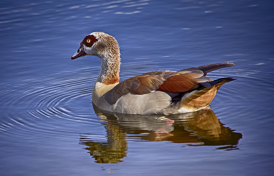
What a wonderful image. The duck's colors are magnificent and the blue water sets them off perfectly. I wanted to see how it would look with slightly tighter cropping (while still leaving room for him to move forward) and a little more vignette. Your thoughts?
|
Aug 4th |
 |
| 5 |
Aug 18 |
Comment |
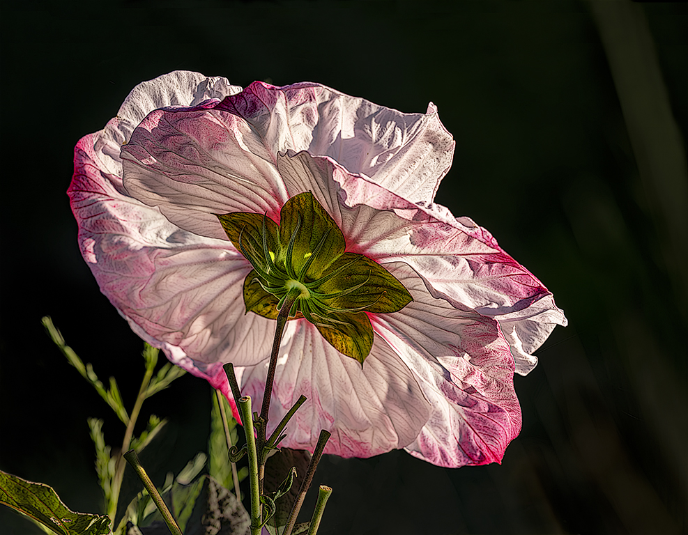
Based on the input received so far, I made a few changes in the attached. How does it look now? Do you think I should go further with the leaf removal?
THANK YOU!
|
Aug 4th |
 |
| 5 |
Aug 18 |
Comment |
Thank you Barbara. This picture is a work-in-progress and I'm delighted to get your input! I agree completely with your suggestion of cleanup and the blurry stems at the bottom left definitely need to go. Also, the partial leaf at the bottom is a distraction that I will eliminate. I have mixed feelings about the long leaf at the right corner. When I added some head room to the original picture, I intentionally left that leaf... thinking that it would add a bit of balance. However, you certainly may be right. I'll watch for additional input from others.
Again, thank you so much. Your opinions and comments are always valuable!
|
Aug 3rd |
8 comments - 8 replies for Group 5
|
| 13 |
Aug 18 |
Comment |
Barbara, I'm visiting from group 62 and noticed your beautiful image. It immediately evokes a sense of fire, complete with purple-tinged flames coming from the center. The cropping is excellent and the sharpness of the macro is amazing. Did you use focus stacking?
Very nicely done!
|
Aug 5th |
1 comment - 0 replies for Group 13
|
| 16 |
Aug 18 |
Comment |
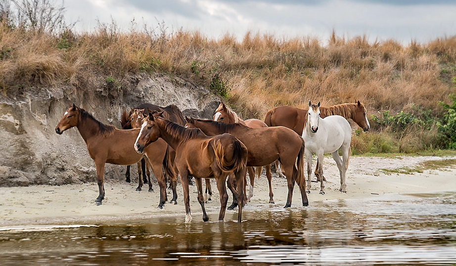
Joan, I'm visiting from Group 62 and noticed your wonderful picture. It's absolutely amazing to me that you came upon this group of horses. Wow!
I like what you've done with the image, but after reading others' comments I couldn't resist doing a bit of PS play. Here's what I came up with after re-cropping and a few other modifications. Your thoughts?
|
Aug 18th |
 |
1 comment - 0 replies for Group 16
|
| 27 |
Aug 18 |
Reply |
Although I liked your original image, the changes in the dragonfly color and orientation have really made it into an excellent picture. You did a great job with the changes! Nicely done!
|
Aug 8th |
0 comments - 1 reply for Group 27
|
| 28 |
Aug 18 |
Comment |
Wanda, I'm visiting from groups 62 and 5 and saw your wonderful capture. I'm absolutely amazed at how perfectly you obtained the focus on the butterfly and flower. Your depth of field is exactly what it needed to be. Also, your post processing is masterful and your cropping is excellent. The only thing I see that might improve this photograph is to be sure there's not a slightly lighter area next to the stem... but that's a nit!
Beautiful picture. Well done!
|
Aug 8th |
1 comment - 0 replies for Group 28
|
| 36 |
Aug 18 |
Comment |
David, I'm visiting from group 62 and noticed your wonderful image. I've always wanted to visit Australia and your picture really increases that desire!
Just to play a bit, I tried lightening the dark rocks and adding just a bit more blue to the top portion of the sky. Although it loses some of the appeal of the silhouette, I think it is still an interesting image. Your thoughts?
|
Aug 5th |
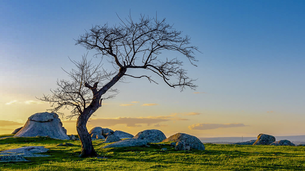 |
1 comment - 0 replies for Group 36
|
| 43 |
Aug 18 |
Comment |
Mike, I'm visiting from group 5 & 62 and saw your Hibiscus image. It captured my attention because of two things -- it's a beautiful picture and I also submitted an image of a Hibiscus to group 5 for this month. Some things that really appeal to me about your image are the way you cropped it and how you apparently worked with the light to make the stamen stand out more distinctly.
When I glanced at your bio I noticed that you indicated that you typically use a Canon M3, yet this image is done with the iPhone. Does that mean you've converted from the M3?
In any event, it's a wonderful image.
|
Aug 6th |
1 comment - 0 replies for Group 43
|
| 47 |
Aug 18 |
Comment |
Albert, I'm visiting from group 62 and noticed your image. This is a perfect picture for infrared photography and you did it very well. The tones and composition are excellent, although I agree with your concern about losing a bit of the structure at the top of the roof. Perhaps you could expand the canvas and clone in the missing part. But, regardless, it's an excellent image! Well done.
|
Aug 17th |
1 comment - 0 replies for Group 47
|
| 55 |
Aug 18 |
Comment |
Matt, I'm visiting from groups 5 & 62 and noticed your wonderful image. I love the lighting that you achieved and especially how you have made the Lilly stand out from the background while still showing a bit of green to give context. Very nicely done!
When I glanced at your bio, I noticed that you also do night sky photography. My wife and I will be headed to Salt Lake City in early October and hope to spend some time at a dark sky area there. Thus, I went back through some of your images and found the one of the Milky Way core (August, 2017). It's outstanding.
|
Aug 6th |
1 comment - 0 replies for Group 55
|
| 62 |
Aug 18 |
Comment |
David, there are so many things that I like about this image. It tells a wonderful story and makes me wonder where the bus has traveled over its life. It also brings a sense of sadness since, as you mentioned, the bus appears to be fading into the surrounding vegetation.
The cropping, the contrast and the overall post-processing is excellent. My only suggestion, which is truly a minor thing, is that the shed doesn't make me think of a bus stop and, thus, is a bit distracting.
Very nicely done!
|
Aug 11th |
| 62 |
Aug 18 |
Comment |
Thank you, Hattie. I really like your cropping. You're definitely right about the dark in the picture being distracting. The part that bothers me the most is the darkness in the corners which your cropping eliminates. Nice!
|
Aug 9th |
| 62 |
Aug 18 |
Reply |
Thank you, Paul. I think converting to monochrome offers a wealth of possibilities that don't always exist in the color image. Plus, it's great fun to work with!
|
Aug 7th |
| 62 |
Aug 18 |
Comment |
Barbara and Pandula, thank you both for your reinforcement of the benefits of Gary's crop and tint. It always fascinates me how the study group consistently provides input that leads to better photographs!
|
Aug 7th |
| 62 |
Aug 18 |
Reply |
Steven, before reading your comments I didn't see the smoke over the window. Now I can't NOT see it. The mind is a funny thing. lol
|
Aug 6th |
| 62 |
Aug 18 |
Comment |
Hattie, I really like the concept of this image and the way you captured the precise moment! I also like the way you've taken the shimmering heat through the rest of the image. Very creative and very nice!
I find that the jumpers seem less prominent that I'd like since the shimmering makes my eyes wander too quickly to other places and the fact that they are dark against a lighter (and fairly busy) background. Thus, I tried to darken the background and lighten/emphasize the jumpers. It certainly gives a different feel to the image. Your thoughts?
|
Aug 6th |
 |
| 62 |
Aug 18 |
Comment |
Pandula, I really like this picture and how beautiful it is in B&W. Personally, I would make very few changes! Perhaps a very slight lightening of her hair to give it a bit of texture, but I wouldn't do anything else. I love how her face seems to "appear" out of the dark.... it's almost magical.
Very well done!
|
Aug 4th |
| 62 |
Aug 18 |
Reply |
Returning to a valued subject is also something I do. However, I tend to do it on a broad scale. For example, living just outside Washington, one of my favorite spots is the National Cathedral. If you've never been there, I highly recommend it. It is huge, beautiful and almost deserted during the week. Plus, you're permitted to wander around with your tripod through the main chapel, the "underground" and even the tower. I've been so many times that I often head to favorite spots to try taking a slightly different picture than I had in the past. And, like you, I try for those special effects -- mysterious, sacred and what many feel is the most important aspect of their lives.
|
Aug 4th |
| 62 |
Aug 18 |
Comment |
Paul, this is a wonderful image of a fascinating person. The way you've emphasized his whiskers is especially impressive (to me). I like how the whiskers reinforce the texture of the fur in his headband. Also, bringing up the details in the feathers fit nicely into that same texture-feeling.
I absolutely agree with Gary that the sepia toning works beautifully. However, it does seem to me that "rebuilding" the top of the feathers was an important thing to do.
Very well done!
|
Aug 3rd |
| 62 |
Aug 18 |
Comment |
Well done, Gary! I definitely like your closer cropping and the tint. I played with the eyes a great deal to try to make them stand out, but it never occurred to me that the butterfly's full wings weren't a necessary component of the image. An additional bonus is the fact that the eyes are now in one of the 1/3's... a "rule" that I don't worry about but am aware of the benefits. I also like how you left the center of the flower in the picture so that there's both context and balance.
Thank you for this input. I'll definitely use it if I decide to enter my image into my camera club's competitions.
|
Aug 3rd |
| 62 |
Aug 18 |
Comment |
Gary, welcome to the group! I've returned to look at your image several times and, honestly, it's grown on me. I really like how you've made the window the subject of the window. In the original picture the clouds/sky seemed to be the primary focus... mostly because of the intense blueness of the sky. The clouds still tie the picture together but now they seem to merge into the vignette, an appealing effect. It appears that you added grain to the image, perhaps as part of the Antique Plate II application. I definitely think it adds to the feel of your picture. Darkening the weeds in the window is also important to the image. The weeds add additional interest to an image that would seem interesting but plain otherwise.
Very creative and very nice. I don't have any suggestions for improvement.
|
Aug 2nd |
| 62 |
Aug 18 |
Comment |
LuAnn, when I first saw this picture I thought it must be a training exercise that the two fighters were doing.... otherwise the perfect pose simply wouldn't be feasible. Then I noticed the crowd and it was clear that the fight was real. I'm surprised that you were able to freeze the motion so well with a shutter speed of 1/800 sec, yet the fighters seem to be in perfect focus. The wide aperture also worked well, showing the crowd clearly but not cluttering the picture.
I like the grain you added very much. It does indeed fit the sports scene. I might have liked a bit of vignette since that would help reduce the distraction of the lights (especially on the left) and focus more on the fighters.
Well done!
|
Aug 2nd |
9 comments - 3 replies for Group 62
|
| 64 |
Aug 18 |
Comment |
I'm visiting from group 62 and noticed this beautiful image of a beautiful woman. The smoothness of her skin highlighted by the jewelry is wonderful. I love that her dark eyes seem "so right" with the black background. It would be great to see just a bit more texture in her hair, but that's a nit... it's a gorgeous image. Well done!
|
Aug 8th |
1 comment - 0 replies for Group 64
|
| 73 |
Aug 18 |
Comment |
I'm visiting from groups 5 & 62 and saw this beautiful image. The picture leads the viewer into it with the walkway emphasized by the yellow and blue hoses. The sky and reflection are wonderful. When I look at the original, your skill in post-processing is obvious. Very nicely done.
Since I felt that the primary point of focus was the far end of the sidewalk, I wanted to see what I could do the make that even more obvious. Thus, I played a bit with the saturation, dehaze and lighting. When I look at the results, I'm afraid it's a bit overdone. Your thoughts?
|
Aug 6th |
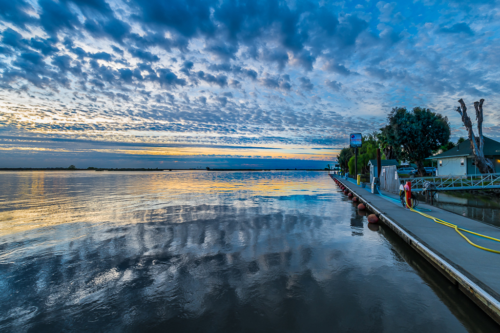 |
1 comment - 0 replies for Group 73
|
| 78 |
Aug 18 |
Comment |
Dave, I'm visiting from groups 5 & 62 and noticed your wonderful image. I love how the floors/walls of the building on the left, combined with the buildings on the right, initially made this feel like a composite of about 5 separate pictures. As I study your image the sky and the wavy reflections pull me into the scene. Soon I find that I'm seeing an entire city, all via the reflections on the left and the buildings on the right.
I wondered if it would be beneficial to highlight the fire escape in the alley. This might add to the balance of the sky in the upper left. With this in mind, I tried slightly opening the shadows and increasing the exposure of the lower portions of the fire escape. Your thoughts?
|
Aug 6th |
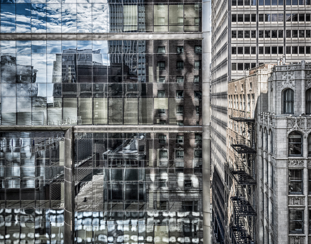 |
1 comment - 0 replies for Group 78
|
27 comments - 12 replies Total
|


