|
| Group |
Round |
C/R |
Comment |
Date |
Image |
| 5 |
Jul 18 |
Comment |
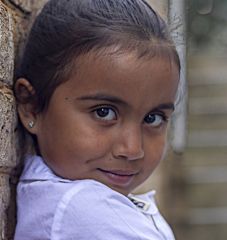
Phil, this is a charming portrait! After reading Nick and Richard's comments I decided to try to incorporate them and see the result. Frankly, I did it a bit too quickly so it's not as "polished" as I'd like... but it gives the general idea.
I think your original is outstanding. I'm eager to hear your thoughts on this one....
|
Jul 6th |
 |
| 5 |
Jul 18 |
Reply |
Thank you, Stephen. I think you may be right about the spot being part of the "body art". However, I think I'll clone it out anyway along with the small white area on his shirt sleeve.
"Strength through pain" is fascinating... and definitely not something that I could get into! lol
|
Jul 3rd |
| 5 |
Jul 18 |
Comment |
John, I love pictures of repeating shadows since the patterns are often lovely and interesting. In this image, I find that there are too many shadow lines to make my eyes see them as a pattern. Your idea is great and your cropping is perfect, however I can't quite "get into" this one.
|
Jul 2nd |
| 5 |
Jul 18 |
Comment |
Nick, would you believe that I had a dream last night of a giraffe heading a huge, orange soccer ball? (LOL.... well, that's a lie.)
I always look forward to your images. They bring a smile to my face and also give me tremendous respect for your talent and imagination in creating composites. I love the fact that you made the soccer ball from "patches" of the giraffe's skin... AND that you left the spaces between them. Brilliantly done. Also, the embossing on the giraffe's skin works very well. The fact that the "floor" is comprised of similar patches is great.
It's really difficult to suggest anything to improve your image. The only NIT that I might mention is the fact that his left foot seems to be hovering a bit off the floor. But, frankly, I had to look hard to find ANYTHING to mention.
Well done!
|
Jul 2nd |
| 5 |
Jul 18 |
Comment |
WOW! I really like this. The choice of flowers is perfect and I love the fact that you positioned them so that the stamens are on the right and left and both facing into the image. Also, the colors are very well chosen.
Barbara, your post-processing is outstanding and your idea of creating a panel of flowers is very inventive.
I have no suggestions for changes. Nicely Done!
|
Jul 1st |
| 5 |
Jul 18 |
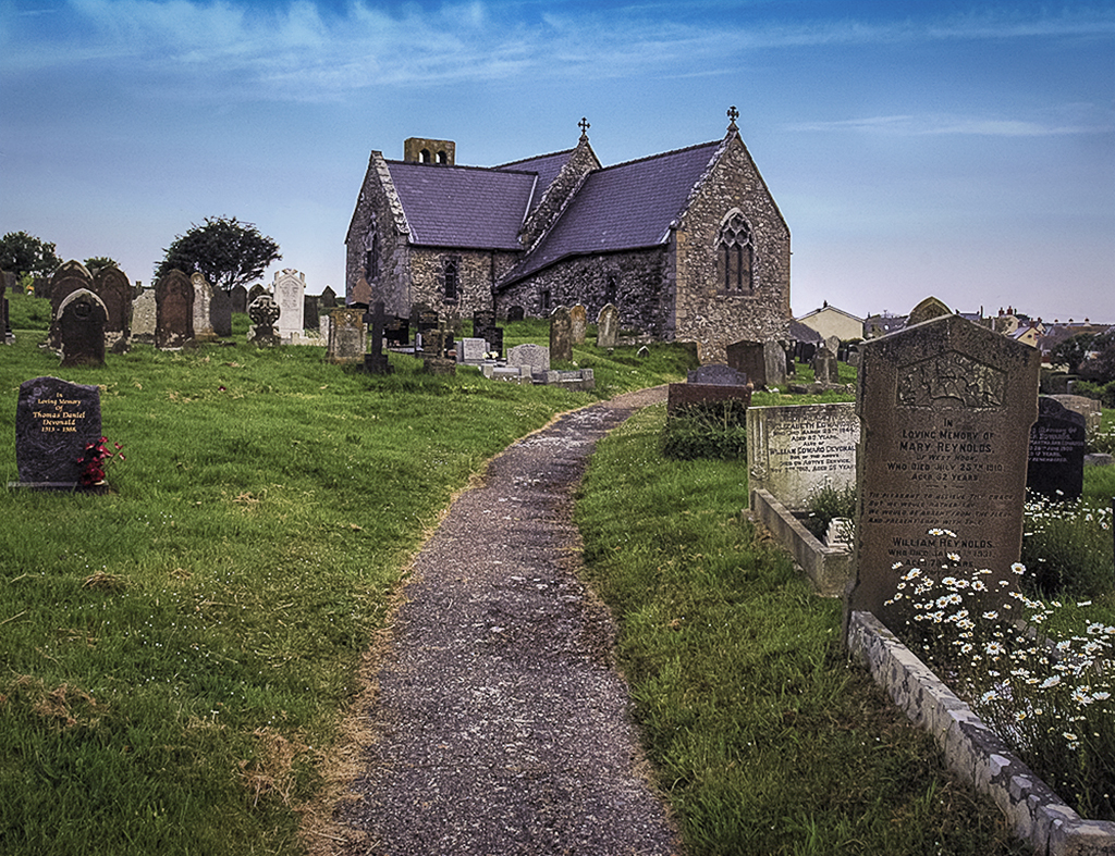
Comment |
Richard, this is a fantastic capture. It definitely makes me want to see Wales! Nicely done!
On my monitor the color balance didn't seem quite right and the saturation seemed just a bit heavy. Thus, I took the liberty of playing with it a bit. Your thoughts?
|
Jul 1st |
 |
| 5 |
Jul 18 |
Reply |
Yes, tattoos seem to have become very prevalent. At the tattoo expo there were people whose complete faces were tattooed. I kept thinking of how much that would hurt their career choices in the future.
It amazes me that I didn't spot the white on his ear. The fact that you pointed it out is another example of why these study groups are so valuable! Thank you!
|
Jul 1st |
5 comments - 2 replies for Group 5
|
| 6 |
Jul 18 |
Comment |
Dick, I'm visiting from group 62 and noticed your beautiful image. The colors and the background are perfect but one of my favorite things is how you handled the rose leaves and stem. It takes a careful look to notice them, but once seen they give context and life to the picture. I also use Helicon Focus for my macros. It's an amazing piece of software.
Well done!
|
Jul 17th |
1 comment - 0 replies for Group 6
|
| 11 |
Jul 18 |
Comment |
I'm visiting from group 62 and saw this extraordinary picture... BEAUTIFUL! All of the elements work together, yielding a delightful story in a fascinating location. Well done!
Since you have concerns about the sky and are interested in other ideas about editing this picture, I played with it a bit to see what else could be done. I'm not at all sure that my changes are an improvement. Your thoughts? |
Jul 3rd |
 |
1 comment - 0 replies for Group 11
|
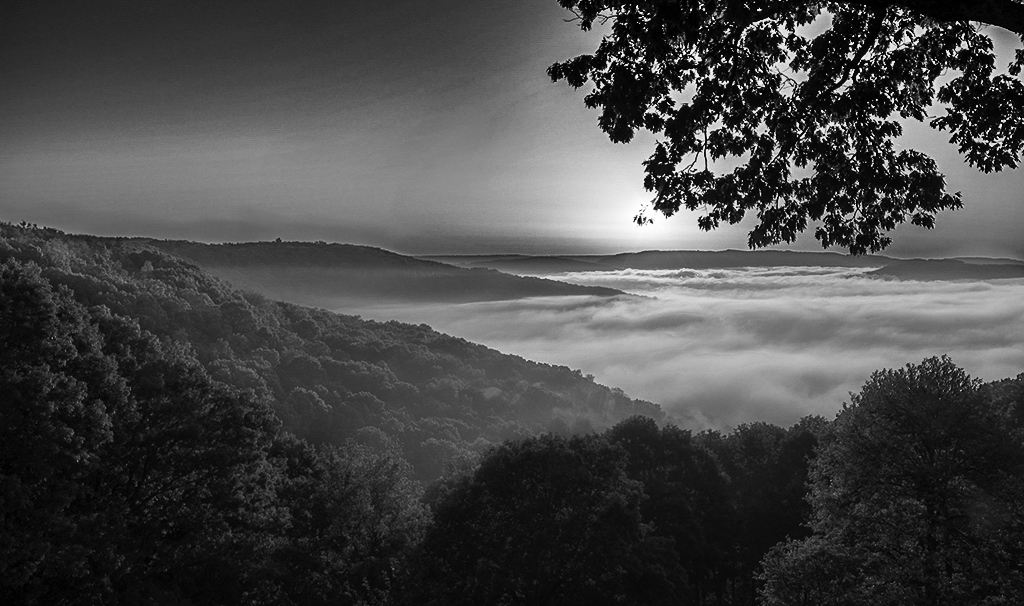
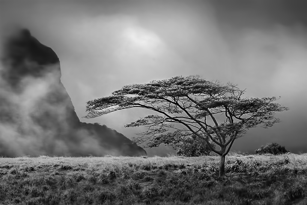
| 26 |
Jul 18 |
Comment |
I'm visiting from group 62 and saw this striking image. Dave, this is lovely. It's one of those that does much better in B&W since it creates a mood that isn't there in color. The sky may be fairly plain, but the blanket of fog makes the picture work beautifully.
I wanted to see how the picture might look with slightly different lighting, cropping and contrast. Your thoughts?
|
Jul 9th |
 |
1 comment - 0 replies for Group 26
|
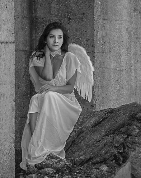
| 27 |
Jul 18 |
Comment |
Jan, I'm visiting from group 62 and noticed your image. It's fascinating and clearly tells a story.... though it's hard to imagine what the plot might be (smiles). You did an excellent job converting it to your personal style. Nice work!
I wanted to play with it a bit to see what would happen if I cropped slightly differently, then changed the contrast and the lighting on the face a bit. Your thoughts?
|
Jul 15th |
 |
1 comment - 0 replies for Group 27
|
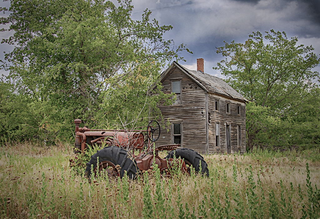
| 36 |
Jul 18 |
Comment |
I'm visiting from group 62 and noticed your amazing picture. The composition is outstanding. Although the colors are clearly critical to the feel of the image, I wondered how it would look as a monochrome. Thus, I played with it a bit. Your thoughts?
|
Jul 25th |
 |
1 comment - 0 replies for Group 36
|
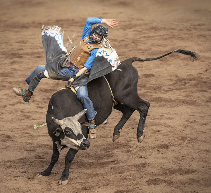
| 37 |
Jul 18 |
Reply |
Grace, I totally agree with you. Leaving space in front of something moving makes it feel more "natural". In the image I posted, it would definitely looked better if I had only cropped the top and bottom. |
Jul 8th |
| 37 |
Jul 18 |
Comment |
Grace, I'm visiting from group 62 and noticed your wonderful bull-riding image. You did a great job capturing it. The action is at its peak and you managed to get it in perfect focus. Although I can't compare this picture to the original, it seems that you did a good job removing the distracting elements in the top of the frame.
I wondered how your image would look with slightly tighter cropping and a little vignette, so I played with it for a couple of minutes. I don't think my version is better... but it's a bit different. Your thoughts?
|
Jul 7th |
 |
1 comment - 1 reply for Group 37
|
| 42 |
Jul 18 |
Comment |
Karen, I'm visiting from Group 62 and noticed your beautiful image. The reflection of the sky, trees and mountain is outstanding.
Concerning judges' evaluations, I suspect that it's because most judges look for a specific point of focus that immediately draws the viewer's eye. I frequently hear statements like "The image should have an obvious point that attracts the viewer. Then the rest of the image should cause the viewer's eyes to move around the picture." Frankly, I think they are missing the point of images such as yours. There's not a SINGLE point that draws my attention. However, the entire scene gives a sense of peace and beauty to the viewer.
Well done.
|
Jul 6th |
1 comment - 0 replies for Group 42
|
| 44 |
Jul 18 |
Comment |
I'm visiting from Group 62 and saw your image. It's outstanding! I love the feeling that it evokes and the composition is wonderful.
I wanted to see how it would look with a bit less saturation, an even darker sky, and a slight vignette. Your thoughts?
|
Jul 8th |
 |
1 comment - 0 replies for Group 44
|
| 62 |
Jul 18 |
Reply |
LuAnn, this is a great topic. Thank you for bringing it up.
I completely agree with you that photographers having a style and that they should feel good about it. Without a unique style, photography would become simply a matter of technique... and the important human element would disappear. I totally support the fact that different artists have different styles and that they should never hesitate to use and display their work with pride.
An article that I once wrote for my local camera club dealt with the topic of "What Makes a Good Photograph". The conclusion was that it's absolutely individual... that a photographer or a viewer would find a photograph to be good if it pleased her/him. Since no two people share the same background or life experiences, everyone has a different "lens" through which they see an image. Thus, you find that images that are dark and/or moody are especially appealing while I tend to prefer pictures that are slightly brighter. Neither opinion is wrong, nor should either be criticized.
When evaluating pictures, I can't avoid looking at them with a bias based on what appeals to me. But, in no way does this imply that my opinion is better than yours or anyone else's... just that it's sometimes different.
The study groups aren't really intended for judging photographs. Instead, they are forums for people to give their candid thoughts about what would make images more appealing TO THEM. This input should always be done respectfully since commenters should realize that the artist will have her/his own unique style. However, the input can give the photographer another person's ideas to consider. Personally, I often find the comments of others very thought-provoking. In fact, they frequently cause me to reassess how I processed my image. At other times, of course, I don't agree with the input since it doesn't reflect my style. However, so long as the comments are kindly phrased and reasonably thoughtful, I find them very useful.
I hope you find that this all makes sense. It's a fascinating topic and I suspect opinions about it vary as much as opinions about photographs.
|
Jul 22nd |
| 62 |
Jul 18 |
Reply |
As you noticed, I lightened his face a bit. Also, I tried to brighten his eyes and darken his pupils since his gaze is a central point of focus. The lack of a pure black didn't bother me, however, it would certainly be feasible to make the dark areas between the tree leaves black.
Glad you like it... but the real art was in your original image. Well done! |
Jul 19th |
| 62 |
Jul 18 |
Comment |
David, your image has really created numerous differing opinions. I think the variety of input demonstrates how a viewer's personal experiences and preferences affect their perception of a picture. There is no "right or wrong"... which is what makes photography an art.
The overriding theme in all the comments is that it's a beautiful image. Well done!
|
Jul 17th |
| 62 |
Jul 18 |
Reply |
Hattie, it DOES remind me of some of my images in the film days. LOL... at the time I always wished that I could increase the contrast.
|
Jul 17th |
| 62 |
Jul 18 |
Reply |
Hattie, I'll play with the idea of increasing the delineation of the mailbox and the background. Perhaps darkening the background a bit, as Pandula suggested, would be the best approach. Thank you for your input!
|
Jul 17th |
| 62 |
Jul 18 |
Reply |
Thank you, Pandula. Good observation and very helpful.
|
Jul 17th |
| 62 |
Jul 18 |
Reply |
LuAnn, after reading everyone's comments, I decided to take a stab at incorporating many of them. Here's what I came up with. Your thoughts?
|
Jul 17th |
 |
| 62 |
Jul 18 |
Reply |
Thank you, Paul. Mailboxes have always intrigued me. They seem to tell a story without needing additional "props". This particular mailbox seemed quite unique because of its age and the metal supporting the rotten wooden stand.
|
Jul 9th |
| 62 |
Jul 18 |
Reply |
David, I'll be interested in seeing your cropped image. I originally included the road to add context and balance to the mailbox.... which, I totally agree, is quite unique. Thank you for your comments!
|
Jul 9th |
| 62 |
Jul 18 |
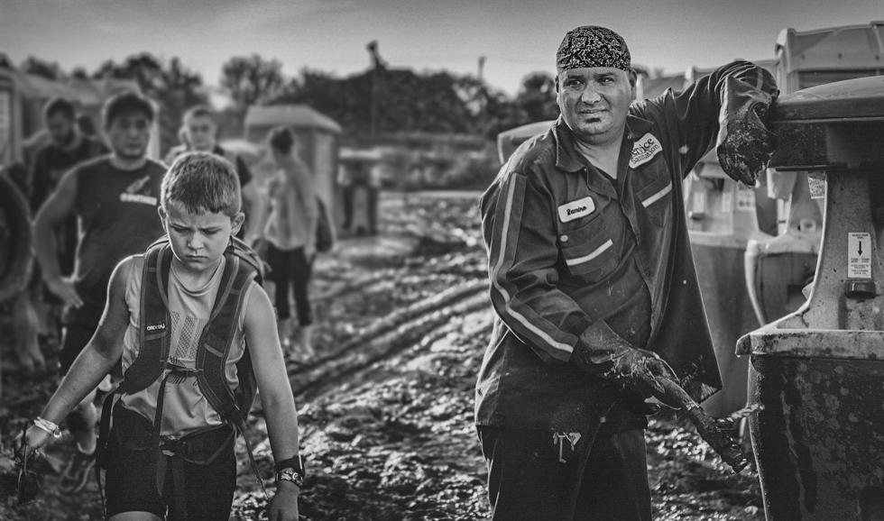
Comment |
Hattie, you have a real gift for seeing fascinating scenes that I would have simply overlooked. The boy's face shows intense concentration.... and perhaps a bit of displeasure. And, the man on the right (at the gas pump?) has an expression that's hard to read but is obviously focused on the boy. It makes me wonder if he might be the father.
When I studied the picture, I found that I wanted it to focus more directly on the boy and the man. Thus, I tried to lighten and sharpen them while blurring the others in the image.... but leaving them recognizable since they give a great deal of context. I also cropped just a bit off the left side so that the dark hose wouldn't be obvious. Let me know what you think.
Beautifully done!
|
Jul 6th |
 |
| 62 |
Jul 18 |
Comment |
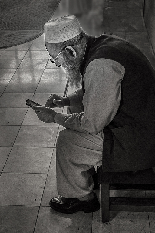
Pandula, I love how you've processed this image. Your lighting on his face and your removal of the background distractions is outstanding. The festival must be absolutely amazing.
Well done!
|
Jul 6th |
| 62 |
Jul 18 |
Comment |
Paul, this is a terrific image! It clearly shows that 1) you have a great eye for seeing what can/will be a fantastic picture, and 2) your post-processing is outstanding. The way you manipulated the light to highlight the man's face, the chess board and the braids of the second man is excellent. Also, bringing out the stone work in the courtyard is done perfectly. Very impressive.
My only suggestion is a nit.... I find the legs/feet of the benches a bit distracting. It might be good to clone them out.
Beautiful job!
|
Jul 6th |
| 62 |
Jul 18 |
Comment |
David, this is a beautiful image.... especially in B/W. Your white frame fits it perfectly.
I'm quite surprised that there is only the slightest movement showing in the reeds on the right since it was a 5 minute exposure and there's obviously enough wind to move the clouds.
Most times I prefer a bit of detail in the shadows. However, your use of complete black in the small island on the left balances the reeds nicely. In large part, the balance seems to be a result of the island being shown as a silhouette.
The tones in your image are beautiful and the fact that the moon is not dominate is excellent.
I will have to come back later to reexamine your submission because right now I can't find any modifications to suggest!
Very well done!
|
Jul 5th |
| 62 |
Jul 18 |
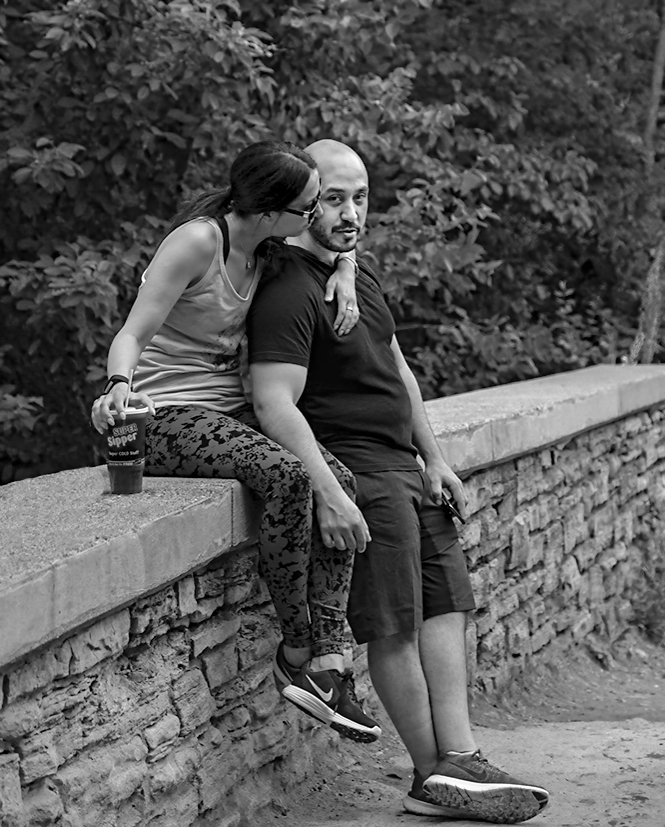
Comment |
Street photography is such fun.... and this image is a wonderful capture. LuAnn, you obviously have the ability to visualize what your pictures will look like in B/W. I say that since I don't think the color version would catch my eye. However, in B/W the people really snap out to the viewer. Their skin tones and the light concrete on the top of the wall immediately draw my attention.
There's very little that I would change about this image. Perhaps the only thing that I'd consider would be cropping out the left-most drink since its bright tone is a bit distracting.
Nicely done!
|
Jul 1st |
6 comments - 8 replies for Group 62
|
| 64 |
Jul 18 |
Comment |
I'm visiting from group 62 and noticed this wonderful image. It really works in B/W. One of the things that struck me was how clearly it tells a story. Very well done.
I wanted to see what the picture would look like with the highlights dimmed a bit. I also modified the lighting and attempted to blur the woman in the background... and gave it a slight tone. Do you think it still "works" as well as the original?
|
Jul 5th |
 |
1 comment - 0 replies for Group 64
|
20 comments - 11 replies Total
|


