|
| Group |
Round |
C/R |
Comment |
Date |
Image |
| 5 |
Jun 18 |
Reply |
Thank you Nick. (I use Layer Masks frequently.)
|
Jun 13th |
| 5 |
Jun 18 |
Reply |
Very interesting. Thank you for sharing your process. I'll certainly give it a try!
|
Jun 12th |
| 5 |
Jun 18 |
Comment |
Nick, your imagination continues to astound me. The idea of bringing together a model, a soap dish and clouds would never have occurred to most people.
It would be interesting to hear your process for doing composites like this. |
Jun 7th |
| 5 |
Jun 18 |
Reply |
Good point about the net being the prize. And, that's emphasized by the fact that the boy's eyes are focusing on it. Very nice. |
Jun 7th |
| 5 |
Jun 18 |
Comment |
Striking colors... I love the red/orange against the greens of the trees and grass. And, your focus and exposure are right on! Well done.
I suggest cropping out the player who's cut off by the right margin. Also, a little of the top and left could be cropped to intensify the focus on the young man in the center. |
Jun 6th |
| 5 |
Jun 18 |
Reply |
Smiles.... that explains it. I thought you knew some Photoshop magic that I wasn't aware of. |
Jun 3rd |
| 5 |
Jun 18 |
Comment |
Beautifully saturated colors! I also really like the fact that his eye seems to have the same texture as the feathers next to his eye. How did you create the final image from the originals? The angles seem different to me... or am I missing something? |
Jun 3rd |
| 5 |
Jun 18 |
Comment |
Thank you, Barbara. I still like the versatility and image quality of my camera over my iPhone. Also, it lets me work in raw which opens lots of post-processing capabilities.
I tried adding a bit of a glint to the pup's L eye and I also did just a small additional cropping on the left of the image. Your thoughts?
|
Jun 3rd |
 |
| 5 |
Jun 18 |
Comment |
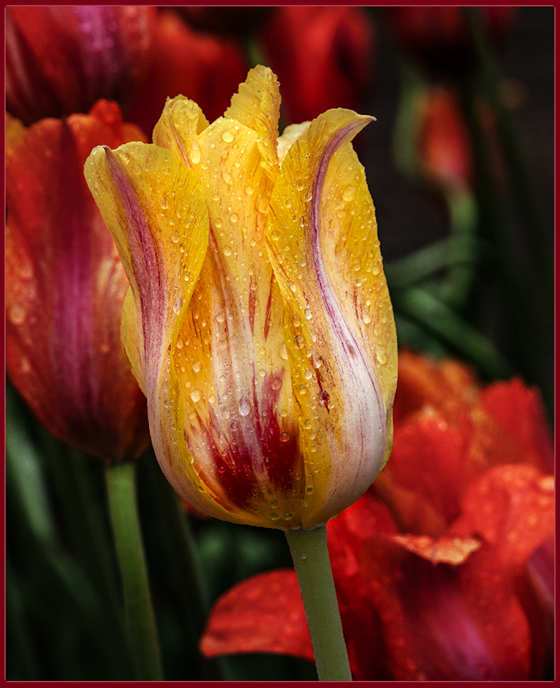
I love tulip pictures. Both their shapes and colors are magnificent. Richard, I like the fact that your background is mostly red and green while your primary subject has a great deal of yellow. This really brings my focus to the foreground tulip.
I played with the idea of darkening the BG a bit... and also desaturating it somewhat. Here's what I came up with. I'm not sure if the additional saturation on the close tulip is too garish. Please let me know your thoughts.
|
Jun 2nd |
 |
| 5 |
Jun 18 |
Reply |
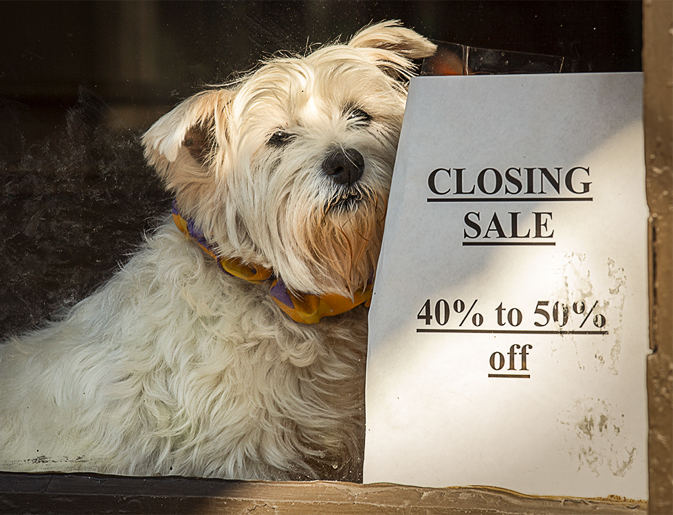
Thank you, Richard. I wasn't sure how people would react to this image. When photographing a subject behind a window, I always struggle with how much to clean the window in Photoshop. I left this one a bit dirty since that seemed appropriate for a shop that's closing. |
Jun 2nd |
5 comments - 5 replies for Group 5
|
| 10 |
Jun 18 |
Reply |
Thank you, Donna. We're delighted to have you visit Group 62... AND to give your input! I looked at your bio and saw that you're quite an experienced photographer! When I have a few moments, I'll look back at earlier months so I can see your style.
Have a good weekend.
|
Jun 16th |
| 10 |
Jun 18 |
Reply |
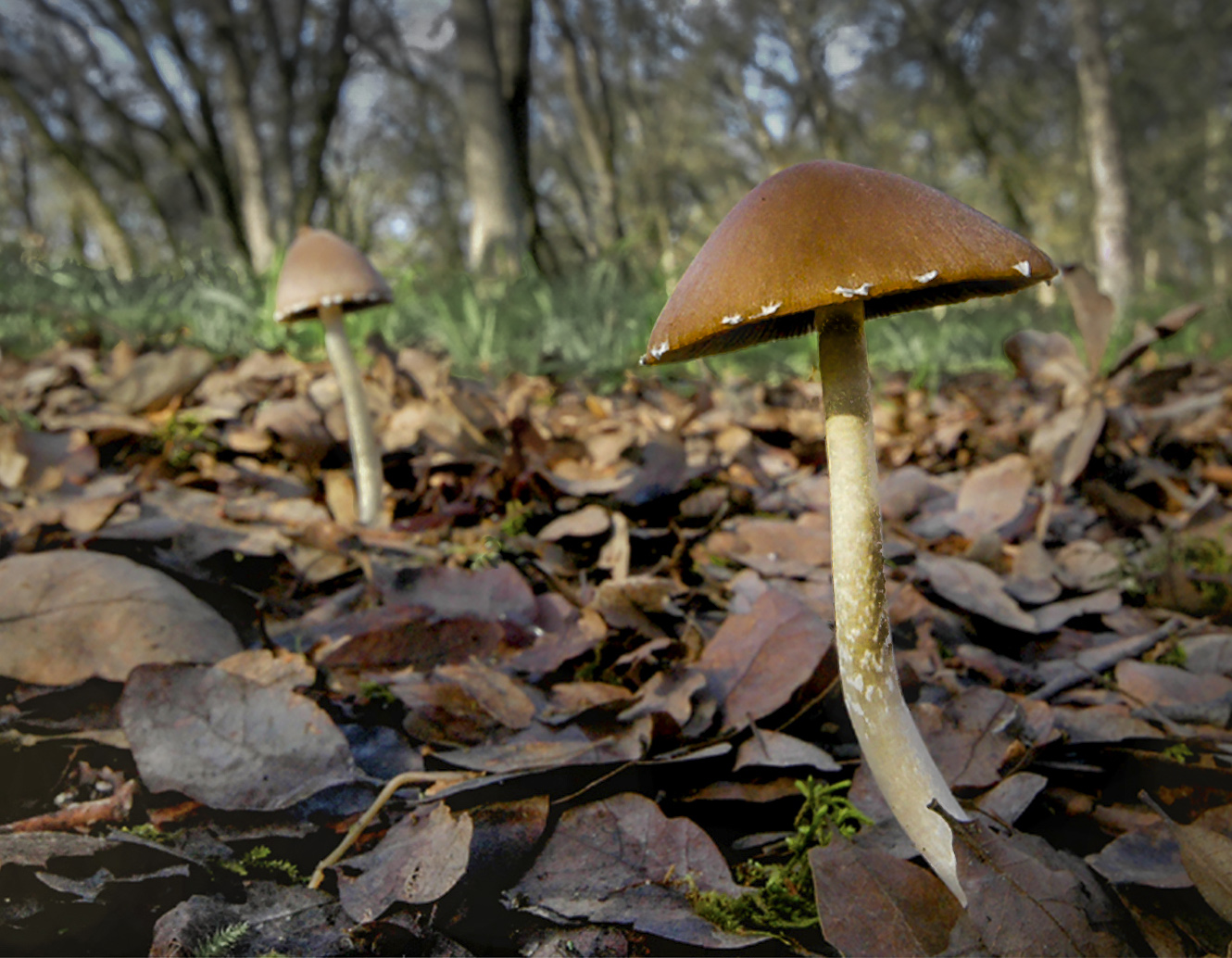
Donna, I'm glad you like it. Much of the cropping that I did was an attempt to eliminate some of the sky which was so bright that it distracted from the mushroom. The vignette also helped darkening it.
I've often heard that the secret to photography is to minimize what's in the picture. Don't know that I agree with this, but I do like to identify what I want the focus point to be and then reduce or eliminate any other distractions.
You have a "good eye", so definitely keep at it!
|
Jun 16th |
| 10 |
Jun 18 |
Comment |
I am visiting from Group 62 and I really like this image. The foreground mushroom makes a wonderful point of focus! VERY NICE!
Like John, I felt that the picture might benefit from a few minor tweaks. Thus, I reduced the brightness and saturation of the sky (and cropped it a bit), tried to emphasize the mushroom cap and added a bit of vignette. Your thoughts?
|
Jun 16th |
 |
1 comment - 2 replies for Group 10
|
| 22 |
Jun 18 |
Reply |
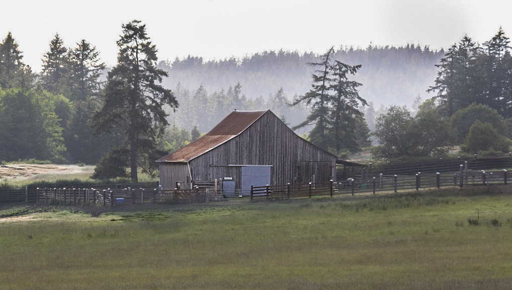
Mike, your original shot was excellent. However, when I decided that the barn was the primary point of interest, I noticed that it didn't immediately attract my attention. Thus, a bit of light manipulation....
I'm glad you like my edits. I noticed on one of your previous pictures that you used the Canon 100-400mm lens. That's one of my favorite lenses... and the 135mm is another favorite.
Please visit Group 62 and share your input when you get a chance. |
Jun 20th |
| 22 |
Jun 18 |
Comment |
I'm visiting from group 62 and saw this beautiful picture. The barn's environment is wonderful and, as others have said, very peaceful. I tried making the barn a bit brighter to see if that would improve (or degrade) your image. Here's my attempt. Your thoughts? |
Jun 20th |
 |
1 comment - 1 reply for Group 22
|
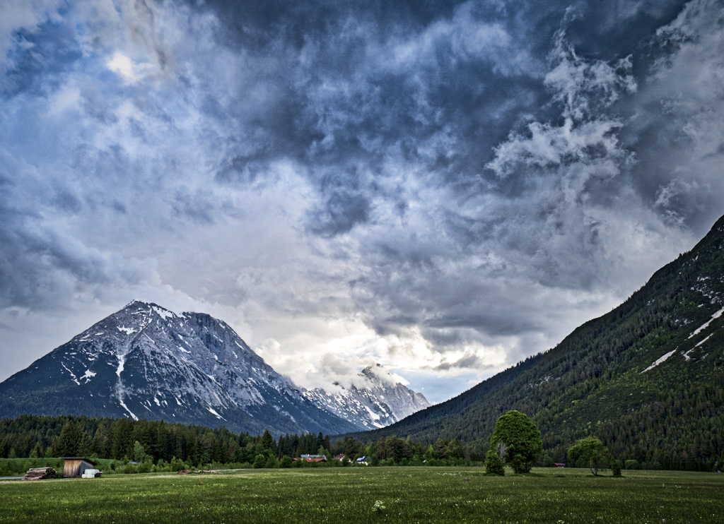
| 27 |
Jun 18 |
Reply |
In this image, the focus (to me) is the lighting between the two mountains. The clouds, the foreground and the mountains support that bright area.
When I look at it now, I think I left too much blue in the sky. |
Jun 19th |
| 27 |
Jun 18 |
Comment |
I'm visiting from Group 62 and noticed this wonderful image. The sky and the lighting are fantastic. Great job!
I tried to see what it would look like with an even more dramatic sky and light. It may be over done. Your thoughts? |
Jun 12th |
 |
| 27 |
Jun 18 |
Comment |
I'm visiting from Group 62 and noticed the wonderful smile on Happy Guy. What a great capture! You did an excellent job selecting the background so that you could darken it. One thing you might consider is putting a frame on the image. I find that a non-distracting frame (perhaps one that's the color of his hat) is often beneficial when I have a black background and the image will be viewed on a black page.
Well done!
|
Jun 10th |
2 comments - 1 reply for Group 27
|
| 32 |
Jun 18 |
Comment |
I'm visiting from Group 62 and noticed this wonderful image. Since I love fairly close to Lancaster, I realize how difficult it must have been to get this picture.
In thinking about Diana's comments, I tried a few things.... cropping to make it more of a panorama, toning it slightly so that it "fits" with the old-fashioned feel of the image and playing a bit with the light. I certainly won't say that I improved the picture, but it's somewhat different.
Your thoughts?
|
Jun 10th |
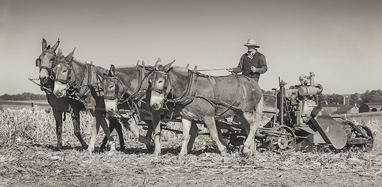 |
1 comment - 0 replies for Group 32
|
| 60 |
Jun 18 |
Comment |
Bill, I'm visiting from group 62 and noticed your beautiful mimosa tree. It reminds me of one that I climbed as a small boy.... smiles.
I like what you've done with the image and how you've made the buds (blossoms?) the focus of the picture. I played with it a bit in Photoshop to see what cropping the left bloom and changing the light a bit might do to the image.
Your thoughts?
|
Jun 22nd |
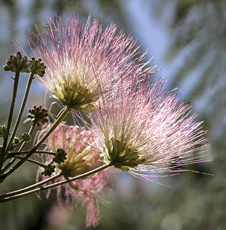 |
1 comment - 0 replies for Group 60
|
| 62 |
Jun 18 |
Reply |
Thank you, Mike. I really appreciate your nice compliments! I hadn't thought of the times (long ago) that I used to leaf through the Life and Look magazines to see the beautiful pictures. Those are great memories.
The 100-400mm has become my favorite lens. I use to have the original push-pull 100-400, but the version II is much, much nicer. Not only for the twist instead of push-pull, but also for its close focus. At 400mm it's almost a macro!
I've never been to the Bosque del Apache National Wildlife Refuge. Thank you for the "pointer"... I'll look it up.
|
Jun 22nd |
| 62 |
Jun 18 |
Reply |
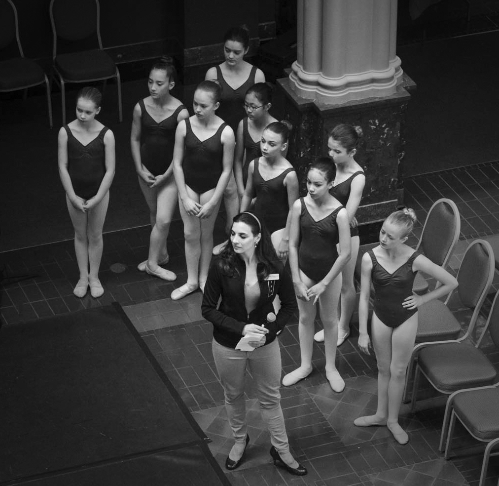
You observed well... smiles. I didn't mention it in my email from 6/9/2018, but I felt the pillar and the bright chrome on the backs of the chairs were so bright that they were a bit distracting.
|
Jun 21st |
| 62 |
Jun 18 |
Reply |
Thank you, Marti. I appreciate your comments AND your visit to our group! |
Jun 21st |
| 62 |
Jun 18 |
Comment |
David, your picture is so intriguing that I keep coming back to it. In fact, three times I've played with it in Photoshop, starting with the color original. I've attempted to incorporate some of the excellent suggestions that other group members have made for your image.... and every time I find that I like your B/W version more than what I'm able to come up with.
I'm very impressed!
|
Jun 18th |
| 62 |
Jun 18 |
Reply |
LuAnn, I liked where you were going with Hattie's image. However, the dark areas seemed too intense to me. So, I tried to bring a bit of detail back into them. I also dimmed the highlights a bit so that the girl's face would be the obvious focus point.
Thoughts?
|
Jun 12th |
 |
| 62 |
Jun 18 |
Reply |
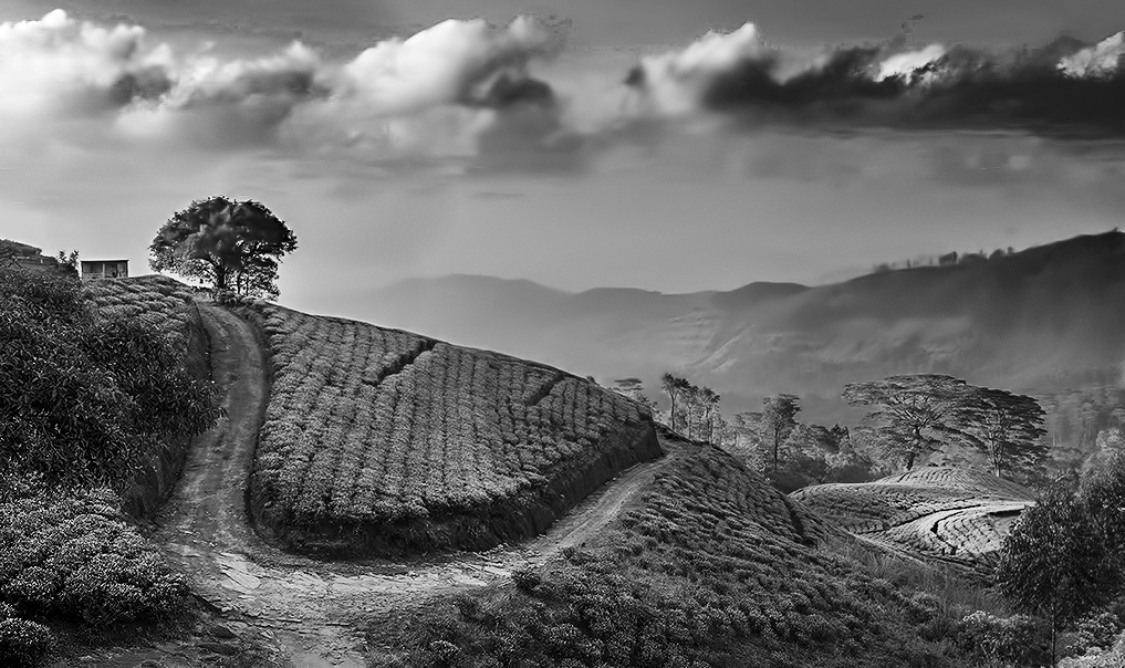
David, I appreciate your input on this. Like you, I found that the road was the focal point. By lighting it and the continuation of the road on the bottom right corner, I thought it kinda tied the image together.
Pandula, it's truly a magical picture. Congratulations!
|
Jun 9th |
| 62 |
Jun 18 |
Comment |
LuAnn, I couldn't resist playing with this... using the comments of Paul and David. I even attempted to add eyes to the 10th girl... lol.
Your thoughts?
|
Jun 9th |
 |
| 62 |
Jun 18 |
Reply |
Thank you, Pandula. I'm glad you like my edits. I felt that brightening the road a bit and also lightening the wonderful scene at the bottom right balanced the tree at the top left of the picture. It's truly a fantastic image. Well done!
|
Jun 6th |
| 62 |
Jun 18 |
Reply |
Pandula, I really appreciate your comments. To me the color version of the picture is too busy, and the colorful flag detracts from their faces. In B&W I have the ability to reduce the distractions and direct the viewer's attention more effectively. |
Jun 6th |
| 62 |
Jun 18 |
Reply |
Thank you, Paul. I really enjoy "people pictures" and the fact that most of my subjects see me as a harmless old man certainly helps set a comfortable mood! lol
Often I find that asking someone if I may take their picture will allow me to begin a conversation that relaxes them and allows them to just be themselves. Of course, at other times I simply don't ask...
|
Jun 6th |
| 62 |
Jun 18 |
Comment |
Pandula, your image is well worth the two-hour climb.... and more. Congratulations on your awards for it. I not only love the scene, but what you've done with it is outstanding!
Based on Paul's comment, I couldn't help seeing what it would look like with the wires removed. I also tried slightly different cropping (almost a panorama) and tweaking the lighting a bit. What do you think?
|
Jun 5th |
 |
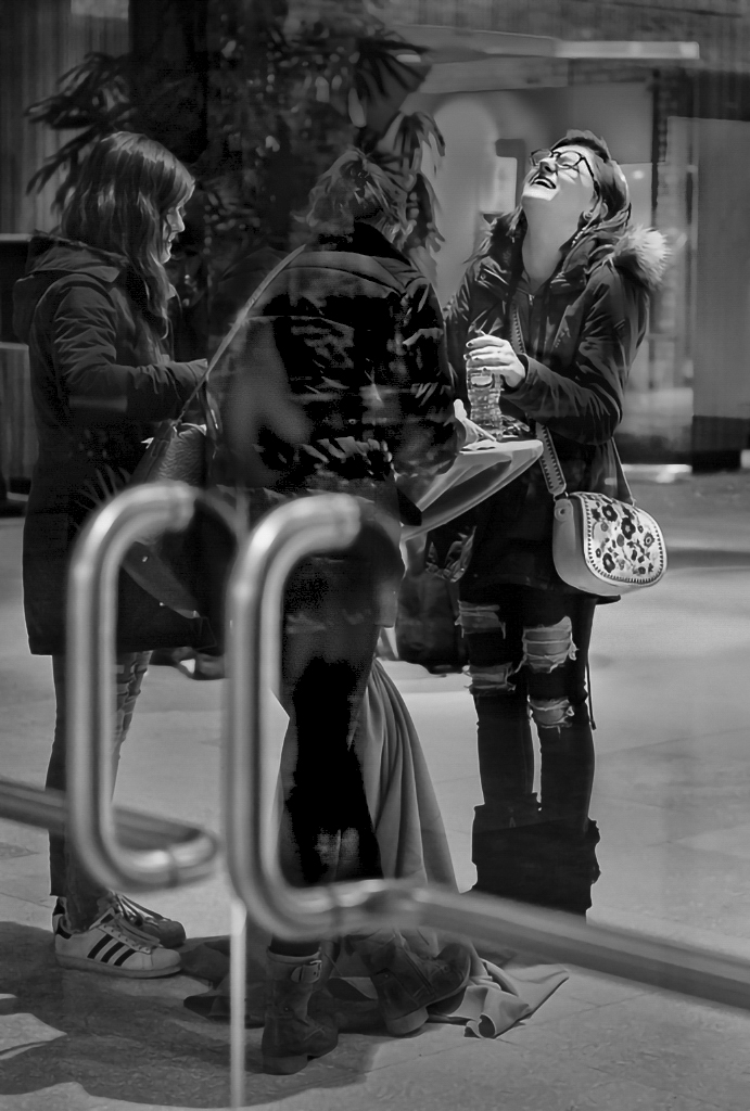
| 62 |
Jun 18 |
Comment |
David, you've really created both a mood and a story. There's so much that could be read into this image! Just the idea of your grandson walking alone on the long pier is very intriguing. The shadows of the fence posts mimic that of the boy and the shadows of the fence lines seem to create a path forward for him. It's easy to envision this as a depiction of your grandson walking into his future... and the B&W somehow makes this kind of "viewer's analysis" almost irresistible.
If I had seen only the color image, I would probably not have pursued it. Yet, you've made it into a memorable picture.
It would have been great to have been able to capture this in raw so that you could have done more manipulation. For example, bringing some contrast into the sky might have been interesting.
Well done!
|
Jun 4th |
| 62 |
Jun 18 |
Comment |
Hattie, you have a wonderful sense of timing for your photographs. The three girls tell quite a story and the door handles give your image good context. A couple of suggestions for you to consider.... First, I think the man in the background is a distraction that you could clone out. And, second, if you have a raw image you might be able to reduce the highlights on the laughing girl's face. It appears that the bright areas on her forehead and chin might be blown out. Also, since the primary focus is the girl's face, you might consider darkening her hand that's holding the water bottle.
I hope these ideas are useful in helping you further improve a fascinating image!
|
Jun 4th |
| 62 |
Jun 18 |
Comment |
Paul, I really like the mood that you've created with this image. Your manipulation of the light and the textures is outstanding. I tried cropping it tighter (as well as less tight) to see if I could avoid cutting off the tops of the right-most windows. None of my attempts worked as well as what you did.
Lightening the people as you did is excellent since they could easily have been lost in the shadows.
I think this is a wonderful example of a picture that isn't very interesting in color, but is outstanding as a B&W. WELL DONE!
|
Jun 4th |
| 62 |
Jun 18 |
Reply |
LOL... fixing the girl's face at this point would be difficult, even in Photoshop! I've found that candid shots not only require that your eyes be everywhere, but they also benefit from a healthy dose of luck!
LuAnn, CONGRATULATIONS on having your Dining Car picture selected by your newspaper and even making the front page of the Life Style section! That's great! And to have that honor followed by your second entry getting on the post card invitation is fantastic. I'm really glad that your artistic skills are being recognized!
Thank you for sharing this information!
I'll definitely check out your web site.
|
Jun 2nd |
| 62 |
Jun 18 |
Reply |
Thank you, LuAnn! I really appreciate your input. I'm also very glad that you pointed out the haloing. It's one of those things that I should have seen and corrected.... but that I needed someone else's eyes to point out. I think it occurred when I was masking out the background in order to darken it. The brush I was using in Camera Raw was feathered and it should have been a hard edge... or I should have used a different technique for masking.
In any event thank you again.... both for your compliments and for your observation of the halo which I can now fix.
|
Jun 1st |
| 62 |
Jun 18 |
Comment |
LuAnn, this image blows me away! It's perfect in B&W and I can't think of a thing to suggest to improve the post processing. The poses of the girls is fascinating... they are all standing with about the same arm and foot positions except the girl on the right. Somehow this seems to give balance to the image.
I really like your conversion of the purple tanks into a dark color that's similar to the instructor's jacket. I also agree with your observations about the value of the white pillar in the image.
If I had to suggest something for the picture, I'd mention a few VERY minor nits. 1) It would be nice to see the face of the third girl from the right. 2) I'd like the chrome on the four chairs on the bottom right to be slightly less bright. 3) PERHAPS a slight vignette would be nice... but I'm not sure.
It's a beautiful picture, LuAnn. I don't know if you'll choose to enter it into a competition but if you do, it should win!
Nicely done!
|
Jun 1st |
7 comments - 10 replies for Group 62
|
| 63 |
Jun 18 |
Comment |
Murphy, I'm visiting from group 62 and noticed your spectacular picture. The colors are striking, but your skill in manipulating the background and the lighting are outstanding. I agree with Priscille that the leaves add a great deal to the composition.
Nicely done!
|
Jun 17th |
1 comment - 0 replies for Group 63
|
19 comments - 19 replies Total
|


