|
| Group |
Round |
C/R |
Comment |
Date |
Image |
| 5 |
May 18 |
Comment |
There are some images that make me ache to play with them in Photoshop. This is one of those. I made a few additional edits... both in lighting and cloning out the foot pedal and a couple of wires.
Your thoughts?
|
May 28th |
 |
| 5 |
May 18 |
Reply |
Thank you Nick. Richard also suggested a cup and saucer so maybe a lace "mat" with a cup on it would be perfect. |
May 20th |
| 5 |
May 18 |
Comment |
For some reason I keep thinking of swarms of bees being swallowed by a tornado in a house of mirrors. (Smiles)
Really, this is a striking image. The colors and the symmetry give it an amazing feeling of motion.... and, as Beverly said, excitement!
Although it's not a restful picture that I'd hang in my bedroom, it is definitely one that I keep returning to see again.
Well done!
|
May 10th |
| 5 |
May 18 |
Comment |
Holy cow! (Or is that "Holy Giraffe"?) Nick, your pictures always show such a wonderful sense of humor AND skill. I think the giraffe road is brilliant.
Well done!
|
May 7th |
| 5 |
May 18 |
Reply |
Thank you, Barbara. I loved his "Smoke Ghost". |
May 7th |
| 5 |
May 18 |
Reply |
Thank you! The photos were great... and gave me LOTS of ideas!
|
May 7th |
| 5 |
May 18 |
Comment |
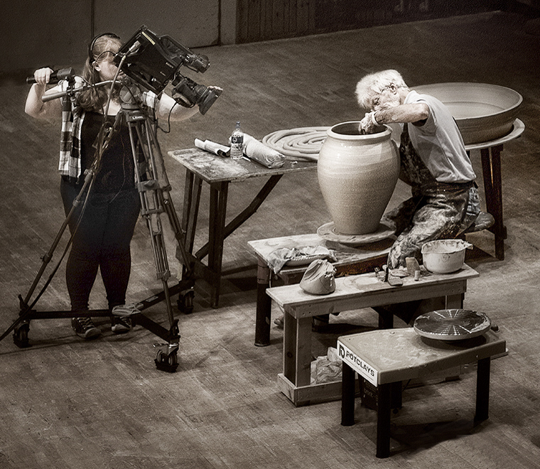
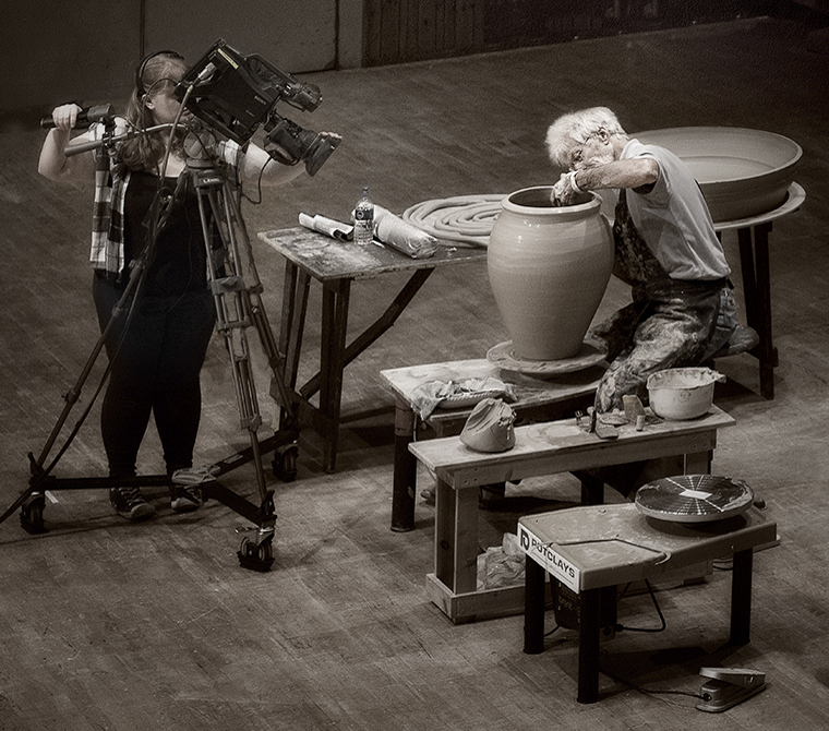
Your post processing really makes this into a wonderful image. The slight glow and the tone provide by the Nik Paper Toner work perfectly for this image.
David, I realize that you prefer a square format. However, I tried cropping a bit of the top of the image and making a few more minor modifications.... removing the rest of the unwanted man, adding a slight vignette and using adding a bit of light to the potter's face and hands. Please let me know what you think.
In any event, you've produced another incredible image. Well done!
|
May 5th |
 |
| 5 |
May 18 |
Comment |
Richard, I like your changes. I attempted to take it even a bit further with the brush... though I don't know that it makes the brush any more obvious.
|
May 5th |
 |
| 5 |
May 18 |
Comment |
Thank you Paul. I like the idea of adding a cup and saucer. I was also thinking about another picture that has an old toaster (if I can find one in the thrift shop). I'd have some burnt toast in it at a level you can see and will add smoke above it. Should be fun.
BTW, someone told me that you can buy incense at Walmart for only $1 a bundle.
|
May 5th |
| 5 |
May 18 |
Comment |
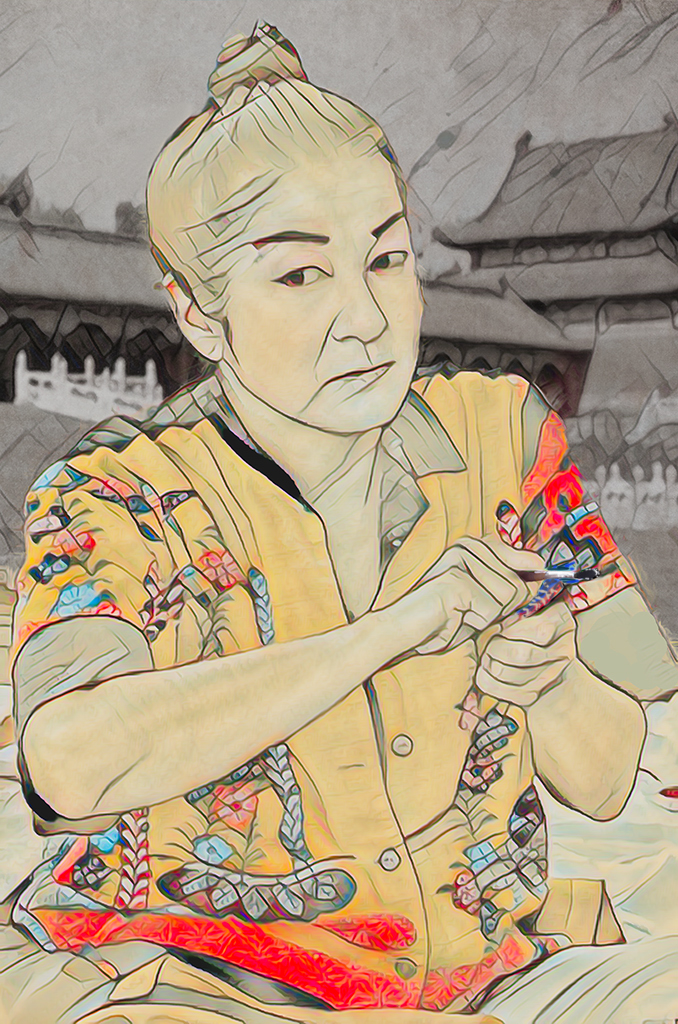
Richard, I really like what you've done with this. Your background couldn't be more fitting. The fact that it's B&W really makes your subject stand out! And, the conversion of the subject to a line drawing is wonderful. I especially like your treatment of the dark areas (i.e., his sleeves, collar, hair, etc.).
If there were anything I could suggest it would be to somehow make the items he's holding more obvious. I realize, after reading your description, that he's holding a makeup brush but that wasn't obvious to me in the picture. Note that I tried to think of how to emphasize the brush but couldn't think of anything that would work.
My comment about the makeup brush is just a nit. You've created a wonderful picture!
|
May 1st |
7 comments - 3 replies for Group 5
|
| 27 |
May 18 |
Comment |
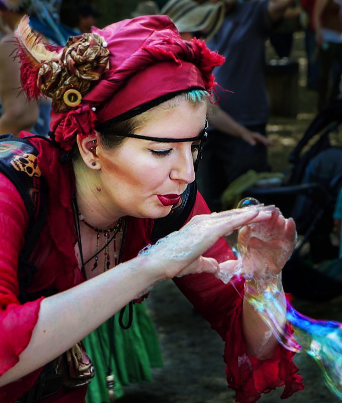
Renee, I'm visiting from Group 62 and noticed your photograph. I've been to the Maryland Renaissance Festival and even seen this bubble-blower. She does an amazing job! Your photo captured her intensity beautifully. However, I found that the background distracted me a bit. So, I played with the image in Photoshop.
Your thoughts?
|
May 13th |
 |
1 comment - 0 replies for Group 27
|
| 32 |
May 18 |
Reply |
Very nice edit. Rotating it makes it feel more dynamic to me.
|
May 18th |
| 32 |
May 18 |
Reply |
If the overlap must exist in either the wagon top/bridge or the horses, I prefer that the horses be separate. The fact that the wagon top is so much lighter than the dark bridge makes them fairly distinctive. |
May 18th |
| 32 |
May 18 |
Comment |
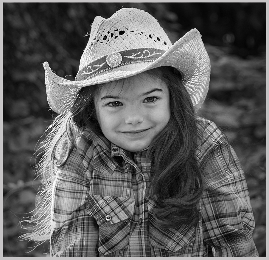
I'm visiting from Group 62 and saw this charming picture of the little girl. I think you really made a delightful photograph! Based on some of Diana's comments I took the liberty of playing with it a bit in Photoshop. Please let me know what you think.
(BTW, does GSCCC stand for Gulf States Camera Club Convention?)
|
May 14th |
 |
1 comment - 2 replies for Group 32
|
| 62 |
May 18 |
Reply |
Paul, I thought I had responded to your input. However, when I just looked over our conversations my comments weren't there. I probably typed them up but forgot to submit them. Age is a terrible thing... smiles.
The headroom that you gave my subject was amazing and really added to the "balance" of the image. I've tried to follow your same process and THINK I managed to do a reasonable job with it. THANK YOU SO MUCH FOR YOUR INPUT ON THIS!
|
May 28th |
| 62 |
May 18 |
Reply |
That's a great observation, Stephen! And, indeed, there's quite a similarity in style.
|
May 13th |
| 62 |
May 18 |
Reply |
Thank you Stephen. I'm lucky to have such extraordinary members of Group 62. They're not only outstanding photographers but they are also willing to share their expertise via constructive input on the other members' submissions.
|
May 13th |
| 62 |
May 18 |
Comment |
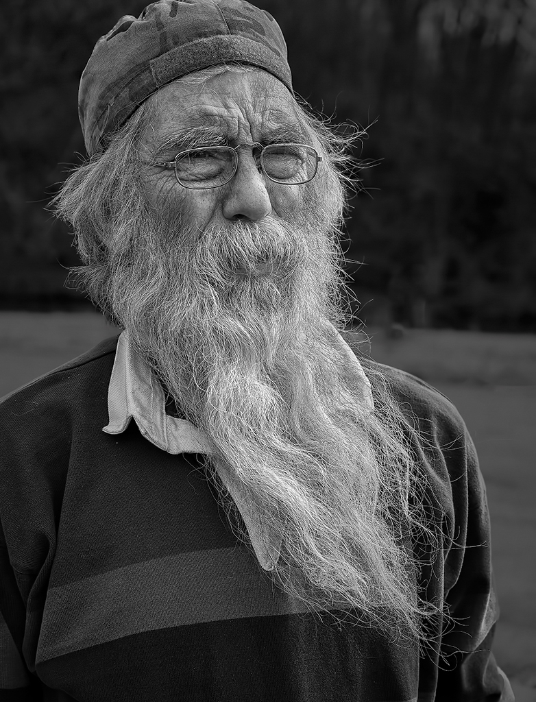
Pandula, I compared (side by side) my original image with the one you posted. The darkened background really brings out the man and his beard. Even though your image loses some of the "environmental context", I think I prefer it.
Thank you!
|
May 13th |
| 62 |
May 18 |
Comment |
Pandula, this is a striking image. I feels very three-dimensional. The shape of the concentric rings is great. Those and the fact that you can't see the path in front of him makes it appear that he's headed into a mysterious abyss. This is further accentuated by the fact that his left foot is off the floor which implies that he's moving forward.
I love the shape of the opening. It's like a keyhole which adds to the feeling of mystery.
Very intriguing and very well done.
|
May 10th |
| 62 |
May 18 |
Reply |
LuAnn, I also sometimes struggle with the question of "what's the primary subject?". Usually, the answer is obvious but at other times there really is no ONE subject... and yet the photograph still works.
Often I've heard "experts" say that you must first decide what your subject is and only then take the picture. Frankly, I think this is misleading. By playing with words you could describe the subject of a beautiful sunset picture as 1) the sun, 2) the color, 3) the environment... etc. However, I really think that asking "what's the primary subject?" is the wrong question. To me, the right question would be "Does this photograph give you strong feelings?". And, for Patrick's image the answer is YES... whether the primary subject is the child or the sun.
Naturally, these are only my personal thoughts/opinions and I am sure that others have differing views.
|
May 10th |
| 62 |
May 18 |
Reply |
Thank you, LuAnn. I like how you've brightened the man's face... it gives him even more character. However, to me the beard is now a little too bright. I'll play with the image and try to do the face brightening as you did.
About your "struggles to perfect Photoshop" -- It is an amazing piece of software. And, as you know, Adobe continues to enhance it. Although I've used Photoshop for many years (and even taught it to professional photographers), I find it a real struggle to completely master it. Once I feel like I've really got a handle on using a version of Photoshop, it gets upgraded again. Smiles... |
May 9th |
| 62 |
May 18 |
Reply |
Paul, unfortunately my original photograph had the same cropping. However, I'll certainly take your advice and "create" a bit more headroom. |
May 9th |
| 62 |
May 18 |
Reply |
Thank you Paul. |
May 7th |
| 62 |
May 18 |
Reply |
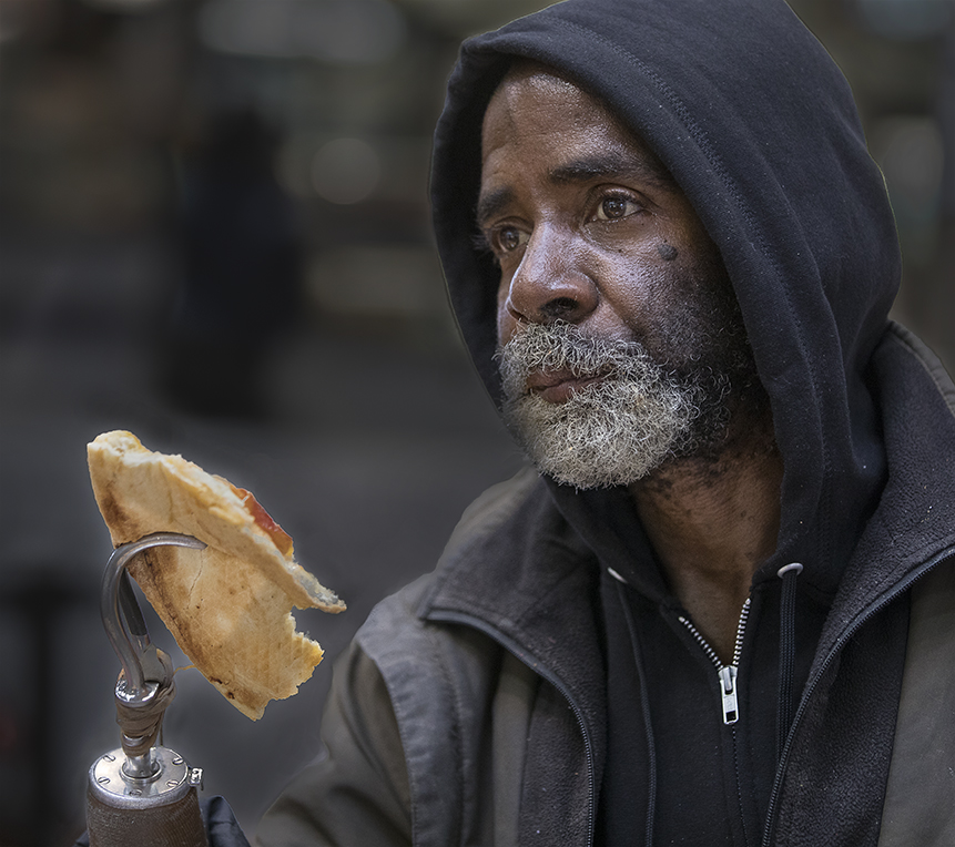
Hattie,
One of the aspects of a photograph that is important to me is its ability to evoke emotions in the viewer. The emotions can be wonderful (e.g., magnificent landscape or a laughing child) or uncomfortable feelings.... like the one I posted.
Here's one more, but I probably shouldn't continue posting new images that aren't even monochrome! Smiles. |
May 7th |
 |
| 62 |
May 18 |
Reply |
By the way, he asked me to take his picture.
|
May 4th |
| 62 |
May 18 |
Reply |
Paul, IMO is a general Internet abbreviation. It stands for In My Opinion. A derivation is IMHO which adds the word Humble. I wanted to jump in and define these abbreviations since it makes me feel younger than my mid-70's to be "hip". Whoops... I guess "hip" is dating me. LOL (Laughs Out Loud).
I like the idea of creating discomfort in images. I often do the same since it evokes strong emotions which are so essential to a meaningful image. Here's one of my favorite ones that I took in Baltimore some time ago. Forgive the fact that it's not monochrome.
|
May 4th |
 |
| 62 |
May 18 |
Comment |
Thank you Hattie. I took your advice and darkened the top of the image a bit, thus darkening his face and hat. I agree that it looks more interesting. Thanks again.
|
May 4th |
 |
| 62 |
May 18 |
Reply |
The Canon L lenses are definitely good. Nonetheless, it's very difficult to avoid distortion with a wide angle lens. But, Photoshop makes it easy to fix if you want to. Note that Hattie prefers your image with the distortion left in and it DOES help focus the viewer on the child.
In any event, it's an excellent photo!
|
May 3rd |
| 62 |
May 18 |
Comment |
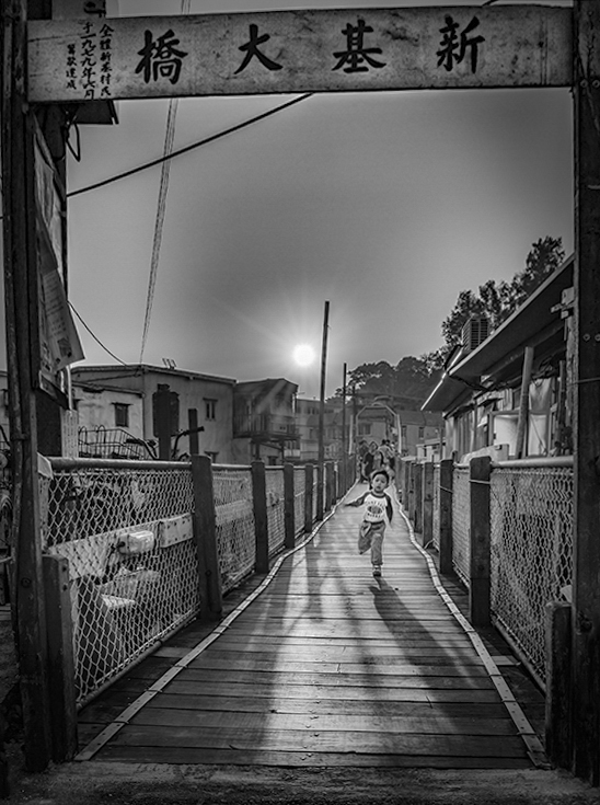
Patrick, this is a marvelous image. I think it works in both color and monochrome, though the monochrome seems better to me since the child doesn't have to compete with the yellow sun.
You really did well to capture the child running with a setting of only 1/20th of a second. I'm not sure that he/she is perfectly sharp (because of his/her movement), but it looks quite reasonable.
I wanted to see how your photograph looked with the wide angle distortion removed and with a bit more emphasis on the shadow. Please let me know if you like it or think that it's not a good edit.
|
May 3rd |
 |
| 62 |
May 18 |
Comment |
Paul, I absolutely agree with Hattie's comments. Your image demonstrates your excellent technical skills as well as a very creative concept. Your manipulation of the tonal gradations is outstanding.
Like Hattie, I find the flipped version more comfortable to view. The original makes me feel a bit disoriented which is, perhaps, your intention. Smiles...
Adding a curve to the staircase is a brilliant idea. It gives an element of suspense and makes the staircase destination even more intriguing.
Nicely conceived and executed!
|
May 3rd |
| 62 |
May 18 |
Reply |
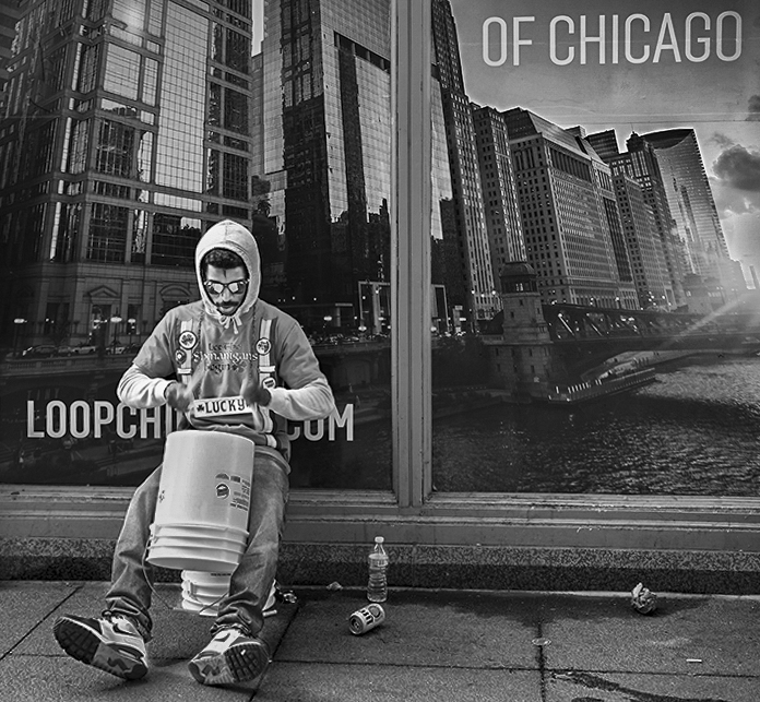
Actually, I think the inclusion of the words (particularly "OF CHICAGO") is very important to the picture. Whether the primary subject is the reflection or the drummer, the words are important. If the reflection is the subject, then "OF CHICAGO" almost POINTS to the images of the buildings. If the drummer is the primary subject, then "OF CHICAGO" provides an important balance to the image.
So, I personally would not consider removing it.
|
May 2nd |
| 62 |
May 18 |
Reply |
LuAnn, I've never used the Fuji X-T2 but the reviews of it are excellent! I would be excited too! Frankly, I think the industry will continuing its move to mirrorless cameras. I use a Canon 5D IV which I like a great deal. However, I am considering adding the new Sony a7iii, especially since the adapter to allow it to use Canon lenses is supposed to be excellent.
It will be fun to see what you think of the X-T2 and to see your pictures from it.
|
May 1st |
| 62 |
May 18 |
Comment |
Hattie, this is an intriguing image! The fact that you split it down the middle with the window frame makes it very different from typical pictures. It's wonderfully creative and unique.
Since the beer can and bottle lying on the sidewalk gave it some context, I played with the original a bit to see if including them would be a positive or negative change. I also changed the contrast a bit to make the drummer's face more visible.
I'm not sure if I like my edits. My changes lose some of the impact of having the window frame so dramatically split the picture into two parts. When I compare the results of my image with your submission, it's almost like two different photographs.
Your thoughts?
|
May 1st |
 |
| 62 |
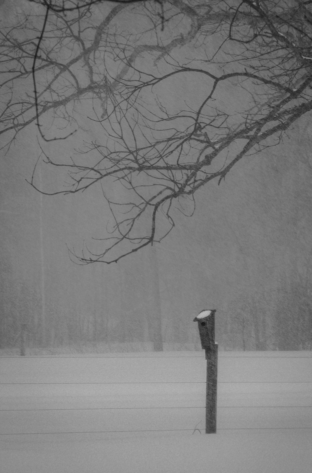
May 18 |
Comment |
It's a wonderful picture and, I totally agree, the isolated birdhouse gives it both simplicity and impact.... especially when it's surrounded by wintry snow. The impact is further enhanced by the fact that it's still snowing. Well done!
Was your camera handheld or did you use a tripod?
Naturally, I couldn't resist playing with your image. The dark, horizontal branch at the top was a bit distracting so cropped it out. Also, I wanted the birdhouse to be immediately recognizable so I added a subtle (hopefully) hole to its front.
Do you think my minor edits were beneficial?
|
May 1st |
 |
7 comments - 13 replies for Group 62
|
| 75 |
May 18 |
Reply |
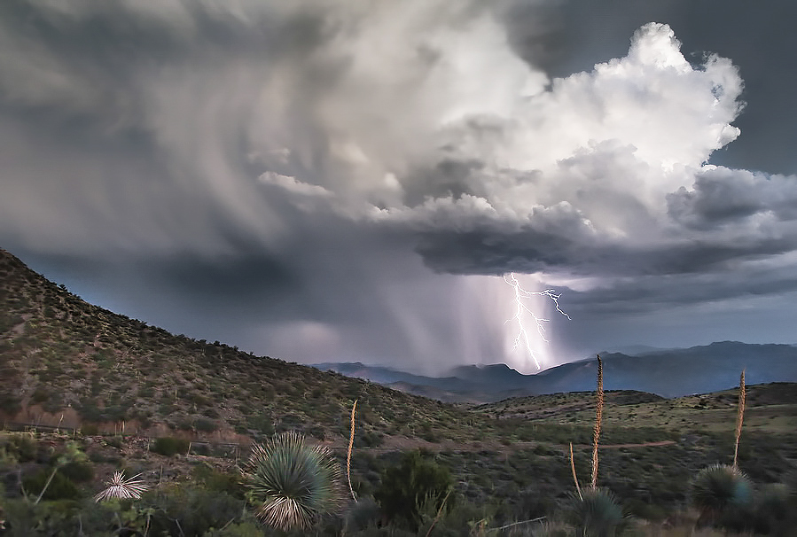
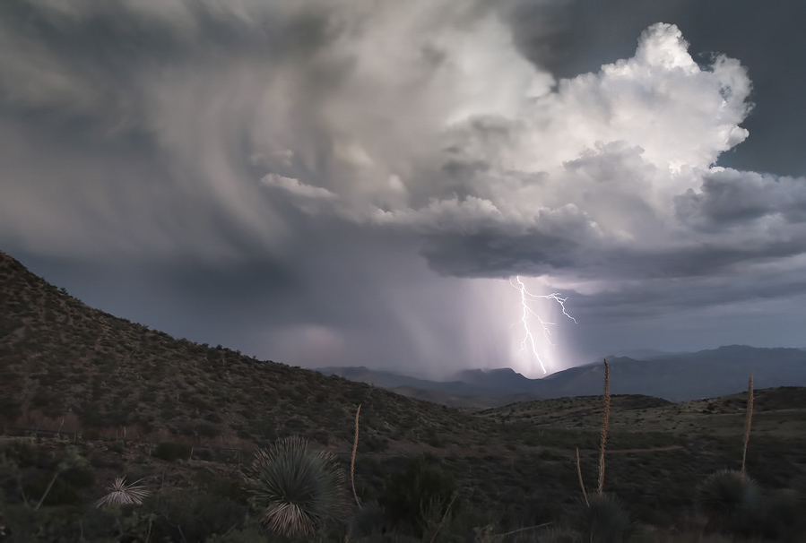
Good points about the foreground and the smaller strands of lightening. Here's a second attempt. |
May 26th |
 |
| 75 |
May 18 |
Comment |
I'm visiting from Group 62. This is a striking picture (no pun intended). I love the depth of field and the clouds... all of which complement the lightning strike. I hope you don't mind my playing with it a bit in Photoshop to see how it would look if it were even more dramatic. Here's what I came up with. Your thoughts? |
May 20th |
 |
1 comment - 1 reply for Group 75
|
17 comments - 19 replies Total
|


