|
| Group |
Round |
C/R |
Comment |
Date |
Image |
| 5 |
Sep 17 |
Reply |
Congratulations! I totally agree with the judge... it's an outstanding photograph! |
Sep 22nd |
| 5 |
Sep 17 |
Reply |
Good input. Thanks, Nick! |
Sep 20th |
| 5 |
Sep 17 |
Comment |
BTW John, one of the appeals (to me) of the first image was that it somehow reminded me of batman. :) |
Sep 20th |
| 5 |
Sep 17 |
Comment |
John, I have several others. Here's one that I like.... although there's still an out of focus flower in the foreground. |
Sep 20th |
 |
| 5 |
Sep 17 |
Comment |
Nick,
My viewer arrived today and I took a look at the images in Group 68. They're very cool. Your submission ("Mount Hood from the Air") was excellent. I was especially impressed with your approach to calculating the separation of the two 3D images. |
Sep 19th |
| 5 |
Sep 17 |
Reply |
Phil, I added just a tiny bit of contrast but I suspect that the additional white threads in her pants came from some additional sharpening. For this image one I used the AKVIS Refocus plugin. It's a wonderful picture of a darling little girl. |
Sep 9th |
| 5 |
Sep 17 |
Comment |
Richard, there's something I wanted to get your personal opinion about. If you're willing, would you please send me your email address? Mine is Oliver.Morton@yahoo.com. Thanks. |
Sep 8th |
| 5 |
Sep 17 |
Reply |
Thank you Nick. I just ordered a Pixi 3D viewer from the site you suggested. |
Sep 4th |
| 5 |
Sep 17 |
Comment |
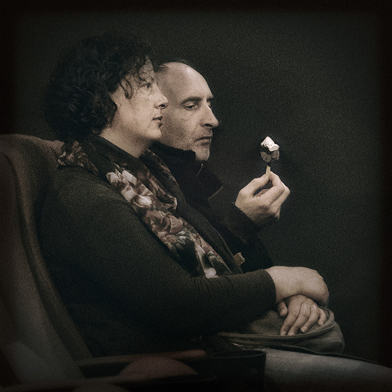
David, you've done a brilliant job (as usual) finding the picture within the picture. You're right, the man's expression and the fact that he seems to be studying the ice cream is amazing and is emphasized by the fact the the woman's gaze is totally straight ahead and expressionless. I love how you've isolated the two people from their surroundings... and the grain is absolutely perfect for this image. It's incredibly well done.
I wanted to separate the two faces a bit but I don't know if it makes any difference to a fantastic picture. Here's what I came up with (it's quite subtle).
|
Sep 4th |
 |
| 5 |
Sep 17 |
Comment |
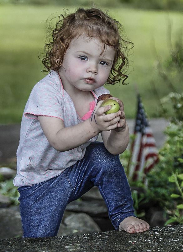
Phil, she's such an amazing child and I love her expression! Well captured!
I feel that the background is a bit distracting so I cropped the image even more. I attempted to have her bare foot plus the flag and fruit balance her face which is clearly the center of attention. I also tried to add just a bit more color to her cheeks.
Your thoughts?
|
Sep 4th |
 |
| 5 |
Sep 17 |
Comment |
Nick, I took a look at your other group and was very intrigued by the images. I attempted doing the "trick with my eyes" to obtain the 3D effect but it was only moderately successful. Thus, I thought I'd see about getting a pair of glasses for 3D viewing. Do you have any recommendations or advice? THANKS!
|
Sep 3rd |
| 5 |
Sep 17 |
Comment |
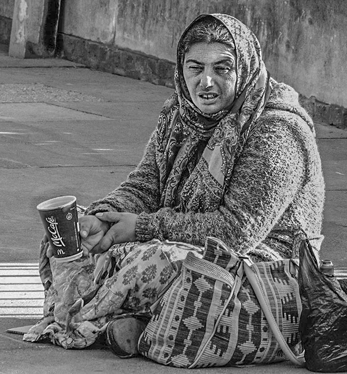
John, I like this a lot. Her face tells a story of a hard life. And her cup really emphasizes her plight. Well done.
I tried reducing the highlights a bit and cropping some on the right since much of that space didn't seem to contribute to her expression. Your thoughts?
|
Sep 2nd |
 |
| 5 |
Sep 17 |
Reply |
Barbara, thank you. I like this technique a lot since it gives a great deal of control over the location and amount of sharpening. I especially like using the mask to remove any resulting haloing. Unfortunately, I think the crux of my problem is that I hurry too much and therefore don't pay enough attention to the results of my sharpening. |
Sep 2nd |
| 5 |
Sep 17 |
Reply |
Thank you Richard. And, you're absolutely right... I looked more closely and see the halos. (Rats!) I find that I have a tendency to over sharpen when I'm working with fairly low resolution jpegs. THANK YOU for pointing it out!
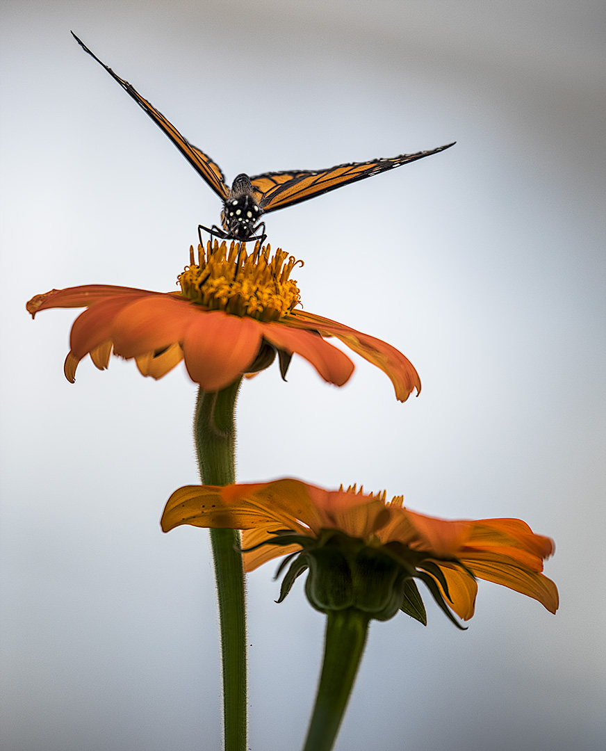
Taking butterfly pictures is made much easier here since there is a multi-month butterfly house that's open each summer (called Wings of Fancy). The only problem with it is that it's often filled with little kids who manage to keep the butterflies moving. |
Sep 2nd |
| 5 |
Sep 17 |
Comment |
Nicely done. I like your imagination and your use of the composite to reflect it. I'd love to learn about 3D software. That sounds like my next challenge. Thank you for showing what can be done with it. |
Sep 2nd |
| 5 |
Sep 17 |
Reply |
Richard, the flaw isn't in your monitor but rather in my modifications. I hdidn't pay enough attention to the impact of the exposure increase and so I didn't notice that I had burned out the woman's glasses. So, it's clear that your monitor continues to serve.... smile.
The change in color of the blue pad was intentional (which does NOT mean that it was beneficial). I was following David's concept of emphasizing only those image components that enforce the main subject. For me, the pin cushion was important (and hence, I left some of the color in it) but the blue pad wasn't a key element.
|
Sep 2nd |
| 5 |
Sep 17 |
Reply |
Thank you Richard. I really like your original photo but I can never resist "playing" with an appealing image since that seems like a great way to learn (and besides, it's fun).
I definitely agree that the study group is really "eye opening". It has been fantastic to get feedback on my photographs and to read the input received on others' pictures. Occasionally (but rarely) I've run into people who assume that I'm criticizing their work when I suggest even the smallest tweak to their images. This clearly is NOT a concern within our group. The interactions of the members is positive and stimulating. I attribute a lot of that to the environment of communications that Barbara has established and the talent and contributions of the longterm members. |
Sep 2nd |
| 5 |
Sep 17 |
Comment |
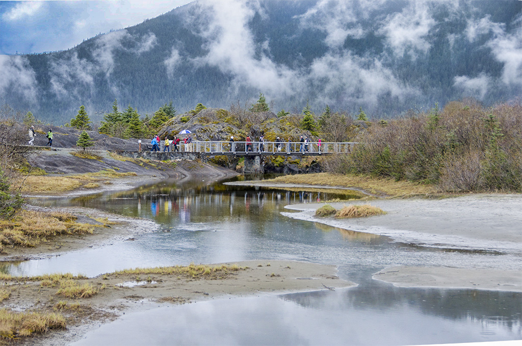
Wow! What a fantastic location... and I love the clouds that seem almost like steam rising. They give a great background to the bridge. The reflections in the water are quite interesting. I played with the photo a bit to see if pulling out the trees in the distant mountain and giving a bit of blue sky would be useful. Also, I use camera raw's adjustment brush to "dehaze" the water somewhat... in hopes of further showing the reflections. Your thoughts?
|
Sep 1st |
 |
| 5 |
Sep 17 |
Comment |
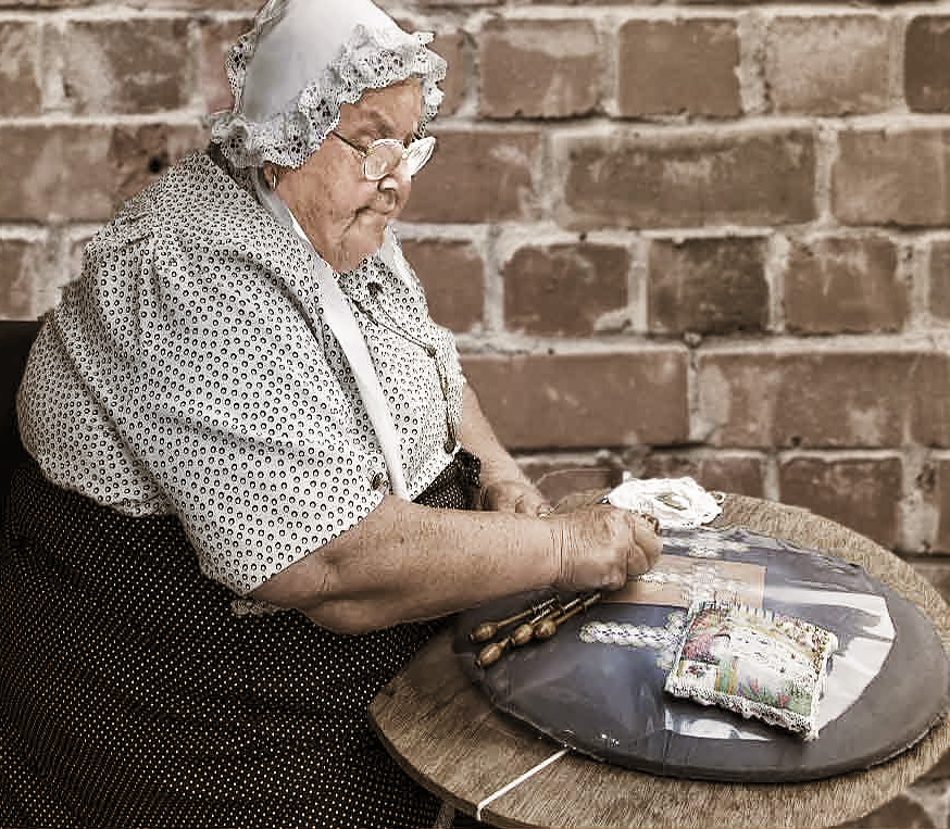
I only did the smallest bit of sharpening. On my monitor it is slightly visible in her shirt and skirt. I used the PS smart sharpening tool with an amount of 238% but a radius of only 0.1 pixels and noise reduction of 14%. |
Sep 1st |
| 5 |
Sep 17 |
Comment |
Barbara, I love this image and your choice of a background is perfect. Well done! However, sticking with the "David emulation" concept I played with it a bit. Naturally, in honour of David, I used the NIK paper toner filter (smiles). I also did a tiny bit of cropping on the left and gave her a touch more sharpening.
What do you think? |
Sep 1st |
 |
12 comments - 8 replies for Group 5
|
12 comments - 8 replies Total
|


