|
| Group |
Round |
C/R |
Comment |
Date |
Image |
| 2 |
Aug 17 |
Reply |
Hung, I'm very glad you and your wife are okay. It's very good of you to help those who are having difficulties. |
Aug 28th |
| 2 |
Aug 17 |
Comment |
I am visiting from Group 5 but stumbled on this stunning photo and Hung's work and reply. Hung, I noticed that you live in Houston and I sincerely hope that the horrible flooding hasn't been too difficult for you and your family. I wish I could do something to help the people of Houston... as I'm sure many folks do. |
Aug 28th |
1 comment - 1 reply for Group 2
|
| 5 |
Aug 17 |
Reply |
John, thank you for the comments/compliments. After re-looking at the image I agree that the green B/G is a bit overwhelming. Thank you for pointing this out! |
Aug 29th |
| 5 |
Aug 17 |
Reply |
Nick, I just gave this a try and it's a great way to make simple borders. Naturally, I found that I need to adjust the inside stroke position depending on the resolution of my image... but it was exactly what I needed for an image of my grandson. Thank you! |
Aug 23rd |
| 5 |
Aug 17 |
Reply |
Very cool. I'll try Nick's approach and may also use the AC Flexible Frames. At $19.95 they seem like a good value. Thank you! |
Aug 23rd |
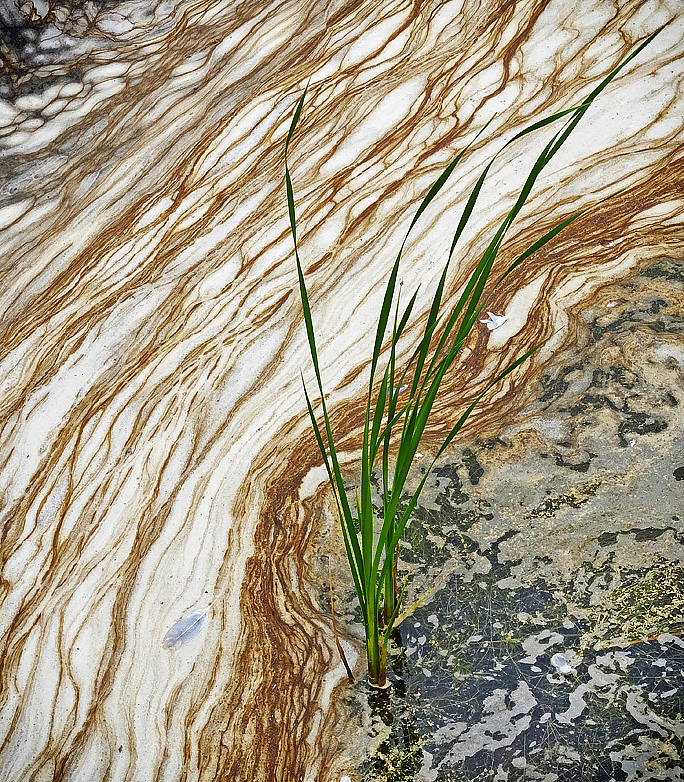
| 5 |
Aug 17 |
Reply |
Thank you Nick. I like the border and will have to start thinking of trying them. However, like Barbara commented below, I prefer the uncropped image since I feel that the twisting length of the reed adds direction and interest to the photo.
Which software do you like for creating borders?
Thanks again.
|
Aug 22nd |
| 5 |
Aug 17 |
Comment |
Whew, it's very hard to make a woodcutting picture! Like Barbara I felt that the grey was too light. Also, it seems to me that the image is quite complex for a woodcutting... though I really have no experience in that area. Nonetheless, I took a stab at it. I'm not sure that I improved it. What do you think? |
Aug 10th |
 |
| 5 |
Aug 17 |
Reply |
David, I reread your comment and realize that you told me that Paper Toner was within the Color Efex Pro 4 group of filters. (Some day I'll learn to read carefully!) As I started looking through these filters I was amazed at the treasures they contain. I'm sure you're fimiliar with them but for anyone who isn't there's an excellent overview of each one on youtube.com. The series of short videos is found by searching youtube with "55 Filters in 52 Weeks". I hope this is helpful to someone. |
Aug 9th |
| 5 |
Aug 17 |
Reply |
David, I couldn't agree more with your observations on the biases of some judges. Several times I've seen judges dismiss pictures because they have some personal objection to the specific content. One judge blatently stated (before beginning to judge) that he didn't like cats so he was giving "fair notice" that any picture that included a cat was very unlikely to do well. Perhaps there should be a forum for judging judges! |
Aug 9th |
| 5 |
Aug 17 |
Reply |
Thank you so much, David. Your complements mean a great deal to me. |
Aug 9th |
| 5 |
Aug 17 |
Reply |
I use the NIK filters fairly often and was surprised to find that I didn't have the Paper Toner one. After a bit of research I think I've found the answer to the delimma -- it is one of the 55 filters within the NIK Color Efex Pro 4 group of filters. And, it's one that I have never experimented with. THANK YOU for pointing it out. It really looks useful. |
Aug 9th |
| 5 |
Aug 17 |
Reply |
Very nicely done... and, I agree that it helps. As an extraordinary photographer once indicated -- all components of an image should support (not detract) from the primary area of interest. The "speaker" was someone named David Cooke. :) |
Aug 9th |
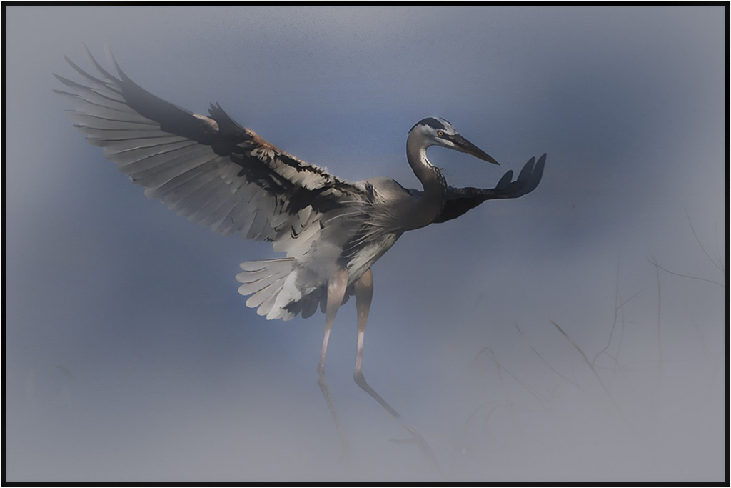
| 5 |
Aug 17 |
Reply |
Richard,
I like your edits better than mine. Brightening the Heron was excellent. Nicely done.
|
Aug 8th |
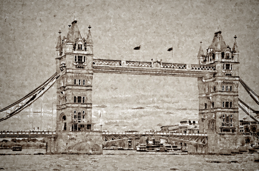
| 5 |
Aug 17 |
Comment |
Richard, this is one of the few "ancient photographs" I've seen created in Photoshop that truly look authentic. The composition is outstanding and the subject is perfect for the affect. Very nicely done... a very appealing image!
|
Aug 4th |
| 5 |
Aug 17 |
Comment |
David, I like the subtle colouring of the potter and the lighting of his face is outstanding. Without seeing the intensity of his focus a lot of the impact of the photo would be lost. Did you consider darkening and simplifying the bottom left corner?
I'm not familiar with a "Paper Toner layer". Can you explain it or point me to a place to read about it? (A quick Google search didn't turn up any useful information.)
As usual you've created a work of art out of a photograph. Extremely impressive!
|
Aug 4th |
| 5 |
Aug 17 |
Comment |
It was clearly a Chinese dragonfly. :) |
Aug 1st |
| 5 |
Aug 17 |
Comment |
I've noticed that L to R is preferred for some reason. I wonder if the same is true in countries that drive on the left (David?). In any event I felt that the reed led the eye straight to the dragonfly and that the pink somehow anchored it.
Thank you for the nice complements! |
Aug 1st |
| 5 |
Aug 17 |
Comment |
What a great capture! The cropping is perfect and you couldn't have found a better moment to take the picture. The focus is impressive.... especially given the fact that the early morning light was soft and there was obviously lots of movement. Nice!
Naturally I couldn't help playing with it a bit. I removed the portion of the reed that reached up toward the Heron and also played with the contrast and the camera raw dehaze a bit. Your thoughts? |
Aug 1st |
 |
| 5 |
Aug 17 |
Comment |
What a great action shot! Barbara I played a bit with the cropping but couldn't find anything that I liked as well as yours. I also tried slightly darkening the water while slightly increasing the highlights but this also didn't work very well.
In short, I think you've got an excellent photograph that I have no suggestions for changing. Nicely done. |
Aug 1st |
| 5 |
Aug 17 |
Comment |
Phil, that's a great action shot. I really like the player looking in from the upper corner. But what really makes it unique is the expression on the main player's face and the fact that he's almost mimicing the expression of the tiger on his shirt. Very nice!
I tried a small additional crop on the bottom, some darkening of the background and some additional sharpening on the main hockey player's face. What do you think? |
Aug 1st |
 |
8 comments - 10 replies for Group 5
|
| 8 |
Aug 17 |
Reply |
Alastair,
I'm visiting from Group 5 and ran across this image. WOW! It's an amazing capture. Beautifully done. Naturally, I couldn't help playing with it a bit. I hope that's okay.
The photo made me think of blood flowing through the body... though the plant and feather bring it back to a more normal environment. Here's what I came up with. Your thoughts?
- Oliver
|
Aug 16th |
 |
0 comments - 1 reply for Group 8
|
9 comments - 12 replies Total
|


