|
| Group |
Round |
C/R |
Comment |
Date |
Image |
| 5 |
May 17 |
Reply |
Nick, thank you for the welcome!
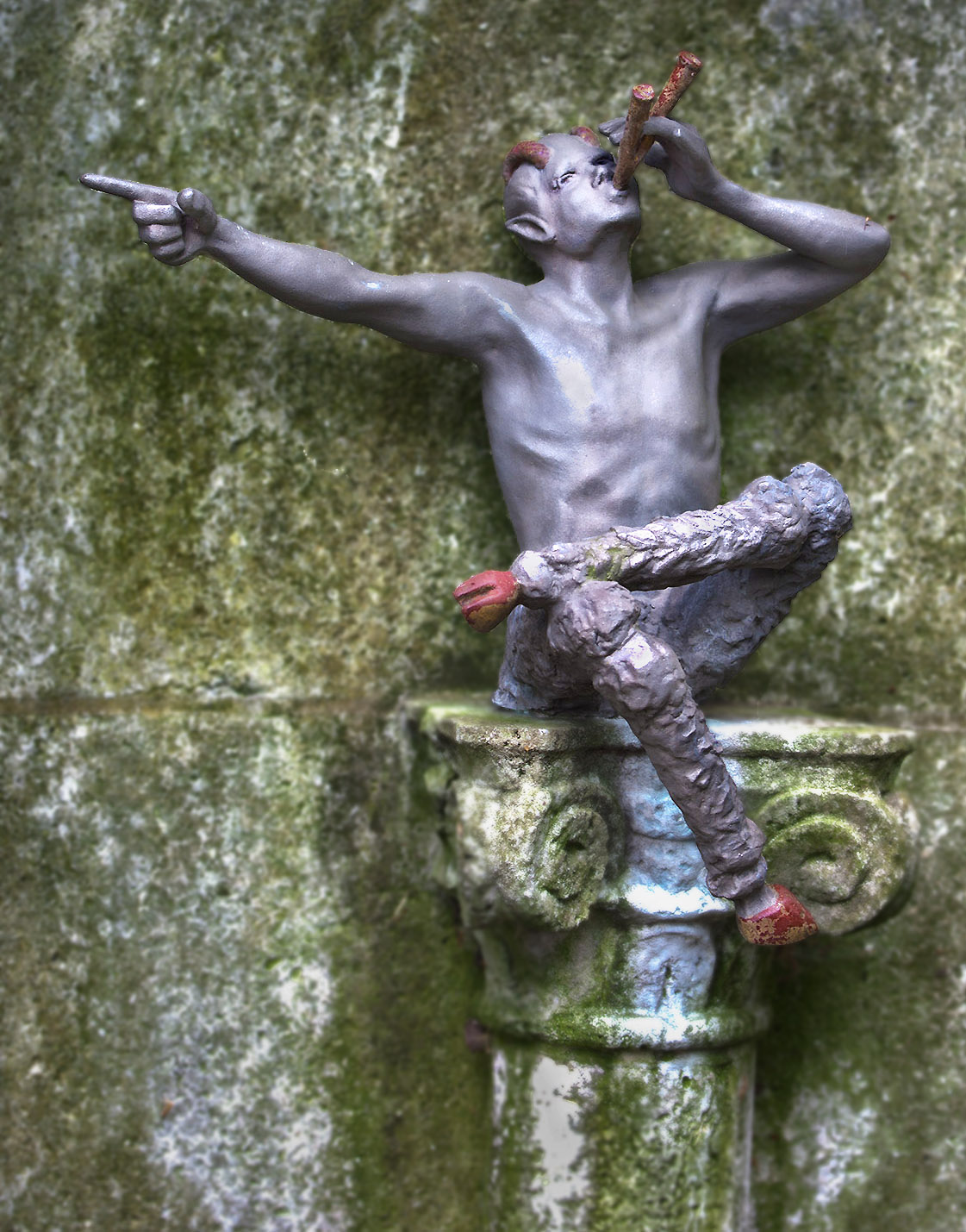
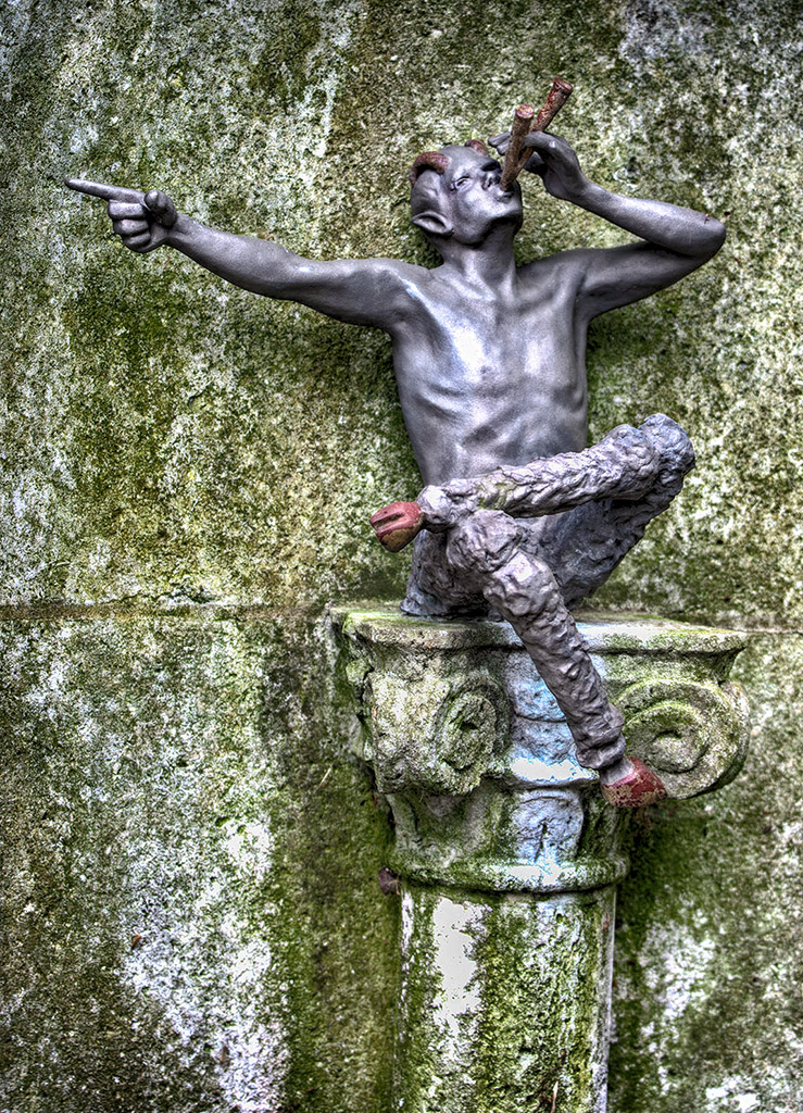
I actually made a number of changes in the image that appear in my post on 5/20 (e.g., blurring the BG and changing the contrast in addition to cropping). However, I've also reduced the brightness of the spot on Pan's chest as you suggested (image below). Does this help?
Thanks for your comment/suggestion! |
May 22nd |
 |
| 5 |
May 17 |
Comment |
David, I'm not fond of this manipulation since I keep thinking of "iron filings on paper over a magnet" that we did in high school physics. However, simplifying and emphasizing the stairs is definitely a plus. Here's another possible approach to that. |
May 21st |
 |
| 5 |
May 17 |
Comment |
I agree that some images are enhanced by a sense of "mystery". Your "A Sad Moment" is an excellent example of this. It leads the viewer to wonder what caused the man to be 1) alone and 2) apparently sad.
However, it seems to me that there are many outstanding images that don't evoke questions. My goal is to engender feelings, emotions and/or thought in the viewer. The feelings can be wonder, delight, memories or simply a sense of peace. |
May 20th |
| 5 |
May 17 |
Comment |
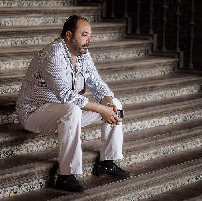
BTW, I realize that I didn't crop the bottom as much as you suggested; however, I wanted to give a feeling that he is sitting on a fairly high column. |
May 20th |
| 5 |
May 17 |
Comment |
David, I've incorporated many of your comments in the image below. I also added just a touch of additional light to Pan's face and a few of the darker areas of his body.
I agree that it would be very advantageous to be able to show what the figure is pointing at. (Similar to Richard's comments that it would have been good to see the path that Pan was indicating.) Unfortunately, the location made this impossible.
Thank you for your comments!
|
May 20th |
 |
| 5 |
May 17 |
Comment |
Very nice modifications David. The cropping works well but the work you did within the ball image is especially appealing to me. Now it feels like an invitation into an attractive alternative world. |
May 19th |
| 5 |
May 17 |
Reply |
Yes, I like this much more than the original. Thank you for your observations!
Unfortunately, there was no way to include the path since there was a thick bamboo grove in the way. |
May 18th |
| 5 |
May 17 |
Comment |
Wow, what a massive undertaking. You're pictures provided a huge amount of information... the more I looked, the more I saw. Also, the video was fascinating. |
May 16th |
| 5 |
May 17 |
Reply |
Thank you Richard. I appreciate your input. Frankly, I hadn't thought about the fact that the image was of someone else's art. That's something that I typically avoid since I agree that it's not generally appropriate.
I actually use the NIK and Topaz plugins fairly liberally. More recently I've been mostly using the PS Camera Raw filter. The brush tool is incredibly handy. Nonetheless, for this image I took your suggestion and applied one of the NIK adjustments (attached). Does it look less flat now?
BTW, I'm not sure what you meant when you asked "Is there a POV that would depict what you wrote in 'How I Did It'?". If you'll elaborate I'll try to respond.
Thanks again. |
May 16th |
 |
| 5 |
May 17 |
Comment |
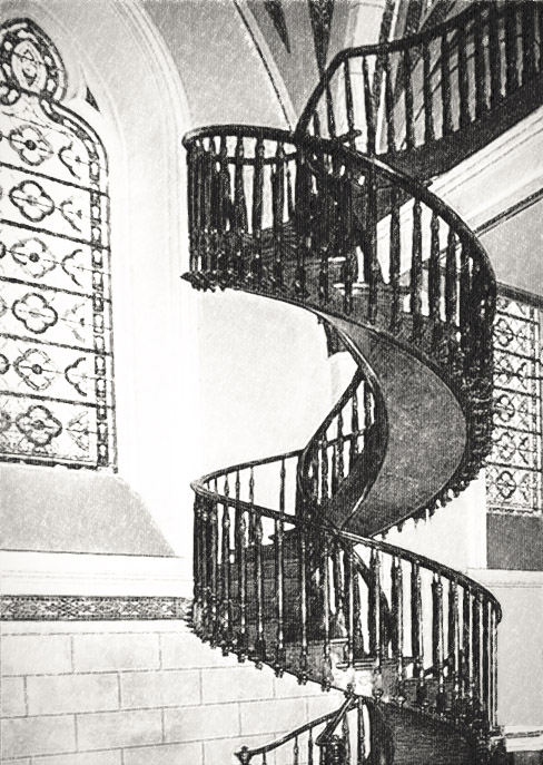
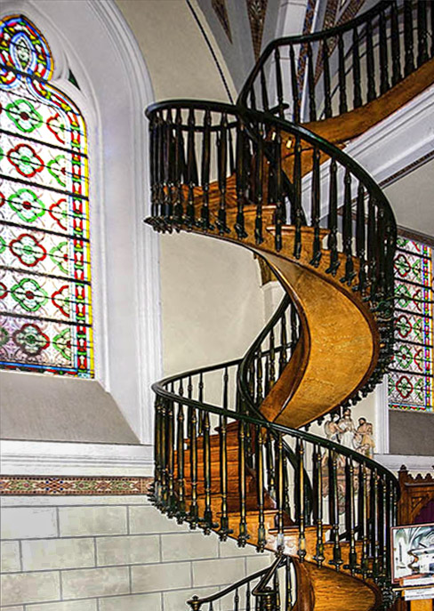
Oh, I forgot to mention that I also darkened the wall and window frame to allow the stairs to stand out a bit more. (I did a lousy job with the wall since I left it "splotchy" but you can get the idea.) Also, I added a bit of saturation to the beautiful wood of the stairs since I wanted to highlight it. |
May 13th |
| 5 |
May 17 |
Comment |
John, I like your composition with the stained glass windows on both sides of the stairs. However, I find the angle of the pews somewhat disturbing. Like Phil, I played with the perspective warp tool but mine didn't work out as well as Phil's did. Thus, I tried another approach... cropping out the pews and making the image about the stairs with only the windows providing context. Mine certainly is a different picture than the original. What are your thoughts?
|
May 13th |
 |
| 5 |
May 17 |
Comment |
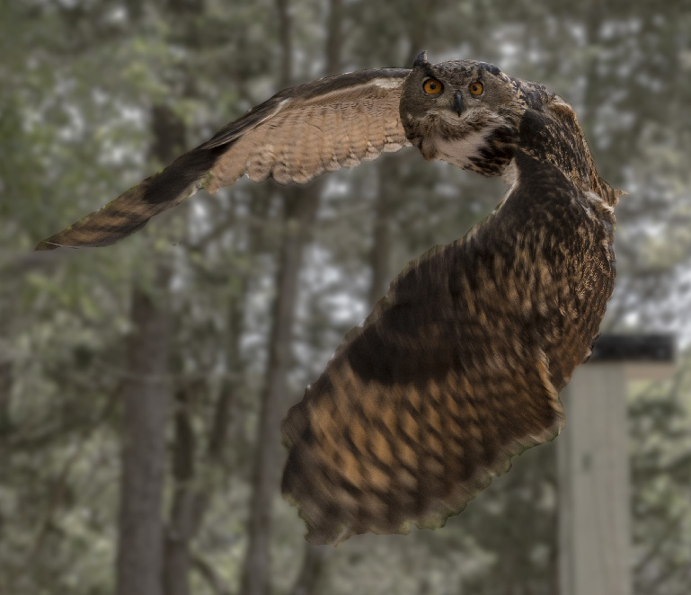
Richard, this is a beautiful "catch". Having the owl look directly at the camera gives the photo a dramatic feeling. I liked the way you cropped the image and the fact that you cloned out the post and light areas (though your cloning shows a few repeating patterns that could be eliminated). I agree that the background is too busy but the blurred wing tips don't bother me at all... they give motion to the photo.
I did a quick selection of the own and then desaturated and blurred the background. Also, I used curves to reduce the contrast. Note that I started with the original image so I didn't have the advantage of your work to eliminate the post. Do you think it looks too unnatural?
|
May 13th |
 |
| 5 |
May 17 |
Comment |
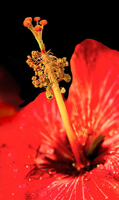
Barbara, in looking at the changes I made I realize that I made a mistake. When I lowered the saturation I should have only lowered it for the red flower pedals. I should not have lowered the saturation of the stamens, etc. alone. |
May 12th |
| 5 |
May 17 |
Comment |
Phil, I think the fact that you inverted the image is brilliant. Initially I felt that the cropping could have been tighter but after thinking about it further, I think it's exactly right as is. In fact, it's the "non-crystal ball" portions of the photo that allow one to realize that it's upside down. I also like the fact that you have the crystal ball touching the bottom of the frame. That makes it feel even more properly oriented.
Well done! |
May 12th |
| 5 |
May 17 |
Comment |
Barbara, removing the white behind the base of the stamens REALLY made a huge difference since it immediately attracted the viewer's eye. Also, eliminating the green in the background allowed the stamens to be the center of attention. Additionally, brightening the stigma (if that's what it's called) really made it "sparkle".
However, I do agree with John that the red color is overwhelming. I made a couple of changes in the attached image. First I cropped a bit tighter and made the stamens become a very strong diagonal for the image. Then I lowered the saturation of the flower just a bit and also made the red flower that's behind the main one less "intrusive". Unfortunately, in doing the additional cropping I lost the border that you had... which I liked.
Do you think the changes are worthwhile? |
May 12th |
 |
| 5 |
May 17 |
Comment |
David, I love the image and what you did with it. Not only does the man's expression convey what he's feeling, but the lines of the steps and rail provide an interesting (but not distracting) background.
I downloaded the picture and tried a couple of additional things. Specifically, I cropped it a bit further and lowered the highlights some. Then added just a tiny amount of contrast. Do you think the changes are beneficial or do they detract from what you intended? |
May 12th |
 |
13 comments - 3 replies for Group 5
|
13 comments - 3 replies Total
|


