|
| Group |
Round |
C/R |
Comment |
Date |
Image |
| 41 |
Jul 17 |
Reply |
I tried more contrast... it was good, but, lost a lot of the hairline marks on the image. Eventually, I'll figure out how to keep them. |
Jul 25th |
| 41 |
Jul 17 |
Reply |
Thank you! |
Jul 22nd |
| 41 |
Jul 17 |
Comment |
Totally awesome!!! Great imagination! Yes, do add the smoke. |
Jul 21st |
| 41 |
Jul 17 |
Comment |
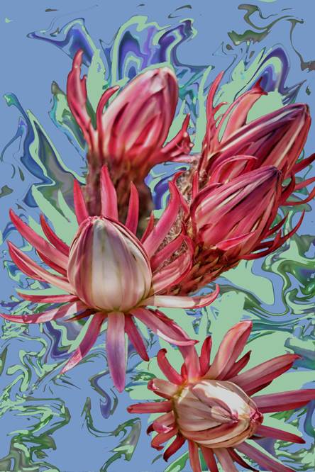
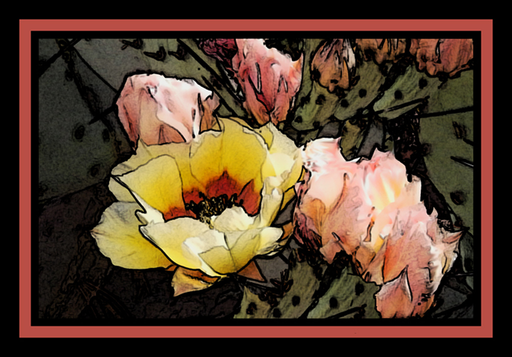
I agree with everyone else... Great job! Beautiful colors!
I would have put some shading/darken on the petal where it is overlapped by the other petal to give it some depth. But, that's me. |
Jul 21st |
| 41 |
Jul 17 |
Comment |
Love the texture/detail in the tree.
The bird could use a bit more detail.. it's just a little flat.
I would darken the background on the bottom (left and right sides); not quite as dark as the original. It would keep the eye focused on the tree & bird. |
Jul 21st |
| 41 |
Jul 17 |
Comment |
I agree with Natalie and Carolyn, except for the vignette. Do take out the waterfall or blend it in with the rocks. As for Tony's comment about brightening, not so sure. I think I would have made the glass more transparent (not too much more). Just enough to see the shape of the mountains better.
It is a great idea. |
Jul 21st |
| 41 |
Jul 17 |
Comment |
I love it! I also like your explanation because I do the same thing. I don't plan it... it just comes |
Jul 21st |
| 41 |
Jul 17 |
Comment |
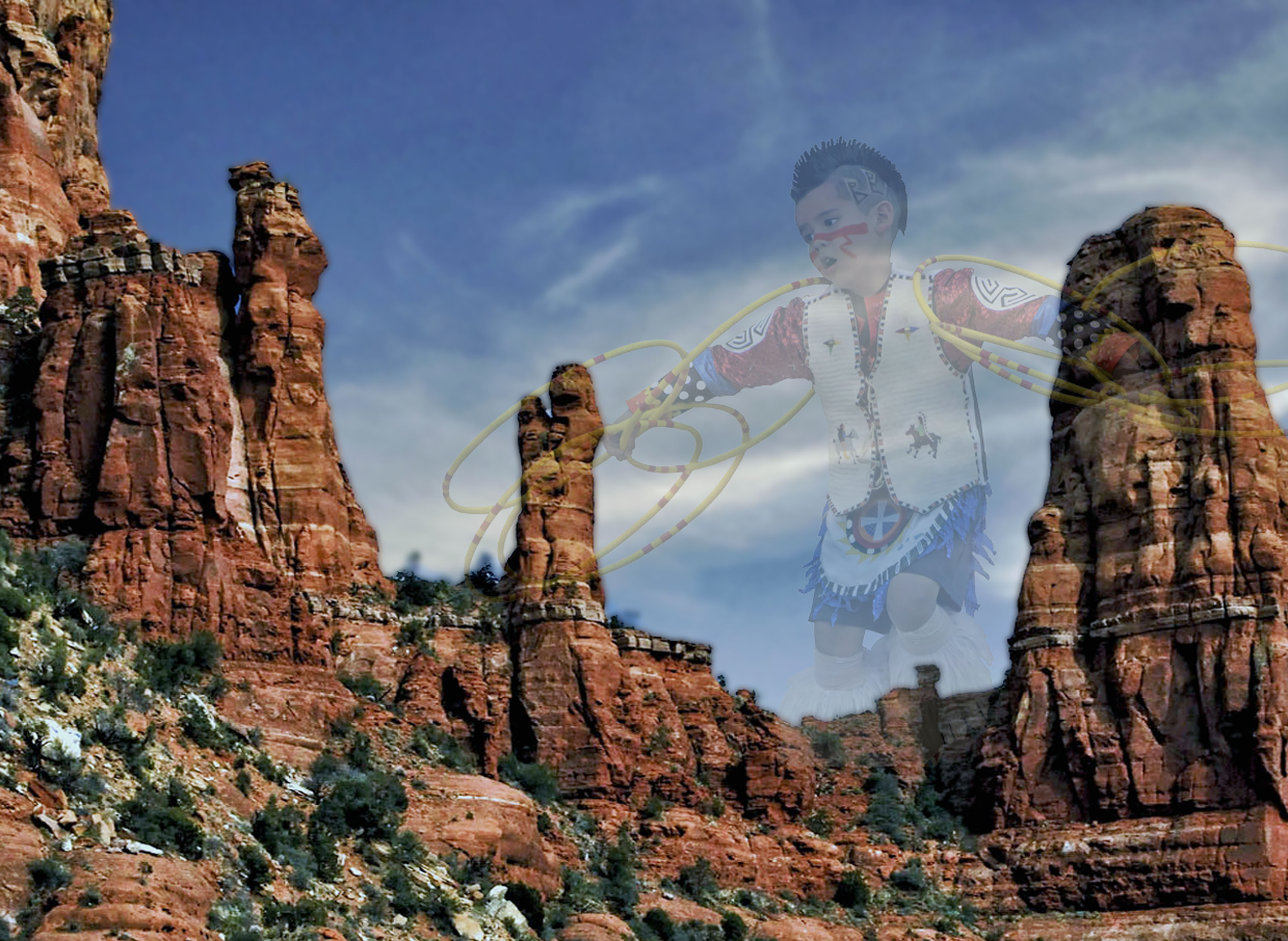
Wonderful action and the background exemplifies the energies from participants and fans. |
Jul 21st |
| 41 |
Jul 17 |
Comment |
Thank you |
Jul 21st |
7 comments - 2 replies for Group 41
|
7 comments - 2 replies Total
|