|
| Group |
Round |
C/R |
Comment |
Date |
Image |
| 58 |
Aug 17 |
Comment |
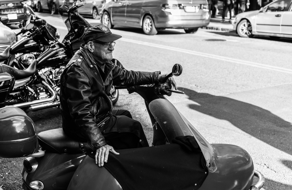
There is probably one more major thing wrong with this image. Most people will not understand the reference to "The Wild One" film from 1953. (BTW, I was eight years old when the movie was released.) Without an understanding of the reference, the image is a shot of an older gentleman on a scooter with a sidecar. Interesting, but without much impact. There's not much to contemplate and there's no emotion evoked. Lack of impact is the most serious flaw with this image. A judge would look at this and go, "Meh!" In fact, a judge did look at this and go, "Meh!" |
Aug 23rd |
| 58 |
Aug 17 |
Reply |
I agree. |
Aug 22nd |
| 58 |
Aug 17 |
Reply |
I understand your edit. In this case I think that your change in lighting looks too artificial. My eye tells me that the subject is in shadow, but the lighting adjustment says something contradictory. My choice was to leave the lighting alone and I used a personal preset that I developed that tries to separate the subject from the background. In this case I thought that it created almost a silhouette of the subject against the background. Your edit might work better if something was also done to the background. I like the textures and detail created in your edit, but personally can't reconcile with the lighting of the scene. |
Aug 22nd |
| 58 |
Aug 17 |
Comment |
The separation of the subjects from the background by the bokeh is a nice effect. I would prefer more saturated colors, particularly in the foreground and in the subjects. The foreground part of the image would be more prominent and enhance the effect. I think that can be done while retaining the natural appeal of the image. |
Aug 22nd |
| 58 |
Aug 17 |
Comment |
This may have been better in ambient light. The stained glass above the altar may have provided a dramatic light and may have added more colors. That may also have provided a slight backlight for the person that may have helped to separate him from the background. As shot, the colors are a bit flat and the richness of the wood altar doesn't really show very well. |
Aug 22nd |
| 58 |
Aug 17 |
Comment |
Thinking out loud, I'm wondering if a shot over the man's shoulder would have been better. It would have been into the sun, but that may have created an interesting ethereal flare. As shot, I'm not bothered so much by the trees and some of the exposure issues as by the large area of empty sky. A panoramic crop and selective color highlighting the man and the kite might mitigate all of the issues. I think that would show the humor in the image: the kite is an angel and the person is shielding his eyes as if from the brightness of the angel from heaven. Selective color would make that pop out. |
Aug 22nd |
| 58 |
Aug 17 |
Comment |
Initially, I thought the position of the people at the sides of the frame were distracting. However, I think this works because my attention is drawn to the house. The parts are uneven: the rafters, the sheets of corrugated metal, the windows. It's clearly a dwelling assembled from scraps out of a need for shelter. The people show the scale of the structure and add a human presence. Nice composition. |
Aug 22nd |
| 58 |
Aug 17 |
Comment |
The textures are very nice: the angry clouds and rough sea. You were able to capture his mood from a very close proximity without disturbing his thoughts. It would have been a shame if he had turned to face your camera with a big smile! The tone is also nice since it keeps the focus on the subject rather than color. |
Aug 22nd |
| 58 |
Aug 17 |
Comment |
Nice composition. I like the simplicity and the shapes. The only life is two people sitting on an island contemplating the concrete sea. Nicely seen and captured. |
Aug 22nd |
7 comments - 2 replies for Group 58
|
7 comments - 2 replies Total
|