|
| Group |
Round |
C/R |
Comment |
Date |
Image |
| 64 |
Apr 24 |
Reply |
hanks, Jerry. Driving the eye with tone and contrast was my aim, so I'm glad the picture is liked. |
Apr 29th |
| 64 |
Apr 24 |
Reply |
Thanks, John. I think this image is quite liked by our group. More will follow! |
Apr 29th |
| 64 |
Apr 24 |
Reply |
Thanks, Chris. I'm glad you like it. I was wondering if I'd over-done this, although I often see images processed like this in books and magazines, and I'm glad that you and the others think it's OK. |
Apr 29th |
| 64 |
Apr 24 |
Reply |
Thanks, Stan. Yes, I'm sure many stories could be told about them.
I suspect the white spots are bird droppings.
|
Apr 29th |
| 64 |
Apr 24 |
Reply |
Yes, I'd agree. I think I had the brightness of a daffodil in mind. I don't advocate sepia flowers, it was just my imagination going after being prodded by your mono. It could be a yellow mono of course.
I've recently been reading about the Victorian photographer Frank Sutcliffe, much of his work was wet collodian and sepia tones. I got some prints from the museum at Whitby where he was a curator towards the end of his life, as well as a professional photographer. They have hundreds of his photos on display. His sepia tones make mine look dull and false, so I've been trying to improve my sepia conversions.
I've still got some way to go!
|
Apr 12th |
| 64 |
Apr 24 |
Reply |
Thanks, Don. Even darker if you turn left at the top.... |
Apr 11th |
| 64 |
Apr 24 |
Reply |
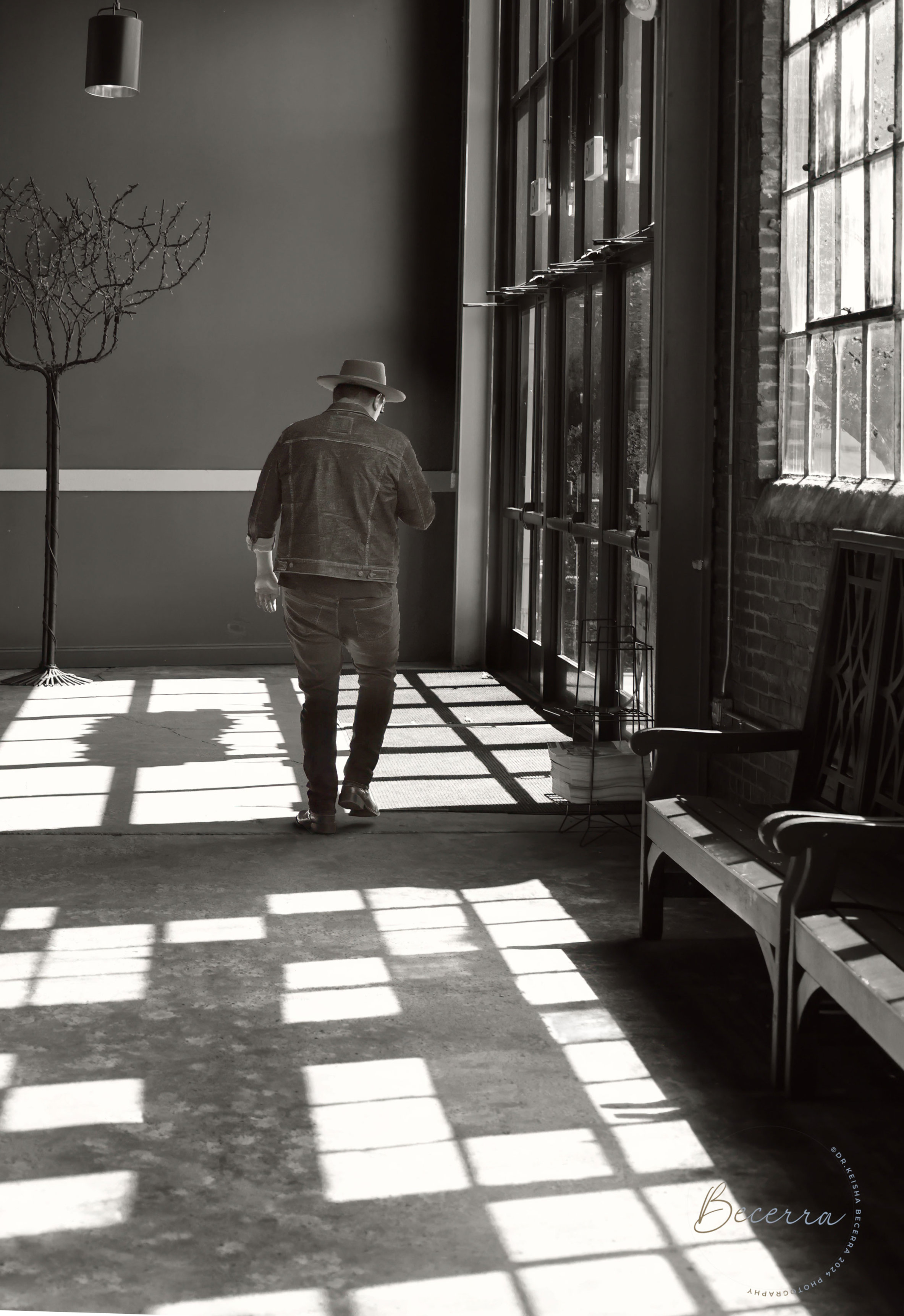
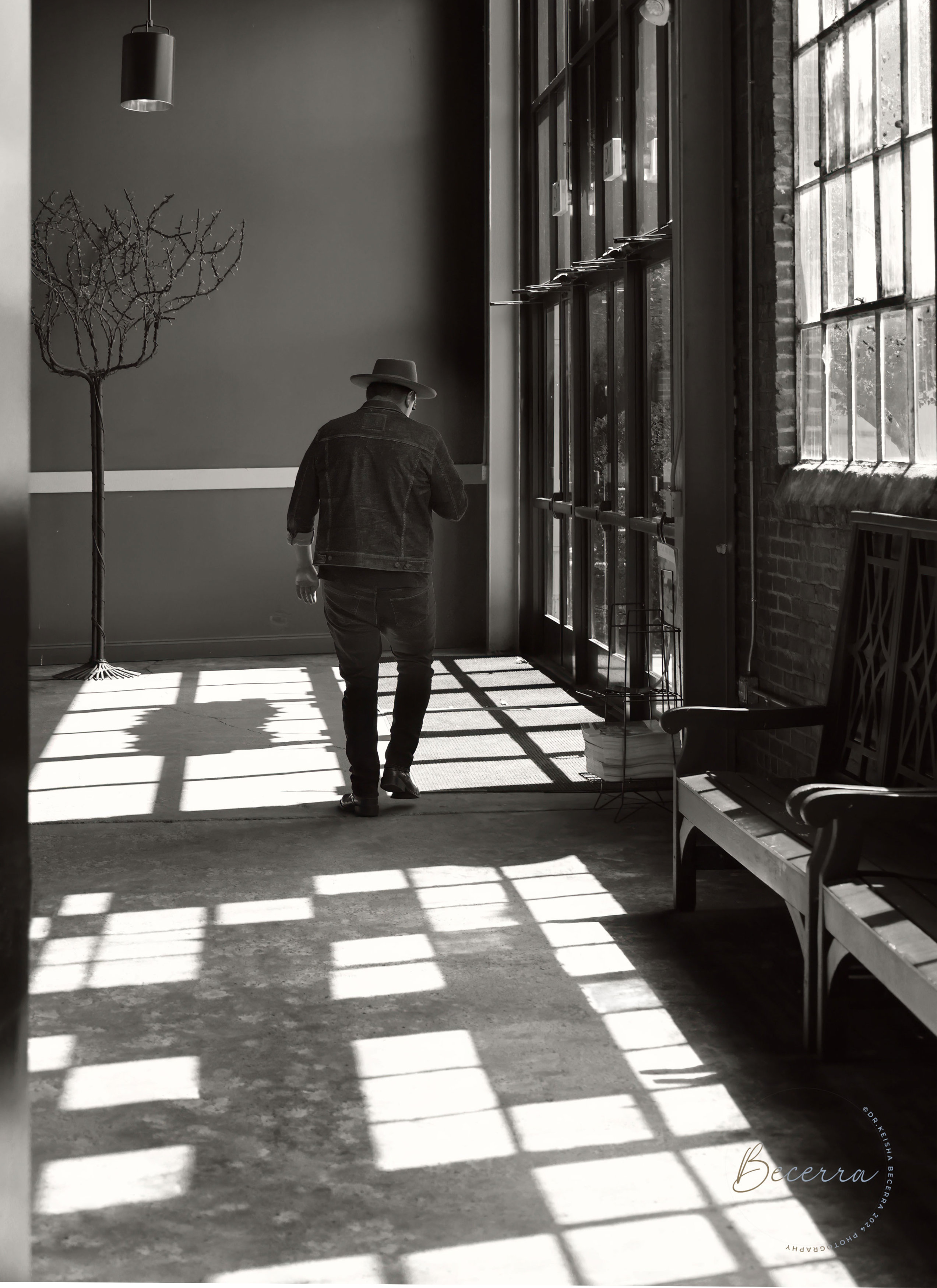
Maybe in hindsight I prefer it without the left wall. I've lightened the figure too, here. What do you think?
|
Apr 11th |
 |
| 64 |
Apr 24 |
Comment |
Street photography I think is a challenging genre in many ways. Sometimes a picture appears and you have to grab it in seconds, whereas some photographers see an opportunity and wait until missing elements (hopefully) appear. I once saw a sign in Shrewsbury for a "Spotty dog" cafe, and had to wait for ages for someone to walk past with a dog! Alas it wasn't spotty, I have too little patience.
In this case, I think it would have been better had the man been coming towards us, and waiting might have yielded that.
I do like the patterns and lines. I like the converging shadows on the floor, they do lead my eye well into the picture towards the man. The vertical lines are not parallel, and in this case I would have corrected them. It's easy to do in Photoshop, I believe. The wall on the left acts as a frame, but I'd minimise it. And maybe clone out the bit of the rail that remains.
I'd have thought an R5 would handle 1250 ISO with aplomb? My OM-1 starts to show noise and loss of latitude and sharpness at maybe 3200-6400 ISO, but the noise usually disappears with Topaz Desnoise if necessary. I usually see ISO as the least important of exposure parameters. I see no problem with noise etc here.
|
Apr 11th |
 |
| 64 |
Apr 24 |
Comment |
What an unusual structure. I wonder what those vertical steel pieces that hang down were for. I wouldn't stand under one!
The mono as usual makes the most of the geometry and patterns of the steel. I've been wondering about cropping off the bottom to make it all about the patterns, and about making the verticals parallel, which in some ways I would think would be better. But on the whole, I think I like it as it is. |
Apr 11th |
| 64 |
Apr 24 |
Comment |
It just goes to prove again that we should always have our camera, at the ready!
Great shot, Chris. His hand position is very Italian, I think. I wonder what they were talking about.
Personally I dislike tattoos, but the one on his arms is a lovely mono in its own right.
I would darken his trousers a little to make the material distinct from the background. Otherwise I think it's spot on, well done. |
Apr 11th |
| 64 |
Apr 24 |
Comment |
I think you've got great motion blur here, Jerry. The lead cyclist is good and sharp, with the pursuer a bit blurred, which emphasises the leader for me.
I don't think the background adds anything, I'd crop off the top to just nicely above the persuer's helmet, and then clone out the bottom of the furniture which would remain. |
Apr 10th |
| 64 |
Apr 24 |
Comment |
I really like this, Stan. Wildlife parks and modern zoos are great places to photograph animals in realistic settings, and no-one would know this is the former from looking at the photo.
I like the sense of flow that I get from the front animal's legs and the other one's stance. I think it's a lovely mono conversion. The viewpoint makes them look quite aggressive and powerful for me. A1. |
Apr 10th |
| 64 |
Apr 24 |
Comment |
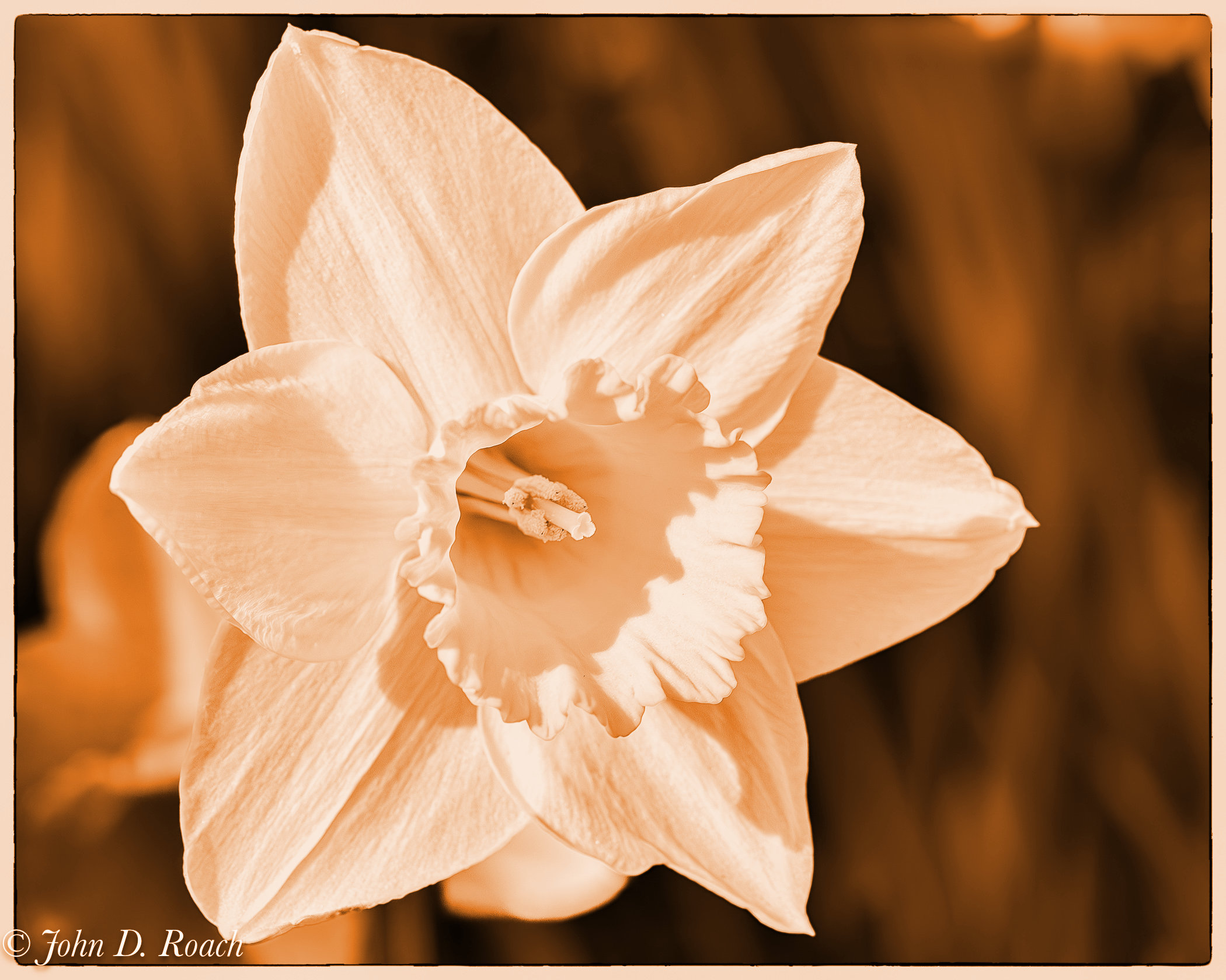
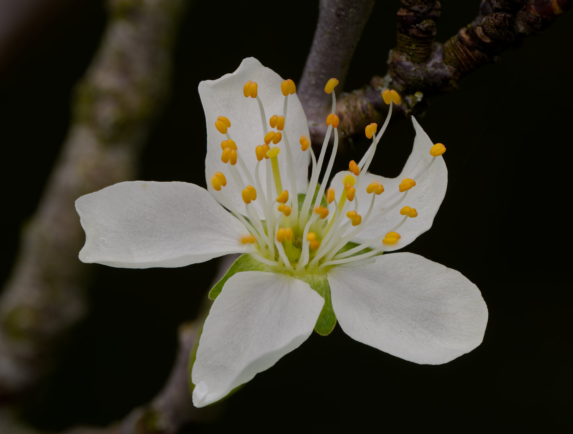
Going by my usual mono yardsticks, I mostly value shape, texture and all tones of grey. I think your photo gets 100% for all of these, it's delightful. Sharpness etc all look fine to me.
I would have left a little more room round the edges - it looks a bit too cramped to me.
But a daffodil in mono? Surely not! Well, why not? I think it looks fine ..... but how about sepia? Sort of a half-way house.
|
Apr 5th |
 |
6 comments - 7 replies for Group 64
|
| 95 |
Apr 24 |
Reply |
I did spot the spider's web and decided to leave it as proof of "real world shooting"! But it is a distraction.
I'd be happy to share photos and a plan of my reflector, but can't for a week or so. We are away from home in our camper van in lovely Yorkshire (in not so lovely weather, but it is April) so I'll do it when I get home. |
Apr 24th |
| 95 |
Apr 24 |
Reply |
Thanks,Keith. Macro is one area of photography where you can often make accessories rather than buy them. I like that!
|
Apr 17th |
| 95 |
Apr 24 |
Comment |
I think this is a good result, Pat. You had to work hard for it!
I think I'm generally going to stop commenting on depth of field in this group as we all know now how to stack, so I assume you planned the DoF to be like this. It could be greater, but this way it adds to the artistic interpretation that you have achieved. I love the stalk as it fades out, and the vignettewhich works well in white I think. Well done!
|
Apr 10th |
| 95 |
Apr 24 |
Comment |
And this one has had a mask applied and a Gaussian blur applied to the background.
Which do you prefer? |
Apr 5th |
 |
| 95 |
Apr 24 |
Comment |
And this one has had a mask applied and a Gaussian blur applied to the background.
Which do you prefer? |
Apr 5th |
 |
| 95 |
Apr 24 |
Comment |
This one is excluding the furthest 3 bracket images from the stack |
Apr 5th |
 |
| 95 |
Apr 24 |
Comment |
Thank you, Margaret. It was just taken in my garden one morning when it was still, and so I went on a foray with my macro lens, flash and flash "diffuser". So the light is artificial, but it does look good. I'm quite pleased with this latest incarnation of my flash diffuser, I've replaced the plastic diffuser with a reflector, covered in reflective tape, which makes the flash much brighter and hence I'm able to use a lower power, and so the flash can regenerate as quickly as the camera takes the images.
We often have debates here about how much should be sharp. It's a matter of taste, I think, for artistic photos.I could blur that branch in post. (I use Affinity, but I guess Photoshop will have similar facilities.) Looking through my bracket of photos, I think I could select fewer such that the merge has no imageto get sharp information about the branch from. Thinking about it, perhaps I could Gaussian blur the branch on some of the bracket photos. I'll experiment and post a reply!
|
Apr 5th |
| 95 |
Apr 24 |
Comment |
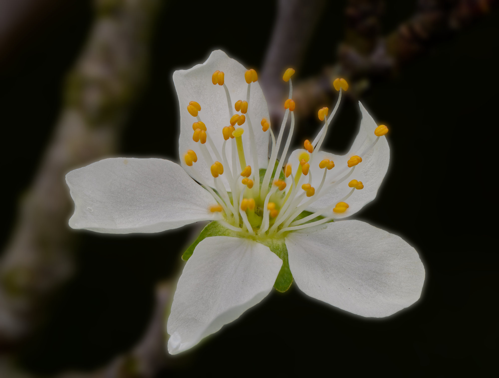
I like your result, Keith. The colour pops out against the nicely darkened and blurred background. The highlight reflections in the stigma are not a problem in my view as they are small and draw my eye to the centre.
I agree, the only blurred part of the flower really is the couple of petals directly below the pistil. The blur does accentuate the sharpness of the stigmas. So it's up to the viewer, to like the blur or not. Personally, I'm easy here, either would be fine.
You have used a wide aperture, and going down to f5.6 of f8 would have increased the sharpness and depth of field, although it's fine overall as it is, I think. Focus bracketting and stacking could also have improved the sharpness, if there was little wind, but a smaller aperture is easier and gives a better sharpness due to normal lens performance being best a couple of stops or so down from wide open.
I looked on Plantnet.org, and found this is probably a water lily "Nymphaea rubra Roxb. ex Andrews"
|
Apr 5th |
| 95 |
Apr 24 |
Comment |
The ayes have it! (Often heard in UK Parliament debates.)
Your cropping is clear as the final result is well over 1x magnification, I suspect. It has also resulted in the final image being a bit soft. But that's not to dislike it, the result is very striking and achives what we are all striving to do - to reveal that micro world that our eyes can't see well without assistance.
Had you used your in-camera focus bracket facility, you might have got a bracket, especially if you gave it several goes and didn't set it to too many frames. But to be honest, it's back to our previous discussions about how much do we need to be sharp. For a technical record, sure, the blurred bits are a loss. But for a photograph for pictorial interest, this is much better in my view.
I'd clone out that little bit of light colour on the left edge, and darken the white patch in the top right corner.
I see a PSA portfolio emerging!
|
Apr 5th |
| 95 |
Apr 24 |
Comment |
Hi Margaret,
Welcome to our Group. I hope we can offer you useful critiques and discussions on your images, and hope that you will give similar to the images of all the group members.
You've started with a nice photo! Using water drops as lenses is good fun. I hope you've seen Don Komarechka's site (http://www.donkom.ca/) and his youtube videos on this and similar topics.
I think your photo is great. It looks easy to achieve when you see Don doing it, but I know it isn't! You have got the images of the sunflower in the droplets, plus the tendrils, super sharp and detailed.
It's interesting looking at the three lenses to see which one is the most striking, as two are on a black background, and one is on yellow. Had I been asked to guess, I'd have said the black background, but to my eye,the one on yellow is best as it has its own black frame which stands out against the yellow petal.
I like the way the colour of the tendrils changes towards the edge of the picture as the background colour is changing as well. This makes them stand out more.
Well done!
|
Apr 5th |
8 comments - 2 replies for Group 95
|
14 comments - 9 replies Total
|


