|
| Group |
Round |
C/R |
Comment |
Date |
Image |
| 64 |
Feb 24 |
Reply |
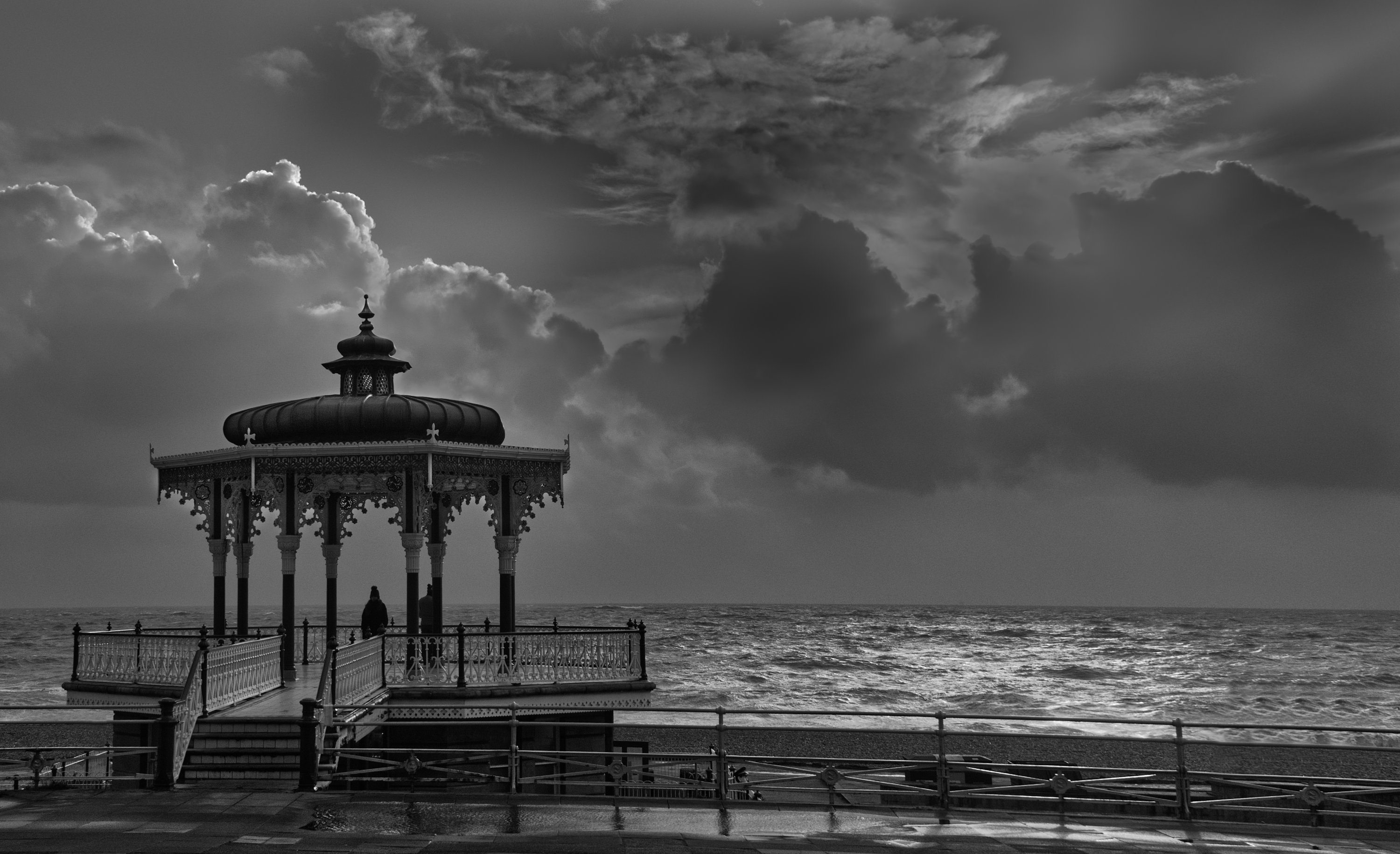
Yes, I hadn't noticed the halos. I must watch that when I use Topaz. But I do like his version's increased depth and contrast. |
Feb 22nd |
| 64 |
Feb 24 |
Reply |
Thanks, Stan. I take your comment about contrast, and my original did need that. I think Don's revision has improved it in that area.
I think the horizontal correction in the lens correction part of Affinity that I applied at comment 5 above did something similar to perspective change, but I'll give that a try as the former seemed to curve the sea a bit. I've not spotted a "free transform" in Affinity.
|
Feb 22nd |
| 64 |
Feb 24 |
Reply |
Hi Don,
Thanks for your comments and your revised version of my picture. I like it! Your interest is welcome.
I've had debates with friends on DD here several times over what is "straight". Sometimes an image can't have its verticals vertical and its horizontals horizontal at the same time, as they aren't at 90 degress in the original. That was the case here originally. I've always worked on the belief that verticals always look vertical, but horizontals don't always look horizontal. But a non-horizontal sea does cause observers to complain more than a non-horizontal land horizon. So I was intrigued by John's comment above, and surprised to find that lens correction in Affinity Photo 2 can fix it. Although I think that in my second image, the sea is a bit curved.
Your changes to lighten the bandstand and somehow to make the wet surfaces look wetter are very nice, I think. They add to the feeling of depth and balance. I didn't think I needed to denoise my original, although Topaz denoise AI can sharpen as well, and I suspect your version benefits from that too.
I see you have Andrew Hersom in your group. Andrew is in the UK too, and indeed I'll meet him in April, which I'm looking forwards to. |
Feb 20th |
| 64 |
Feb 24 |
Reply |
Thanks, Chris. Non-flowing sea now posted above! |
Feb 18th |
| 64 |
Feb 24 |
Reply |
Oops,sorry,I forgot to attach the revised photo |
Feb 18th |
 |
| 64 |
Feb 24 |
Reply |
OK, I've had a go at both of those. I opened the previous afphoto file in Affinity, but brought in NIK silver efex and puta control point in the cloud. I increased the local contrast, and left NIK, which took me back to Affinity.
Then I opened the Develop persona where the lens correction is applied, and the correction for this lens had been applied by default. However it allow forther correction, and the Horizontal correction was able to level the horizon without spoiling the verticals, which I had previously used to set it "straight". A slightly non-level horizon doesn't bother me much as long as the verticals are vertical! But this correction, with the ensuing level horizon, has made an improvement in my opinion. I must remember that.
Thanks!
|
Feb 16th |
| 64 |
Feb 24 |
Reply |
Yes, I like it too, a typical Victorian structure, I think. The pier is many times larger,and wouldn't have made as nice a shot I suspect. Bigger is not always better! |
Feb 14th |
| 64 |
Feb 24 |
Reply |
That's fine, Chris, whatever suits you. I've used a similar method to yours for making sepia and other tones rather than B&W mono.
I'd mention that adding a mono layer in Affinity takes about 5 seconds too, to get that initial mono view. Altering the sliders to investigate how the straight mapping of colours to greys might be changed to give an improved (or not) mono result takes a minute or two, but is always worth it for me. Local defect fixing can be done with or without the mono layer in place.
|
Feb 14th |
| 64 |
Feb 24 |
Comment |
Ah, I see. Much better as you have edited it, I think. The tarp even stands out on the thumbnail. Pity about the "reality " rules - I'm sure it would have been removed a while later!
|
Feb 9th |
| 64 |
Feb 24 |
Comment |
What a striking photo! A bit creepy to me at first, but it has grown on me. I love the sharpness and piercing eye, and just enough detail in the feathers to make it interesting but not taking away from the overall feeling of the photo.
Can you remove the light splodgeon the bottom left? It's a bit distracting once noticed. Also, the light detail on the top right might be better cloned out with water texture from the left? |
Feb 9th |
| 64 |
Feb 24 |
Comment |
Yosemite must be a great place to visit. One day I might get there. But not climbing that mountain! It's so steep.
Super picture! You might lighten the shadows a little for a classic mono, but I like it as it is. |
Feb 9th |
| 64 |
Feb 24 |
Comment |
Well, I can't see the tarp. I think this is a fine mono, very enjoyable.
I wonder if the bridge isn't a bit "in the shadow" of the foreground trees and bushes? I would try to crop a little of them off, just to give the bridge more prominence. |
Feb 9th |
| 64 |
Feb 24 |
Comment |
I think he's given up! Pax!!
I like all the diagonals and lack of distractions, which all add to the drama.
I'm glad you took this as I'm tired of the way many people think photos of someone else's children are illegal. Not so! Children make great subjects, and parents should have nothing to fear about real photographers.
I know you usually use this mono conversion technique, Chris, I'd like to know why. There's nothing wrong with your result, I stress, but I know that when I add a mono conversion layer in Affinity, the first thing I do is to adjust the colour sliders to see how the modelling and contrast vary. PS probably has a similar system. NIK doesn't, but its presets seem to give changing results based on altering the mapping of colours to greys. Your system only seems to have one result available (apart from general lightness and darkness) - or am I missing something?
|
Feb 9th |
5 comments - 8 replies for Group 64
|
| 95 |
Feb 24 |
Reply |
Thanks, Gloria. One of my grouches about macro is that many people see it as mainly made up of horror-movie images of insects. I like insects in a natural environment, but one set of fangs looks much like the next in my view. So going to look for new things to photograph is good fun. Don Komarechka has some great images (https://www.donkom.ca/) and he did a tutorial for the PSA which is available to PSA members - well worth a view! As is another one there by Charles Needle. Some people's creativity makes me feel quite unadventurous. |
Feb 22nd |
| 95 |
Feb 24 |
Reply |
Yes, go for it! You won't get this effect without crossed polarising filters, but you might see rainbows through water drops.
I didn't mention above, these crystals are of common (table) salt (sodium chloride, NaCl). They are usually cubic in shape, but the crystallisation of a thin film of solution on top of glass has made them flatter.
|
Feb 20th |
| 95 |
Feb 24 |
Comment |
Yeah! A nice result. Oil drops in water are a good subject for bad weather amusement.
As you say, the real work is in the light and post processing, and I do like your result. I think we can see the texture of the cloth, which gives it a grainy sort of appearance. I like it.
|
Feb 9th |
| 95 |
Feb 24 |
Comment |
A nice result, Keith, I like it. Super lighting and detail in places. I don't think we get fuzzy melons here. An interesting plant. How big is it?
Your depth of field is a bit limited I think. No surprise at 105mm and f3.3! But the critical bits are really sharp, which grabs attention.
I know it's a common format of this type of image, but would removing the leaf(top middle) then flipping it vertically be nicer?
|
Feb 9th |
| 95 |
Feb 24 |
Comment |
Great result, Pat! Great colour, detail and clarity.
I think you selected the best camera settings. A few more images for the stack,and more travel in the rail, would have grabbed the foreground and far pencil into the stack,but I'm sure this result is much better than any one original. 3D subject are challenging, it's so nice to crack it! |
Feb 9th |
| 95 |
Feb 24 |
Comment |
I've no idea what it is in life, but it made an interesting macro! The colours and textures are fascinating.
I know I often bang on about focus stacking,and it is a great technique. But not always necessary! At 1.4x it probably is usually necessary, but getting the plane of the subject parallel to the sensor (or vice versa!) is often 9/10 of the battle. I'm not sure about here as I'm not familiar with the subject.
(We should all remember perhaps to take a non-macro of unfamiliar subject to help the others to understand. This site accepts up to 4 images in each entry,the final result and up to 3 "original" images, which we can use for this. Let's give it a go!)
|
Feb 9th |
4 comments - 2 replies for Group 95
|
9 comments - 10 replies Total
|


