|
| Group |
Round |
C/R |
Comment |
Date |
Image |
| 64 |
Jan 24 |
Reply |
I'm quite sensitive to verticals, and I know what you mean about how difficult it can se sometimes to get all the cues right.
I also wondered if the sky is too dramatic and hence out of context with the building somehow. But we all seem to like a bit of feeling there, so I didn't comment. But I like its texture and feeling, so I wouldn't reduce it much, if any.
|
Jan 20th |
| 64 |
Jan 24 |
Comment |
I like the image, but despite the fabulous texture which is a normal pusher towards mono of course, I do agree that the colour image is more satisfactory.
I recall a debate here years ago on a slanted horizon in one of my photos. People said it wasn't straight! I said it was, because a non-horizontal horizon can be fine, it's just non-vertical verticals that never occur "normally". I could argue that again here, but I agree with Chris and John here, it makes the whole picture feel tilted to the right.
|
Jan 19th |
| 64 |
Jan 24 |
Comment |
A super image, I think.
Personally, I think the contrast is fine, although having seen them now, I'd reduce the contrast near the people to make them more visible.
I like the leading line of the path, but sorry, the name spoils that line - better on the bottom right if you feel it's needed. (We debated signing our images some months ago, so I won't go into that.)
My other comment is that the verticals aren't quite vertical - a degree or two of clockwise rotation would resolve that for me.
|
Jan 19th |
| 64 |
Jan 24 |
Comment |
I've been buying quite a few books on mono photography recently. (My favourite is "Seeing in Sixes" by Lensworks. I've only got the first of the four, they are cripplingly expensive to ship to the UK, so I keep scouring ebay. If any of you see one for sale there, please let me know :-) ).
Anyway, what I observe is that whereas a club judge would suggest as above - crop it down, make the building stand out - many books (and salon entries) don't do that, they go for a wider context, they try to pull in a feeling rather than a punchy image. (The feeling is punchy in itself I guess, but I hope you know what I mean.) Blank areas and blocked areas are not necessarily bad!
I think this image gives that feeling - a rainy day in a beautiful area, giving feelings of isolation and desolation but they are not alone, a boat is going there. I love it! I'd just suggest a clone out of the little features on the left just below the horizon.
|
Jan 19th |
| 64 |
Jan 24 |
Comment |
Not being a sailor or a grown-up Boy Scout, the comments on the knot are lost on me. I just see a knotted rope, with lovely texture and a fascinating pattern. I like it!
|
Jan 19th |
| 64 |
Jan 24 |
Comment |
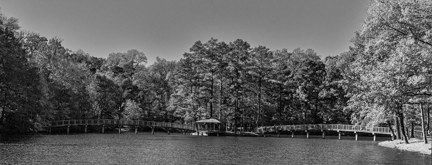
I seem to be having a letterbox session this month, in the dialogue groups I take part in. I think this is also a candidate. I agree, the span of the two bridges is a key part of this picture, so no left-right crop for me please. But the foreground water and distant sky add little, so a letterbox it should be for me.
Re colour or mono for fall shots - I think the mono has handled the contrast from the sunshine much better than the colour, so mono it is for me here.
|
Jan 19th |
 |
| 64 |
Jan 24 |
Comment |
Thank you all for your kind comments! Maybe I'll put it into Midphot (a competition run by the Midland Counties Photo Association, our local one) which is open for entries at the moment. I put a print of it into a club competition earlier this week, printed on an art paper, which looks good. It came 2nd, the judge also suggesting that I crop a bit off the bottom edge. I need to reprint it, so I'll see what I can do with the contrast of the rails too. |
Jan 19th |
6 comments - 1 reply for Group 64
|
| 95 |
Jan 24 |
Reply |
The stacking software uses a specific "algorithm" (maths speak for a formula or a series of formulae) to figure out which pixels to put into the final composite image. I don't understand it much beyond that level!
As I understand it, it's basically looking for the image (out of all the images in your bracket) which has the strongest change in contrast in a given small area, choosing that bit of that image for that bit of the final image. It then moves that small area and does it again, until it has done all across the frame to complete the job. Sometimes you can chooose the size of that area. Finally, it blends the chosen pixels in the composite in different ways.
Some programs such as Affinity only have one algorithm, so you get that one and it doesn't have much you can adjust to change the stacking result. Usually, the result is OK, but occasionally, it can give a lousy result.
But others do have alternatives. I use Helicon Focus for several reasons, once being that there are 3 distinct algorithms you can choose, called "Rendering Method A", "B" and "C"). The results from processing the same focus bracket set of images using the different methods aren't dramatically different, but each method does work better in some situations. You can further refine each one by choosing values for 2 parameters "Radius" and "Smoothing", which further alters the result. Personally I leave them alone usually at mid values.
I also have Focus Projects 4 professional, made by the German company Franzis, which has 11 stacking methods in it! I've never systematically explored what benefits each one has. It also will automatically sort a folder of images which has several bracket sequences in it into series that it thinks are complete brackets, which can make workflow quicker. Personally I find it less than 100% accurate, so I prefer to put all my brackets into separate folders. FP4 won't process RAW images apart from DNGs, so that's a thumbs down for me.
So overall, Helicon always gets my vote.
So, if you've got this far, the software doesn't split the images into strips and stitch them together, it's far more subtle than that. If you have a "lumpy" subject with close-to-the-camera spots in different places across the frame, cutting it into strips wouldn't work well. These methods of scanning the entire image will catch the sharpest bits, no matter where they are. All clever stuff!
|
Jan 20th |
| 95 |
Jan 24 |
Comment |
As you do more macro, the interplay between parameters becomes clear. Not wishing to be pedantic, but I'd say it's flatter plane OR focus stack OR both. The trick is seeing where the limits are!
If you took this shot from directly above, you'd easily be able to get all the flat top in focus, but it would (in my opinion) be a much less interesting photo.
With a fairly overhead position, some interest would be returning, and probably it would have worked OK at f8, but if not then try f16 or f22. A lot of junk is written about the perils of diffraction and how you can never get a sharp shot at f22, but often you can,just give it a try.
But if you can't, then you are into stacking. A short stack of 2 or 3 would be enough if the single frame only just misses out, you only need massive stacks in extreme cases of high magnification.
|
Jan 19th |
| 95 |
Jan 24 |
Reply |
I think Carol meant "smaller aperture", ie larger aperture number. |
Jan 19th |
| 95 |
Jan 24 |
Comment |
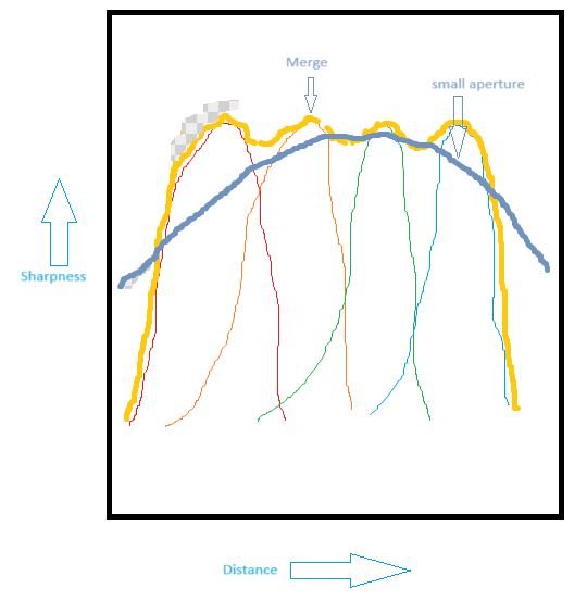
What we are used to seeing, from a single image, is a gentle falloff of sharpness as in the grey line. However the stack has a much higher slope at the edges, the sharpness drops off much more quickly (the yellow line), and that sometimes is obvious and looks unusual. The top left of Pat's photo falls into that area! So it's very blurred.
Now that might be the intention, this is not a criticism! It's another creative tool in macro photography for us to use.
|
Jan 19th |
| 95 |
Jan 24 |
Comment |
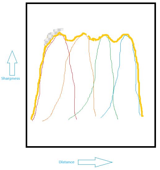
Note that the sharpness wobbles a bit over the top, but that should be too little to notice. If your images in your bracket are focussed too far apart, you will notice this wobble as bits that are less sharp.
Then let's looks at what you might have got with a much smaller aperture. The depth of field is much greater, but it's the slope of the sides that is important here -
|
Jan 19th |
 |
| 95 |
Jan 24 |
Comment |
Now, when we stack those we get this. The thick line is the stacked result.
|
Jan 19th |
 |
| 95 |
Jan 24 |
Comment |
Very good, Pat, you have grasped focus bracketting and stacking now! Once you've done it, it's not as difficult as some people think.
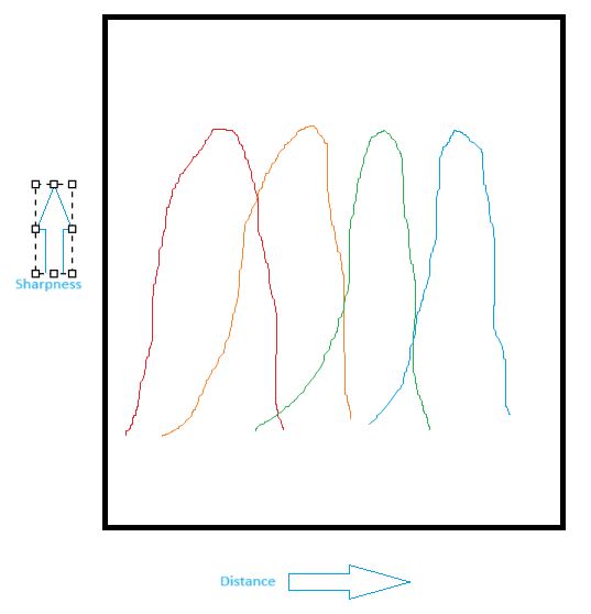
One aspect of stacking that we can all see here is how quickly the blur can come in if part of the picture has no sharp detail in any of the images in the bracket. Why does this happen? It's because the shape of the sharpness plot varies a lot between "normal" images and a stacked one. A picture tells a thousand words, so see below.
All those bell shapes are intended to be the same. Sorry my mouse sketching is rubbish! Each bell represents the sharpness of one image in the stack. Each image is similar to the others, but focussed on a different position.
|
Jan 19th |
 |
| 95 |
Jan 24 |
Comment |
Super. I agree with all the above. Well done!
|
Jan 19th |
| 95 |
Jan 24 |
Reply |
If you fancy using flash, I can recommend using a flash diffuser that fits over the flash gun and makes a sort of stage of light for the subject. There are many online for sale, but I've made my own from plastic card and plastic press studs. I can point you to the design (a generic one, it needs tailoring to your camera and lens) if you are interested.
I used to have a ring flash which was good but alas I bought one for Canon and it wouldn't work on my Olympus, so it had to go when I sold my Canon.
|
Jan 15th |
| 95 |
Jan 24 |
Reply |
It's all personal preference I guess. I found the 60mm was fine, and have no issue with the 90, I rather like the focus clutch and 2x capability. It is heavier, but I've not found that a problem. Maybe my hands are a bit stronger than yours? I'm disappointed the 90 doesn't focus any faster than the 60. The Canon 100mm macro was a bit of a beast, as was the MPE, although that's a tripod-only lens in practice I think. There's a lot to be said for lightweight plastic extension tubes!
|
Jan 15th |
| 95 |
Jan 24 |
Reply |
Thanks, Carol. Hoverflies are a good subject as they can be quite still, even when flying (ie hovering).
I've made comments further down re stacking and the "modelling" of the fly. Yes, even 2 images in a stack could have got the wing a bit sharper. Assuming I'd focussed there for frame #1!
I'm interested in your "sliding off" comment. I sometimes hear this (not just on my photos) and struggle to understand it, as I never seem to get that feeling. So thanks for the comment, I'm still learning!
|
Jan 15th |
| 95 |
Jan 24 |
Reply |
Thanks, Pat. As with all photos, I chose the shutter speed/aperture/ISO combination as a compromise for that shot, given it was hand held without flash. Hence a limited depth of field, but at least I got it sharp on the eye! I think I took it before I started to always take a focus bracket, which I try to remember to do now. This is whether or not I intend to focus stack the results, it just gives me several go's at getting the best focus for a single image.
As for being "tail out", which all are commenting on - well, that was deliberate. It gets boring to see the model in the same pose every time, I think!
|
Jan 15th |
| 95 |
Jan 24 |
Reply |
Thanks, Keith.
I don't use Topaz denoise very often, although I'm using it more often as I go along. The OM-1 sensor is said to be low noise, but if you get up to ISO 1600 like this one, the noise on smooth areas is becoming noticeable when you zoom in. It's much more pronounced if you get up to ISO 128000 of course!
Historically I've been a bit gung-ho with ISO, and I still am, but if the result bothers me I run it through Topaz and often it improves the image. Not always, but often. The program also improves sharpness, and there are sliders in the workspace to alter both denoise and sharpness increase amounts, and this aspect works on most images too. I'm a sucker for sharpness, I've been accused of images being "too sharp" sometimes. Huh??!? No such thing, unless low sharpness is used for artistic effect, in my view.
If you read the dialogue on Carol's image this month, you'll see some interesting observations I've made with this camera on the effect of ISO on sharpness. All of those comments relate to images that have not been through Topaz, of course.
|
Jan 15th |
| 95 |
Jan 24 |
Reply |
When I had a Canon camera I was pleased to find that the EXIF specifically recorded the magnification, certainly for the MPE lens (1x to 5x zoom). Alas the 60mm Olympus didn't do this, and when the expensive 90mm Olympus came out with magnification up to 4x, I assumed it would record the magnification too.
To my great disppointment, it doesn't. So I'm afraid I'm back to guessing the magnification from looking at the image. I know roughly how big a hoverfly is, and the image is uncropped. The vertical height of the sensor is about 12mm, so after some guesswork to allow for the angle of the fly, I guessed the magnification was in the 0.7x region. But it's as crude as that. Very disappointing, Olympus (OM Systems)!
|
Jan 15th |
| 95 |
Jan 24 |
Reply |
Try a microscope lens on bellows - then it almost touches the subject!
At least the 60mm is relatively cheap if you decide to go back. I've ignored the 30mm macro because of its close working distance, but a "wide angle" macro perspective is sometimes interesting, and this lens is cheap, so I might be tempted... |
Jan 13th |
| 95 |
Jan 24 |
Reply |
Noise has been a "subject" of my study recently. The OM-1 as you know is fairly good for noise, but I'd noticed it being obtrusive at say ISO 3200 and above on some shots, and I took the plunge and bought Topaz Denoise AI. Its price had been putting me off as tests with the free version had been so-so. I still think it's a bit over-priced compared to say Affinity. However, I find its performance is often quite noticeable in both noise reduction and sharpness improvement. Some people say "it's too sharp", but personally I never agree unless it has sharpening artefacts, except for deliberately dreamy, mist sorts of shots. So it's often a win-win.
Secondly I did an experiment over Christmas. It started with just messing with my camera when Sue was watching something on TV that I found boring. Well, even more boring than usual. I was taking pictures of the carpet, and the texture of the pile caught my attention. I ended up systematically taking photos of the pile at max aperture, min aperture, and "sweet spot 2 stops down from max" with all my lenses, and ISO from 200 through 1600 to 25600. All focussed at 1m to 3m. After "wobblers" had been re-photographed (some were very slow shutter speed, all hand held, so not a very scientific test really) the pattern was stilll clear - the high ISO ones had lost acutance most noticeably. Noise was higher at higher ISOs, but the loss of sharpness struck me as unexpected. Going from "2 stops down" up to maximum aperture always gave a sharpness improvement due to the ISO going down. Wow!
I need to do this test again on a tripod, but the structure of the carpet pile was a very telling test. The loss of sharpness from increased ISO was noticeably worse then that from using a high aperture. So I really learned something there.
Last year I sold my Panasonic 7-14mm lens, mainly because it had bad chromatic aberration (as does the Olympus one I understand) but also because it was f4 maximum aperture. I replaced it with a 9mm f2 Panny, a 15mm f1.8 Olly, and I have had a 25mm f1.4 Panny for years. Plus I have a 45mm f1.8 Olly and a 75mm f1.8 Olly, so I've got all the kit to go low ISO when needed. I did this mainly for internal low-light shots, but now I use them to keep my ISO down when needed. Going to the even wider PRO lenses would be even better, but they are too expensive (not to mention heavier) for me to buy.
Plus we know that as the ISO increases, the sensor latitude comes down. I use RAW all the time, as at low ISO the latitude is about 12 stops, meaning that RAW processing can do as good a job of tackling large brightness ranges as 3-shot x 2 stops HDR can do. But at very high ISOs the latitude has come down to JPG levels (8 stops) which can be a problem.
So, I've now learned there are several good reasons to keep ISO down, unless it's inevitable or deliberately done for effect. Learning all the time!
|
Jan 13th |
| 95 |
Jan 24 |
Comment |
That's a lovely shot, Carol! I think you achieved your objective very well.
The highlights on the wings suggest to me that a flash was fired. It has given great detail. I'm surprised I can't see a shadow behind the butterfly, but maybe it was offset enough and the backgound far enough back to place the shadow out of shot.
I'm impressed by the lack of noise from that "very old" camera at ISO 3200.
|
Jan 6th |
7 comments - 10 replies for Group 95
|
13 comments - 11 replies Total
|


