|
| Group |
Round |
C/R |
Comment |
Date |
Image |
| 32 |
Dec 23 |
Comment |
Super! Not a subject I'd have thought of taking, so thanks for widening my eyes.
|
Dec 18th |
1 comment - 0 replies for Group 32
|
| 64 |
Dec 23 |
Reply |
Yes, I read that, hence my comment on the small sensor. I'm wearing my macro hat! Somehow phones seem to do better than even a small sensor would suggest possible, and I'm wondering about trickery going on inside the phone that they don't bother to tell phone users about. It's no criticism, the result is astounding, really. If I could peek forwards in time about 5 years I might be tempted to sell my "real" camera before its price crashes! |
Dec 18th |
| 64 |
Dec 23 |
Reply |
Sounds fascinating. We are planning a motorhome trip this coming autumn and might get to northern Italy. If we do then this is a good destination for us. |
Dec 18th |
| 64 |
Dec 23 |
Comment |
Further thanks due. Looking at the pictures that "inspired" me, and comparing them to this, I've come to the conclusion that I've done too little. Yes! But alas, on the wrong original. I've done too much on this one, and it is out of context. I agree with all your criticisms. Next month maybe I'll find a better original to heavily mess with. |
Dec 18th |
| 64 |
Dec 23 |
Reply |
You're welcome, it was very easy although I could have done it better with more time and an original image. I see from looking in past rounds that you use Photoshop Elements. I used it when I started getting more involved in digital, but quickly got to dislike Adobe's constant upgrading and move to subscription rather than purchase. But Elements has tools to remove unwanted things in the photo like that. I use Affinity Photo now, it's more powerful than Elements, certainly than PE12 which I think I had. Much cheaper than Elements, too! |
Dec 18th |
| 64 |
Dec 23 |
Comment |
Yes, I think you are both right, it's a bit overcooked. Ah well, nothing ventured......
More practice is needed. |
Dec 17th |
| 64 |
Dec 23 |
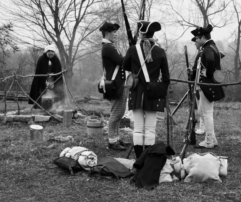
Comment |
Here we seem to have good focus, image stabilisation and a steady hand giving a good sharp result despite the slow shutter speed. Handy that they weren't moving!
The mono processing is great, I think, as we have classical black and white - black, white, and lots of greys! Super, I always like that.
The composition I find looks good at first, but is let down by detail. Most of their faces are hidden or very oblique. The barrier ropes and supports make the context very obvious. Attached is your picture after 10 minutes using Affinity's Inpainting and Clone brushes.
|
Dec 17th |
 |
| 64 |
Dec 23 |
Reply |
Santiago's response was exactly what I'd have said. It's motion blur, not lack of focus, I believe. I'm surprised that the overall sharpness looks a bit low to me, given that camera and lens. Poor focus?
I think it's a good piece of street photography, but needs perhaps a steadier hand on the camera and better processing from RAW to tame the contrast, especially the background.
|
Dec 17th |
| 64 |
Dec 23 |
Comment |
Me too, and enjyable result. The green just obscures the lovely texture and flowing lines which the mono lays bare for us to see.
It's amazing that there's so much depth of field at f2.8 - a consequence of the small sensor and perhaps multiple exposures (done, I'm led to believe, by the camera? I gather that iPhones take HDR stacks as a matter of course, and maybe focus brackets too??) In this case, it hasn't been good enough to get the point of the closest leaf sharp, but it was a challenging task.
Pity about the dust and marks on the leaves. The mono accentuates them. |
Dec 17th |
| 64 |
Dec 23 |
Comment |
Personally I would have been dialling down the highlights and lifting the shadows, as I think the contrast is too high, losing too much detail at the moment. I would also add a frame; it doesn't have to be white, a mid grey would be fine I think. |
Dec 17th |
| 64 |
Dec 23 |
Comment |
I'd agree with Don and Chris. I see why you would put the statue upright in the neck of the jacket, but it is a bit lost here. Perhaps a lower viewpoint rather than laying it flat, with the "N" behind and offset?
|
Dec 17th |
| 64 |
Dec 23 |
Comment |
I've not come across Manarola before, but it reminds me a bit of Positano on the Amalfi coast. Whatever, I think it's a good scene, lots of interest, but not a day for sailing there.
I think the detail is great, and the mono conversion is a good result, although I'm wondering why do it that way? I find the facility to change the grey mapping by using the colour sliders one of the most powerful tools in "normal" mono conversion using a mono layer, and I think that this method doesn't have that.
I feel the composition is a bit off balance, so much detail on the left and little apart from the waves on the right. I little sky detail would help, I think.
|
Dec 17th |
7 comments - 4 replies for Group 64
|
| 95 |
Dec 23 |
Reply |
I selected the subject, inverted the selection, then I tried to lighten the tone of the background, just with the "dodge" brush, but it caused lots of unwanted details to appear. So I scrapped that, and then filled it with black using the "flood fill" tool until all the background was black, then flood filled the result with a mid grey which it did in one go. It was just to get an appreciation of how it would look. Maybe I should try to contour it now.
Or maybe I should just pinch a nice background from another image! |
Dec 18th |
| 95 |
Dec 23 |
Reply |
Thanks, Gloria. Interesting. Maybe if I lightened the black to a mid grey ..... I've just tried that and failed to get a result I liked. Here's a plain grey version - very artificial looking, I think. (Done quickly, the border is poor, please ignore that) |
Dec 18th |
 |
| 95 |
Dec 23 |
Reply |
Hmm, I thought the angle and the background made it look sort of mystical. So much for my imagination! |
Dec 17th |
| 95 |
Dec 23 |
Reply |
Yes, that's the procedure. The videos are password protected on vimeo, so you fill in the forms, and Sharon Powers sends you a link and password. It only lasts for a few days, so you need to watch it soon after getting the link etc. Sounds laborious, but it works OK.
|
Dec 17th |
| 95 |
Dec 23 |
Reply |
Yes, a polariser (circular or linear) would help reduce them. I rarely use a polariser, but I'm making an effort to use them more. Cross polarisation works even better (illuminate with polarised light and have a second polariser on the lens; you need linear polarisers for this, not circular ones).
|
Dec 17th |
| 95 |
Dec 23 |
Reply |
OK, I either forgot or misunderstood. Sounds like you eliminated some that had no useful sharpness, which I always do. They are usually the first few or the last few on a bracket if it is taken in a linear sweep of the subject. The software should ignore them if you add them into the stack, but I prefer to remove them prior to stacking. But you were still missing some frames with sharpness in at places where these 5 all had sharpness missing.
Internal focus bracketing in the camera is good, but a rail is much cheaper than a new camera! About $100 gets a decent one, I use a Velbon. Tripods are ungainly tools for macro workers, but apart from table top tools like Carol mentioned this month somewhere, there's little else to hold the camera steady in any position. Unless someone knows about something I've missed - please tell us if you do. You can of course put the camera on a tripod, set it to manual focus, and shift the focus a little each shot. But that's a bit of a hit-and-miss method. I'd go for a decent rail any day. |
Dec 17th |
| 95 |
Dec 23 |
Reply |
Sorry I'm being picky, but it might help if discussing macro outside the group. "Perpendicular to your lens face (camera sensor)" means the opposite of what we want! We want the subject to be "parallel to your lens face / camera sensor". Or "perpendicular to the lens axis", it means the same thing, although I omitted the word "axis" in my original comment.
|
Dec 17th |
| 95 |
Dec 23 |
Comment |
Good try! Alas you have taken two images whose points of focus are too far apart, with the result that you have two separate sharp areas and blur in between them. However you managed to overlap the originals very well, given the camera was hand-held.
The result is indeed better than either starting original I think, but not quite correct. There's lots of nice detail in there, and I understand that many, like Carol, will see the shortcoming as minor. As indeed it is, but I'd suggest if you had taken say 5 images and combined them, the result would have been great. Doing this handheld is difficult - if your camera won't do the focus bracket quickly and automatically, then a tripod plus focus rail is the best way to do it. |
Dec 17th |
| 95 |
Dec 23 |
Comment |
The pattern and colours are very striking, which give this good impact. Your crop has improved that aspect of the photo. More cropping, as Carol suggests, might take that further.
The distance from the camera, square-ness of the subject (ie square to the camera axis) and good choice of f9 had meant you didn't need stacking here, your depth of field was adequate. Although as Carol pointed out, it is less sharp at the edges, so maybe DoF was a small problem.
I watched Dom Komarechka's PSA webinar (which I recommend to all the group) recently, and he suggested (amongst many good ideas) to improve depth of field by taking a high resolution shot (many modern cameras can do this by overlaying several images into one) from further away than normal, with the intention to crop down the result to a "normal" resolution. The depth of field in the final result will increase! At first I thought this was an error, but no, it seems to be correct. Whether this would be considered real macro (as the initial image would be close-up at best) I don't know, it's another debate! |
Dec 17th |
| 95 |
Dec 23 |
Comment |
I do think it's a good result, there's lots of super detail in its body. I would just have preferred the 'hopper to be lighter and the background darker. Retouching would go some way to help.
Don't we all have three hands?? ;-)
|
Dec 17th |
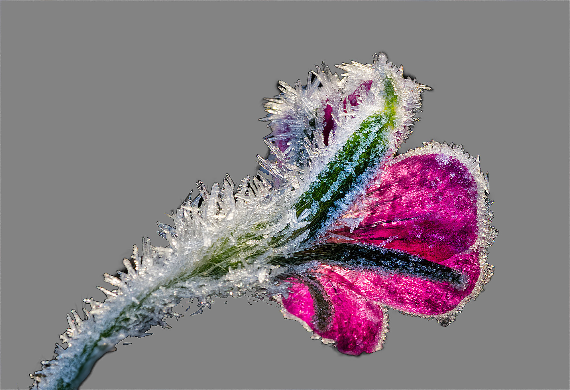
| 95 |
Dec 23 |
Reply |
Hi Andrew, thnks for your comment. I hadn't noticed the bit of missing frost, or if I did, then it didn't bother me. The background did bother me a bit, and eventually I had fun with the blur too, and liked the result. But my taste is often not shared by others, so this is a good place for a straw poll. |
Dec 13th |
| 95 |
Dec 23 |
Comment |
Yes, I should have looked for a flower facing the other way, away from the sun, and photographed it from the top as opposed to here where I took it from below.
I agree, the composition is a bit odd, and I did try to rotate it to various degrees, flip it and so on. Nothing seemed much better to me, and I think that's because they all share the same "fault", ie being taken from behind the flower.
What did you think of the background? |
Dec 10th |
| 95 |
Dec 23 |
Comment |
I have "moments" too, sometimes, when memory, the photo and the EXIF just seem to be on different planets. One thing I really wish is that manufacturers would put magnification into the EXIF file for macro lenses. The only one I've come across is the Canon MP-E, and you have to go searching for that in the long EXIF. But it is there.
Anyway, again you have given us a lovely picture, Carol, very much like a watercolour. It would be good to know exactly what has changed it from a "normal" photo of a rose to this. Soft focus? Overexposure? Maybe, but definitely on top of a great frame and composition.
The only things distracting me a little are the areas that are more yellow than pink; had they been a similar pink shade, the flow of pink would have been uninterrupted. But that's just me, what do the others think?
The issue of "what is macro" will never leave us. I think that "1:1 and greater magnification", the traditional definition, is fair enough but a bit harsh and a bit inappropriate now. It excludes many pictures that would otherwise be valuble. In that sense, we are more a close-up group. But I think we should not reject photos taken at say 0.5:1 as "not macro", nor even 0.25:1. These are with reference to 36mm x 24mm, the fullframe size, and for those of us working with cropped sensors, you could say macro is a subject 18x12mm filling the frame, but on the other hand you could say that is 2:1 magnification based on full frame size. So I think it's a bit blurry, we should not get too hung up on precise magnification limits for true macro. But there's no doubt in my mind, getting closer usually gets more interesting!
With that in mind, can I recommend to us all to see Don Komarenchka's webinar on "The Universe at our Feet". You can see it by going to https://psa-photo.org/general/custom.asp?page=webinars, then go down the page to the Techniques section, open it up and you'll see it on the right hand side. To view it, you have to request that. Go to the top of the page, next to Stephanie's photo, and click "Request to view webinars". This will give you a list of all the webinars available in a form. Complete that form, and you will get an email link to the webinars on Vimeo in a few days. There are some great talks there, and I found Don's talk very inspiring, interesting and informative. There are other macro webinars there too, eg "Imaginary Realms, The Photography of Stones and Crystals" by George Fellner. I found this one less inspiring, but his technique and results are exemplary.
There are many videos on youtube featuring Don's work as well. Go and be inspired over Christmas!!
|
Dec 7th |
| 95 |
Dec 23 |
Comment |
For me, yes, a little, but I would lighten it still more. How about this? Increased brightness and contrast. I know, I'm not very subtle in my editing! ;-) |
Dec 4th |
 |
| 95 |
Dec 23 |
Comment |
Well done for getting your camera to focus stack, Keith!
I like the detail that you have got from getting really close. Your processing of the stacked image has enhanced the detail nicely.
Unfortunately it has also enhanced the specular highlights. The light coming from the top left is being reflected by the surface of the leaf. The possible ways to get round this are to use a polarising filter on the lens, which can often block reflections, or just adjusting your light source(s) or viewpoint until the reflection is avoided.
For good focus, subjects like this are sometimes easier if placed perpendicular to the camera lens (ie parallel with the sensor) to minimise the depth of field needed. Then it's possible that you can get everything you want in focus with a single frame using a suitable aperture.
Usually, if part of a stacked image is out of focus, it means that the closest and/or furthest focus points of the bracket weren't set far enough, and the stacking program found nothing sharp in that area in any of the images. It doesn't matter how many images were taken in the bracket (provided that the in-focus regions overlap from one image to the next) if they don't reach far enough forwards and backwards. Sometimes I set my bracket so as to leave the furthest points (eg the background of a flower) out of focus, but that's a deliberate decision to get the result I want.
Do you really mean 2.5 seconds per frame, handheld?? |
Dec 4th |
| 95 |
Dec 23 |
Comment |
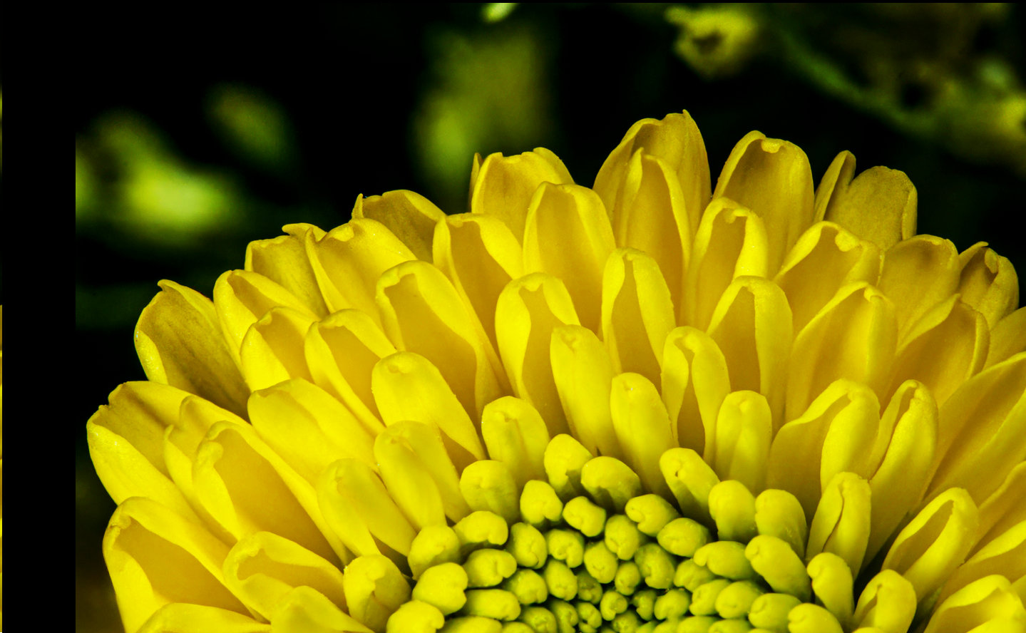
Very drole, Tom!
It's nicely sharp to me, and I like the colours and the nice background.
If it were mine, I would lighten the flower to bring the colours out a bit more. |
Dec 3rd |
| 95 |
Dec 23 |
Comment |
Yes, a very interesting specimen. And a successful photograph, considering the conditions.
The sharpness and depth of field look fine to me. At this distance and f8, the depth of field is big enough to render the subject sharp from front to back, focus stacking wouldn't have improved the sharpness.
Your biggest problem was the strong sunshine, and you've photographed it contre jour (back-lit). The camera has done a decent job of the exposure, but it doesn't know what are the important parts, it just exposes for the average wherever it was set to measure it. This might be the whole frame, it depends how you set up the camera. If you get another hopping model, I suggest you try to take it with the light behind you, and use live view to get the exposure right on the insect by adjusting the exposure compensation. Failing that, give it say a stop overexposure, or better still set the exposure area to the centre, or spot, and use that.
It would be good to get closer if it will let you, just the head and antennae would look dramatic! A small stack of say 5 photos and/or f11 or f16 would keep it sharp. |
Dec 3rd |
9 comments - 8 replies for Group 95
|
17 comments - 12 replies Total
|


