|
| Group |
Round |
C/R |
Comment |
Date |
Image |
| 64 |
Oct 23 |
Reply |
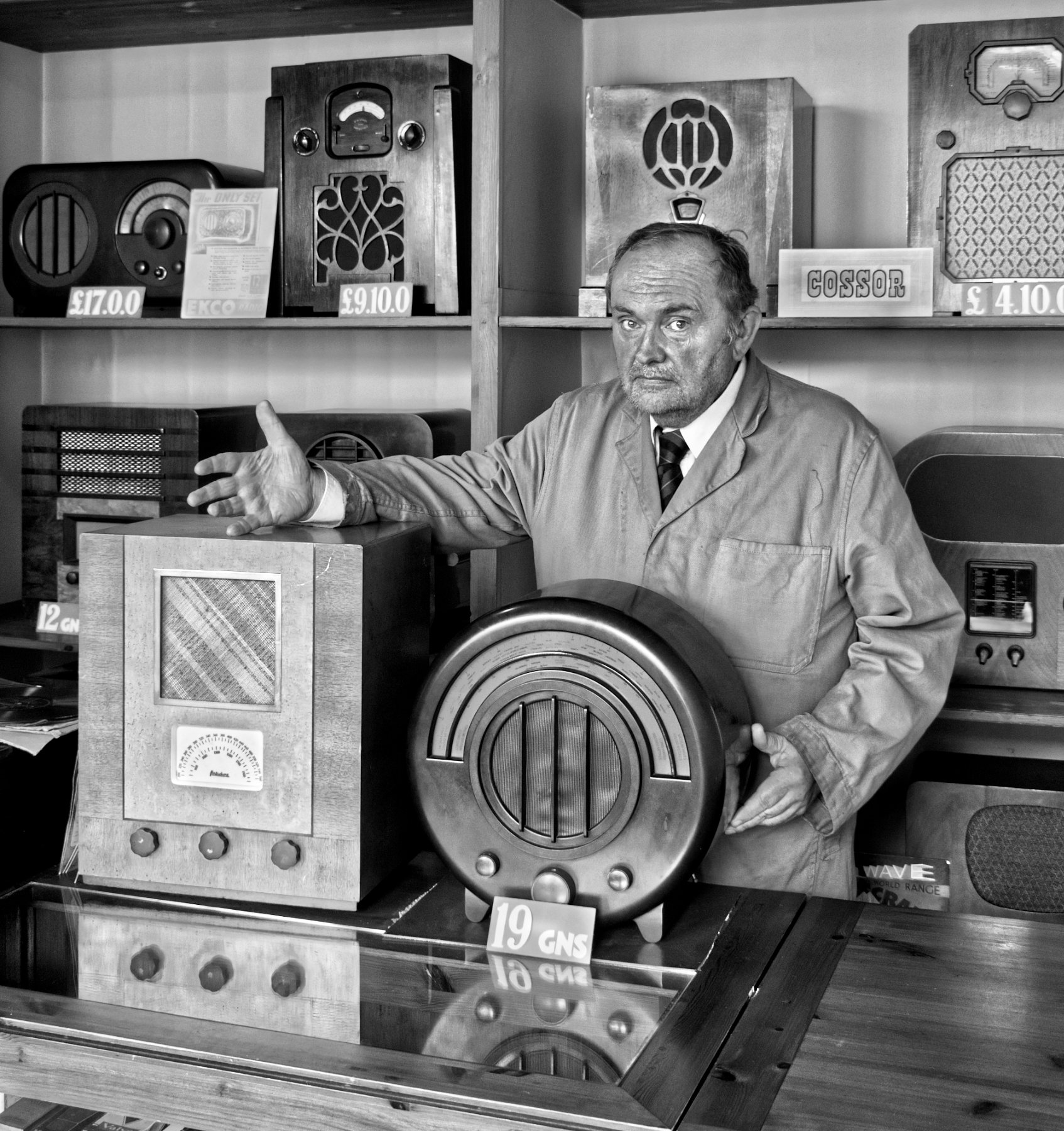
The actors are all willing volunteers, but this one was less keen to be asked to do something he didn't normally do. He did try, but it's a bit obvious, he could have smiled etc. Mind you, not all sales people have charm! But it would have helped here, I agree. I'll just have to go back and see who else are at the various sets (I have many photos from the visit), the ticket is valid for a year.
I was trying to remember what period of time the museum is set up to represent, and I think it's the turn of the 19th-20th centuries. These are increasingly popular in the UK, it's hard to get into many at school holiday times.
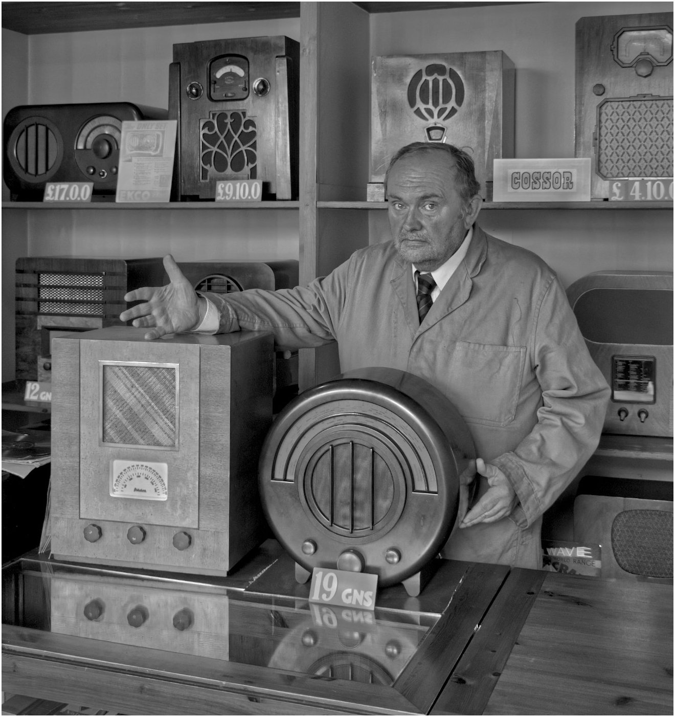
I've increased the contrast on this version. It does seem to make his skin look dark, despite my effort to hold his skin tone back but to remove the highlights which were appearing. It seems to be an improvement to me - what you you think?
|
Oct 27th |
 |
| 64 |
Oct 23 |
Reply |
Guineas were currency in the UK "before I was a lad". They are �1 (one UK pound) and one shilling (pre-decimal money, there were 20 shillings in a pound). I believe race horses are still priced here in guineas, certainly they were until relatively recently.
Yes, I agree it doesn't have much punch. I'll fiddle with it in due course. |
Oct 25th |
| 64 |
Oct 23 |
Comment |
That's absolutely fine, Jerry. All art is very subjective I think, and mood dependent. I've been a bit low recently, which probably explains my initial reaction. I had a similar slightly negative response to Stan's photo. The mysteries of the human mind! |
Oct 14th |
| 64 |
Oct 23 |
Reply |
I think we shoot from the hip, rather like a club competition judge, sometimes. I felt at the time that the central building was too dominant, but today I think less so. The buildings to the sides are darker which frame the central one well, so I think on second sight that it's well balanced.
My understanding of horizontals and verticals is that verticals are always vertical, but horizontals don't need to appear horizontal. Your picture seems fine to me in this respect. |
Oct 12th |
| 64 |
Oct 23 |
Reply |
My memory for names is pretty poor, so I thought perhaps I'd forgotten you from a previous month. Now I've looked back a few months, I see you are new to our group. Welcome, Santiago!
Our histories are so similar. I'm a retired chemical engineer. I started in mono about 55 years ago, with a Zenit 3M, and ended many years of 35mm with a Pentax MX. Now, digital mirrorless is definitely the way to go in my view, but I love micro 4/3 for its light weight.
Anyway, back to your picture. I always marvel at how good some PDIs are, in terms of picture quality, and at 1600x1200 max they are under 2MPx. I wonder if we can persuade the PSA to up the image size allowed?
Forgetting about that aspect as it's unique to here, your picture is very enjoyable. But you could tweak the background and just enter it into a general pictorial class. |
Oct 12th |
| 64 |
Oct 23 |
Comment |
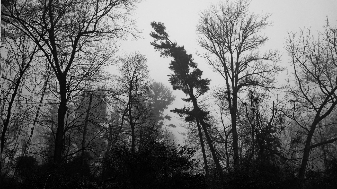
I like the simple silhouette and the oppressive mood that results. However I thought it lacks a bit of punch, so I took a screen shot and increased the contrast and brightness to get the attached. What do you think?
|
Oct 11th |
 |
| 64 |
Oct 23 |
Comment |
Isn't it amazing how you can fail to see something in front of your nose? Or his nose, in this case! :-) Alas I didn't when I sent it to John, so here's a better version. |
Oct 11th |
 |
| 64 |
Oct 23 |
Comment |
Indeed, I do! The exposure gives a little feather detail, just right, and the shape is close to a complete heart symbol. The water texture is nice, too, in my view.
What spoils it for me is the background. It would have been even nicer if the bridge had not been there. Unless you plan to enter it in wildlife competitions, you could clone that out. I hesitate to criticise images here for lack of sharpness as we are limited by the file size allowed, but the swans look a bit soft to me.
|
Oct 11th |
| 64 |
Oct 23 |
Comment |
Ah, Stan, you are making me jealous, I haven't had a dose of French cuisine and ambience for a good few years. Never mind, we plan to take our motorhome over there next spring, en route to Italy.
I think your image and mono conversion are super. The shapes, textures and patterns are classic mono. Well done!
I'm wondering if the central building is a bit dominating, and perhaps a little more of the side buildings and roadway would have made it less so?
|
Oct 11th |
| 64 |
Oct 23 |
Comment |
I like the leading diagonal which lead my eye to the child and the distance. The clouds are soft compared to the sea which makes a nice contrast, I think. Very pleasant light.
The silhouette made me wonder what it was a first - somehow it looks like a person in a suit with a helmet, or a robot, comes to my mind! Yes, I know, too much imagination. Enlarging the picture and zooming in reveals it is indeed a child. The result at this magnification is rather noisy. |
Oct 11th |
| 64 |
Oct 23 |
Comment |
A dramatic landscape! The contre jour view has made it very contrasty, and some highlight outlines that I initially thought were the result of over-sharpening, but I now think they are not.
I've taken a screenshot here and reduced the contrast and expoure, then burned in the cloud highlights, plus the lake and the bright area bottom left. Any better? Maybe I've overdone it a bit.
|
Oct 11th |
 |
| 64 |
Oct 23 |
Comment |
You didn't say how much you had cropped it. From the shot specification, I guess you must have cropped heavily to get this result.
Having said that, the picture is super, I think. It's a classic "pose", the bird looks fearless and majestic. I would want to keep it, too.
I ran a screenshot through Topaz denoise AI as it looks noisy to me, but I couldn't get a satisfactory improvement. However other programs to emulate film grain more might work, as I gather thay would "rearrange" the electronic noise to look more like celluloid grain. |
Oct 11th |
8 comments - 4 replies for Group 64
|
| 95 |
Oct 23 |
Reply |
Thanks, John. I must try it in mono! |
Oct 25th |
| 95 |
Oct 23 |
Comment |
Thank you all. I'm glad you enjoy this. It's very pleasing when an "ordinary" idea brings a result which viewers like for a variety of reasons. I wish I could do this every time! But as is said "The Harder I Practice, the Luckier I Get", so I guess I need to practice more.
|
Oct 20th |
| 95 |
Oct 23 |
Reply |
What's that? I can't find it on the PSA website, and when I googled it I only found the (UK) Professional Speaking Association! I don't think we could afford the speaker's travelling expenses from the USA ;-) |
Oct 20th |
| 95 |
Oct 23 |
Reply |
Well, I'm sticking with my humble Samsung A50, I'd be worried about losing a �1000+ phone. I'd rather spend the money on a 90mm macro lens! I have a speaker coming to my local photo club later this year to talk on phone photography, and I've set a phone photo competition later to see what we have learned! I guess I'll have to give it a go. |
Oct 19th |
| 95 |
Oct 23 |
Comment |
I love wood textures and colours. The variations that can be found seem to be endless.
I think you've found an interesting one, some fibres seem to be torn, and others shave smalll shakes (fractures) in them. Spot on focus and exposure, I like it!
|
Oct 16th |
| 95 |
Oct 23 |
Comment |
You absolutely nailed the focus, Carol. The texture of the wood complements that of the insect, too. Despite the brightness, the shadows don't seem to be too dark or extensive. There is quite a bit of noise in the background.
Phones are quite amazing, they seem to make a mockery of the trouble we usually go to! I guess you must have been close to its minimum focus distance, as it looks like a small insect?
|
Oct 11th |
| 95 |
Oct 23 |
Comment |
Beastly! At least it was dead - and small.
I think this was a very successful stack, the image has a 3D quality to it, and a perfect depth of field.
It looks a bit under exposed to me, or rather perhaps too high a contrast, as despite the overall dark tone, there are some burned highlights and blocked shadows.
|
Oct 11th |
| 95 |
Oct 23 |
Comment |
We have debated how much depth of field is optimal a good few times here in the past. I think it all depends on your intention. Had it been a picture for a scientific record, then the blurred part would be a disadvantage.
But this image isn't for that purpose, it's for art, so in my view the sharp area and blurred area are where they should be, and the blur complements and ephasises the sharp area, enhancing the picture. This also ensures that the background is well out of focus. We can see that it's more barnacles, so it's all in place and telling a good story.
I like the diagonal line of the oyster and the clarity of its surface.
|
Oct 11th |
| 95 |
Oct 23 |
Comment |
Fran knows that I like bees! She's having a field day, more nectar than she can shake a waggle dance at.
I do like the crop you have used, and the offset flower prevents the central placement of the bee from being too central, in my view. Sharpness is good, nice background, a good picture I think. |
Oct 11th |
6 comments - 3 replies for Group 95
|
14 comments - 7 replies Total
|


