|
| Group |
Round |
C/R |
Comment |
Date |
Image |
| 64 |
Mar 23 |
Reply |
Thank you, Helen. I like macro as much as mono! |
Mar 27th |
| 64 |
Mar 23 |
Reply |
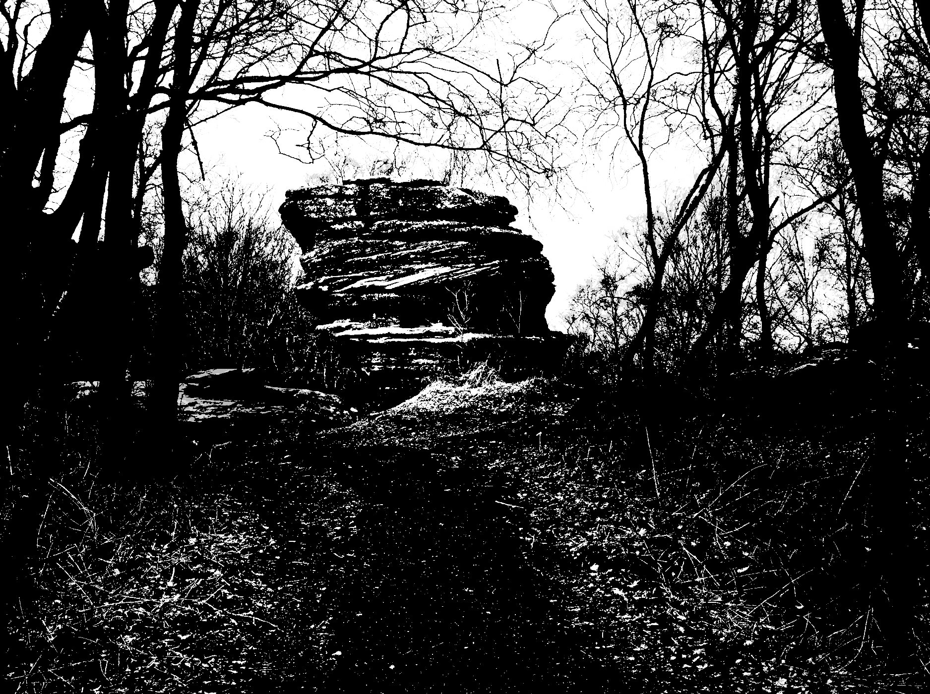
I think your mono is a good "normal" conversion. I was trying to get a bit more pizazz!
More tones than about 15 in the posterisation didn't look that much more dramatic than the unposterised version. Actually, 12 tones looks OK, but for whatever reason no matter how small I export it and at how low a jpg quality, the file is still over 4MB, so it won't upload here. |
Mar 18th |
| 64 |
Mar 23 |
Reply |
Yes, it was weird, not a leg at all!
I thought after posting this, these are nothing compared to Pinnacle Balanced Rock, Spider Rock etc, but you have to live with what you are given sometimes! |
Mar 10th |
| 64 |
Mar 23 |
Reply |
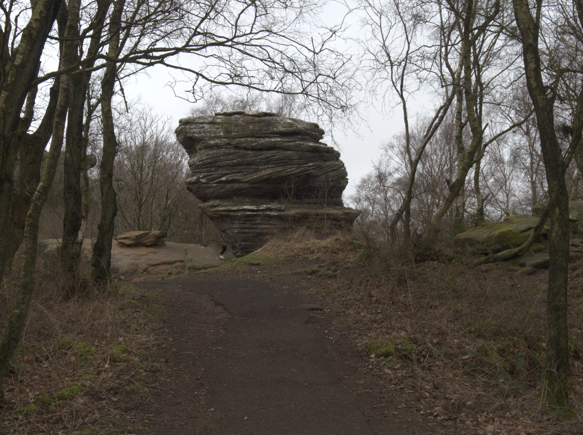
Here it is again, but masked before dodging, which I should have done the first time! I also notice that I originally sent John a full size jpg at 6MB, he must have reduced it - sorry, thanks John.
Any better? |
Mar 9th |
 |
| 64 |
Mar 23 |
Reply |
I didn't send the original to John as I didn't think it was helpful due to the big changes I'd made. Are you looking at the black, top layer of rock? Although I see a light halo round the rock now, and looking at the afphoto file I see I dodged the path and rock rather carelessly, and that is the cause of that which does look a bit like a cloud. The sky was uniformly grey, no clouds! Here is the unedited original. |
Mar 9th |
 |
| 64 |
Mar 23 |
Comment |
I think that the mono conversion has brought out the limestone marks which are an interesting feature. The conversion has improved on the original in my view, the texture and shapes are very attractive.
Personally I prefer a single span image rather than a double, and my preferred one would be the left hand half of the conversion image as it shows sky both above and below the arch, emphasising its shape. I'm debating then whether I would clone out the tree on the left - on balance, I would.
|
Mar 8th |
| 64 |
Mar 23 |
Comment |
Wow! I wouldn't like to live there (even if I could afford it), but the building is exciting, and your capture is spectacular. Very well done.
The picture pulls your eye to the top of course, where the building gets a little darker. I wonder if dodging the top darker area might help with this effect and add to the grandeur? |
Mar 8th |
| 64 |
Mar 23 |
Comment |
A very grand facade, and a lovely capture of this building. I like the way the walkers and the seats and brolly lead my eye to the building. The tree and the street buildings frame it well. The clouds complement it well. The stone does indeed convert to mono well.
The thing that bothers me is the curvature of the tower. At first I thought it was just converging verticals, but the curvature seems to increase with height, and the church sides are parallel. Plus the general feel of the texture of the image made me think "phone camera", and indeed it was. The ISO isn't high (I presume ISO 200, not 20?), so it puzzles me. Have you seen this on other photos with the phone? Also there's a halo on the roofline - sky replacement? |
Mar 8th |
| 64 |
Mar 23 |
Comment |
At first I thought this was a photo taken in a park with a wet pavement, but no, I now see it's much more exciting than that.
I love the contrast and strong diagonals, the high contrast, the geometric shadows contrasting with the natural shape of the trees, the reflections.
A good landscape often is enhanced by a strong foreground object to give depth. The leaves on the left are too indistinct and offcentre to do this, I wonder if a slightly different framing would have got them in place for that? You would need to have stepped back as well I think, and I don't know if that was possible. Or something else to use, perhaps. As it is, I would crop off those leaves. Other compositions to put the (obscured) sun more off-centre might have been interesting too. |
Mar 8th |
| 64 |
Mar 23 |
Comment |
I like this one as well. Having entered a posterised image myself this month, I've got to love this! The original must have been high contrast anyway as you only appear to have only a few tones of grey left, which accentuates the clarity of the "faces". Well spotted, Don!
Looks like I'm going to be copying you guys this month, as when cutting up some tree trunks this summer I got a number of sections that resemble a face. Let's see what I can make of them.
|
Mar 8th |
| 64 |
Mar 23 |
Comment |
Much to my surprise, I've got to say that I really like this result.
Why surprise? Because my normal "rule" says "if colour is important, use colour". But here is an exception. The resulting limited number of grey tones (predominantly 4 or so I reckon) gives the shape and form that we love in mono, and the less dominant greys give lovely texture in the petals. The detail in the edge of the cup are so much clearer in the mono, a beautiful texture. I'd have loved to see more photos taken at different angles - I like the bird's eye view, but I want more!
Daffodils are starting to come out here, I know what I'm going to do!!
Super, great vision, John.
|
Mar 8th |
6 comments - 5 replies for Group 64
|
| 95 |
Mar 23 |
Reply |
Yes, I see what you mean Carol. Thanks for your idea, but it didn't bother me as it's intended to represent a real background rather than a studio shot, and to me the darker area seems more remote therefore adds to the 3D feel. Cloning it to match the rest would be easy enough, but I think I like my first original above all. Sorry! For once I think I got the original right. Or rather, to suit me :-)
|
Mar 23rd |
| 95 |
Mar 23 |
Reply |
Their supported camera list is here - https://www.heliconsoft.com/supported-cameras/
|
Mar 23rd |
| 95 |
Mar 23 |
Comment |
I don't know how your Nikon's internal focus bracket function is set up. In my Olympus, you have to guess the "step length" setting and it uses that. The actual amount of focus shift depends on the focussing distance and the aperture in use as well. It's pretty much guesswork, a bit of a let-down considering how good the camera's other functions are. I usually deliberately take too many frames so that the "far" focus limit is too far, and I cull all the frames that are not needed. Is yours any better than this?
If not, have a look at Helicon Remote, which I use with my Canon, it's such a good way to set up stacks. I'm trying to persuade them to do an Olympus version of it at the moment, then I can buy the new Olly macro lens!
Whatever, you've nailed the bracket, well done.
Mixing light colours can lead to odd results! Tom's edit is an improvement I think.
Personally, I am very sensitive to pictures that are tilted, and this definitely needs a few degrees clockwise of the subject in my view. You have plenty of space to do it in the original.I'd prefer a bit more room round the subject. |
Mar 20th |
| 95 |
Mar 23 |
Comment |
I can't say I've thought much about the spikes on a pine cone, which I now realise are petals. I learn something every day! I watched a youtube video about cutting them off for kids to play with, and now I've seen a few detatched petals, I don't know which end this is. My guess is it's the outer end, not the inner one, cut off.
Whatever, it makes an interesting picture. As the others say, the colour and texture are really nice. Sharpness is good for f32. Nicely lit with soft shadows. I like the dark but not black backgroound. |
Mar 20th |
| 95 |
Mar 23 |
Reply |
That's an interesting modification, Tom. I rather like it. It's not what I saw in the viewfinder, and sometimes I think that that reduces the scope of the editing that I do. Thanks! |
Mar 19th |
| 95 |
Mar 23 |
Reply |
Thank you! That image appeared in this group some time ago, but when asked to choose one for the site I looked through my archives and it always stands out for me.
Ah yes, I see the artefact, Carol. I'll clone it out if sending it to a competition. Thanks. |
Mar 18th |
| 95 |
Mar 23 |
Reply |
Thanks, Marge. Macro can be a wonderful world, I love it and have done for 55 years. Alas I've not been practicing for that long, I was "off" photography for a good many years when too busy with family and work, so I'm still a beginner really. |
Mar 17th |
| 95 |
Mar 23 |
Comment |
If anyone is interested, the PSA has kindly added one of my images to the Member Showcase on http://psadigital.org/ |
Mar 15th |
| 95 |
Mar 23 |
Comment |
I've only photographed a preying mantis once before, when in Kenya 40 years ago. They are weird, and as you say, prehistoric-looking.
It's very much my cup of tea, you've used your processing and texturing skills to create a unique photo I think. I like the composition, the colour, and the limited depth of field. You could have tried going up a few stops in ISO I think, especially with the processing used, and so got to say f11 at 1/80sec, for a bit more, but some blurriness is an advantage here I think. I'd have tried down to say 1/10sec with this lens and IOS working. Nothing to lose!
Maybe clone out the 3 spots below its body, between its legs? |
Mar 8th |
4 comments - 5 replies for Group 95
|
10 comments - 10 replies Total
|