|
| Group |
Round |
C/R |
Comment |
Date |
Image |
| 64 |
Feb 23 |
Reply |
Thank you, John. I didn't have to go far, it was outside my hall window when I opened the curtains one morning! |
Feb 21st |
| 64 |
Feb 23 |
Reply |
Ah, Ihad forgotten that, John. I don't enter competitions or exhibitions, I look through the eyes of a pictorial photographer only. Yes, if Stan needs to follow the Photo Travel rules, then what I offered is not helpful. However, in that context, I would say that the gutter and pavement change is of little consequence, the photo was fine as it was.
But I see below that Stan is thinking about considering it as a more general photograph. It seems a pity to me that rules do this, but I can see where they are going with the rule.
|
Feb 17th |
| 64 |
Feb 23 |
Reply |
I just used the clone brush on this edit of a screen grab, it took me under a couple of minutes. |
Feb 16th |
 |
| 64 |
Feb 23 |
Reply |
The title! |
Feb 15th |
| 64 |
Feb 23 |
Comment |
I think your conversion has resulted in a very successful picture. Well spotted, you didn't have to process much to get this.
I would prefer to trim off a little to remove the part trunk on the left edge. |
Feb 15th |
| 64 |
Feb 23 |
Comment |
Hah! Very drole, Helen. I like it! |
Feb 15th |
| 64 |
Feb 23 |
Comment |
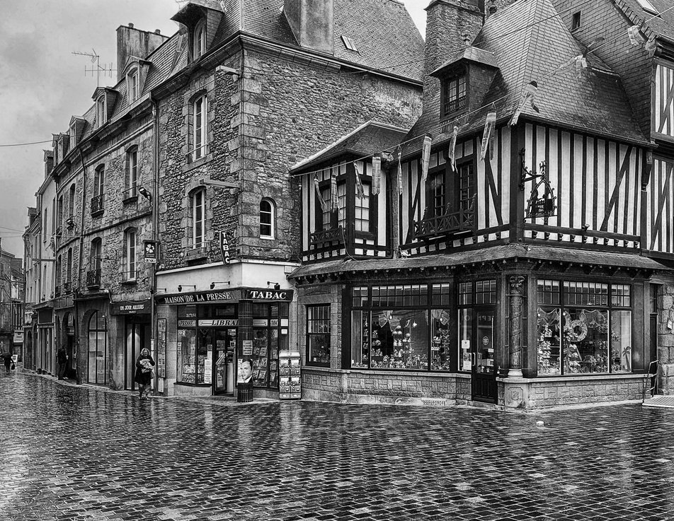
A very enjoyable picture. Phones are amazing these days for sharp pictures despite the tiny sensors.
I don't mind missing off the roof tops, it concentrates the viewer on the buildings. But I' not that keen on so much pavement, much as it leads the eye well. This is due to the gutter and change in slope, which I think is distracting. Just crop it out.
I'm glad you've chosen a mildly detailed sky to use, too much drama there would have been detracting from the subject. The new sky is just fine for me.
|
Feb 15th |
| 64 |
Feb 23 |
Comment |
You've caught him at a good moment as the board lifts off the water. The composition emphasises the fact that he's on a hill of water, which I like. Good sharpness from your fast shutter speed and accurate focus. A really nice sports shot.
Like Don, I would darken the water a bit, too. |
Feb 15th |
| 64 |
Feb 23 |
Comment |
These are amazing creatures I think, full of menace. Your capture shows super detail on its skin, and the dodging and burning has focussed attention well.
I wonder if a little dodging on its lower jaw to lift it from the shadow below would improve it a little? |
Feb 15th |
| 64 |
Feb 23 |
Comment |
An absolutely super capture I think. We have about six bird boxes around the garden, but they rarely get lodgers.
I'd agree with Don, the bird box front is a bit dominant. I'd like to see it darkened down, and also both birds lightened slightly, to make them more prominent. |
Feb 15th |
| 64 |
Feb 23 |
Reply |
That was what I wondered, too, Don. There isn't any grout, I don't think, the natural stones were just laid adjacent to each other on mortar, so maybe the snow has filled the gaps and provided a sort of "store of coldness" for the snow above, delaying its melting. All crazy! |
Feb 11th |
6 comments - 5 replies for Group 64
|
| 95 |
Feb 23 |
Reply |
Agreed! |
Feb 21st |
| 95 |
Feb 23 |
Reply |
Yes, that's good Tom, I like it. Darker than my second version that will be seen at my club tomorrow. |
Feb 20th |
| 95 |
Feb 23 |
Reply |
I've put this image into a club fun competition, "It's a knock-out PDIs" after darkening and softening the background, so I'll find what the club members think on Tuesday as it's member-judged. |
Feb 20th |
| 95 |
Feb 23 |
Reply |
There is no right and wrong really, unless there was a specific aim and the result failed to achieve it for a technical reason.
I like Carol's images with blurred and vignetted edges, she does a super job of those.
To expand on my original point, I think that your photo is half way between the two alternatives - a) you have blur on the subject where a sharp subject had been the intention, and b) you have not enough blur (to go round the whole flower) where a blurry border had been the aim. You could process in more blur to achive the latter if you wished.
Whilst I often don't follow my own advice, I recommend taking shots several times over with different settings. I have many photos with high shutter speeds and are blurred from camera shake, and many with low shutter speeds that are sharp as a razor. I try not to do the former, but I can't guarantee it. Taking a few shots only costs a few minutes in pruning out the failures once they are on your computer. The viewfinder and rear screen are not good enough to spot such small details, I think. |
Feb 17th |
| 95 |
Feb 23 |
Comment |
Yes, very nice. I love all lilies, they are majestic flowers. The colours and viewpoint are super. The centre is all very sharp and clear, which gives lots of punch.
Personally I'd have preferred a smaller aperture and getting those rear petals in focus, as well. If there'd been a whole ring of them blurred, that would be different to me. Carol likes limited depth of field, strategically placed, so I can understand her comments. I'm more techy than arty, that doesn't usually help me :-( |
Feb 15th |
| 95 |
Feb 23 |
Comment |
I'd agree with those comments. Your focus is on the eye lashes, as it should be here I think. It's a good eyedea to photo a closed eye, but the subject is very 3D and so challenges your depth of field. In this case physics has won, as it usually does.
Do try again with a smaller aperture if you can. The possibility of stacking will depend on how still your model can be. |
Feb 15th |
| 95 |
Feb 23 |
Comment |
I hate to be negative, but is it sharp? I've seen photos from that lens on this forum several times before with f45 shown. At the time I was astonished that the images were good and sharp, whereas I would have expected diffraction to have softened them. I think we discussed it and wondered if it really was f45 in the normal mechanical sense, or if the lens is doubling the f value to allow for the 1:1 ratio, so it was f22 in reality. Maybe there was a little camera movement despite the tripod, as 25 secs is a long exposure.
Anyway, it has given enough depth of field to cover the subject.
I think I'd have gone for a complementary colour background, the picture is excessively green in my view.
I'm glad that leaving the plant in situ meant you kept the peace ;-)
|
Feb 15th |
| 95 |
Feb 23 |
Reply |
That's an interesting comment. If I were to make it like your photos, Carol, then yes, a plain background, perhaps vignetted, would give this a similar look. I was trying to show the flower in its natural surroundings, but to dull them down to be subservient to the subject. I haven't blurred the background in post, that's as it came from the camera. Going to f4.5 (or 2.8, the lens' limit) would have made it more blurred, but would have risked losing sharpness on the limits of the flower, which I didn't want here.
Is it the lines of branches that you feel are detracting? |
Feb 15th |
| 95 |
Feb 23 |
Comment |
I can't say that white vignettes are usually my favourite, Carol. But here we have a steady brightness gradient from the white periphery to the darker centre, which makes this photo for me. A dark vignette wouldn't have worked. Nic result!
I followed your link and can see why you like Kathleen's photos! |
Feb 6th |
| 95 |
Feb 23 |
Comment |
It's hard to be too simple, I think. Roses are usually too big to fill the frame and be macro, so you've taken the right track I think. I wondered if a few water drops would have enhanced it, and some might say so, but the simplicity of this is its strength, to me. Super. |
Feb 6th |
5 comments - 5 replies for Group 95
|
11 comments - 10 replies Total
|


