|
| Group |
Round |
C/R |
Comment |
Date |
Image |
| 64 |
Jan 23 |
Reply |
Thank you!
It's odd really, as I was only half sold on this as a photo for our group, but the group likes it. It's growing on me! |
Jan 19th |
| 64 |
Jan 23 |
Reply |
Fair enough, it was only a suggestion, that's what we are here for :-) |
Jan 19th |
| 64 |
Jan 23 |
Reply |
I've never tried either method, but I've seen some good results from the latter. |
Jan 13th |
| 64 |
Jan 23 |
Comment |
This is good fun! I've enlarged the right side here to reduce the perspective effect of the curvature of the tree, and make it more like a uniform abstract. |
Jan 13th |
 |
| 64 |
Jan 23 |
Comment |
I sometimes do a screen print and paste that into Affinity and try messing with the image. I've followed Stan's idea and got the attached. I think it's just as good as the original. It occurs to me that it's almost like a fractal! (A fractal is a pattern that repeats itself as you zoom into it.) Maybe that's the essence of a good abstract? |
Jan 13th |
 |
| 64 |
Jan 23 |
Comment |
I see Jerry's point. Sometimes I hear judges saying that there are two photos in the photo being considered, and perhaps that's true here - below the crossing piece alone is a complete picture and stands stronger than the full original I think. The half above the crossing piece is nothing in comparison to that below it, and it doesn't add much as there is no visual connection between top and bottom in each vertical third. So I think Jerry has the better idea. |
Jan 13th |
| 64 |
Jan 23 |
Comment |
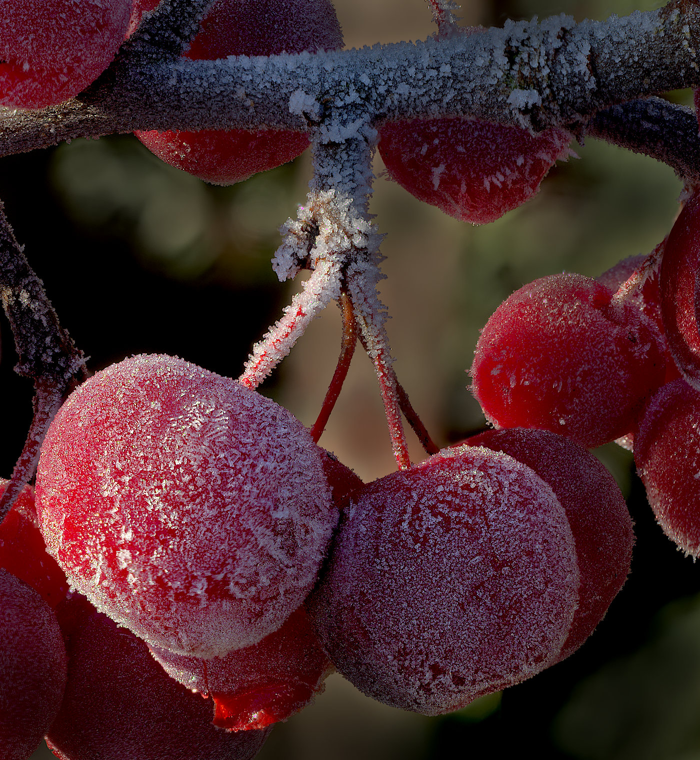
Or this, red = 132%? |
Jan 13th |
 |
| 64 |
Jan 23 |
Reply |
Thanks, Stan. I've re-opened my Affinity file and found the red in the mono conversion layer was at +32%, yellow at +253%, green at +220%, the others at 100%. If I alter the red, say to 100%, I do get some slight gradation in the berries, and I do prefer that. Does this look any better to you? |
Jan 13th |
 |
| 64 |
Jan 23 |
Reply |
I hadn't realised they are contemporaneous, Stan, they don't look it! Maybe a drone was needed to get the best of both worlds.
I'd love to go and see some of these wonders, but my belief in minimising pleasure air and other long distance travel due to climate change makes me very reluctant to. Still, there are great pictures out there for us, thank you for this one. |
Jan 12th |
| 64 |
Jan 23 |
Reply |
Have you ever tried software that removes moving objects, or long exposures for minimising people in a photo? |
Jan 12th |
| 64 |
Jan 23 |
Comment |
I think this is a fascinating view, really well taken and processed. The glass distortions make me wonder if it's pre-float glass. I like the raindrops too.
The only puzzle to me is, why exclude the top of the window? |
Jan 9th |
| 64 |
Jan 23 |
Comment |
Very nicely taken and processed in my view, Helen. It's years since I was in Paris, but we didn't visit this church. Our loss, it was obviously very photogenic.
Your picture has a great feeling of depth I think.
Some might think it naughty, but I'd remove that small triangle of roof line on the right edge adjacent to the tower. |
Jan 9th |
| 64 |
Jan 23 |
Comment |
The Egyptian pyramids are true wonders. How people in those days had the imagination and skill to build things like this is beyond me.
As a photo, I like the detail and composition. Even the clouds have been obliging in their positions! A super mono conversion I think.
If I were picky, I'd suggest that the foreground buildings are a bit too dominant, decreasing the impact of the star of the show. Maybe there wasn't the space for you to move backwards and increase your focal length, but it would have reduced their relative size. It might have brought in unwanted extra features in the forground too. Life's easy from the armchair! |
Jan 9th |
| 64 |
Jan 23 |
Comment |
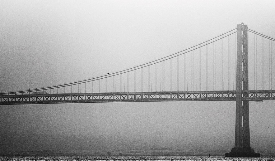
Yes, I think it did, too. You have chosen part of the bridge which lets it dominate the photo nicely.
It just looks a bit too grey to me, and I wondered if increasing the contrast might help. In this picture I took a screen shot, then added a brightness/contrast layer, took the contrast up +100% (wow!) and the brightness down 20%. Any less brightness made the left too dark, so I stuck at this and burned in the right and middle a little. Does this look any better? |
Jan 9th |
 |
| 64 |
Jan 23 |
Comment |
I like the way the density of the stems increases to the back, which gives me a good feeling of depth in this photo. I like the texture of the snow, which contrast the stems well.
At first, I thought that the dark features on the top left were distracting, and they could be easily cropped out to give more emphasis to the tracks. However, the stems do tend to hide the tracks a bit, and after removing them I realised that they actually provided me with a greater sense of the tracks moving through the scene. So on second thoughts, I've changed my mind, it's fine for me as it is. |
Jan 9th |
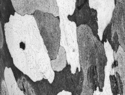
| 64 |
Jan 23 |
Comment |
Well, I'd never have guessed that this is bark! Especially after the mono conversion. I think it makes a very interesting and attractive abstract, the limited number ot tones make it look very artistic. |
Jan 9th |
10 comments - 6 replies for Group 64
|
| 95 |
Jan 23 |
Reply |
OK, I give in! Here is a result of gentler processing :-)
Does that improve it, or reduce the punch? |
Jan 22nd |
 |
| 95 |
Jan 23 |
Comment |
I'm glad to see I'm not the only one doing that sort of thing!
I like this too, it is simple and direct, sharp and with impact, and clearly macro original magnification. Mundane life perhaps, but not a mundane picture! It just shows, subjects are all around us, we just need to look with a photographer's eye.
I'm going to suggest that a crop of would improve it for me. We can't see enough to understand what the changes to the shoelace are as they are out of focus (increases in diameter and dark/light/dark colour on the left and on the top strand). Cropping off a little of the left and removing the top strand gives it more impact for me. |
Jan 13th |
| 95 |
Jan 23 |
Comment |
I would agree with Carol here, the picture is a bit too fussy with all the detail. Often such detail is far enough behind the subject to allow you to throw it out of focus by appropriate choice of aperture, or to blur it a bit in post processing if optical defocus isn't enought to stop it competing with the main subject. It's one of the challenges of macro, enough depth of field to make your subject adequately sharp and not so much that the background is too sharp! Looking around for a similar subject in a more favourable environment often works. Thank goodness digital photos cost so little to take! |
Jan 13th |
| 95 |
Jan 23 |
Reply |
I admitted that I'd created the brightness gradation, it's just a result that I like. It seems to me that it's in vogue with salons too - simple subject processed for dramatic effect. I don't enter salons, I briefly tried years ago and got nowhere, and the costs was not inconsiderable I thought, but it's interesting to get examples there for inspiring my efforts.
Normally I'm a severe cropper of my photos, but I think your stronger crops here are good ideas. I guess I was trying to keep some depth then I made it, but it wasn't necessary. Thanks! |
Jan 13th |
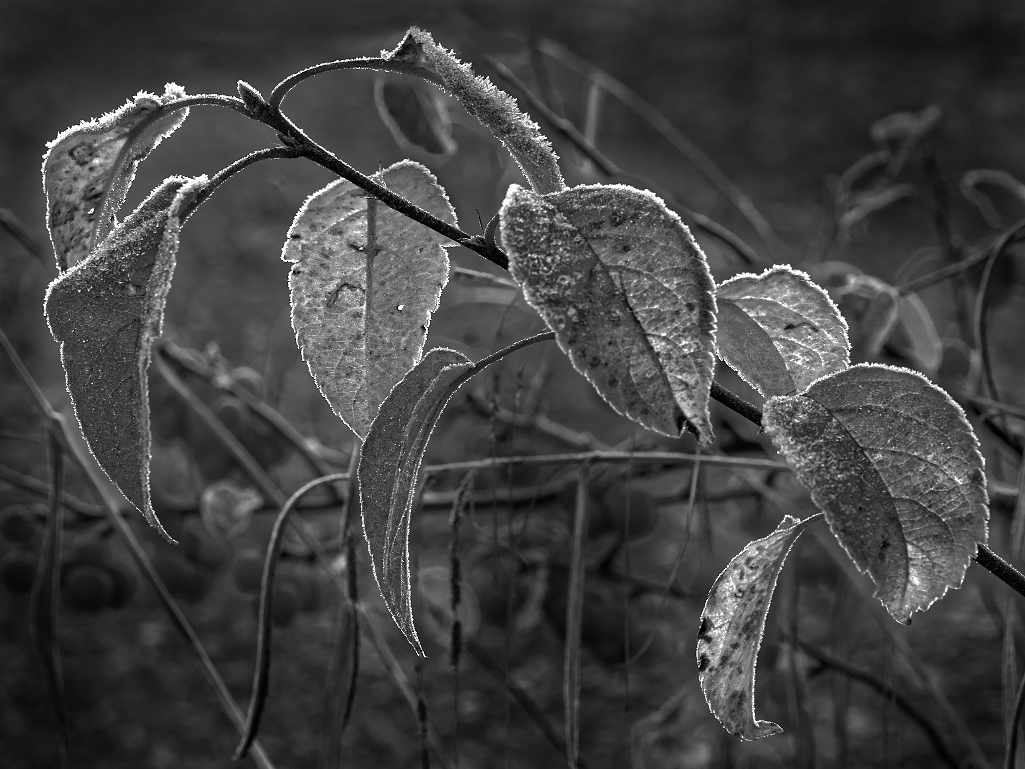
| 95 |
Jan 23 |
Reply |
Thanks, Gloria. It was a lovely morning with subjects in abundance that could keep me going all year in this group. This one stood out to me, as frost is difficult(I find) to make look realistic - because close-up its structure is less clear than it appears from further off. Light is key of course, and the sun was low when I took it. I've not used cameras for focus stacking other than Olympus, and my OM1 mk2 takes them so quickly that hand movement is small enough for the stacking software to align the errors. I've seen it done by other cameras too, although looking at the specification of the 80D I don't think it has an in-camera focus stacking mode. Tripod and focus rack still works fine! |
Jan 13th |
| 95 |
Jan 23 |
Comment |
Well, I thought it was a lily at first, it shows you can't rely on my botanical knowledge!
Another lovely result, the delicacy of your processing is something I try to copy sometimes but never get it good enought to show you the result!! If I were processing that original, I'd mask off the main flower before blurring and perhaps smudging the background, but you seem to have blurred the main flower petals a little, so maybe you didn't mask it. Your result is all the more subtle and calming, I think - well done, as usual.
|
Jan 9th |
| 95 |
Jan 23 |
Comment |
This looks the same as your December picture, Pat. |
Jan 9th |
| 95 |
Jan 23 |
Comment |
It amazes me that you have cropped so heavily and still got half decent sharpness! Not the normal way to do macro.... but well spotted! I've not seen a sea fan before.
All the light areas are blown out. I don't know how you could have avoided this in this case, or even if it would improve the picture, although avoiding any blow-outs is usually important. Getting closer and taking an exposure bracket might have found a better frame, perhaps for HDR.
|
Jan 9th |
5 comments - 3 replies for Group 95
|
15 comments - 9 replies Total
|


