|
| Group |
Round |
C/R |
Comment |
Date |
Image |
| 64 |
Dec 22 |
Reply |
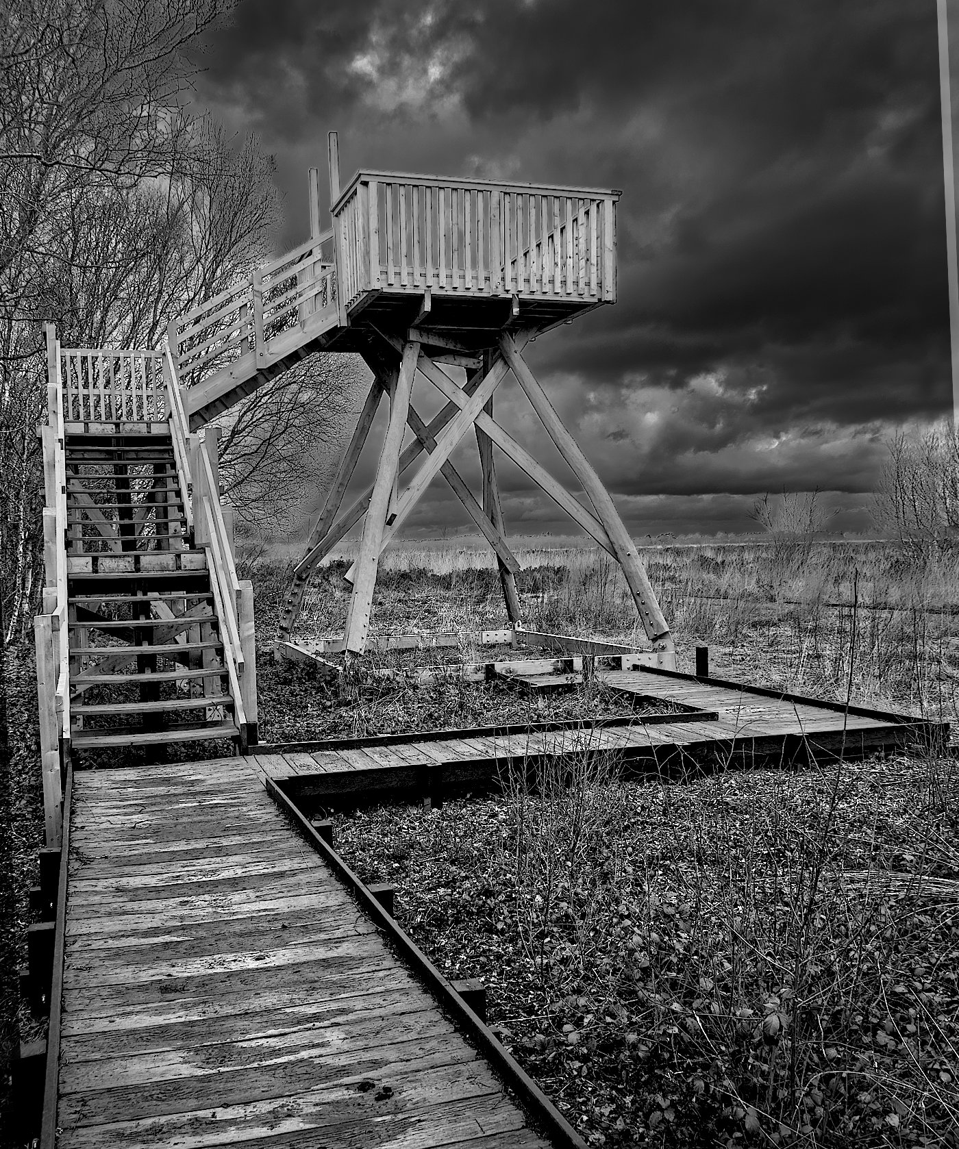
Thanks, Chris, that's an insightful, helpful critique. In my partial defence I'd say that the original didn't have more to the left, so it's a fatal flaw at the outset. I did realise that it was imbalanced but still liked it and thought it worth some aggressive processing. I'm happy with the result per se, but it's no competition image for the reasons you state. I should have asked my wife (we were just out on a walk at a moss reserve not far from home) to be a model. She doesn't like her picture being taken, but could be persuaded to be an anonymous model, perhaps!
It was intended to be a dark, foreboding image, so the reactions of our group are pleasing to me on the whole. |
Dec 29th |
| 64 |
Dec 22 |
Reply |
Hi Helen,
Thanks for your perceptive comments and suggestions. Yes, it is whimsical!
There were 5 layers in the original. So I followed your suggestion and merged them. Initially I got an almost completely black sky, but turning off the brightness and contrast layers returned me to what I had had previously. Then when I clone stamped on the merged layer, it filled in the triangle without the light line being formed. So, you were right! I found that when I turned back on one of those layers, the line came back, so it must be something in the processing history to do with that layer that caused it. I've had several goes at processing this image, I've forgotten the details of the early work. It's possible to save Affinity files with all the processing history for revisiting in the future, but I've seen the resultant file exceed 100MB, so it's not practical for me to save the history usually. Anyway, I'll try the same trick next time I have the same problem, thanks!
What you have also noticed, the black edges, is another unwanted artifact of my processing. The general process I've used is to make a selection (eg the sky here) and then darkening it with a contrast/brightness adjustment layer. I then invert the selection and make another contrast/brightness layer in the non-sky area, which I lightened. This process highlights an area by lightening it and also by darkening the area outside it. It seems logical to me, and it moves me towards the effect I was seeking, but tends to leave those black lines. I don't know how Affinity does selection areas, are the marching ants in one area or the other, or neither? I don't know. My knowledge of masks is weak, so I've seen this problem several times in the past and not been able to prevent it. Perhaps a different process with layer masks is needed. You sometimes see photographers with dozens of layers on their image, which is beyond me! |
Dec 22nd |
| 64 |
Dec 22 |
Reply |
Gosh, I'd not noticed that until you pointed it out. The front right leg (as we look at it) is quite bent, it looks like it's from War of the Worlds and is off for a walk! When looked at carefully, the whole picture seems lacking in horizontals, but the platform is indeed the most obvious. I should have paid more attention to the verticals, what few there are.
Now I'll ask you (all) a different question. Below I have taken my .afphoto file (like a Photoshop .psd file) and rotated it a little. It had wedges of blank canvas on the sides but I didn't want to crop it off the one on the right as it would have cropped of the corner of the walkway. So I did the usual, I tried to clone in some of the base image layer to fill it. Alas, it made that light strip along the edge of the previously-blank area, and it won't fill it. Affinity does this sometimes, it's as though the clone brush has run out of ink. Has anyone any idea why this happens? It is rather frustrating. |
Dec 19th |
 |
| 64 |
Dec 22 |
Comment |
Sorry if I'm being dim, but I can't see any red from the right. Perhaps there's a hint behind the trees, and reflected in the clouds. The orange leaves are bright, but the colour looks like autumn leaves to me. No matter, I stand by my liking of it. |
Dec 15th |
| 64 |
Dec 22 |
Comment |
Just straightening the converging verticals would have made a good improvement on the original, and you've done an excellent job on that. But the mono version is just in another dimension, way above the colour one. The hedge detracts a little, but I love it anyway. |
Dec 15th |
| 64 |
Dec 22 |
Comment |
It's a view with potential I think, but the conversion is rather dark in my view. There's scope for getting a bit more out of the clouds as well as detail from the blocked areas. Here is a quick edit I've done on the original - what do you think?
The mono version, of course, is the better! :-) |
Dec 15th |
 |
| 64 |
Dec 22 |
Comment |
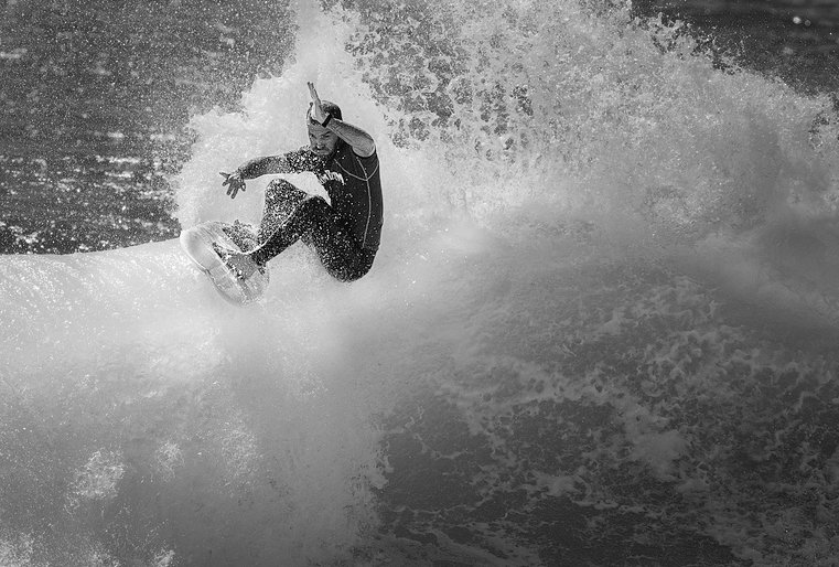
Yes, a very pleasing image after cropping, and as Don says, different crops lead to interesting variations.
I think that the surfer is too dark, but the contrast with the waves is good. I've done a bit of selective adjustments of brightness and contrast to get this result. It's a bit more dramatic and focussed to me. what do you think? |
Dec 15th |
 |
| 64 |
Dec 22 |
Comment |
Another super landscape to enjoy. I like the grass which points up to the interesting sky, there's depth from the distant view on thr right, and the tree leaning over to the left leads my view to the schoolhouse. The lighter sky above the building adds to that movement.
I would say that the old swing and lone pole behind it spoils the composition a little for me, and I'd have cloned those out. Cropping a little off the bottom would put the house into the 2/3 area without losing the effect of the grass. |
Dec 15th |
| 64 |
Dec 22 |
Comment |
I'm not sure about the "Sunset" description, as I can see no red shades in the original. But that aside, I think this is a lovely picture, the conversion is classic monochrome. As Don says, the reflections (with the treelines) give a super feeling of perspective. Even the ripples in the water add to the depth and tranquillity of this scene. |
Dec 15th |
6 comments - 3 replies for Group 64
|
| 95 |
Dec 22 |
Reply |
Ha! I'm glad Carole likes the original red, because I do too. For me, once it was pointed out, the only problem with it was that it did lack detail, and the darkened and desaturated version has that detail back. Maybe I could fiddle with it and get the best of both worlds. |
Dec 20th |
| 95 |
Dec 22 |
Reply |
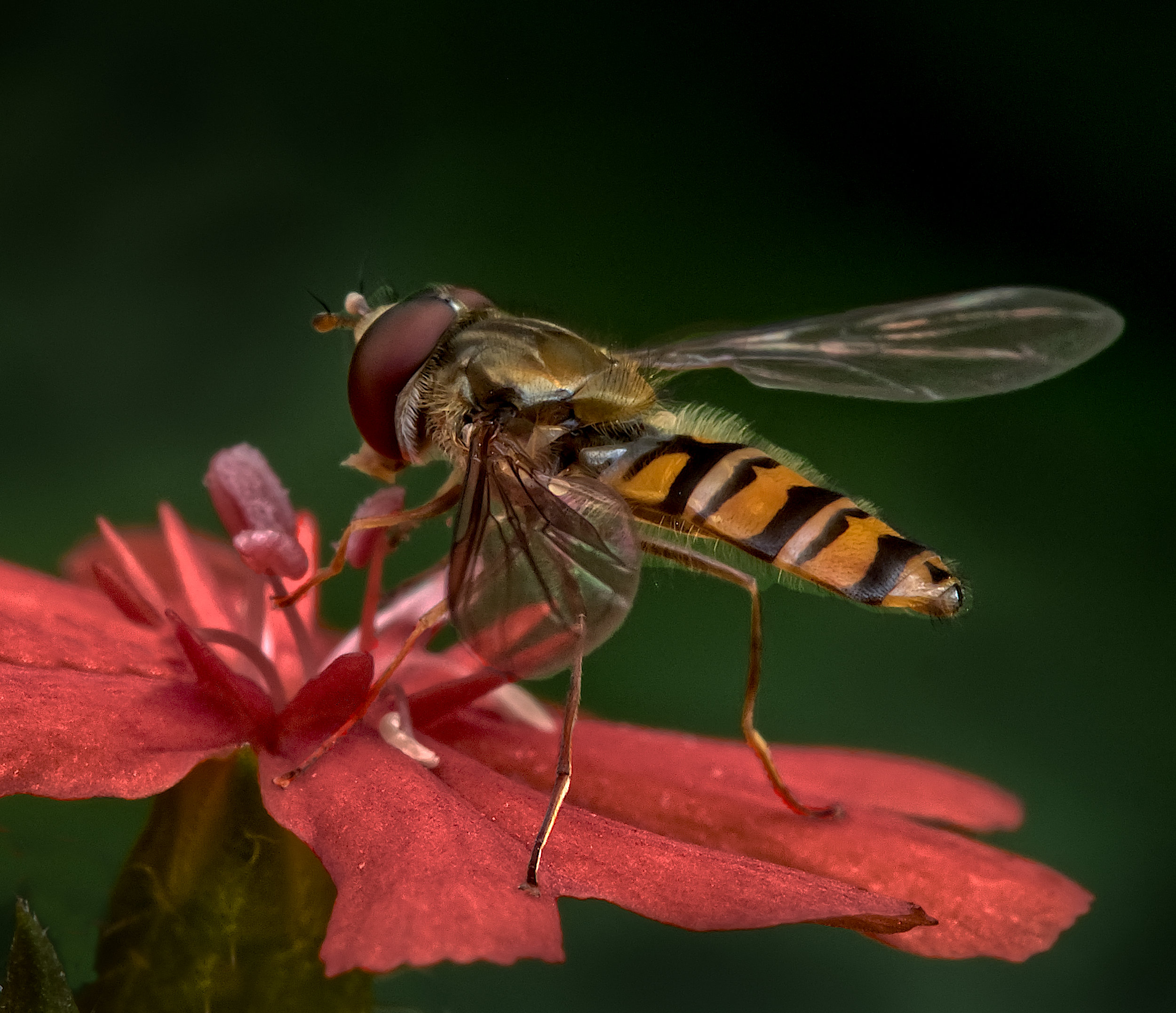
Thanks Tom. Red has always been my favourite colour! Many judges here seem to dislike excess green. Maybe we should all go to mono. But here, colour is key to the picture. I suppose I could change the flower to yellow, say. I gave that a go and got a poor result, my colour changing skills aren't up to much. However turning the saturation down on the petals seemed to work - |
Dec 18th |
 |
| 95 |
Dec 22 |
Reply |
Yes, that sort of thing, that's as good as can be done with this original I think. But for a pattern image, I think it's a pity that the front row is still dissimilar to the row in focus, so a second original is needed, maybe focussed on the next row further away. |
Dec 18th |
| 95 |
Dec 22 |
Reply |
"Failure" is too harsh I think, just not your best. We all learn from experience, which usually means lots that didn't work as well as hoped for. That means I should be far better than I am! :-(
|
Dec 18th |
| 95 |
Dec 22 |
Reply |
Great job, it looks better all round! |
Dec 18th |
| 95 |
Dec 22 |
Reply |
Enough judges have drummed into me to check the outside edges of my finished images for distracting light patches or details, that I tend to do that automatically now ;-) |
Dec 17th |
| 95 |
Dec 22 |
Reply |
Yes, that was what I meant, you could have used a smaller aperture as you would still have got a fast enough shutter speed. This would have increased the depth of field, which I think would have been beneficial. |
Dec 17th |
| 95 |
Dec 22 |
Reply |
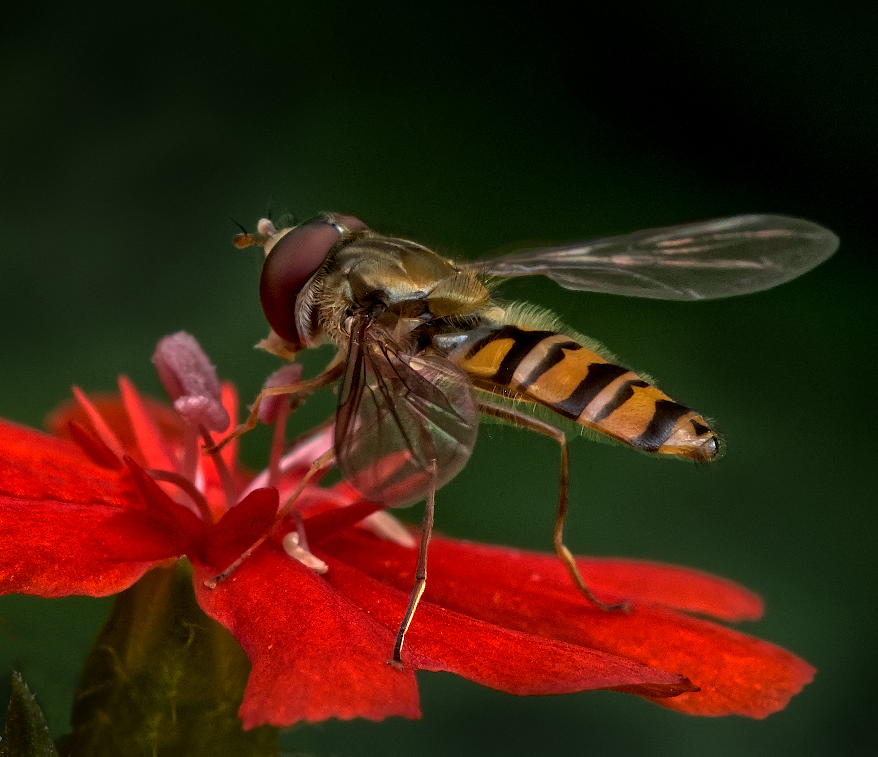
I looking in my .afphoto file to see if I'd increased the saturation, but no, that was unaltered. I did alter the brightness, and now I've found that by decreasing the brightness of the flower petals, I get more texture which I think is an improvement. In the version below, I've cropped it as suggested in my reply to Carol. Alas I've not refined the mask around its abdomen and the change is obvious there, but I think it demonstrates what Keith was meaning. |
Dec 17th |
 |
| 95 |
Dec 22 |
Reply |
Thanks, Carol. Alas, those petal tips weren't in the frame, I guess I was concentrating on doing a good job of the fly. An alternative strategy would be to crop more off the left I think, maybe 10% of 15% of the width, making it look more deliberate, but avoiding leaving the fly in the middle. |
Dec 17th |
| 95 |
Dec 22 |
Comment |
I think it's a pleasant, effective photo Carol. I would suggest the focus is soft, which is a perfectly valid effect when deliberate, and adds to the ethereal feel your processing has brought. Well done! |
Dec 15th |
| 95 |
Dec 22 |
Comment |
Well, there's no way you could improve on the eye focus - it's bang on, well done. The whole of the side of the frog is nice and sharp. The far edge is soft, and I wonder if 1/500 sec and the aperture doubled would have rendered it less soft since it was still. The surface it is sitting on would have had more depth then too, whilst the background would still have been well out of focus.
At first I wondered about the green area, top left, and wondered if cloning that out with local branch (?) texture would have been better. But actually, as it's the same shade of green as on the frog, I think it has a pleasant balancing effect, but others might not agree!
|
Dec 15th |
| 95 |
Dec 22 |
Comment |
4s at f16 and 21 images sounds odd. Clearly it was dead and not going to move, but would 1 sec at f8 have been better? Not that there's anything wrong with your result, it looks fine to me. The background is a bit boring, leaving it suspended in space - could it be replaced?
|
Dec 15th |
| 95 |
Dec 22 |
Comment |
Great imagination, Pat! It takes a photographer to see a picture like this. I like the result, it's well taken and interesting.
Personally I'd have moved forwards a little to exclude the two circular objects at the front, they are a bit distracting. |
Dec 15th |
4 comments - 9 replies for Group 95
|
10 comments - 12 replies Total
|


