|
| Group |
Round |
C/R |
Comment |
Date |
Image |
| 64 |
Oct 22 |
Comment |
A super shot, just caught in time! I'm wondering if you had taken it a split second earlier so that the bike was more in the bright area it would have been better. Perhaps not on balance, as the drk background to the rider make him stand out. Well done. |
Oct 23rd |
| 64 |
Oct 22 |
Reply |
You're right, Don, and I didn't notice! |
Oct 15th |
| 64 |
Oct 22 |
Reply |
Thanks, John. |
Oct 15th |
| 64 |
Oct 22 |
Reply |
Thanks, Jerry. I do HDRs of many subjects, and it would have been a good option here. |
Oct 15th |
| 64 |
Oct 22 |
Comment |
A real challenge to do that!I think you've elevated a record shot to an interesting picture, and for me your aim has been realised.
I think I would have left the point of the frame on, or cropped it a bit more.I would also correct the converging vertical to remove the visible part of the lighter frame part at the right edge.
|
Oct 9th |
| 64 |
Oct 22 |
Comment |
I think the scene is super. I don't know why the sky is so dark, but it emphasises the line of the buildings very well.
I think it has exaggerated the perspective as you were close to the fountain.
The tone is interesting, but perhaps a bit too light brown when compared to the sepias in my mum and dad's old photo albums to look like sepia to me, but there's nothing wrong with this colour in mono.
It looks to me a teeny bit like it's leaning to the right slightly.
|
Oct 9th |
| 64 |
Oct 22 |
Comment |
I thought more or less as Chris says, even before I read his post.What an unusual roof feature! Was it for a crane/ pulley, or similar?
Perhaps lighten the front face of the cabin a little? |
Oct 9th |
| 64 |
Oct 22 |
Comment |
Nice scene. As you probably know, I'm a troglodite when it comes to infra-red photos, so I'll say no more than that I like Original 3! |
Oct 9th |
| 64 |
Oct 22 |
Reply |
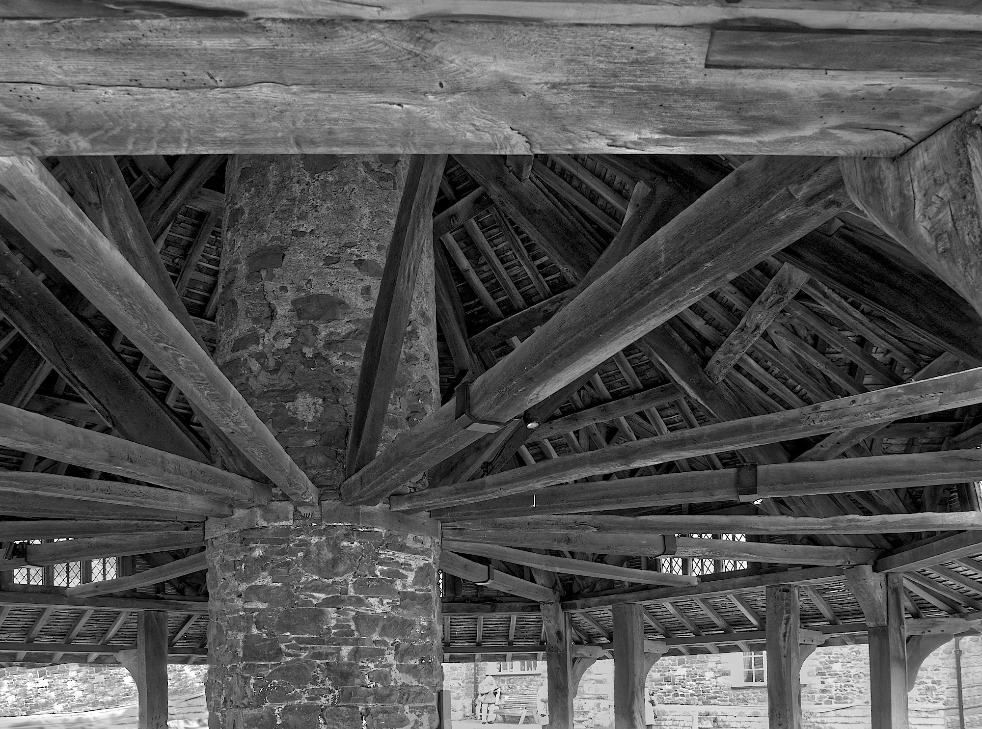
Thanks, Chris. It does look good, over 400-year-old wood! We don't build them like that any more.
I agree, my darkening of the burned out area was hasty and clumsy. I had hoped there would be hidden detail there which would be brought up, but no.I thought about cloning in a bit from the lower right area, and in hindsight would have been better. I'll give it a go. Any better?
The grass track picture did improve for most people from removing the marshall. Those going to such events would know who he was, but for most he was just out of place. Glad you like it!
|
Oct 9th |
 |
5 comments - 4 replies for Group 64
|
| 85 |
Oct 22 |
Comment |
Hi Pete,
I think we had a chat here some months ago about my getting into drone photography, and you recommended your Air 2S. I bought one a couple of weeks ago, and am getting used to it - rather different to model aircraft! So far I've just been doing practice shots locally, but pictures like this one are very much the sort of pictures I want to take. But in the UK! This is a super picture, well done. There is a lot for me to learn from this group from all your shots - quite inspiring.
|
Oct 13th |
1 comment - 0 replies for Group 85
|
| 95 |
Oct 22 |
Reply |
Thanks Gloria.
Stacking doesn't improve sharpness really, it increases depth of field. The sharpness never improves from stacking (although it can be improved in other post processing of course), but the depth of field can be increased many times over.
|
Oct 25th |
| 95 |
Oct 22 |
Reply |
A white border round the photo, a bit like a frame, but it's often essential in competitions when the photo has a substantial amount of its border dark or black. Without it, the viewer can't see the extent of the photo easily, and the border (only 2 to 4 pixels wide) shows where it is. |
Oct 18th |
| 95 |
Oct 22 |
Reply |
You made me look at it again, Pat, and I see I've forgotten to add a white stroke. |
Oct 17th |
 |
| 95 |
Oct 22 |
Reply |
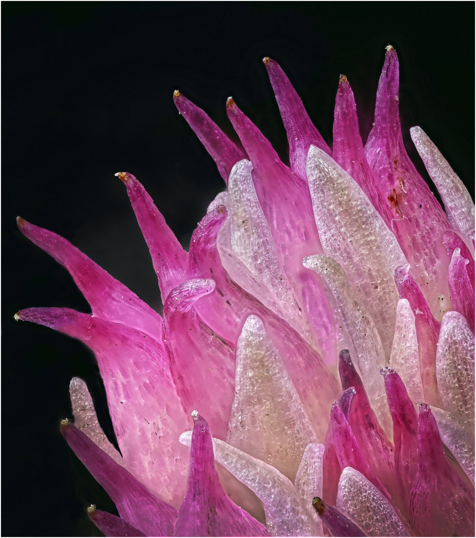
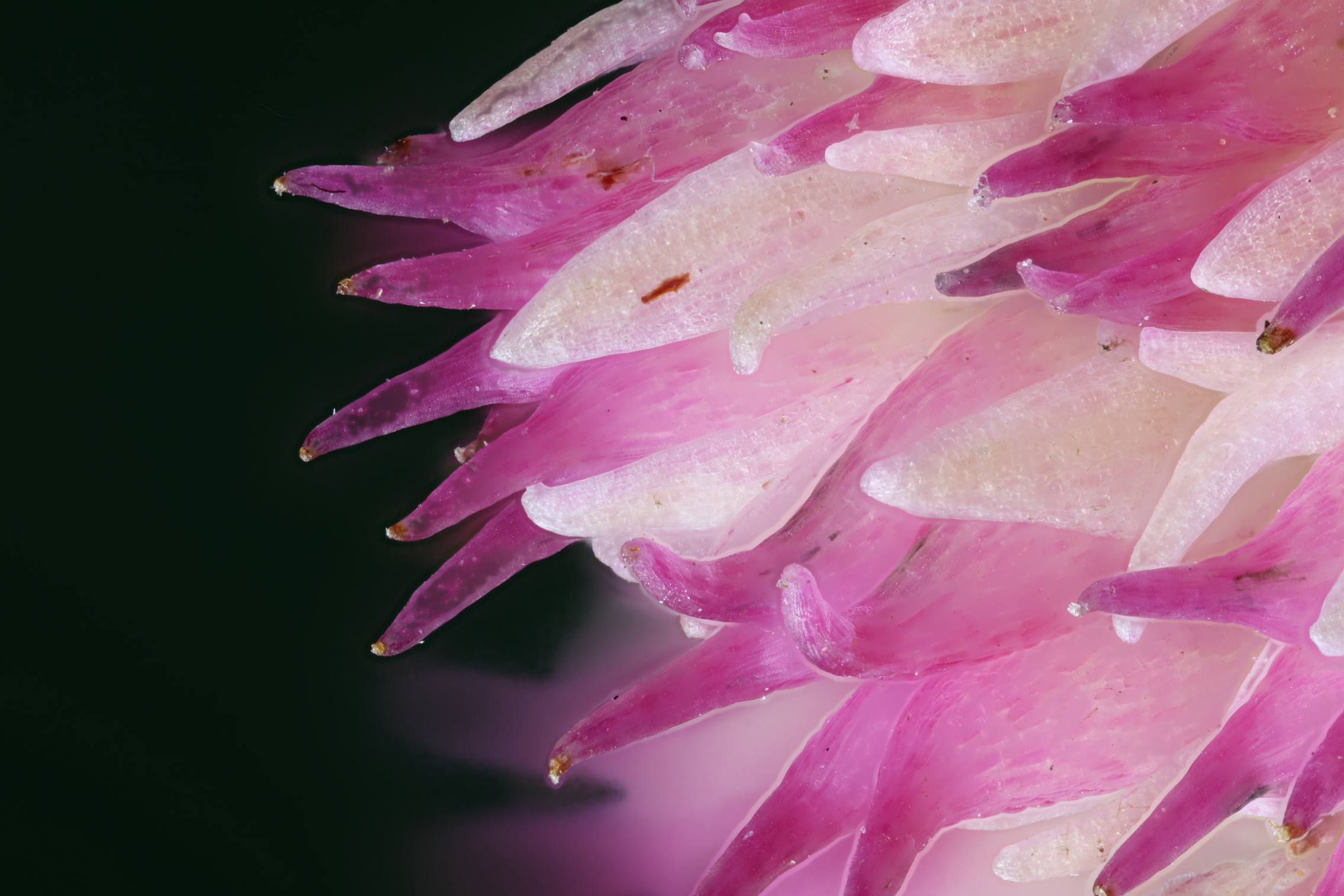
I think there are no hard and fast rules about whether a macro image should or shouldn't have out of focus areas. Non-macro can definitely have out of focus areas of course, and equally macro can be 100% in focus, it all depends on your intention. If it's a record photo then out of focus areas might not be helpful, but in artistic photos it's entirely your choice. Carol is good at presenting flower photos with substantial areas out of focus with great artistic results. This present photo is definitely art rather than record, and my first impression was that the out of focus background wasn't helping and could go. However on looking again, I think that if you cropped off maybe the top 20%, leaving some but not as much out of focus, then it does give the best of both worlds - it's clearly macro and a nice pattern, colour and texture. Just my view, you are welcome to consider and reject it :-)
|
Oct 16th |
| 95 |
Oct 22 |
Reply |
It's nothing much, a bit of a tease! If you look at the original out of Helicon (attached) you will see pink glow from background petal which I thought was distracting, as well as some outlines which must have come from the stacking, so I got rid of those, but there are tell-tales due to my hamfistedness.. |
Oct 15th |
 |
| 95 |
Oct 22 |
Reply |
53 is just just getting started! If you look here https://www.nikonsmallworld.com/galleries/photomicrography-competition
then you will find some wonderful microphotography, and many use large stacks, for example -
https://www.nikonsmallworld.com/galleries/2020-photomicrography-competition/bogong-moth (64 images)
and
https://www.nikonsmallworld.com/galleries/2019-photomicrography-competition/small-white-hair-spider (128 images)
Many photos there say they are stacked without saying more, but once you know that their depth of field at higher magnifications is measured in microns, then you know it's a lot of inages in the stack! But despite it being a microphotography competition, they don't exclude what we would call macro shots, eg this one at 1x magnification:
https://www.nikonsmallworld.com/galleries/2019-photomicrography-competition/female-oxyopes-dumonti-lynx-spider
Enjoy browsing there!
|
Oct 13th |
| 95 |
Oct 22 |
Reply |
You're welcome, honest comments are the raison d'etre of the DD I think. I don't use PS, although Affinity Photo is very similar apparently. It has a number of selection tools, but not "select subject". I have found that, once the mechanics of editing have been mastered, then the finesse of invisible editing is another, harder step along the way - which I'm still making! |
Oct 13th |
| 95 |
Oct 22 |
Comment |
I think it was a good idea to remove those background stems, and the bokeh looks fine to me. The texture and sharpness of some of the stem are very attractive to me.
The bit which draws my attention is the severed end of the stalk which is quite diffuse. The stalk, to me, is the pinnacle of interest here as the bokeh pushes the eye to it, and the lines on the body all lead to it. So I would seek more depth of field to cover all the stalk. |
Oct 12th |
| 95 |
Oct 22 |
Comment |
I found this picture had instant appeal to me, but something wasn't quite right.
On closer examination I spotted a few signs of your editing. The valleys made by the spiral above the middle and right rose images was the first I saw, they are circle segments rather than cusps, and I gradually realised that the green to background edges are all a bit too sharp. I suspect you've been darkening the background with a burn brush or similar to produce this, as it's not on the original. So I agree with Carol, a good original shot, but perhaps you could try to darken the background (which I think is the right thing to do) with attention to those details?
The sharpness of the rose images does seem to be a little soft, but that's fine as I think that can happen with this type of setup. The sharp edges that I've commented on tend to draw attention to the softer roses due to the contrast. |
Oct 12th |
| 95 |
Oct 22 |
Comment |
Wild flowers make good subjects for us I think, as they are often quite small like this.
Despite Carol's comments, I can't help but think it's not all that sharp.The petals and sepal on the top part are nicely sharp, but the stamen and the lower petals look rather soft to me. So, I would crop off the lower area and a bit of the stem. |
Oct 12th |
| 95 |
Oct 22 |
Comment |
A coincidence, I was photographing a rubber band a couple of weeks ago, but the texture of this belt and the shapes made are much nicer.
I would crop the distant, out of focus area, as I feel it's distracting rather than adding to the context. A letterbox crop looks OK to me as the lines of the belt are predominantly horizontal. |
Oct 12th |
| 95 |
Oct 22 |
Comment |
A good capture, Gloria. You can spend hours in places like that, seeking little critters. I'd take something to kneel on, else I wouldn't be there long!
I would darken the top corners to math the brightness of the bottom corners. |
Oct 12th |
| 95 |
Oct 22 |
Comment |
Very nice, Fran, an excellent result.
I would agree with removing the dark corner. I'd be happy with cropping off the right edge just enough to remove it, or cloning in from the adjacent area to its left. I find cloning much easier than trying to match with a brush - Carol is an expert at that, I'm not!
|
Oct 12th |
6 comments - 7 replies for Group 95
|
12 comments - 11 replies Total
|


