|
| Group |
Round |
C/R |
Comment |
Date |
Image |
| 64 |
Sep 22 |
Reply |
How about this? |
Sep 26th |
 |
| 64 |
Sep 22 |
Reply |
I must admit I'd thought about cloning him out as well, Chris. He wouldn't leave his post as he was an important part of the safety system, so that would be the only way to remove him. I'll give it a go! |
Sep 17th |
| 64 |
Sep 22 |
Comment |
Sorry, Jerry, I wasn't clear. I certainly wouldn't wish for less of his face; as you say, it's the main subject. I'd meant a crop off the foreground. I would have suggested cropping off the bottom edge up to and including the top of the white triangle on the left edge. Then I think the fish still lead your eye into the face, but aren't competing for attention. This is the sort of street photography that I really like!
|
Sep 12th |
| 64 |
Sep 22 |
Comment |
I like the radial filter version. To me, the out of focus foreground is not an issue, it's part of the photo and leads the viewer to the face which is great, although a bit less of it would be good I think, less then in the "cropped version".
I think it needs to be rotated about 5 degrees anti-clockwise. I'd also darken the light patch above the "redcompra". |
Sep 11th |
| 64 |
Sep 22 |
Comment |
It too me several looks to realise it's the Golden Gate bridge. Certainly it's completely different to any picture I've seen of it, and it's really interesting.
I can see merit in the suggestions about the clouds, but would echo Stan's comment not to diminish the punch of the image of the bridge.
|
Sep 11th |
| 64 |
Sep 22 |
Comment |
This image demands attention! Plenty of impact!
Overall I think the clarity looks rather high - the texture of the fountain just seems a bit incredible to me. The black sky also looks odd to me - perhaps paste in a cloudy sky? |
Sep 11th |
| 64 |
Sep 22 |
Comment |
I think this is a well thought out photo. I think John's ideas are well worth a try.
I find the change in pattern on the water at about 1/4 of the way up (a diagonal line falling slightly to the right) spoils the pattern a little. I'd crop it off; I think the composition improves then.
|
Sep 11th |
| 64 |
Sep 22 |
Comment |
I agree, it's a nice abstract photo. I'd put a white stroke round the frame to help the viewer see where the picture ends.
"Very poor light"? It's quite directional, but the picture doesn't suffer from that, and there's plenty of light from your exposure despite the high ISO!
|
Sep 11th |
| 64 |
Sep 22 |
Comment |
Completely different to my TV-created impression of Hawaii! Regardless, it's a picture that I like, and technically it's super with a good mono conversion.
I find the grey box on the right somewhat distracting and at odds with the texture of the rest of the picture, so despite Helen's comment, I'd prefer to see it removed. |
Sep 11th |
| 64 |
Sep 22 |
Reply |
It's interesting that for more years than I care to remember, I've sought not to "cut off" items in a photo. I guess it comes from my early years when my dad was famous for cutting off people's heads in family photos! So my first teendency is to keep in the whole of the right hand bike, but there's no doubt in my mind now that the part is better than he whole here.
Thanks for all other helpful comments. |
Sep 11th |
| 64 |
Sep 22 |
Reply |
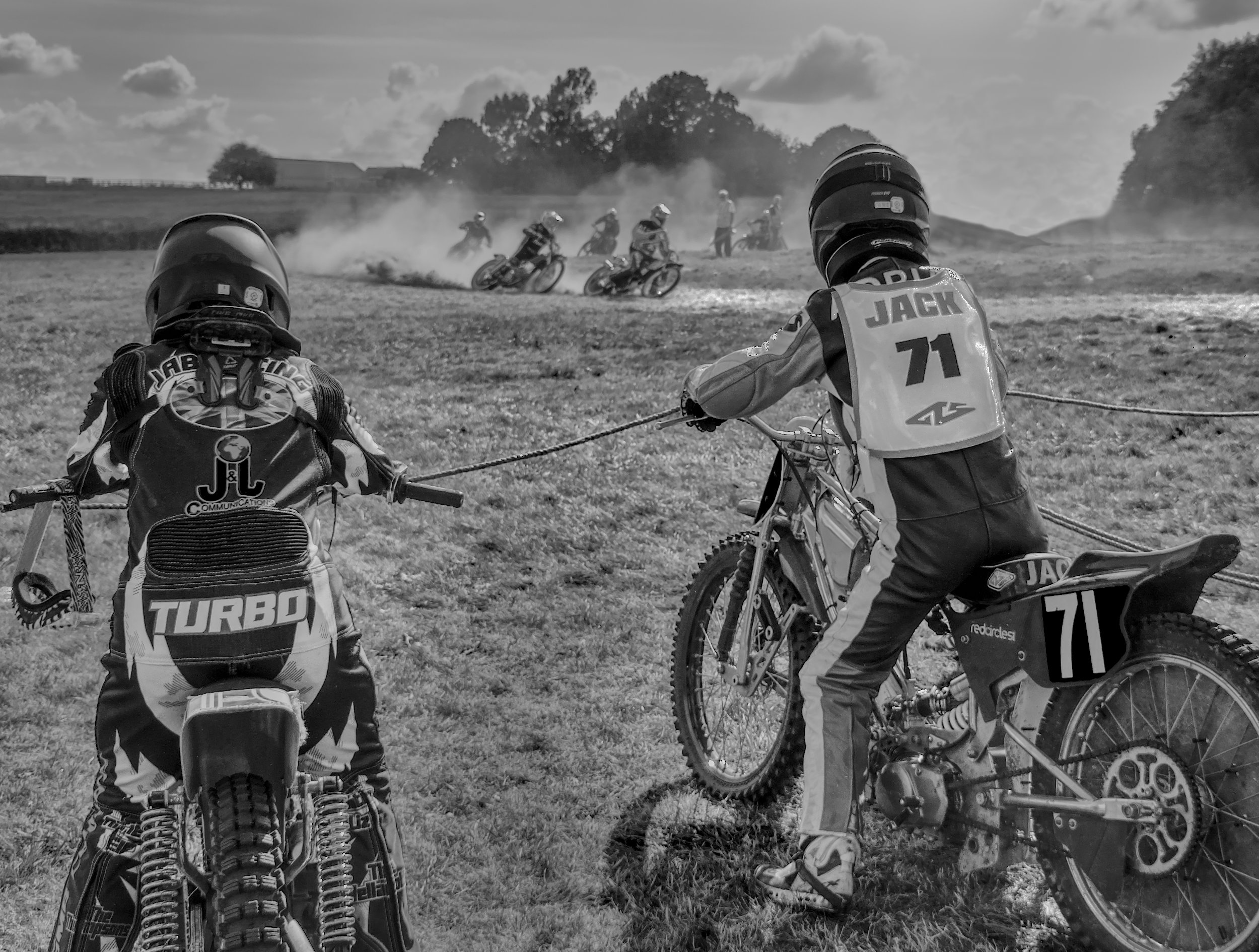
Thanks, Stan. A crop would help this, I agree, but the relative size of the distant riders to the waiting riders would be the same, and I'd wanted to alter that. I liked the full bike in view as he's the main subject, but losing a little just balances Jack with Turbo so still seems to work. |
Sep 5th |
 |
| 64 |
Sep 22 |
Reply |
Thanks, Don. Yes, I think the foreground grass is a bit too bright. I've had a go at darkening this, and directly burning in the grass seems to be best. The odd thing is the histogram is all in the left hand (ie dark) side, none in the right! |
Sep 5th |
| 64 |
Sep 22 |
Comment |
Ah! I see that what I have written, "putting the two together", does make it sound like I was making a composite. Actually, I just meant getting a single picture with both those in the assembly area and those actually racing in it. That's what this is.
We are having very dry weather here, and the course was very dry, as shown by the dust off the racers. Despite the knobbly tyres, a few fell off. Grass track racing is quite popular, cheap and relatively safe motorsport. |
Sep 4th |
8 comments - 5 replies for Group 64
|
| 95 |
Sep 22 |
Reply |
Pat,
If you look at the top of this page, above the orange text "PID Digital Dialogue", you will see the link "BULLETIN BOARD". Click that and you will find it.
|
Sep 26th |
| 95 |
Sep 22 |
Comment |
I was guilty of only looking at the flower, Carol, and your observation is quite right I think.
Do you think you could give a breif guide or some comments on how to do a texture? I use Affinity Photo, but if you don't, do you know of anywhere where I can get an idiot's guide?
By the way, we seem to be neglecting the bulletin board, it would be a good place to put such information. |
Sep 17th |
| 95 |
Sep 22 |
Reply |
Yes, I ike that, Tom. I often find that the loss of the periphery when merging the stack leads to tighter borders than I would like - I must remember!
I like your darkening, too - the blue is deeper which improves it.
|
Sep 16th |
| 95 |
Sep 22 |
Reply |
Hi Keith,
Thanks. No, it was shot indoors under artificial light. Adaptalux is a UK firm selling macro lights (see https://adaptalux.com/) which I use a lot and like. I have some home-made LED lights as well. You can see them as a reflection in some water drops. My macro rig is set near a window so inevitably there's some daylight coming onto the subject, but the main light is those LEDS. |
Sep 14th |
| 95 |
Sep 22 |
Comment |
It's a challenging subject for hand held. The result is rather pleasing, although I think a few points could be improved. I would clone out the bright spots in the top right side.
Firstly, the reflections are still rather hot. More highlights suppression might help, especially if you used RAW.
Depth of field wise, I'd have preferred a bit more to get her bust line sharp, so perhaps f11 or f16. Doing this in the field is rather hard, so I'd have taken several with different settings (if I'd remembered!).
Finally, a little more on the left edge would have given her a bit more space which I would have preferred. You could extend the canvas to the left and clone in more of the left edge - being out of focus it would be quite easy.
. |
Sep 11th |
| 95 |
Sep 22 |
Comment |
Well, it's a good exercise and a good result.
If your intention was to get it pin sharp from front to back, then you missed a little at the back. Perhaps another image or two would have been needed. |
Sep 11th |
| 95 |
Sep 22 |
Comment |
It's amazing how greater magnification turns a recognisable object into a mystery one! The texture and colours are really interesting I think.
|
Sep 11th |
| 95 |
Sep 22 |
Comment |
Stacking is more or less impossible with a moving subject, Pat, so don't think it would have helped. To get more into focus, you need to keep the subject parallel to the sensor / camera. Not easy with a wriggler!
In the circumstances, at the magnification you've achieved, this is a good effort, well done.
|
Sep 11th |
| 95 |
Sep 22 |
Comment |
I think this is a really attractive photo. The leaves have a slight diagonal slope which is pleasing, and the lighting is lovely. The background is a bit bland, but it helps the strong message I think. Beautiful texture and colours. Well done!
The depth of field is less than the subject depth, so the far edges of the leaves are a bit soft, but for an artistic image that's absolutely fine in my view. More, please!
|
Sep 11th |
6 comments - 3 replies for Group 95
|
14 comments - 8 replies Total
|


