|
| Group |
Round |
C/R |
Comment |
Date |
Image |
| 64 |
Jul 22 |
Reply |
Oops, sorry for my typo, I meant "catherine wheel" |
Jul 26th |
| 64 |
Jul 22 |
Reply |
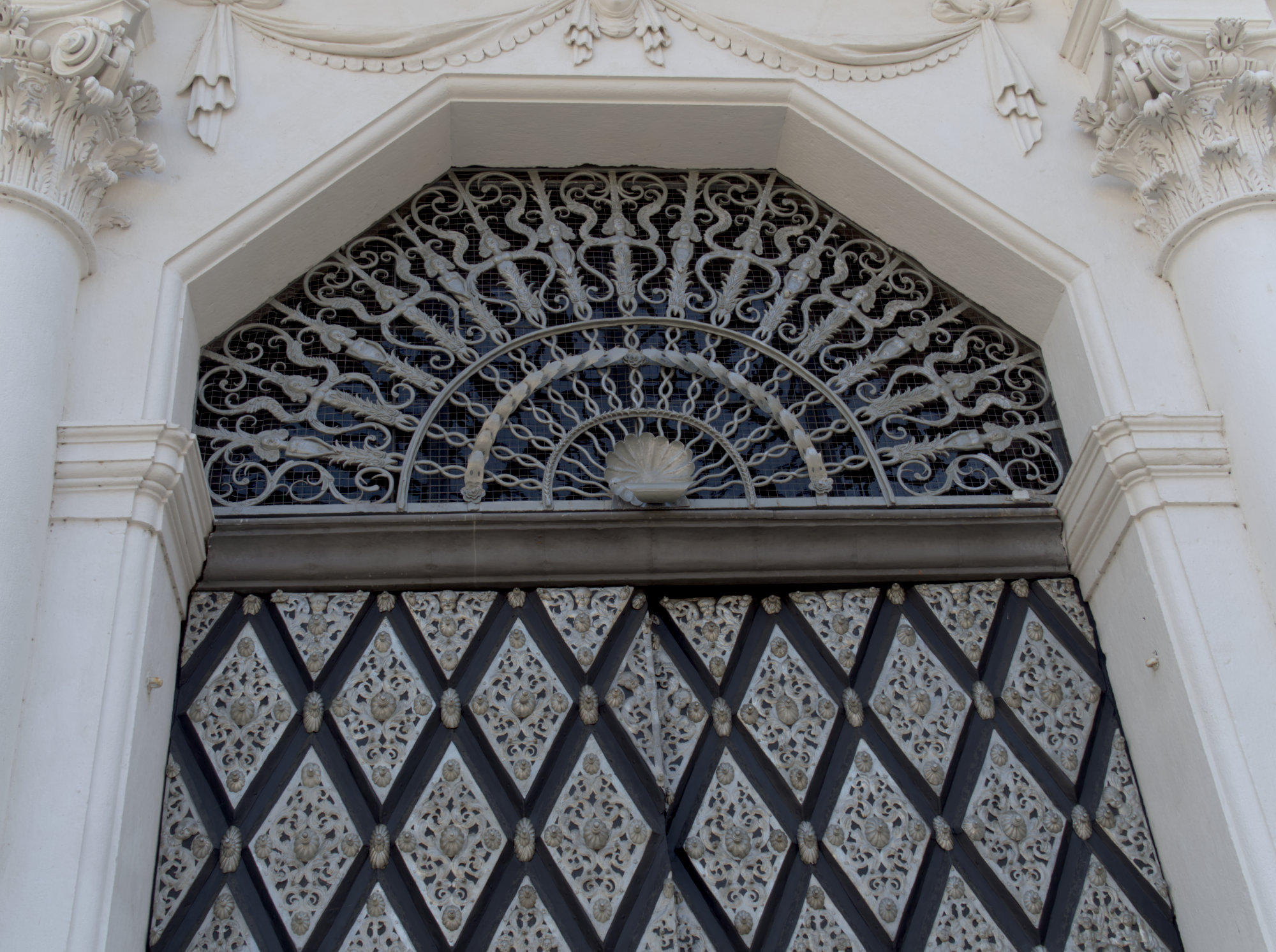
Hi Chris,
Thanks for your comments. I like your ideas, and as you can see now I've uploaded an original that there is scope for those. I didn't centre myself very well, if I had there would only have been converging verticals to deal with. I don't recall how much space was behind me to minimise the converging verticals, either. We only had 1/2 day in Passau, which is a really lovely city, so my excuse is being rushed by the others in my party! |
Jul 26th |
| 64 |
Jul 22 |
Reply |
Yes, I agree. I can't honestly say whether the door has that distortion in it, of if the lens introduced it. Affinity Photo applied the correct lens correction. This is a cropped picture - original attached, I must have forgotten to send it to you originally. |
Jul 26th |
 |
| 64 |
Jul 22 |
Reply |
Posterisation was a technique I was able to do in the darkroom many moons ago. It can give nice effects but it's not something you'd want to see often I think. Good fun on occasions.
I got to four levels just by clicking other numbers of levels and seeing what I liked best.Once you get past say 10-15 levels, it doesn't look all that different from a unposterised mono. |
Jul 26th |
| 64 |
Jul 22 |
Comment |
Hi Chris, and welcome to our mono group. I much enjoy having people from other countries in our group as they bring a very different flavour of photographs for us to enjoy, and this is a good start!
I immediately liked this picture, but on closer inspection there are some points that might be improved in my view.
Personally, I would tone down those blown highlights in the centre with a little cloning from nearby as you suggest, as judges always seem to latch onto such things to criticise. I think I'd darken a little the wave spray on the left. I think the contrast is fine, but the figures are all silhouettes. There's nothing wrong with that as it concentrates the viewer on the waves, which are very attractive (to a viewer, I wouldn't dream of going in!). But lightening them might reduce the feeling of high contrast? |
Jul 11th |
| 64 |
Jul 22 |
Comment |
Living dangerously!
It's a bit like a giant horizontal catering wheel. I wonder if a slightly elevated view would have been even more spectacular. But this has worked well, I think. |
Jul 9th |
| 64 |
Jul 22 |
Comment |
I was so taken by the nice pattern that I didn't notice at first that this is a non-black mono. Well done, it's very enjoyable. |
Jul 9th |
| 64 |
Jul 22 |
Comment |
Well,I think it's a very satisfacory picture of this scene. The skyscrapers seem to reach up to those striking clouds, and the short focal length has given a strong sense of perspective. The only suggestion I'd have would be to burn in the white clouds a little. |
Jul 9th |
4 comments - 4 replies for Group 64
|
| 95 |
Jul 22 |
Reply |
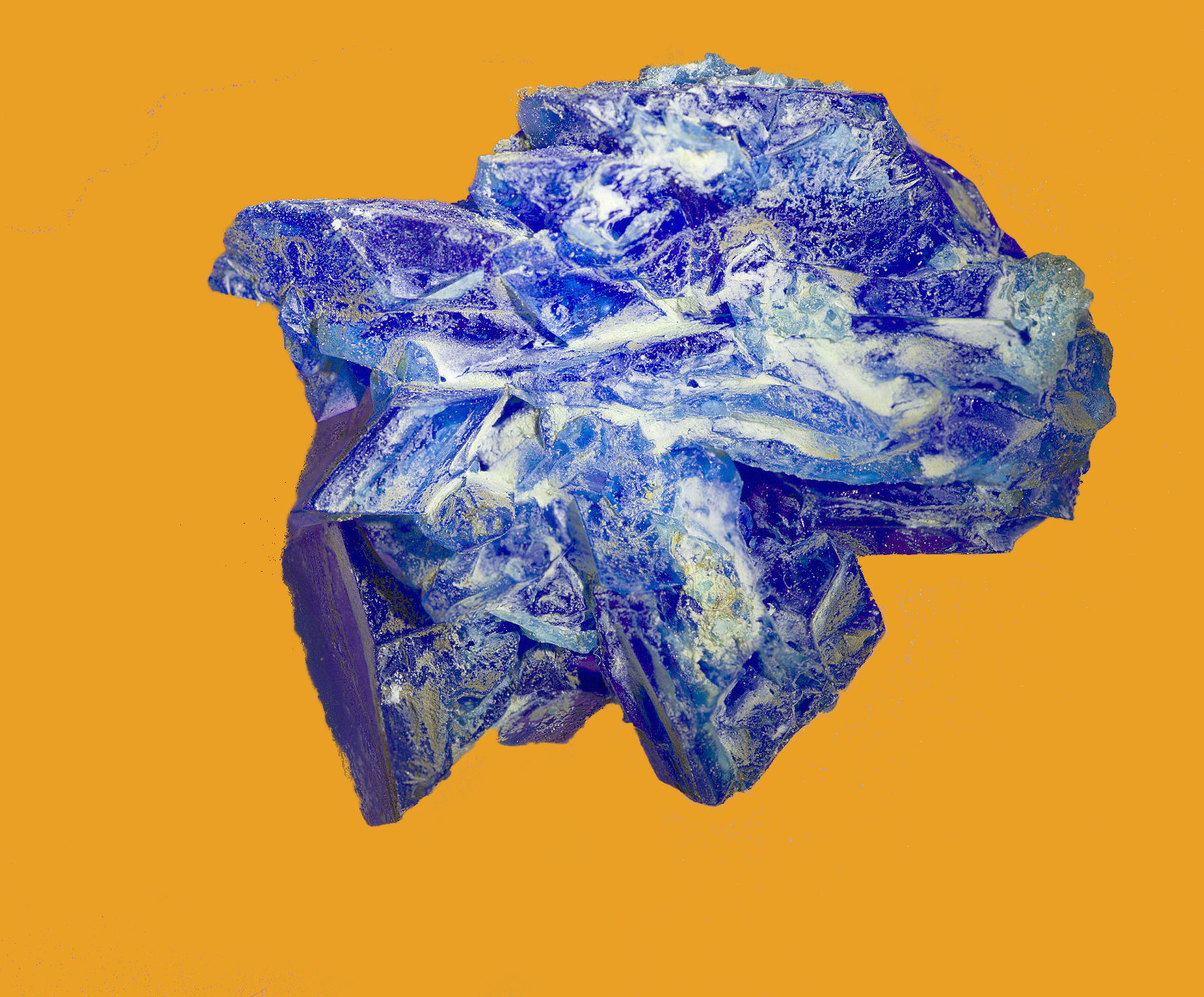
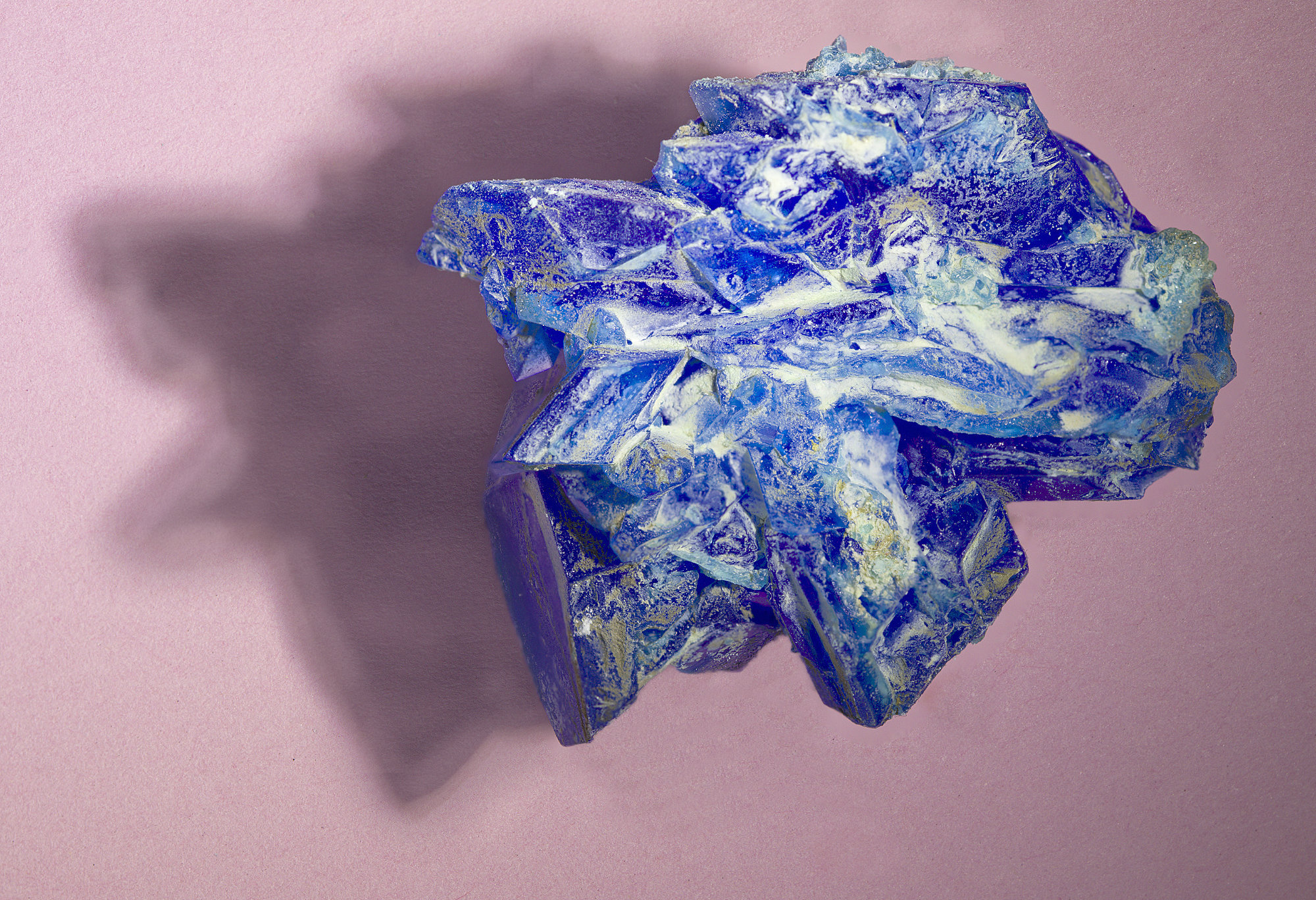
The orange I chose is rather garish. A lighter one might work better, but the pink seems OK to me and is muted.
I think the original was improved by my lightening of the shadow, retaining its original size. The large shadow gives some information about the height of the crystal, as it is quite oblique. However I think that your smaller shadow still gives an impression of depth, which is important, without grabbing too much attention, which the very first one clearly did. So, on the whole, I prefer your modification. Well done!
|
Jul 16th |
| 95 |
Jul 22 |
Reply |
I looked at a colour chart as well after Carol's comment, as I'm no artist. I figured that pink and orange are not that far apart, so I didn't really understand. So I've now swapped the pink for orange, and the difference is quite dramatic, so you are both right I think. I lost the shadow in the flood fill operation, but it makes the point about the colour I think. |
Jul 13th |
 |
| 95 |
Jul 22 |
Reply |
Thanks. Looks like I need to tone down my shadow! How about this version?
When we had the first lockdown in 2020, I had the idea to buy salts that I could crystallise. Usually salts (I don't know if you have a chemistry background, but "salt" means any metal + acid combination, eg copper sulphate, iron nitrate, calcium carbonate, etc) come as small crystals, too small for us to photograph with typical macro equipment, but they can be dissolved and crystallised again in such a way as they grow. The colour and shape can be preserved, they just get bigger, and easier to photograph. Plus you can add impurities (say another salt in small quantity) which alters the colour and shape. All good fun even before you get your camera out! There are helpful videos on youtube. |
Jul 13th |
 |
| 95 |
Jul 22 |
Reply |
It looks unchanged to me, Pat, both here and on the thumbnail on the July overview page. |
Jul 12th |
| 95 |
Jul 22 |
Reply |
Thanks, Pat. I could easily lighten the shadow as you suggest.
This is 1:1 more or less, but I can go up to 5:1 with my MP-E lens. What I've found with all macro is that getting close to "large" objects so that we only see a small part of them often makes it difficult for viewers to understand what they are looking at. So we end up with an "abstract" type picture, which I try to avoid usually. However, here the surface is intriguing, so it might be worth a go. As you say, we can both develop our July photos :-)
|
Jul 11th |
| 95 |
Jul 22 |
Reply |
Interesting thoughts, Carol. What colour background would you think would work better? Colour is not my strong point! |
Jul 11th |
| 95 |
Jul 22 |
Reply |
Yes, indeed, very small. Diffraction will start to limit your sharpness if you go much smaller, so it looks like a good choice.
The only way to extend your depth of field for this image then is focus stacking. |
Jul 11th |
| 95 |
Jul 22 |
Comment |
Ha! I've got about a zillion clovers like this on my lawn.
I think this is a nice result, Bags of detail and all in good focus. Paying attention to lighting has paid dividends.
If it didn't cause a problem like specular highlights, I'd have suggested a bit more light say top left, just to give a little more depth and drama, as it seems a little flat to me. |
Jul 9th |
| 95 |
Jul 22 |
Comment |
A very nice result, Pat. I love the colours and textures in the rock.
Personally I'd have preferred more depth of field. You haven't said what aperture you used, perhaps you could have gone smaller. |
Jul 9th |
| 95 |
Jul 22 |
Comment |
Outdoor macro of a dangling flower in the wind is normally very frustrating! You've got the focus well on the nearest petals, and you succeeded in finding an excellent background I think. |
Jul 9th |
3 comments - 7 replies for Group 95
|
7 comments - 11 replies Total
|


