|
| Group |
Round |
C/R |
Comment |
Date |
Image |
| 64 |
Apr 22 |
Reply |
This is what I'd been aiming at, Helen. Plus several other colours! |
Apr 25th |
 |
| 64 |
Apr 22 |
Reply |
Thanks, yes, I agree again, that would improve it. It's amazing how often I post a photo that looks OK to me and you all see ways to improve it. It's a bit like proof-reading one's own writing - not at all easy. I must try harder! |
Apr 12th |
| 64 |
Apr 22 |
Comment |
Yes, the lack of detail on the right is disappointing as the detail on left is super. I find increasing the clarity often helps in such cases, as well as increaing its contrast.
I'd suggest that a border / stroke is essential here due to the completely black edges all round. |
Apr 7th |
| 64 |
Apr 22 |
Comment |
You've found another interesting set of shadows! Well spotted.
I'd agree with Don's comment, but suggest that you avoid letting the grass go too dark. |
Apr 7th |
| 64 |
Apr 22 |
Comment |
I find this very attractive, an oriental look even though the model isn't. Nice pose, super eyes and face detail.
I'd suggest a border / stroke round the photo would make it more striking. There are a few spots on the background that could do with removal.
I like Lance's crop. It proves that less is often more. Losing a lot of parasol doesn't detract in itself, and the re-positioning of the model away from the centre is better in my view. Also, the midriff area of the girl was fussy and distracting - the crop deals with that well.
|
Apr 7th |
| 64 |
Apr 22 |
Comment |
Yes, a cute fella, they are peaceful creatures most of the time, I like them too.
I'd agree with Don about the need for more than depth of field to separate the duck from the background.
However I'd also say that this fails the mono test for me. This test is "If colour is important to the picture, use colour; if not, use mono". I love the colour of the male's feathers, feet and breast, they are characteristics of ducks for me. So, I'd have left it in colour, which I think works better than the mono, just as it is. |
Apr 7th |
| 64 |
Apr 22 |
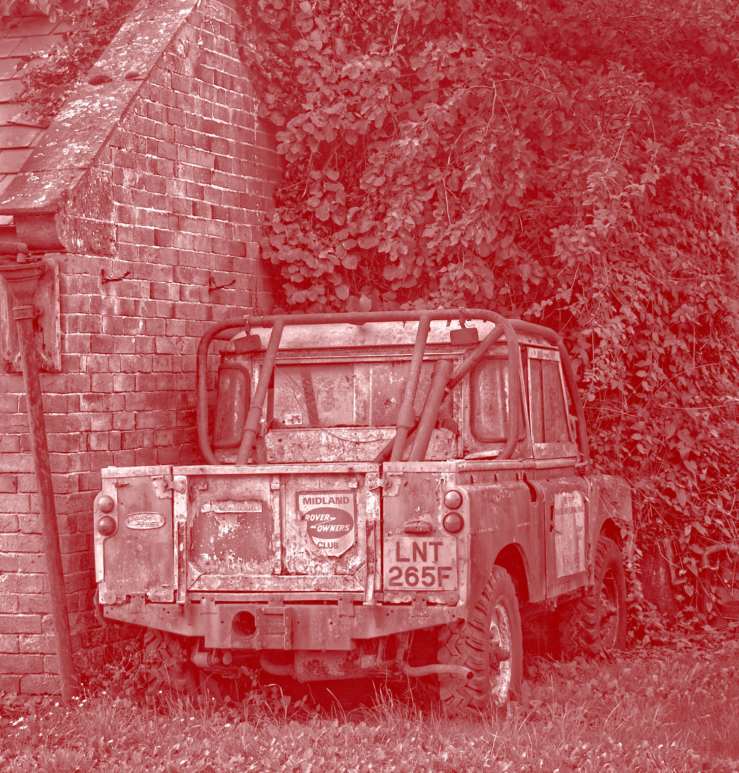
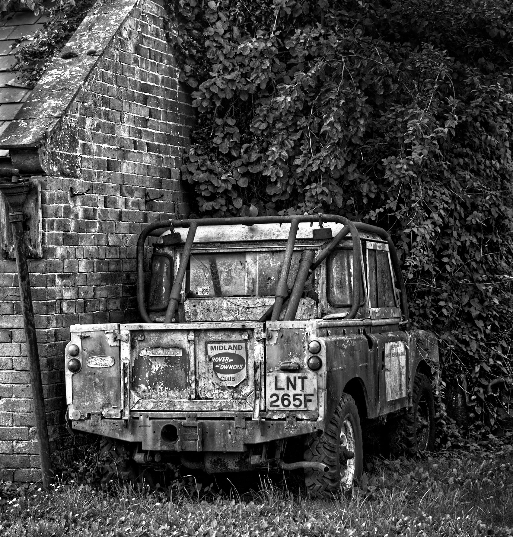
Reply |
It might still be running, Don! Land Rovers aren't subtle vehicles, built to do a job and to last. My neighbour has a couple of similar ones. The suffix "F" registration here meant 1967-68, so yours would have been G or H.
You're right about contrast, I think. I processed this as a step to toning it, so low contrast was fine, but not for here.
Better? |
Apr 7th |
 |
4 comments - 3 replies for Group 64
|
| 95 |
Apr 22 |
Reply |
Thanks, Tom. Dodging and burning for that purpose isn't something that's occurred to me, but I can see it could improve the sense of depth. I'll give it a try. |
Apr 21st |
| 95 |
Apr 22 |
Comment |
This is a bit like those pictures that fool your brain into looking first like one thing, then like another (eg two facing silhouettes of faces where the space between them can be seen as a vase). I still can't make up my mind whether I see this as an imprint of a shell, or a shell! I think the artificial "background" contributes to this. Somehow, to me, this natural and subdued subject doesn't go well which such a plain, vivid background, which seems a bit incongruous with the subject for me.
Having said that, I think the macro aspects are good apart from the soft top edge as Carol pointed out. |
Apr 18th |
| 95 |
Apr 22 |
Reply |
Thanks, both.
Looking at Bernie's comment "Love the colors" I went and looked at my colour wheels again and see that the brownish hues and the background are close to complementary, which happened by chance or instinct I don't know but not by conscious choice. A lesson for me on backgrounds!But the shades of brown / yellow are nice, I agree.
My macro tends to be "get closer and see more", whereas Carol and others make post processing input to make art. I guess I'm not so uch of an artist.
Stacking is my favourite process, Bernie. You can control the depth of field accurately, but also you can make it go more quickly from sharp to very blurred outside the sharp region. This is because all the images, but especially the first and last images, are taken at a wide aperture (compared to what you'd have to use to get a deeper depth of field in one exposure using a very small aperture)and so the focus drops off quickly as you go outside the stack. |
Apr 13th |
| 95 |
Apr 22 |
Comment |
Water drops like this always add to a photo, their lens effect is always fascinating I think. The fluffy "hair" is soft and doesn't detract from the sharp areas, the balance of the two is great I think.
My only comment on your setup is that the brighter top left corner, which you have almost cropped out, is still a slight spoiler. It might have been better in the centre if you could manage it. |
Apr 9th |
| 95 |
Apr 22 |
Comment |
You'll find life much easier with that focusing rail! They are a boon.
I like the colour and sharp texture of your photo. You've managed to get the centre one all sharp, and the other two a little soft, which helps focus attention on the centre one without losing the compositional advantage of the three, which I like.The shadows are nice, and not a blown highligh in sight! All very good, well done. |
Apr 9th |
| 95 |
Apr 22 |
Comment |
It looked like bubbles to me at first, but looking more closely I see they are not perfectly round where I'd expect it, so maybe it is glass. Whatever, a nice image. I like the exposure and mono (is it a conversion or was it like that originally?). It's nice and sharp in the centre, but getting softer at the top and bottom. Maybe it was a bit curved. f3.2 of course has a narrow deth of field. |
Apr 9th |
| 95 |
Apr 22 |
Comment |
Tropical countries get such colourful creatures. I was just this morning reading "National Geographic" about some guys trecking in Guyana (south America) looking for new types of frogs on elevated planes of land that are very inaccesible. Better them than me, although one of the party was 11 years older then me! Hats off to him.
Anyway, I love this chap. You nailed the focus well as you had little depth of field, pin sharp on the eye which is the most important. Well done! |
Apr 7th |
| 95 |
Apr 22 |
Comment |
Fascinating little creature, I don't think we get those over here. We get lots of wood lice that are similar, no shortage of specimens. I don't like them but they might make a good subject.
Your detail is very nice I think, a good job done. The head looks a bit in the shade to me - a bit more light from the left might have helped? |
Apr 7th |
6 comments - 2 replies for Group 95
|
10 comments - 5 replies Total
|


