|
| Group |
Round |
C/R |
Comment |
Date |
Image |
| 64 |
Mar 22 |
Reply |
No problem. Thanks for your comments.
I don't use Photoshop, but Affinity has a replacement brush tool which is the same I think. However, I left it in because, as Helen says, I think it adds to the story, and it also balances the composition. |
Mar 27th |
| 64 |
Mar 22 |
Reply |
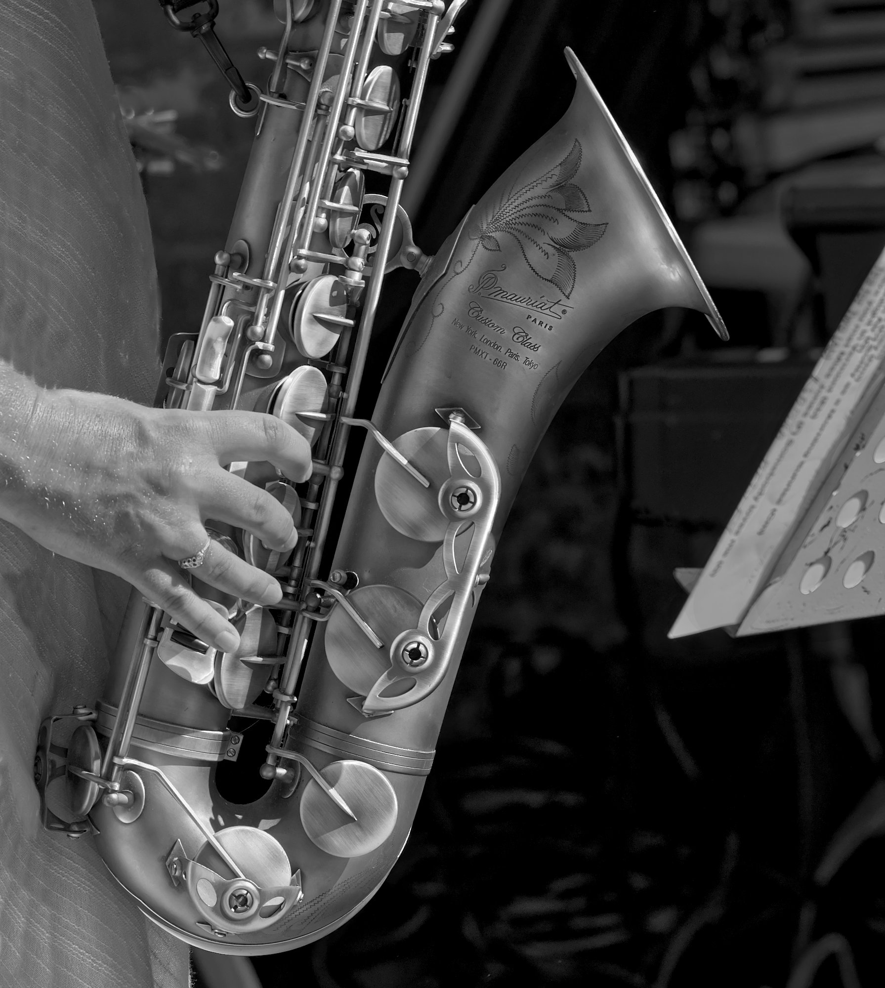
Thank you Helen. It wasjust a grabbed street photo, the lighting is just good luck!
I don't know about the engraving. I used to have a French clarinet which was engraved with the maker's name, and the writing here seems to be that as well. But the engraved flower etc could have been done by the owner, it's an instrument to be proud of! |
Mar 26th |
| 64 |
Mar 22 |
Reply |
It's absolutely your right to modify the sky any way, even making it bland to avoid distraction from the rocks, if that's your preference. I was just stating mine for your consideration!
Masking can be difficult, but Affinity has a "modify" tool when making a mask which can even do a good job on strands of hair, so it whould have no trouble here. I'm sure Photoshop will have the same. |
Mar 24th |
| 64 |
Mar 22 |
Reply |
f8 and 400mm is the reason! So easy to have 20:20 hindsight, though, I'd have used something similar probably. As John is perhaps hinting, I would clone out the foliage on the left with a few more dragonflies. |
Mar 15th |
| 64 |
Mar 22 |
Comment |
Well, they say we should never convert to mono to rescue a failed colour photo! But I think the essence of this photo is the striking shape of the buffalo, and the mono silhouette does this well. A good spot, well composed.
The dragonflies are a nice additional item of interest.
You haven't told us camera setting details; I'm thinking that the aperture was quite wide, as the foreground and some dragonflies are a bit out of focus; I'd have preferred them to be sharp. |
Mar 14th |
| 64 |
Mar 22 |
Comment |
I'm none the wiser! I'm still jealous of your scenery in this area, whatever it is here.
It looks to me as though the sky has been replaced- has it? I'm noticing in particular the artificial-looking boundary between the rocks and the sky, especially on the right. To be honest, I think it needs the sky to be replaced with somethng a bit less bland. Not too much, we don't want to compete with and distract from the nice rock details, |
Mar 14th |
| 64 |
Mar 22 |
Comment |
I'd agree with the comments above, `and think Oliver's modification works. The original has the deer standing out by being darker than the background, but light draws the eye usually, so it's a bit distracting. This way round makes the animal stand out and pulls your eye to it. I'd go a notch further in darkening the backgound, especially round the head. |
Mar 14th |
| 64 |
Mar 22 |
Comment |
Normally I'd say "I don't like IR", but this proves me wrong. I guess it doesn't look like a typical IR. This looks more like a posterised photo to me. Whatever, it's striking and does evoke a feeling of wind, however it was produced. Well done! |
Mar 14th |
| 64 |
Mar 22 |
Comment |
Very nice; the mono is so much better than the colour, in my opinion.
It's an interesting concept to use HDR here. As I'm sure you know, if the HDR images have movement in them, then these can come out as ghosts, which Photomatix can remove usually, but not always 100%. Being an "average", the blurred moving parts might be essentially similar in these terms.
I'm spending a lot of time at the moment researching for a talk on HDR, and am finding that in all but extremely high dynamic range subjects, a single RAW file, accurately exposed, can be developed to just as good a result as an HDR merge. I do this by outputting from the RAW editor in 32 bit and then tone mapping that. I'm speaking as an Affinity Photo user, but I guess the same must be possible in Photoshop etc. By coincidence, I've been working on some images processed this way this evening, I'll post one next month. |
Mar 12th |
| 64 |
Mar 22 |
Comment |
Thanks, Don, good idea. I darkened the music and removed a couple of highlights too - |
Mar 10th |
 |
6 comments - 4 replies for Group 64
|
| 85 |
Mar 22 |
Comment |
The processing seems to have given it pastel, cartoon feel. Whatever, I think the finished result is super. The clouds are now visible and finish it off. |
Mar 14th |
1 comment - 0 replies for Group 85
|
| 95 |
Mar 22 |
Reply |
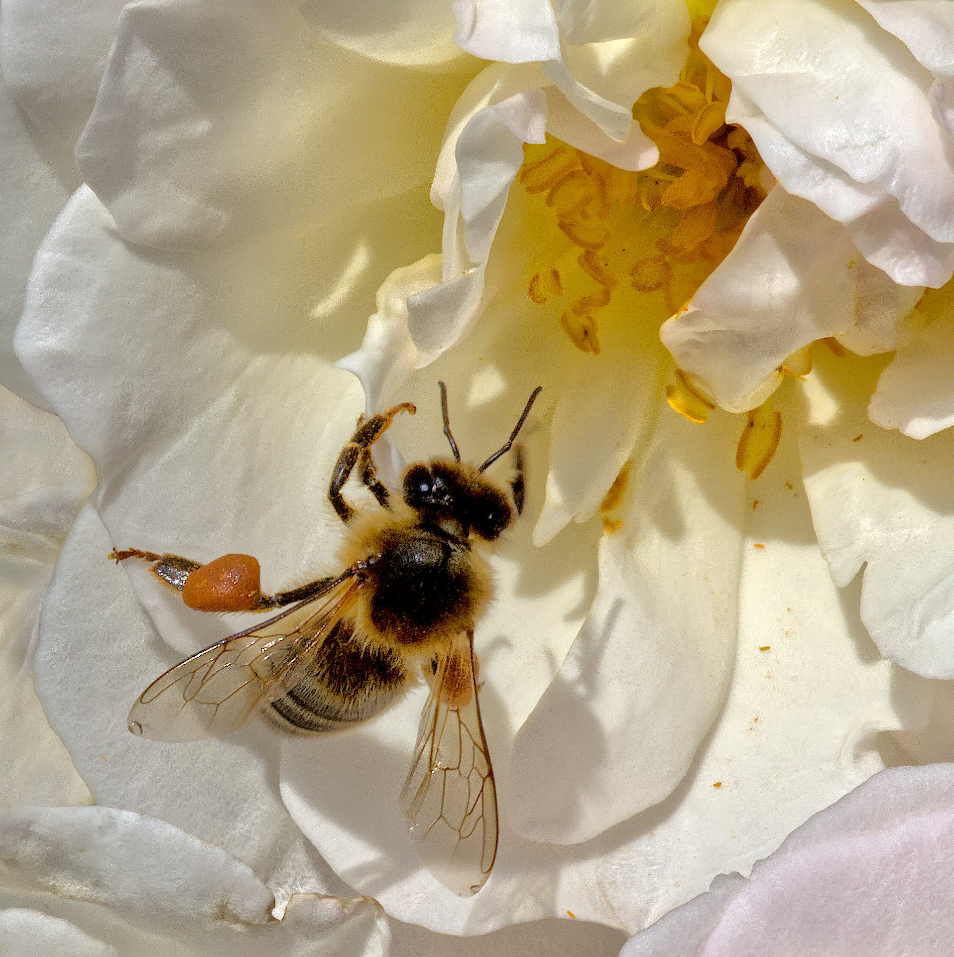
You're probably right. I'm sure Carol has tweaked it lots of ways before deciding it's finished.
I think I was looking at the "shadow", top left above the petal, maybe other background parts too, but they could well be petals further away from the camera. Regardless, a super result. |
Mar 23rd |
| 95 |
Mar 22 |
Reply |
Yes. Maybe. I think it was sunny on the day I took it, last summer. Maybe I should take a diffuser with me. Trouble is, like John Wyndham's child character in his book "The Chrysalids", I'd be wishing for an extra arm. I could use a tripod to hold one, I guess. But bees don't pose and wait, so that's difficult.
Thanks. I have one hive left at the moment in my garden and they were buzzing in and out this morning in the sunshine, with pollen on their legs, but not as much at this lassie.I intended to stop beekeeping last year, but this hive had a fungal infection so I couldn't sell it. The bees were clearing it out late last year, so when it's warm enough to open the hive I'll see if it's gone. They are fascinating, and home honey is excellent, but more work to keep than you'd guess. |
Mar 23rd |
| 95 |
Mar 22 |
Reply |
I'm not a fan of Adobe products. I use Affinity Photo, and generally it has much the same features as Photoshop I believe, but not necessarily with the same names. So I figure the dodge and burn brushes here are the equivalents, and I can go down to single pixel size. So I've tried that a few times, and I really do have to go down to a few pixels, something I've not done before. However I think I get the idea now. I've fired up my graphics tablet for the first time in ages, it was much easier that way. So I've done more burning than dodging, but think I've given an impression of greater sharpness in various places, mainly the head and thorax. What do you think now? |
Mar 17th |
 |
| 95 |
Mar 22 |
Comment |
Very, very nice, Carole.
We've got to be very critical to offer suggestions! I'm thinking that perhaps a bit more space between the flower and the background would have removed the occasional shadow that I think I see.But maybe that would lose some of the petals' outline, so maybe not. |
Mar 14th |
| 95 |
Mar 22 |
Comment |
I think we have trans-Atlantic telepathy, because my wife cut a melon the other day, and I nicked it for photography!
I don't mind the cutting of seeds; it's part of a whole.
Tom's right, a key in any macro system is stopping the wobbles unless you are lighting by flash or have such brightness that you can get a good shutter speed without too big an aperture or too high an ISO.
No suggestions really, you got lovely texture here, and I assume you've got the specular highlights as I can't see any! |
Mar 14th |
| 95 |
Mar 22 |
Comment |
Without the blurring, the depth of the basket wouldn't be apparent, and the picture would seem interesting, but flat, I think.
I'd prefer not to have that splodge of orange in the bottom left corner, it's distracting, and spoils the flow to the top right in my view. Can be cropped out without loss to the picture though, I think. |
Mar 14th |
| 95 |
Mar 22 |
Comment |
Good stuff, Bernie. It's a striking photo, I like it. The bounced flash is perfect.
To me, a couple of improvements to suggest.
1. More depth of field! It's a frequent comment in macro, and we debate it a lot, when we have too little, or indeed too much. Here I think the blurred rear (left) of the larva spoils it a little. Going down a couple of stops would have belped, and with flash you wouldn't worry about camera shake.
2. I'd rotate it anti-clockwise a bit. Maybe 45 degrees. I'd like to see the leaf on the bottom left here disappear, it's distracting. That would give a more diagonal flow, which is usually considered more pleasing.
|
Mar 14th |
| 95 |
Mar 22 |
Comment |
Definitely photographic art; well done.
White vignettes don't often work for me, but this one is an exception, helped by the very appropriate frame. |
Mar 14th |
| 95 |
Mar 22 |
Reply |
I like them in the fur (?) too, they are gentle creatures actually, they just don't like you squashing their sisters and get cross if you do.
I tend to agree with your comment, although I think it's just the way their fur (or hairs) appear. I've taken the Affinity file and maked off the head and thorax, and messed with the highlights and shadows. This seems to be the best I can do. Any better? |
Mar 13th |
 |
| 95 |
Mar 22 |
Reply |
Thanks, Bernie. I'm waiting for people to tell me my ISO was too high, and others to comment on specular highlights! But I thought it came out well enough. I'd rather have a bit of noise from high ISO than blur due to small depth of field or slow shutter speed. |
Mar 12th |
5 comments - 5 replies for Group 95
|
12 comments - 9 replies Total
|


