|
| Group |
Round |
C/R |
Comment |
Date |
Image |
| 64 |
Jan 22 |
Reply |
I'd be very happy with it now.
If you wanted to and felt justified, assuming one wasn't around at the time, maybe an old farmer standing in front if it could be added?? Maybe such an image isn't fair game for a creative approach. |
Jan 22nd |
| 64 |
Jan 22 |
Comment |
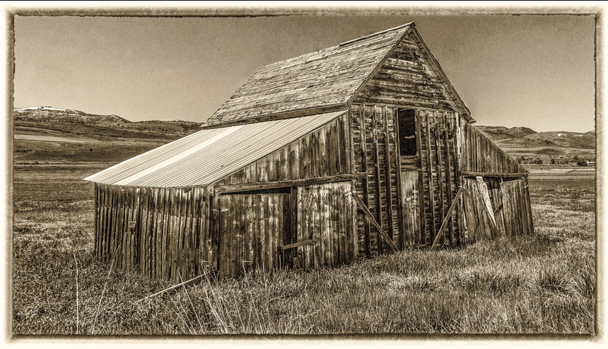
I think this photo is very enjoyable. The sepia conversion and frame go well with the picture and make is resemble an old print.
My comment would be that I'm not fond of the piece of fence on the left. I hope you don't mind, but I do like "fiddling" with photos. I found it was easy to remove with the Inpainting and clone brush tools. I wonder what the reflecting strip on the roof is? MAybe a repair. The top rear slope of the roof looks a little odd, which I've cloned out. |
Jan 22nd |
 |
| 64 |
Jan 22 |
Reply |
I preferred the original, too. Although the comments and my trying to follow them has been a useful exercise, I think. It's a normal procedure to scale down an image to PDI proportions; cropping it to the same is a valid way to do it that I'd not needed before. But the original, perhaps given a bit or artificial depth of field as Jerry suggests, would be my favourite. Perhaps with a little cropping.... |
Jan 14th |
| 64 |
Jan 22 |
Reply |
That's a good idea. This lens is f6.3 max at 150mm, and it was a long way off anyway, so I couldn't do it by controlling depth of field, but I could do it in post processing. |
Jan 14th |
| 64 |
Jan 22 |
Reply |
You and me together! Despite living in a country under 800 miles long, there are lots of places I've not been to here. Hopefully getting to Lands End in Cornwall will occur this year - it was planned for last year, but covid put paid to that. I've driven right round Scotland, but there is lots of it I've not seen. One day we will load our motorhome (RV) onto a ferry and spend a long holiday in the USA. But places are so far apart!! |
Jan 12th |
| 64 |
Jan 22 |
Comment |
I spotted the face too before I read Stan's comment. You're right, the whole left side looks a bit like a figure! Dare I say that I can even imagine that figure to be a man eyeing a female figure which is the second dark area with her hand on her hip?!!! No comments please on the inappropriateness of my age for that type of observation, I'm still a man!
I think this is actually a case of two photos in one, the right can be cropped off to leave the figure(s) and equally the left can be cropped off to leave the more random pattern. Either way, it's fun! |
Jan 12th |
| 64 |
Jan 22 |
Comment |
Yes, I agree with all your suggestions for cropping. I suppose we can consign the idea of printing it to the dustbin, but it's still in with a shout if a PDI. Here I've reduced it to 1600x1200. Better? |
Jan 12th |
 |
| 64 |
Jan 22 |
Comment |
Great idea, well done.
I'd agree that it all should be darkened except the main tree trunk to emphasise that tree and the shadow.
The devil's in the detail, and for me the hump on the shadow on the left side is distracting, and the shadow above reminds me of a spider - Little Miss Muffet? I'd also lighten the triangle, bottom left of the tree, if you can, to continue the shadow line down from the right.
|
Jan 12th |
| 64 |
Jan 22 |
Comment |
You guys are lucky to have such photogenic landscapes over there!
I also think the colour version is the more interesting as it stands. The four main rock formations stand out well in the colour, but their distinction from the background is less clear on the mono, ;eaving it a bit flat. I'd agree with Don, the sky doesn't seem to fit or to complement the scene, and a sky replacement would probably add to the picture. |
Jan 12th |
| 64 |
Jan 22 |
Comment |
I do scratch my head in wonder at some self-styled "artists" who do crazy things like this. A pile of bricks in the Tate. A sandwich left in an art gallery that people later thought was an exhibit. Bonkers in my view. Quite bizarre that anyone would think this worth doing.
In terms of a photograph, as the others said I think it's well done and definitely a mono. |
Jan 12th |
| 64 |
Jan 22 |
Comment |
Years ago, my in-laws had a flat at Castellon, and later a house near Malaga, so I've seen a little of that coast except north of Barcelona. Barcelona and Tarragona are interesting places, as indeed is Malaga and many other places. The coastline is nice and green, but it soons gets dry and grey as you go inland, so it's not my favourite part of the world. Some coastline villages and towns are fscinating, as indeed this one seems to be.
I think this is an attractive photo, well taken and developed as usual for John. The aspect that disappoints me is the feeling of wanting to see more, and the tree obscuring that. I wonder if it would have been possible to go forwards a couple of metres, putting the tree into the sky and reducing the amount of the bush on the left which is visible? The towers and town would be then more dominant, with a bit more of that nice sky as well perhaps.
|
Jan 12th |
| 64 |
Jan 22 |
Reply |
Here's the original FYI. Not very exciting! |
Jan 8th |
 |
| 64 |
Jan 22 |
Reply |
Thanks Stan. I liked the recession in my original which is why I left it, plus the cropped image was becoming small, so I held back a bit! But I see your point, just taking off the darket bands. |
Jan 8th |
 |
7 comments - 6 replies for Group 64
|
| 95 |
Jan 22 |
Reply |
Hi Bernie,
Welcome to our group!
I tend to input long answers and/or comments if I think I can help, as indeed do others. I'm no expert, learning all the time as they say. When I discover something that makes a big difference to me, I explain it for others to learn from or point out the error of my ways! We are all very welcoming to queries and comments, praising or critical - it's the only way to learn |
Jan 29th |
| 95 |
Jan 22 |
Reply |
I don't know what the mk3 is like for noise, but my mk2 is fine up to 1600ISO to my eye at least, and it's not really intrusive until I get past 12800 or so. Maybe on really big prints I'd have to watch it, but I'm hardly printing anything nowadays. |
Jan 22nd |
| 95 |
Jan 22 |
Reply |
I can guarantee it wasn't out of focus! The Canon macro lens via Helicon remote is always spot on.
Your retouched version certainly looks tidier. I guess it's back to the "art or record" issue. We know that as magnification increases, previously unseen detail like little specs, hairs, etc, become visible and even intrusive. But they were really there, so removing them is moving away from a "natural" state. A bit like the principle about retouching nature shots. So I had left them in on purpose, but I think overall I prefer your retouched version. |
Jan 22nd |
| 95 |
Jan 22 |
Comment |
Nice shot. Lovely detail and composition. I suppose insects like this aren't bothered which way gravity is acting, but as a human I like it a bit more rotated 90 degrees clockwise. I love the way the background has come out - it's there to anchor the subject, but vague so it doesn't draw the eye at all.
You could have reduced the shutter speed a stop at least, and gone up in ISO without degrading the quality, I think. So a couple more stops to increase the depth of field - I think would have been better. It would have sharpened the stem it's on of course as well, but that could have been toned down in post if desired. |
Jan 11th |
| 95 |
Jan 22 |
Comment |
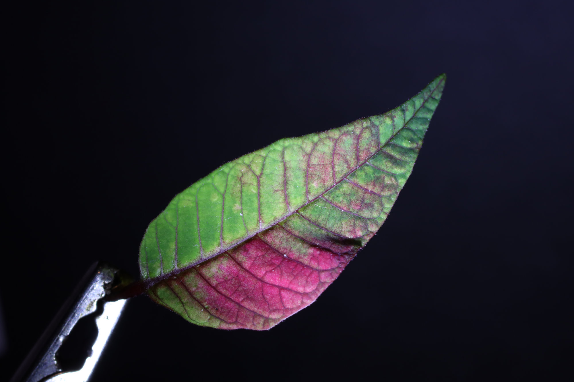
Nice picture, I like it. Orchids are lovely subjects. I'd agree with Carol's comments.
As a comment, the physics works both ways - the fact that this is a full frame camera and has a significant depth of field at f2.8 means the magnification was quite low. |
Jan 11th |
| 95 |
Jan 22 |
Comment |
I think Carol has said it all, Tom. It could be argued that a stack wasn't needed for this pictorial macro of course, and I would do so - if it were sharp at the front it would look false I think. Good shot, no suggestions.
BTW - what is SOOC?
TTFN
:-) |
Jan 11th |
| 95 |
Jan 22 |
Comment |
As a picture, I think it's a bit busy, too many shells to look at.
As a macro technique exercise, I think it's good - good exposure, nice lighting and exposure with no blown highlights or blocked shadows. Good sharpness at the plane of focus. As we've discussed before, depth of field in artistic macro can be whatever you like to get the effect you're after, and here we've got a sharp central area and nicely lightly blurred background which makes the central ones stand out. Good! |
Jan 11th |
| 95 |
Jan 22 |
Reply |
I was actually trying to look for transmitted light subjects, and had an Adaptalux arm shining up from below, but I suspect the only visible result of that was the rim lighting on the tiny hairs on the edge. There was a "flood" light from the front right (a bank of 9 LEDs, home made) and another Adaptalux arm from rear and left. I didn't measure the relative strengths of the lights, but yes, I guess the front right was the strongest. |
Jan 11th |
| 95 |
Jan 22 |
Reply |
OK, here is the 4th image from the stack of 8.
You're welcome! |
Jan 10th |
 |
4 comments - 5 replies for Group 95
|
11 comments - 11 replies Total
|


