|
| Group |
Round |
C/R |
Comment |
Date |
Image |
| 64 |
Nov 21 |
Comment |
The facial expressions were comical in their variety as the event passed. Some were clearly struggling to do as well as they could, others were out for a fun Sunday jaunt it seemed. All got my respect as it was a Strongman event, swimming, cycling and running. Made me tired just thinking about it. |
Nov 21st |
| 64 |
Nov 21 |
Reply |
OK, that's fine, I see your point of view. |
Nov 18th |
| 64 |
Nov 21 |
Reply |
Because I think the mountains and clouds are great, but too much foreground detracts from those IMHO. |
Nov 18th |
| 64 |
Nov 21 |
Comment |
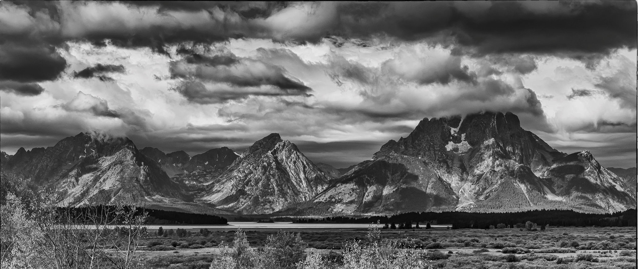
My first impression of this was war - beach landings or something similar. Alas the power lines blow that idea pretty quickly, which seemed a pity to me. Equally the bare branches seem to detract from the very graphic silhouette of the fence. In fact, thinking more about it, if only those branches weren't there, then the story of the fence keeping people away from the power lines would have much more punch. This could be edited - a bit of a tedious job - but perhaps another viewpoint nearby could be found? |
Nov 18th |
| 64 |
Nov 21 |
Comment |
Alas I'm not a lit major, so I had to google "Archetypal Elements", so now I understand your title. The pattern is interesting, but I would agree, it needs a bit more to be more than just interesting. The person is a good attempt at that I think. Someone without a stick and the black shadow behind would be a better contrast I think, and the black corner also seems to distract me. It has no detail in it, so perhaps clone the pavement up to replace it and also edit around the person to make him "clean"? |
Nov 18th |
| 64 |
Nov 21 |
Comment |
I like this photo, too. The light vignette and sepia makes it look very old. Personally I think the vignette on the right is a bit over-done, which I think makes it look an old photo rather than a misty one. |
Nov 17th |
| 64 |
Nov 21 |
Comment |
Sorry, but it doesn't "float my boat". I suppose it looks much like an infra-red, and I'm known for not liking those usually. The detail is interesting, and I see John's observations too, but I'd have liked something to stand out and focus my attention. Sorry! |
Nov 17th |
| 64 |
Nov 21 |
Comment |
I'd agree with Jerry. My first reaction was to suggest losing that lower left detail, but I see his point, it adds to the photo. It also prevents the river bank from dividing the picture into two. I might even suggest that a bit more there would be even better.
Minimalist and excellent! |
Nov 17th |
| 64 |
Nov 21 |
Comment |
I suppose I'd agree with those who say that the foreground is demanding attention and detracting from the mountains and clouds, which are great. A letterbox crop is nice too, I think. |
Nov 17th |
 |
| 64 |
Nov 21 |
Comment |
I hadn't noticed that! The wheels were the same size. The perspective exaggeration is greatest closest to the camera. |
Nov 9th |
8 comments - 2 replies for Group 64
|
| 95 |
Nov 21 |
Reply |
Yes, indeed, we are familiar with your excellent stacks.
I don't usually take at different apertures, but it's a good idea to, as the LCD screens in the camera are a poor way to judge.
I'd agree, f4 is pleasing and going in Carol's and Charles Needle's direction, which I like. f2.8 better! But I know why not. Although, being full frame, f4 is similar to my Olly's f2.8 in terms of DoF. In the past we'd have been judiciously smearing a UV filter with vaseline! No reason not to now, of course. |
Nov 18th |
| 95 |
Nov 21 |
Comment |
I'd comment that the f45 picture is, not surprisingly, somewhat less sharp in the in-focus areas than the f4 one. If I couldn't get the depth of field that I wanted (and there's nothing stopping us from taking several photos at different aperturesto decide between later) in one exposure, I'd focus bracket. Then, you could then choose which exposures to stack to get what you want. But to be honest, I prefer the f4 and would still work on it in Affinity with the blur tool or a mask and a Gaussian blur layer if that's the effect you were seeking. |
Nov 17th |
| 95 |
Nov 21 |
Reply |
Thanks for pointing that out, Carole! It's probably been there all the time I've been on DD, yet I'd not seen it. The comments there are what John Roach sent group 64 members, but I don't know which is the chicken and which is the egg! |
Nov 17th |
| 95 |
Nov 21 |
Reply |
Yes, that's better - I'm getting a large picture now when I click your thumbnail. Nice detail is clear now. |
Nov 17th |
| 95 |
Nov 21 |
Comment |
Whilst we would like to keep close to the "standard" macro definition of 1x to 2x magnification, we don't criticise photos from being less than 1 or more than 2. With many different sensor sizes available now, it's a moot point quite what this range means, anyway. So as long as it looks rather close and is interesting, I won't complain.
At first I thought it was very close, until I realised it's a sunflower!
Regardless, it's a nice close-up. It's amazing how often I find things on my macros that I didn't see in the viewfinder, and you have a second bug near the top right! I would crop it out, actually, it disturbs the "flow" from stamens to the ladybird i think.
|
Nov 17th |
| 95 |
Nov 21 |
Reply |
I think it depends on the lens and camera, Pat. My Canon M50ii records magnification ratio when coupled with my Canon MP-E, probably because the magnification ratio is set on one of the lens rings, rather like you zoom with a zoom lens. My Olympus M1ii and Olympus 60mm macro do not record it. Although it does record the focus distance (distance from lens to camera, I assume from the lens front, but am not sure. You can work out the magnification from that.). Quite irritating! |
Nov 17th |
| 95 |
Nov 21 |
Reply |
Good question! I'm sure Carol or Tom will put us right as I've forgotten the size criteria required. I send in pictures that are usually about 1500 to 2000 pixels maximum dimension, 85% JPG quality, the over-riding criterion being a maximum file size of 1MB (1024 kB). I've downloaded your photo here and it seems to be 320x214 pixels, 43 kB. I'm no expert here, I'd just noticed that when I double click your photo above I get an image on my screen only 5cm (2") wide, whereas if I do that for say Fran's picture, it is 17 cm (7") wide and of course showing much more detail.
Looking back in my PSA DD corrspondence, I found an email from John Roach (he runs group 64 of which I'm also a member) in 2019 when he sent to the group lots of wise guidance including this -
"Current recommended size for your images is 1024 pixels wide by 768 pixels tall and 72 dpi, but not to exceed 1Mb in file size." My limited knowledge suggests that 72 DPI is not important here, the pixel dimensions are, but I stand to be corrected by experts!
John gave a lot of useful comments in that email which might be useful to us all.
Carol and Tom,
This email includes advice on describing your photo when submitting it each month, and on what sort of comments are encouraged for others' photos, suggestions on downloading, editing and re-uploading others' pictures to illustrate comments you are making where appropriate, etc. Perhaps it could go on our Bulletin Board for everyone's aid, but I could show it to you first if you prefer. |
Nov 12th |
| 95 |
Nov 21 |
Reply |
By coincidence, we were in a "butterfly zoo" a few weeks ago, but the butterflies were so large (most 4" wingspan or more) I thought I wouldn't post any for fear of being told "not macro"! |
Nov 9th |
| 95 |
Nov 21 |
Comment |
I'd go for the more cropped one.
Photographing frost is notoriously difficult I find, it's hard to get it to look sharp for some reason. The overall impression to me it that this isn't look pin sharp, but I think it is if you look at fine details. It's just the way that crystals often look!
I like the contrast between the brown and green areas, and the light on the leaves and crystals.
We've had slight frosts now too - winter is coming. |
Nov 8th |
| 95 |
Nov 21 |
Comment |
It's an unusual and interesting photo, Pat. I like the diagonal lines.
Have you sent a small original to Carol?, as it is small even when clicked to enlarge it. So, it's difficult to examine closely.
It seems nicely exposed and sharp over the central area, courtesy of your subject being quite flat and lens at f8.
|
Nov 8th |
| 95 |
Nov 21 |
Comment |
Yes, it's a well-caught photo, pleasantly constructed with a nice diagonal and triangles, as you say.
Depth of field, as I often say, is the friend and enemy of macro photographers. Within limits it's within our control, so we must assume the photographer meant it to be the way it is. You have elected to have a shallow one, and in some cases that enhances the photo. However here, I think most photographers would feel it spoils the photo. The head isnice and sharp, but we would expect most of the body and wings to be, too. That's quite a challenge with the wings coming towards the camera, unless focus stacking can be done.
Personally, I find that 1/320sec is faster than you need to prevent camera shake at 60mm, especially with sophisticated stabilisation such as your camera has, provided you take care. So I would have gone down to 1/60 sec at most, which enables f8 at this ISO and lighting. That would have given more depth of field, but probably not enough to get all the butterfly sharp. Going on to f11 with ISO 800 would be OK, a little less sharp than f8, but still much better than f3.5, and more DoF. I would have tried that and examined the result. It would be worth a pot at f16 ISO 1600 at the same time. Noise in your camera at that ISO is still minimal. If you have one, a ring flash would allow lower ISO and guarantee no camera shake blur. |
Nov 8th |
5 comments - 6 replies for Group 95
|
13 comments - 8 replies Total
|


