|
| Group |
Round |
C/R |
Comment |
Date |
Image |
| 64 |
Oct 21 |
Reply |
Thanks, John. And indeed thanks to all for your comments. Photography gives lots of split opinions, and in most ways that's good. It would be boring if there were a formula that always worked for everyone. |
Oct 18th |
| 64 |
Oct 21 |
Reply |
Yes, I prefer the colour version, too. Normally the emphasis on texture would pull me to the mono, but alas the colour did add to the original in my view. |
Oct 18th |
| 64 |
Oct 21 |
Reply |
Your way tells a different story to the one I saw when first seeing the photo, and that's fine. I suppose I was also looking through judges' eyes at the separation between them which could be argued reduces the pictorial impact, but the crop does eliminate that story. I've no idea how creatures manage to make a living in such terrains. The temperature has dropped to 10 degC here recently, for me that means winter is here! |
Oct 18th |
| 64 |
Oct 21 |
Comment |
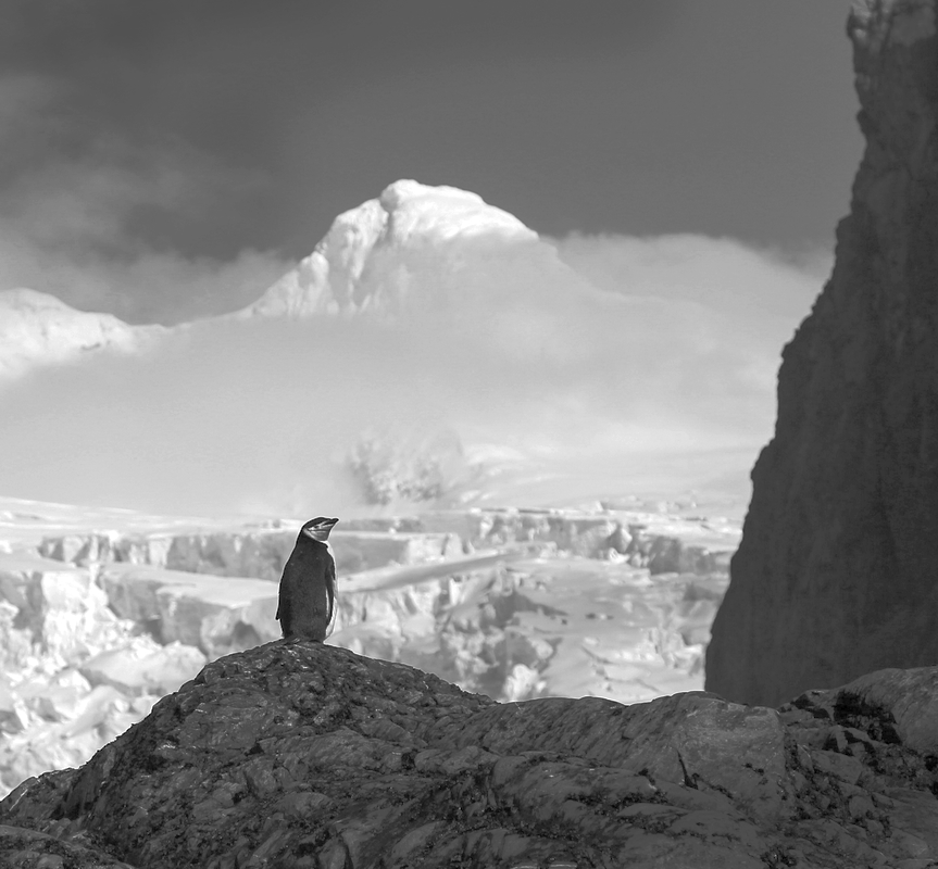
I think this is a cracking picture, Jerry. I would agree that it could be improved with processing, especially if you used RAW. I would crop tighter, too, to make the standing penguin more prominent, and to remove the second one which is a bit superfluous. Can't do a lot with a screenshot, but I think this hints at what could be done? Is it a King penguin? (Sorry I'm no naturalist). I like the title "The king surveys his land", or similar. |
Oct 17th |
 |
| 64 |
Oct 21 |
Comment |
Fascinating picture. I think you've flipped it as well as cropped and rotated it?
To answer your question, I think I prefer the second. I don't think it's worthwhile trying to figure out which way is up and what we are seeing, it's too abstract to make that meaningful. But the table doesn't seem to fit into the photo to me as it's flat and uninteresting. The cropped picture is harmonious and pleasing in my view. |
Oct 17th |
| 64 |
Oct 21 |
Comment |
I'm with Helen here, it's the contrast that interests me. It might have been increased if a viewpoint could have been found that separates the piles from the bridge on the right where they overlap here, just to emphasise that difference. |
Oct 17th |
| 64 |
Oct 21 |
Comment |
It's interesting how the mono conversion has completely changed the feel of this picture. The colour version looks like natural rocks, but the mono looks like concrete to me. Maybe it's because I've been doing some concreting in my garden! Or perhaps a lava flow, having seen a volcano on tonight's news. Either way, the contours and textures are interesting. |
Oct 17th |
| 64 |
Oct 21 |
Comment |
It's a dramatic picture, an impressive loco.
I'm afraid I don't understand the strong lean to the left and the high contrast, they just look wrong to me. Sorry! |
Oct 17th |
| 64 |
Oct 21 |
Comment |
I agree with those comments, a splendid picture, especially in mono, perhaps a little better if the fish could be darkened and the light feather detail clarified.
If you are keeping to the "nature" rules, I suppose cloning out the light branch is off the menu, which I think is a shame as I would prefer it removed. |
Oct 17th |
| 64 |
Oct 21 |
Reply |
Thanks, Bob. Yes, it is a dfferent one. I expected people to comment on that man in the first one because it looks to me like his legs are cut off! He might be in the water, or it's just a trick of the light. Cropping just makes that look worse, so I chose a different image. I did darken the sky a bit, probably could have done more, but I didn't want to distract too much from the silhouettes. |
Oct 10th |
| 64 |
Oct 21 |
Reply |
You're right, Jerry, the rocks were absolutely lethal when wet! I saw several people fall. At one stage I found myself at the far end and with a couple of metres of all wet rock between me and dry rock as the tide was coming in. I was contemplating crawling as I didn't want to fall especially carrying camera, but managed to test each foothold and made it without that. The things we do for photography! |
Oct 9th |
| 64 |
Oct 21 |
Reply |
Thanks for your comments. I have some other images taken at the same time without the left side, but I chose this because it makes (for me) a triangle pointing to the figures, and the interesting texture of the foreground rocks. The left edge is a bit indistinct, but that's the nature of the rocks. On reflection, it's a fair comment. Here's another one which you might prefer. |
Oct 6th |
 |
6 comments - 6 replies for Group 64
|
| 95 |
Oct 21 |
Reply |
Yes, the extra blurring does improve it, thanks Tom.
I gave a macro talk to my club a few days ago and was pointing out the further benefit of stacking as it gives depth of field control such that you can get a blurrier background as well as increased depth of field of the subject area. Most would say that such an outdoor shot can't be done hand-held and out of doors. However, the Olly does internal focus bracketting, and internal stacking up to 15 frames, taken at 60 fps so movement is minimised, and I should have tried that. But there's more than one way to skin a cat (do you have that saying there??), and post processing has done a good job. |
Oct 30th |
| 95 |
Oct 21 |
Reply |
Briefly, the phenomenon of diffraction is what happens when light passes very close (within thousanths of a millimeter) to a sharp edge like a diaphragm blade. Diffraction causes it to bend slightly towards the blade, it no longer travels in a straight line, and so this light in a camera goes out of focus. This happens all the time, but when the aperture is large, the amount being bent is small compared to the amount of light passing far enough away from the blade to be unaffected by diffraction.
So it has no noticeable effect at apertures like f2, f4, even f8, but becomes important at say f16, f22 and lower. However at small apertures, a lot of the light is affected and so the blurring from diffraction becomes noticeable. Nothing we can do about it - it's physics!
Try taking the same photo of something flat and perpendicular to the camera (to remove depth of field effects) which has fine detail, across the whole range of your apertures and examine them to see. You need to make sure the camera is steady on a tripod etc to make sure the only effect you are examining is the effect of changing the aperture. You should see sharpess at f2.8 say increase as you pass through about f8 and then fall off again as you go to f16 and smaller.
Focus stacking is really fun and gives great results and isn't too hard - we will help if you like when you want to try it. |
Oct 24th |
| 95 |
Oct 21 |
Reply |
Well, I suppose eveything is under our control within the limits of physics and our equipment. Our job is usually to balance trade-offs to get the best result we can to suit our purpose. If the lens is well corrected and has a flat field, then the X-Y plane should be all in focus as you say. The Z-axis will show sharpness falling off steadily as you move away from the plane of focus. Eventually the focus is sufficiently softened that the observer sees it and finds it unacceptable, and there you have the depth of field between the closer and further points where this occurs. It's subjective, although most people judge it in a fairly similar way.
You need to adjust your aperture to try to get the depth of field to be what you want. As a first approximation, the depth of field increases as you stop down (larger aperture numbers), but alas these smaller aperture openings increase the blurring effect of diffraction, and so you might not be able to get an image of acceptable sharpness over the range you want.
If this occurs, you can increase the depth of field in the final image by focus stacking. Here, we take multiple exposures either from the same camera position with the lens focussed at different points to cover the range desired, or by moving the camera with the focus distance fixed. We use a moderate aperture for these, where the lens performance is at its best, usually a couple of stops or so down from maximum aperture. The number of images can vary from a few to many, depending on the task. We then merge all the images in a computer program which selects the sharp areas from the different images to render a photo with all the sharp parts of the original images in the one composite image. This way you can force the depth of field to be what you want.
Sounds easy! It isn't, but it's not too difficult either, but it does need the right equipment and practice. Experimenting with different apertures is the first step, to find what you can get without resorting to focus bracketting. |
Oct 23rd |
| 95 |
Oct 21 |
Reply |
I'm a new grower of dahlias, but this year their colour, shape and variety has been stunning. And they are still flowering here, in October! I'll be growing many more next year. |
Oct 17th |
| 95 |
Oct 21 |
Comment |
Another new member! Welcome, Fran.
The best picture I've seen of a daisy! I didn't realise it was a daisy at first sight. Nice crop, and the important centre is nice and sharp so the blur I see as good artistic interpretation.
|
Oct 17th |
| 95 |
Oct 21 |
Comment |
Hi Keith,
Another welcome to our group! (Pat is new, too.)
Straight shots of flowers make a good subject if you're just starting to get closer. You'll soon discover (you might already know) that depth of field becomes a real problem the closer you get, but that can be used to advantage by a skilled photographer.
You'll see that the furthest petals are becoming blurred, but the foreground ones are all sharp, and to me that's fine. Much better usually to let the background go soft and keep the foreground sharp as it pulls the viewer's eye. I'd recommend manual focussing as the camera doesn't know what you want to be sharp! Usually they go for the closest point to focus on, but not always.
Capturing an insect is an added bonus! I often don't notice little critters getting in until I look at my photos on the computer. |
Oct 9th |
| 95 |
Oct 21 |
Reply |
Actually, now I look more closely, your original seems to have less on the bottom than the submitted version! It could be argued that the original, with just a little off the bottom to remove the part bud which is on the bottom edge, might be a better version. |
Oct 6th |
| 95 |
Oct 21 |
Reply |
I think I saw a picture of your setup months ago when you posted it. I've been too lazy / busy to develop my own version, but higher magnification macro is near impossible without a sturdy support. You've certainly used a beefy base. Devices to give versatility eg those sold by the motorised rail vendors look to be very useful too. I'd thought of using a sensitive drill base and column, screwed to a similar heavy wood base.I bought a cheap sensitive feed drill some years ago as I needed a motor and set of pulleys and this drill was cheaper than buying a motor alone! So the base and column is somewhere in this house I'm sure, but we have a lot of hiding places. I'll let you know how I get on. |
Oct 5th |
| 95 |
Oct 21 |
Reply |
True. Even more reason for me to make a good stand, like yours, as my MP-E is the worst for making my setup wobble, being so heavy. Tomorrow, maybe! |
Oct 4th |
| 95 |
Oct 21 |
Comment |
Hey, Tom, I'm glad to see your picture.
Glad to see that Laowa being given use, too.
You remind me, I must make a more rigid camera support, my tripod is too wobbly for high magnification.
I like your composition, which gives nice interest to, as you say, a not very unique subject. Nice and sharp, good detail. Good interpretations of common subjects is fine in my view, else we'd see few nice flower pictures either. |
Oct 4th |
| 95 |
Oct 21 |
Comment |
Hi Pat,
Welcome to our group!
You've taken a very nice flower photo.I'd agree with Carol's comments, except for the pumpkin pie (an unknown dish over here!)
I would comment about the unsharp tips of the closer petals as on Carol's. As there's only a little unsharp, it looks like a mistake rather than an artistic intention. Sorry if I'm wrong! |
Oct 4th |
| 95 |
Oct 21 |
Comment |
I agree, a technically splendid photo, well done. There's enough texture in the background to make it interesting, too. As a close-up, it's difficult to improve I think, maybe just a little cropped off the right edge to get the subject a bit more off the centre for my preference.
As you might have gathered, I'm not one to get too anxious over the magnification, and my picture this month is certainly less than 1:1, but I believe in a flexible definition of macro! If you crop off a lot, then some or the artistic balance (the tip with the water drop, the stem with the seeds) is lost I think. There's no perfect answer! |
Oct 4th |
| 95 |
Oct 21 |
Comment |
What lovely texture and colour, Carol.
Personally I love the limited depth of field. I think it turns a record shot (or a technical shot) into an artistic one. Limited depth of field is both a nuisance and a blessing to us macro photographers!
If I had to be picky, I'd point to the tips of the closest petals being out of focus, and I'd prefer them to be sharp like the bulk of the closest petals. |
Oct 4th |
| 95 |
Oct 21 |
Reply |
Hi Carol
Thanks
I did wonder about removing it, as it is well out of focus, but being a geometric sort of guy I liked the 3 radial lines. You are probably right about the clarity - it's something that I like, but recognise that I probably over-do it. I suppose I'm a bit paranoid about sharpness as in the past I've been criticised for lack of it, and increasing the clarity does help with an impression of sharpness I think. I'll give it a go! |
Oct 4th |
6 comments - 8 replies for Group 95
|
12 comments - 14 replies Total
|


