|
| Group |
Round |
C/R |
Comment |
Date |
Image |
| 4 |
Sep 21 |
Reply |
That's sad to hear, they might as well be biassed against macro photographers too because we have special tools as well, etc.
Here in the UK too, drones have a bad reputation in general as idiots have flown them near airports, causing a major London airport to be closed for over a day recently. The CAA (FAA equivalent) now regulates all UAVs (unmanned aerial vehicles, which is mainly model aircraft) and we have to be "licensed operators", paying an annual fee and having to take tests if we don't have an appropriate model flying qualification. Crazy, the idiots just ignore the rules but those of us in model aircraft clubs have to obey them. Flying is generally less regulated in the USA I think. |
Sep 5th |
| 4 |
Sep 21 |
Comment |
I think this is a striking photo and a good example of drone photography done well. I can't say I'm a fan of drones (although I have a simpler one, being an avid aeromodeller too) as many users use them inconsiderately, but this is how to do it, a super result. The focal length must be quite short, judging by the perspective. This is a photo that you couldn't realistically have taken by any other means.
With a judge's hat on, I would remove that edge of a building on the right and clone in a little bit of green on the left to separate the wall from the stroke. I love the sky, very appropriate! |
Sep 5th |
1 comment - 1 reply for Group 4
|
| 64 |
Sep 21 |
Reply |
Actually the pics were taken within an hour of each other! English weather is famously quickly variable. |
Sep 28th |
| 64 |
Sep 21 |
Comment |
Well, I suppose it has a passing resemblance to Stonehenge!
The picture though is much more authentic I think, and I like it for the same reasons as given above.I'd agree with Jerry's comment, that rock is uncomfortably cloase to the edge (as indeed is the mid rock to the right edge)and more of that rearmost rock would add, I think. |
Sep 18th |
| 64 |
Sep 21 |
Reply |
Thanks, Stan. I prefer to have not too much detail off the subject, and the bsckground was rather busy, so "close to blown out" is fine by me.
That sounds like a great trip. We enjoy holidays in France etc, but it's a few years since we've been. Tha castles in the Loire area make good photos. The boats aren't built for speed, so I guess it's a long holiday. We are going in 2022 too for our first trip to the EU in several years, which will be a river cruise on the Danube - cancelled twice now due to covid, hoping for 3rd time lucky! |
Sep 9th |
| 64 |
Sep 21 |
Reply |
The Victorians were amazing engineers really. It was a time of great developments and fearless innovation in all facets of engineering. However, the spirit isn't lost, and there are lots of interesting modern initiatives. You might like to look at the Falkirk Wheel - https://www.scottishcanals.co.uk/falkirk-wheel/ - a different and modern solution to the same problem. |
Sep 9th |
| 64 |
Sep 21 |
Reply |
That's an interesting observation, John, and in hindsight I've got to agree. All I can say is there were no lights under there, and I didn't dodge it! It must have been the angle of the roof. The sheds beyond the structure appear to have even lighter roofs, although they aren't beneath anything like this foreground one is. |
Sep 9th |
| 64 |
Sep 21 |
Reply |
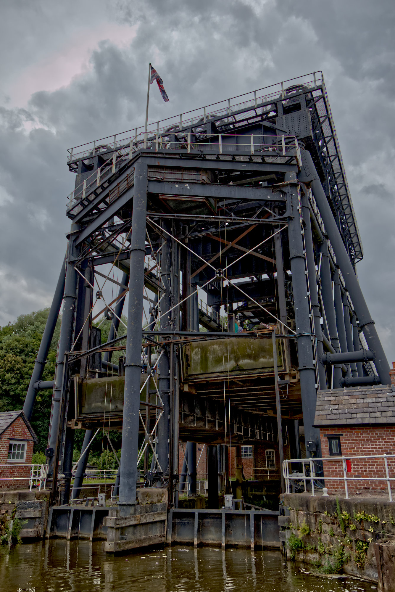
Happy to oblige! Here you can see the moving sections of "canal" about to pass each other. The single hydraulic ram under each section can be seen too. |
Sep 6th |
 |
| 64 |
Sep 21 |
Comment |
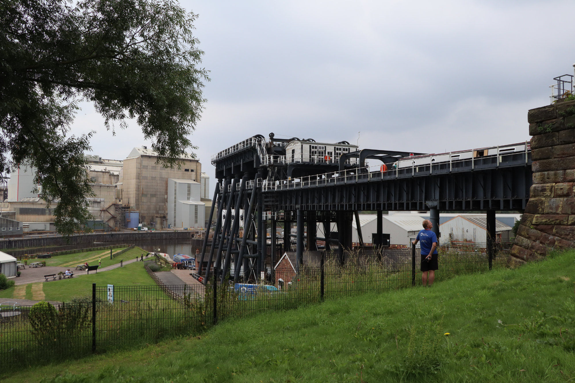
Here you can see the canal approach to the lifting section. The works in the background used to be ICI Winnington Works, making soda ash (sodium carbonate) and related products. My first job as a chemical engineer was there! |
Sep 6th |
 |
| 64 |
Sep 21 |
Reply |
I've just been discussing a drone photograph in group 4. That would get round the problem! ;-) |
Sep 5th |
| 64 |
Sep 21 |
Comment |
I do like historic buildings depicted in a way like this. I wouldn't like to see them all done this way, churches can look very grand in simple mono, but some like this are very nice.
In this case, I think the leaves on the left obscure and dominate rather too much. Cropping won't help, only a different viewpoint from further forwards to peep out from the gap a bit more. I don't know if that was possible, of course. Also, I wonder why the base of the building has been omitted - a bit like a portrait with its feed cut off. From the focal length `I see you were a distance off, so perhaps you were juggling the overall picture as if you couldn't get closer. A shorter focal length, whilst seeing more of the vertical, would have added more leaves to the sides. Perhaps a portrait orientation would have worked? |
Sep 5th |
| 64 |
Sep 21 |
Comment |
Whilst this image has a nice range of greys from black to white like Don's does, here the histogram is a bath-tub shape, with dominance from white and black and much less of the greys that I like.
The reason I think is that there's a lot of dark foreground and white sky. Cropping those improves this, I think.
We have a place called Carmel in the Lake District, a Fell area. A rather different landscape!
The fires there are quite worrying for you. Alas climate change is only going to get worse with more severe consequences even if we do put in the effort to limit it as best we can, much damage and irreversable change has already been done. I'm so sad, our kids and grandkids are going to have to live with this mess. |
Sep 5th |
| 64 |
Sep 21 |
Comment |
I think this is a classic mono photograph, the way I always strived to get a print in wet print days, with lots of greys from black to white. Great!
Delapidated buildings make interesting subjects provided there's something to lift the picture from just a photo of a dilapidated building, and here I think the tree on the right makes a big contribution. It doesn't jump out at me, but once noticed after taking in the picture, I think it adds depth and focus.
I'm glad you placed it a bit off-centre, and its height is clearly depicted. The trees at the front obscure that interesting face a little, but nothing you could do about that. |
Sep 5th |
| 64 |
Sep 21 |
Comment |
I think this is a well-taken image, technically spot on.
My first impression after taking in an over-view was "what is the line in the middle?". It drew my eye strongly and reduced the impact of the picture. It looks like a print with a fold in the middle! I think it's a reflection of a chain, made prominent by the bright reflection of a light behind it. It's easier to understand the chains and their reflections in the colour version.
A tiny bit more at the top, or removing the right-most aerial, would give the picture more room in the frame too.
So I prefer this image with about a third of it cropped off the bottom to remove that reflection and the aerial removed, making a letter-box result that I think has real punch, lots of interest and no distractions. |
Sep 5th |
 |
| 64 |
Sep 21 |
Comment |
This to me was the photo that popped out and grabbed my attention when I viewed the thumbnails of this round.
More closely examined, as it's the first time I've seen it, I think it's fascinating and attractive. This subject seems ideal for it, well chosen!
However, I can't help thinking that this texture is a bit too harsh for regular use, and I'd soon get bored with it if I saw it repeatedly. |
Sep 5th |
7 comments - 6 replies for Group 64
|
| 95 |
Sep 21 |
Reply |
I don't have experience of any other ring flashes, but this Nissin one works well on my Canon. My only complaint would be that I have been unable to find any way to get it to work at all on my Olympus M1ii. |
Sep 28th |
| 95 |
Sep 21 |
Comment |
Well, I think it was nice originally, althought the right side being a bit blown out does detract. That remains even on Stuart's crop. But it gives a dreamy quality that I like in the original. I'm not keen on the part of the leaf showing below the petal.
The insect (a hoverfly?) is nice and sharp across its depth, remarkable for f4, you nailed the focus at the ideal spot I think. |
Sep 18th |
| 95 |
Sep 21 |
Comment |
I love the texture on the petals, Bill. You've done a good job with the depth of field, too, just a teeny bit less sharp on the right. I quite like the crop, better than the small crop on the original. I don't know wht you mean by your comment about bokeh and green. |
Sep 18th |
| 95 |
Sep 21 |
Comment |
Thanks, Barbara. It was good fun taking them. |
Sep 4th |
3 comments - 1 reply for Group 95
|
| 98 |
Sep 21 |
Comment |
Very original, well done! |
Sep 5th |
| 98 |
Sep 21 |
Comment |
A super street photograph, Bob, I love it. Can I be picky and say "pity about her lost feet"? But the subject and excellent post processing to straighten the perspective gives this great impact. Some of the blue reflections are a bit eye-catching if you have the patience on a long winter evening.... |
Sep 5th |
2 comments - 0 replies for Group 98
|
13 comments - 8 replies Total
|


