|
| Group |
Round |
C/R |
Comment |
Date |
Image |
| 64 |
Jun 21 |
Reply |
I thought I'd uploaded a version with adjusted horizon, but apparently not, so here it is. |
Jun 30th |
 |
| 64 |
Jun 21 |
Comment |
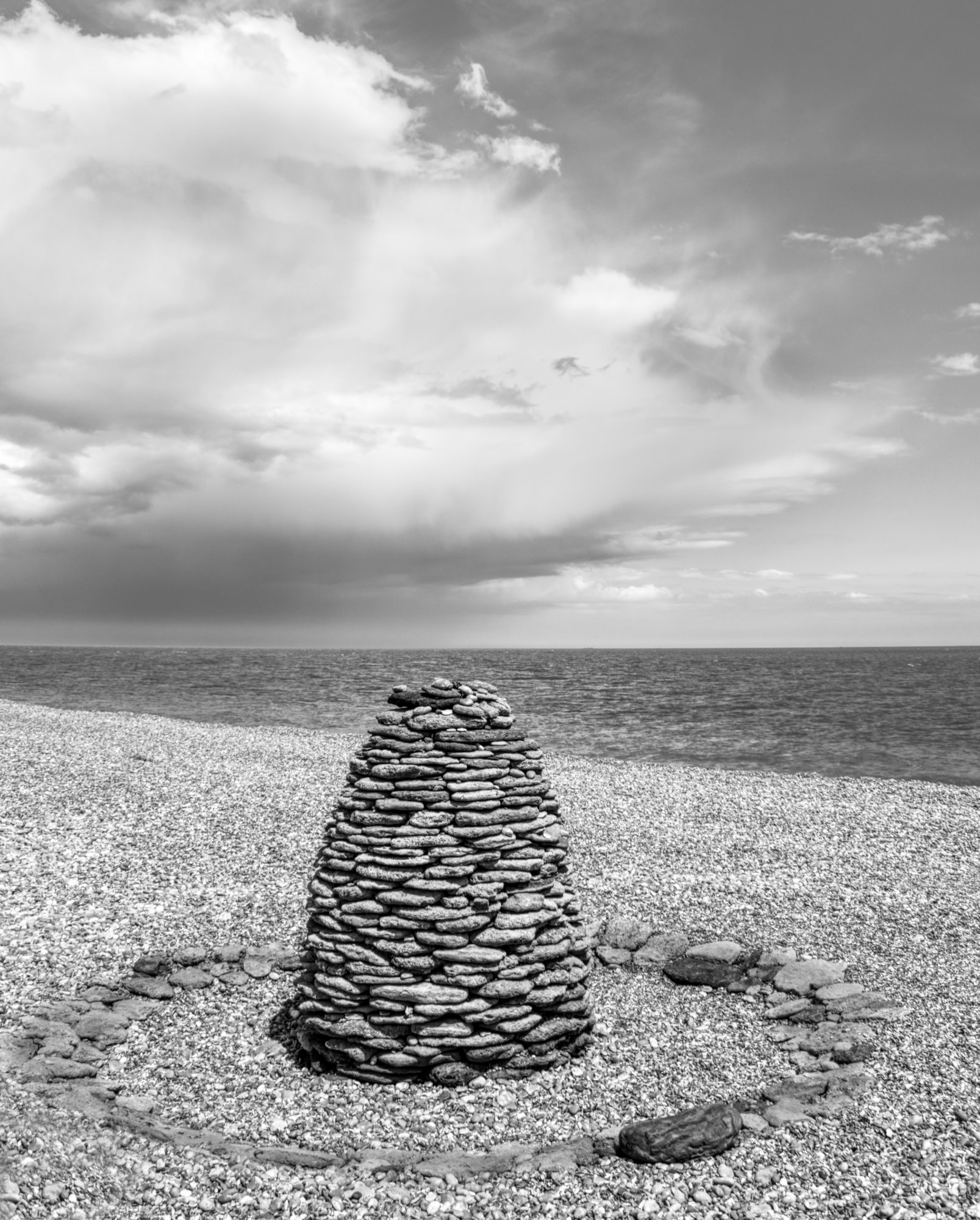
Sorry I've just noticed this entry. I like making a photograph out of "nothing special", and I think you've succeeded well in doing that here. It takes a good photographic eye to see a picture in something like this, and a mono conversion is a must in this case.
I wonder if the wire were a bit diagonal rather than upright then it might be more interesting? |
Jun 25th |
| 64 |
Jun 21 |
Reply |
That's a good idea, I hadn't thought of that. I can make the horizon level whilst keeping the vertical unchanged. I've been able to do that in Affinity, and it does look better. Alas whenever I upload it, the horizon is still slanted even though it looks OK on my computer. So sorry, I can't show you the result. |
Jun 17th |
| 64 |
Jun 21 |
Reply |
It's not exactly worlds away, in that it's maybe 200 miles from my home. But it's a poor journey with traffic and few motorways in that region, so suffice to say I've been to that part of England maybe 5 times in my life! It's not my favourite area of the country, we went there because someone else had organised a meeting of a motorhome owners club to which we belong, there. So alas no, its fate will remain a mystery to me! |
Jun 17th |
| 64 |
Jun 21 |
Reply |
No, they didn't seem to be, the pile was symmetrical and vertical as far as I recall. The beach was sloped in more than one way. I always follow the maxim "verticals are always vertical", and even a sea horizon can look sloped when viewed at an angle like this. A sea horizon is always horizontal when you look directly out to sea with equal amounts to left and right, but it appears down to the left when looking left (and vice versa) like this. So`I agree, it looks odd at first but I think it's correct. Disagree if you like! |
Jun 13th |
| 64 |
Jun 21 |
Reply |
It's very marginal in my view, it would never be noticed without such long parallel lines right next to the frame. |
Jun 11th |
| 64 |
Jun 21 |
Reply |
Your gradation does give a more 3D look than my version, and lightening rather than cropping would preserve a bigger view. Either way, it's a nice picture. Reminds me of Tutenkhamun, or at least Egyptian patterns, somehow. |
Jun 11th |
| 64 |
Jun 21 |
Comment |
I'm sure that one of the PSA Webinars, a speaker showed lots of photos of diners. I've just looked down the list (gosh, it has grown a lot) - it's called "Neon at Night with Joe Pellicone", October 24, 2020. His are all colour, but to me this outshines them for impact with its reflections, graphic shapes and interior detail. Excellent photo!
I would remove the bright lights on the left. And I'd agree with Ian about a stroke due to the darkness at the photo edge. |
Jun 10th |
| 64 |
Jun 21 |
Comment |
Super, a compelling photo and an excellent mono conversion.
Would a little off both edges concentrate the viewer onto the water a bit more?
|
Jun 10th |
| 64 |
Jun 21 |
Comment |
Fossils (and shells) are interesting, and getting in close to show the detail is a big improvement on the original I think.
I think it would benefit further from the darker top left being cropped out, a bit more contrast and darkening the centre to be consistent with the outer. I've had a quick go at that below. |
Jun 10th |
 |
| 64 |
Jun 21 |
Comment |
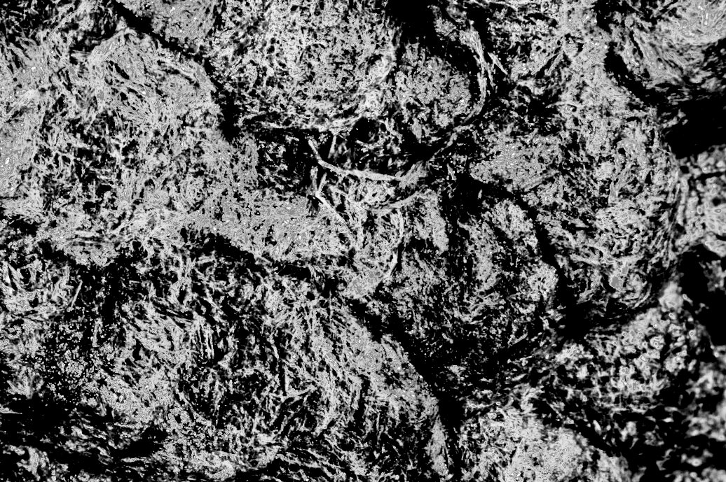
I find this an unusual and interesting photo. I'm trying to understand the texture. At first I thought that the histogram must be a sort of bath-tub shape, but a screen shot pasted into Affinity doesn't show this. It's reminiscent of many years ago when I was using wet processes to push HP5 to silly isos. (Say 3200! How things have changed).
I'd remove that curved intrusion on the left edge.
The post in the middle (if that's what it is) dominates the picture for me, whereas I think the real interest is in the gears, but I guess it was hard to avoid.
|
Jun 10th |
| 64 |
Jun 21 |
Comment |
I think I'm with Jerry, the darker "border" gives a nice frame, although personally I'd have preferred these to be a similar width on both sides. Reducing the width on the left would remove that lamp post which is a bit distracting I think.
The interest is in the detail for me, as vastly different ages of building sit close together in many cities here and in Europe.
It gets more interesting the bigger it gets, I find! A big print would be impressive.
Does it need a degree of clockwise rotation? Straight lines at the side are very telling! |
Jun 10th |
| 64 |
Jun 21 |
Comment |
We wondered that too, Jerry! It's difficult to scale from the photo, but is at least 1.5m tall and so must weigh several tonnes, unless it has a hollow core somehow. So shifting it, even from somewhere local, would have been a big job.
Anyway, well done them, it's interesting! |
Jun 6th |
7 comments - 6 replies for Group 64
|
| 65 |
Jun 21 |
Comment |
Great shot, Michael! I guess you're using the MPE lens, it's a tour de force. Looks like Darth Vader of the insect world!
I think your range of sharp focus was well chosen, although maybe a little more to get the second joint of the front legs? |
Jun 10th |
1 comment - 0 replies for Group 65
|
| 95 |
Jun 21 |
Comment |
Better!
My friend snapped me taking the photo - |
Jun 21st |
 |
| 95 |
Jun 21 |
Reply |
Well, it's not a silk purse in my view! |
Jun 10th |
| 95 |
Jun 21 |
Comment |
Yeah! Lovely. The ART of macro.
Alas we can't let you away with 10/10, as I agree with Bill. Post might not do it, it's back to the f5.6. Go on, jack it up to f16, or stack! Alas the subject was not very bright - I would really recommend my new macro ring flash. Shutter speed is irrelevent, and f16 or lower is easy without sky high ISO. But any bounced flash might help if you avoid harsh shadows.
So, 9.5/10
Have you seen Charles Needle's work? He also gets lovely pastel type macros. There's a PSA webinar he gave called "Creative Macro Photography with Charles Needle" - very well worth a look. His book of similar name is good too. |
Jun 10th |
| 95 |
Jun 21 |
Comment |
I've photographed the inside of a wasp's nest, but there you get the honeycomb not unlike that of a honey bee. The outside it a bit uninteresting I'm afraid. I'd go for jacking up the contrast and mono conversion. Here's a quick go at that, using a linear light blending mode for the contrast layer.
I keep honey bees for a hobby (alas one of my many hobbies, but I'm giving it up this summer) and can assure you bees don't want to sting you, as they die if they do. You can push and shove them and they just shrug it off. Don't squash one though as they give off pheremones which tell the others "I'm under attack!" so they might send reinforcements. Wasps, and probably hornets, are another matter though, they can be nasty especially in the autumn when they are hungry, and whilst they have a rightful place in our ecosystem, I squash the blighters if they get in my house! |
Jun 10th |
 |
| 95 |
Jun 21 |
Comment |
A challenging subject with a shiney surface.
The old humbug depth of field is not in your favour here I think, and the settings show why. I'm sure you could have gone down a few stops in aperture, going up in ISO and even down a stop in shutter, to get a bit more sharpness. A polarising filter might have toned down the reflections a bit, although that wouldn't help the exposure (most are -2 stops), but PS could be used carefully to stop them glaring at us!
I see what might be a bit of a web - easy to clone out with PS. (Healing brush with Affinity, PS might have its own name for it.) |
Jun 10th |
| 95 |
Jun 21 |
Reply |
Yes, I concur, Bill, the tiny subjects make it difficult to interpret because they are outside normal observation. Except bugs, I guess, as everyone recognises them, as so many images of them have been shown. But I find those rather boring (and difficult to take as the blighters move so much. Except mating damselflies I suppose, but we've all seen scores of photos of those).
I'm finding my way and completely missed the background. I could remove it in post I suppose, but there are other aspects of the photo I think in hindsight I got wrong, so I won't bother.
I didn't realise the broom was indigenous here - we have several bushes in our garden, different colours, very pretty! |
Jun 6th |
4 comments - 2 replies for Group 95
|
12 comments - 8 replies Total
|


