|
| Group |
Round |
C/R |
Comment |
Date |
Image |
| 64 |
Mar 21 |
Reply |
I think we all suffer from myopia of our own work. I do try to stand back and look at mine when "finished", and I still miss things of course. |
Mar 15th |
| 64 |
Mar 21 |
Comment |
I like your revised version. You've also lightened the drawer front, which I though was too dark in the original conversion.
I'd suggest you crop or clone out the drawer handles which are cut off by the bottom edge. Or even crop out the whole drawer - this directs more attention to the jug and wall, I think. |
Mar 13th |
| 64 |
Mar 21 |
Reply |
I did agonise a bit about whether or not to leave the line in. Perhaps I should have.
The replacement glass has arrived and is a teensy bit too big! Some emery paper is called for to adjust the edge thickness. Bet I'll break it! |
Mar 13th |
| 64 |
Mar 21 |
Comment |
It's interesting to notice the differences between the windows. The shapes of the support, the presence/absence of clouds, and tree, the different frames and widths to suit the individual bells. Gosh, that's just what Jerry said, so I agree!
Really nice texture and tone, and details well brought out. |
Mar 13th |
| 64 |
Mar 21 |
Comment |
Me too. The texture and tone is lovely.
I like the crease of the back and the rump contrasting with the spherical apple.
I'm wondering if clipping off the left edge of the statue's back (top left)has spoiled the nice flow of that line? |
Mar 13th |
| 64 |
Mar 21 |
Comment |
It looks cropped to me!
The original is rather nice too. The colours within the patterns are fascinating.
I often quote something I read many years ago - "If colour is key to a photo use colour. Otherwise use mono." So I suppose with my comments in mind, this should be colour. But actually I like the mono better. There is texture and patterns beyond the colour. So there we are, two for the price of one! |
Mar 10th |
| 64 |
Mar 21 |
Comment |
IR filter??
I'm afraid I find the severity of the vignette rather severe and distracting. The bird is fine, nice strong contrast with the sunlight glowing on parts of its wings, but the vignette spoils it for me. Sorry. |
Mar 10th |
| 64 |
Mar 21 |
Comment |
Yes, I'd agree, the person doesn't dominate the photo, but if it had been taken without someone like her, the obvious comment would have been the lack of a human.
I love the textures, shapes and shades of grey! All the characteristics of a mono to enhance the story. |
Mar 10th |
6 comments - 2 replies for Group 64
|
| 95 |
Mar 21 |
Reply |
Interesting how different they are. As you say, the first difference you notice is the relative darkness of the FP merge. However they are different in crop (least by AP), colour, and detail. The area at the bottom seems to have a lot of yellow in it in AP and HF versions, and in this region the FP merge has much more detail.I took a screen shot of the FP one, opened in Affinity, did a bit of tweaking of clarity, brightness and colour balance, and got this. It looks quite good to me onmy computer, but oddly the version on the DD site is nothing like as clear and bright, so what you can see when you open it is not as good. Editing this post, I've over-done these adjustments now to make the difference less, but it's still not as good as on my computer. Indeed, there's not a lot of difference in colour between your FP merge and my tweaked one when viewed here, but a world of difference on my Affinity screen. Any idea why? |
Mar 18th |
 |
| 95 |
Mar 21 |
Reply |
It's the front edge of the bee's wing, seen from above. I've no idea why it has hairs and what looks like a zig-zag structure there. The colour is what I saw.
What you can see at these magnifications is quite outside normal experience, so you have to just accept I think. My experience suggests that a binocular microscope which gives a range of 5x to 40x or so is more likely to give photographic rather than scientific results.
But maybe the money would be better spent on a Conon MP-E lens! (2x-5x zoom I think). Alas I'd have to buy a Canon body as well. |
Mar 16th |
| 95 |
Mar 21 |
Reply |
Love it! |
Mar 15th |
| 95 |
Mar 21 |
Reply |
Maybe no iridescence because the magnification is so high (by our normal standards)?
The lighting was reflected, no transmitted light used.
It's hard to tell where Focus Projects stands in the pecking order of stack-merging softwares. Affinity has suspiciously few controls compared to say Helicon, and FP has many as well. Having the time to systematically test them all, using a range of their settings, on a range of test images, is way beyond my time availability. So my impression is that I found Helicon and Zerene offfering no performance benefit over Affinity, and of course are not cheap, whereas FP sometimes seems to give a better result than Affinity. But sometimes the converse is true, I havn't detected a pattern. FP has some features like automatically searching out focus brackets in one folder, although I find the thumbnails it then displays are far too small to be really helpful. As they were offering it for $20 I thought it was a fair deal. |
Mar 15th |
| 95 |
Mar 21 |
Comment |
Very pretty. You've deliberately gone for a small depth of field to emphasise the central petals and make the stem very blurred. I like the way the stem fades out before it reaches the edge of the frame, too. |
Mar 13th |
| 95 |
Mar 21 |
Comment |
My first impression was "wow", but after looking further I became puzzled. The top right petal edge is very sharp (almost artificially so), the centre is also very sharp, but the foreground petal is blurred, and at first glance it seems to be between those others, so it shouldn't be. Unless the tips curve towards the camera?
Anyway, ignoring that, I still really like it! I suspect that starting your bracket closer to the camera would have helped. |
Mar 13th |
| 95 |
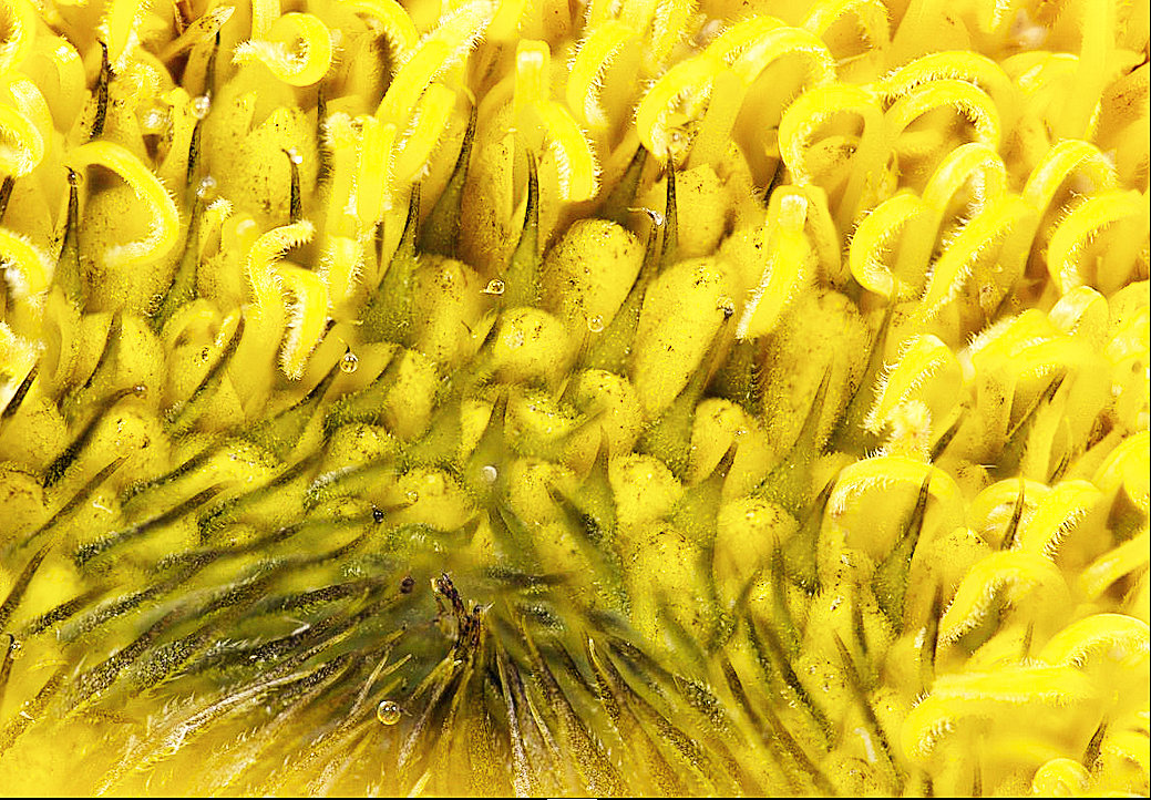
Mar 21 |
Comment |
Nice, Tom.
As with Bill's the highlights are well contained, although I wonder if a little brushing of the local colour might dampen them down even more. Getting this close frequently seems to reveal reflective surface, I find.
I wonder also if cloning out the patterned stem (or petal) in the top right corner would help? The same might be said for the petal in the bottom left, and the little "tip" detail in between them. It's the general repetitiveness of the pattern, but still being natural, that I find attractive.
|
Mar 13th |
| 95 |
Mar 21 |
Comment |
Doesn't look anything like the wasps here! But we only have one type, as far as I'm aware. Is it a stinger?
I like the way you've prevented the shiny surfaces of the wings and stone wall from burning out.
I'm afraid agree with Barabara, it does look soft. Shutter speed is OK, so can only be focus, I think? Difficult, hand held. I seem to think that many macro photographers when working hand-held put the camera on multiple exposure and seek the sharpest one. Not something I've done, but I can see the benefit in this situation. |
Mar 13th |
| 95 |
Mar 21 |
Reply |
Thanks. "Composition" takes on a new meaning here! Not the same as for "normal" photos.
Yes, the viewer would never guess what it is without an explanation! Unless they were a bee expert, I guess. |
Mar 13th |
4 comments - 5 replies for Group 95
|
10 comments - 7 replies Total
|


