|
| Group |
Round |
C/R |
Comment |
Date |
Image |
| 20 |
Nov 20 |
Comment |
Super, I do like many aspects of this, especially the luminance and the clarity. I've never thought of using a scanner, but I've noticed a couple of other pictures in previous months doing this. I like the "stroke" inside the border too.
Having said that, I think I'd prefer it a little with the adjustments suggested. |
Nov 18th |
| 20 |
Nov 20 |
Comment |
Fascinating, Jerry! I like it. Not an effect to be repeated too often I guess, but it seems to suit this original rather well.
Looking at this month's pictures prompted me to look through several previous ones and I do like much of the work I see. Generally I'd thought that "Creative" means "imaginery composites" and ones I've seen in the past didn't really float my boat, but many here do. I'll keep an eye open in future! |
Nov 18th |
2 comments - 0 replies for Group 20
|
| 34 |
Nov 20 |
Reply |
Wilco. Email me your contact details please. |
Nov 29th |
| 34 |
Nov 20 |
Reply |
My remarks are well deserved. It would be nice to meet you! I was born in Middlesbrough and brought up in Normanby. My dad always said that the summer hadn't started until he'd been to Whitby for a day. Great place for photos, Goth weekends are brilliant, and best fish and chips anywhere! I have a story about a colour chemistry student at Leeds, but that's not appropriate here! See www.s-ord.uk if you are interested, and stuart@s-ord.uk |
Nov 29th |
| 34 |
Nov 20 |
Comment |
Ah, I've just read your bio. Whitby is one of my favourite places! Not been this year since my name isn't Cummings, but hopefully will in 2021. |
Nov 29th |
| 34 |
Nov 20 |
Comment |
A beautiful photo, well done. The improvement in the rendition of the main flower is a great advert for Topaz Studio. However, no matter how good the tools, it takes a good craftsman to use them this well and think it's "Quick and simple". |
Nov 29th |
2 comments - 2 replies for Group 34
|
| 64 |
Nov 20 |
Reply |
Thanks, Helen. Yes, very glad we were upwind! Being micro 4/3 this was full frame equivalent to 390mm. Very handy! |
Nov 15th |
| 64 |
Nov 20 |
Reply |
I doubt it, she's heavily into doing her PhD at the moment, no time for outside interests!
I've just Googled this lady and have read a bit about her. Not someone to be crossed! I wonder which candidate she was hoping would succeed as President. Alas I see she passed in September, so she didn't get that wish. |
Nov 11th |
| 64 |
Nov 20 |
Reply |
I brushed in "eyes" and a "mouth" very faintly, taking the shapes and places they seemed to be in the original. I'm no artist, but I reckoned the dust might have made the features look like that. So I'm pleased you like it. |
Nov 11th |
| 64 |
Nov 20 |
Reply |
I guess being American increases one's chances of recognising it! No problem, I'm the odd one out here. My daughter has a degree in Design and comes up with posters and this reminds me of some of her work. I'm sure the style could be used in many contexts. |
Nov 11th |
| 64 |
Nov 20 |
Reply |
Thanks, John. I hadn't noticed the face detail really, but you are right, there is some vague detail in the original. I've had a go at enhancing it both in the conversion and by going back to the original, but I can't enhance it enough to make any difference. I'm wondering if it's a psychological effect - there's a small hint of face features, and we know it's a face, so we are able to see the features even though in terms of shades of colour in adjacent pixels, the difference is tiny. So I've had to resort to cheating......can you spot it? |
Nov 10th |
 |
| 64 |
Nov 20 |
Reply |
The contrast in the original is very high, so I was surprised that it gave anything apart from colour and black. Working just from a screenshot, the resolution is quite low. Zooming in on detail in Affinity, I can see some shades of red - so it is black, shades of red, white. Or do you think that "colour monos" should be dark colour, shades of colour, light colour?
Sorry, I'm wandering off topic again. Deviation closed! |
Nov 9th |
| 64 |
Nov 20 |
Comment |
I certainly recognise blast furnaces, having been brought up a couple of miles from a large steel factory.
The first thing I saw was the "Stop" sign - candidate for removal?
The difference between the photos is interesting. The large number of wires in the recent one spoils it a lot I think. However some items in the steel plant have been demolished now by the look of it, and so the blast furnaces are much clearer and more interesting in your photo. People living in the close proximity of such plants, when the air would be heavy with dust and smoke, suffered lots of health problems, so the cemetary is quite relevent and makes a strong story. Pity about those wires.
|
Nov 9th |
| 64 |
Nov 20 |
Comment |
It took me a few looks to realise this has been made from the steps in your October photo. Nice abstract pattern, but I don't understand the words or the need for some - are they relevent to the photo? |
Nov 9th |
| 64 |
Nov 20 |
Comment |
Most photos of this area are new to me, and if this is a traditional place to take this photo, then the reason is quite obvious, it make a very attractive picture. The shadowas help direct my eye to the homestead, and it all leads nicely to the main attraction.
I wonder if the person is a bit of a distraction, being just big enough to notice but not big enough to be part of the picture?
The clouds behind the mountains take away some of the drama I think, as they disguise the outline a bit. I wonder if they could be darkened a little to make the mountains stand out more? |
Nov 9th |
| 64 |
Nov 20 |
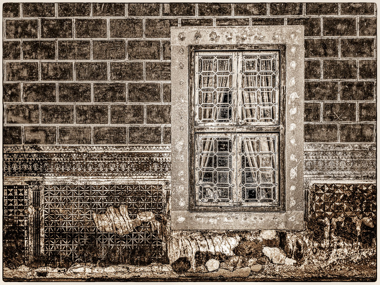
Comment |
Whilst I also like the original, I find the line of blue distracting.
In the mono, I wondered if darkening and increasing the contrast of the lower part of the wall would stop it competing with the window for attention, so I tried it and got this - |
Nov 9th |
 |
| 64 |
Nov 20 |
Comment |
With my mind on "colour" monos, I couldn't resist this. Is this still mono?? |
Nov 9th |
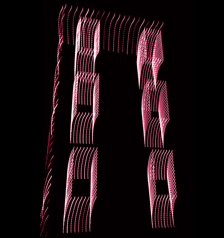 |
| 64 |
Nov 20 |
Comment |
I'd agree, very nice. Personally I go for a bit more contrast, but this has a nice, gentle feel to it |
Nov 9th |
| 64 |
Nov 20 |
Reply |
I had done a gentle vignette, bu I think you are right, a bit more would improve it. I didn't want it to look too dark and make the lighter areas look burned out, so I've adjusted it a bit more here including make the driver a bit more of a silhouette. |
Nov 9th |
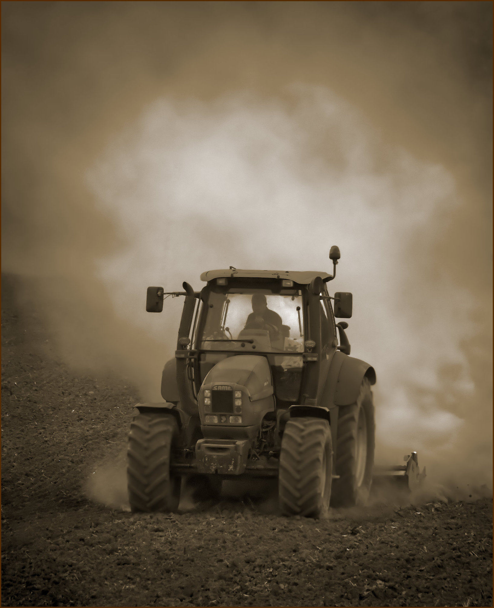 |
| 64 |
Nov 20 |
Reply |
Yes, 50% toned this month. Although in my case, it's not "sepia", it's "brown"! So what's the difference? Very little in terms of viewing the final result, but it was a deliberate selection of brown as opposed to say green for the "colour and white" conversion which John gave us several links for in the bulletin board a couple of months ago. I felt that brown suited the scene as it was the predominant colour in the original.
OK, next month a non-sepia-like colour! |
Nov 6th |
6 comments - 8 replies for Group 64
|
| 95 |
Nov 20 |
Reply |
Oh, I thought it did. Must be PS Elements I'm remembering. I did try Bridge, maybe with a very old trial of PS, and uninstalled it for some reason. I've seen now that Bridge is free to keep after a CC Trial, so I'm trying that. Ah, snag, it won't display the embedded jpg in Affinity Photo files. Not too surprising, I guess. Still, I'll try it. |
Nov 23rd |
| 95 |
Nov 20 |
Reply |
That seems to be the opinion of the others, too. |
Nov 23rd |
| 95 |
Nov 20 |
Reply |
I did try Bridge once, but it kept "losing" photos when I moved them using another program. That's the problem with catalogues which build their own database. Rebuilding or refreshing the database was too much hassle for me, and I found other programs much quicker to use. Anyway, slap my own wrist, digressing again! [I got into trouble on Group 64 for that ;-) ] |
Nov 23rd |
| 95 |
Nov 20 |
Reply |
OK, maybe my system isn't as extreme as I thought.
One day maybe I'll get to put a USA folder in mine! But I do have New Zealand and Australia folders (inside "Holidays") so I was lucky there. So many places to visit..... |
Nov 23rd |
| 95 |
Nov 20 |
Reply |
Thanks, Nilan. Do you see an improvement between the original and the newer version that Tom and Bill like?
|
Nov 21st |
| 95 |
Nov 20 |
Reply |
Maybe I'm just not subtle enough! Probably better I think, but I still like the first one as well as the surface of the grounds wasn't particularly flat.
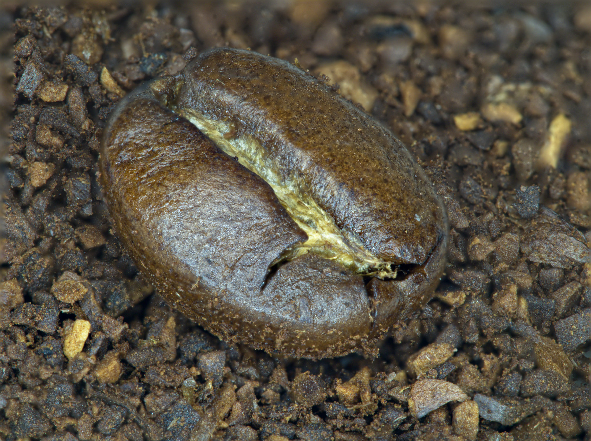
Oh, where do I start. Historically I put photos into a folder which is just for photos, and had subfolders for things like "Home", "Holidays", "Aircraft", "Events", "Family" etc, each having sub-subfolders and so on. Later as I got back into photography as opposed to record shots, these are still useful so I added top level folders "General Photoshoots", "Theme photoshoots", and some others. Theme Photoshoots for example has subfolders "Macro", "Mono", "Street" etc, and these have sub-subfolders of the year, and within those are folders of the shoot, eg 2020_10_26 Coffee. The latter has another level for the individual stacks.
But then, do I leave the files I worked on in there, as over time they then become very scattered, so I have yet another top level folder "Affinity files" where the Affinity Photo files and any exported jpgs go, all of course in subfolders for "Mono", "Macro" etc. Still with me? I've had several re-organisations over the years, but it can get very time-consuming to do and snags emerge when they are used, so sometimes I've turned the clock back.
At the other extreme, I've seen people just put all their files into a single folder sorted by time and rely on looking for the thumbnails knowing roughly when they were taken, but that's too chaotic for me.
All of these depend on good software to search and look for things, and I think Mac users are better off there. I have several photo viewing softwares that all have strengths and weakneeses - XnViewMP, Olympus Workspace, Fastone Image Viewer, digiKam, even Windows Explorer.
And Everything for searching for lost files! And even that drew a blank in the case here. Must be my memory!
I guess it's all what works for each of us, and usually this works OK for me. |
Nov 21st |
| 95 |
Nov 20 |
Reply |
Filing and cataloguing my photos has long been a rod in my back. I'm sure I made two focus merges as described in my narrative and gave them names with the file name ranges in them. Can I find them? No. But I remember that the merge of all originals made the background too sharp, so it confused the far edge. Hence the second merge of fewer originals, taking the background blur of the furthest-focussed original I suppose, which is what I submitted. I guess you are saying that something in between would be better. So here I've added more originals, making 12 in total. |
Nov 20th |
 |
| 95 |
Nov 20 |
Reply |
I couldn't figure out what it was. I wouldn't expect that the water made a difference unless it arrived after you'd focussed?
I hadn't noticed that it is a "blur vignette". Good idea! It looks to me a bit like we are looking down a tube with the periphery a bit closer hence blurred. |
Nov 18th |
| 95 |
Nov 20 |
Reply |
Thanks, Carol. Yes, it could be! Personally I don't like bugs either, so you won't see many photos of them from me. |
Nov 18th |
| 95 |
Nov 20 |
Reply |
Sounds you might like the concept of smellivision, which was suggested some years go as something coming in the future. Glad it hasn't, I wouldn't watch countryside programs then!
;-) |
Nov 18th |
| 95 |
Nov 20 |
Reply |
Thanks, Barbara. I'd never have guessed the centre would be so yellow, but I've not manipulated that at all. |
Nov 18th |
| 95 |
Nov 20 |
Comment |
I like the result, Carol, as the attention is on the skin detail which is sharp, and the background is out of focus but giving context. The dark area, bottom left, might be better removed.
If you'd intended more depth of field, then either the step was set too small or you didn't take enough frames. I have an M1ii, and Olympus give no help in understanding how the internal automatic step size relates to the shift in focus. I've spent many hours measuring what the camera is doing with various settings, and trying to summarise it all in a way simple enough to use during a shoot. The step size does change with the aperture set and the focus distance. I haven't succeeded yet! If you'd like me to dig out my records and results, I'd be happy to do so. |
Nov 9th |
| 95 |
Nov 20 |
Comment |
PL@nt Identify thinks it is a "Erigeron uniflorus L.", or "Large mountain fleabane".
Whether it is or not, it's a nice photo! Pretty good focus, maybe a little further away would have got the centre of the flower and the tips of the petals a bit sharper, and they are the main centre of attraction I think. I like the exposure and colours, and the dark background. |
Nov 9th |
| 95 |
Nov 20 |
Comment |
This has worked really well I think, Tom. The bit between the eye (or head?) and the antenna looks odd - is the eye really flat there, or coming from the background replacement somehow? I didn't know this microscope can be connected to a phone - how did you set it up? |
Nov 9th |
| 95 |
Nov 20 |
Comment |
I like this, it's nice and sharp and very well lit - the combination has worked well I think. It doesn't seem to have suffered from the high ISO - good camera! I like the backgroound, it's completely unobtrusive yet with some interest and adding balance to the picture. |
Nov 9th |
| 95 |
Nov 20 |
Comment |
It's a familiar problem, skittish insects giving the photographer too little time to decrease the shutter speed and allow you to reduce the aperture to a minimum opening to get more depth of field. Your focus is good in that you've got the head in sharp focus, but the rest isn't as your aperture was too large. Focus stacking is all but impossible with such subjects. Unless they are ex-subjects, of course. (ie dead.)
A flash with suitable deflector, or a ring flash, is one way to allow small apertures and keep short exposure to arrest any movement, if you are keen on these types of subjects. Keep trying - people take many photos before getting ones like this right. |
Nov 9th |
| 95 |
Nov 20 |
Comment |
Very interesting. The presence of a single non-green item makes it a neatural focus of attention, but it's not very sharp, which is a pity. The bottom left is blurred as well - would a crop of the bottom 15-20% improve it? |
Nov 9th |
6 comments - 11 replies for Group 95
|
16 comments - 21 replies Total
|


