|
| Group |
Round |
C/R |
Comment |
Date |
Image |
| 64 |
Aug 20 |
Reply |
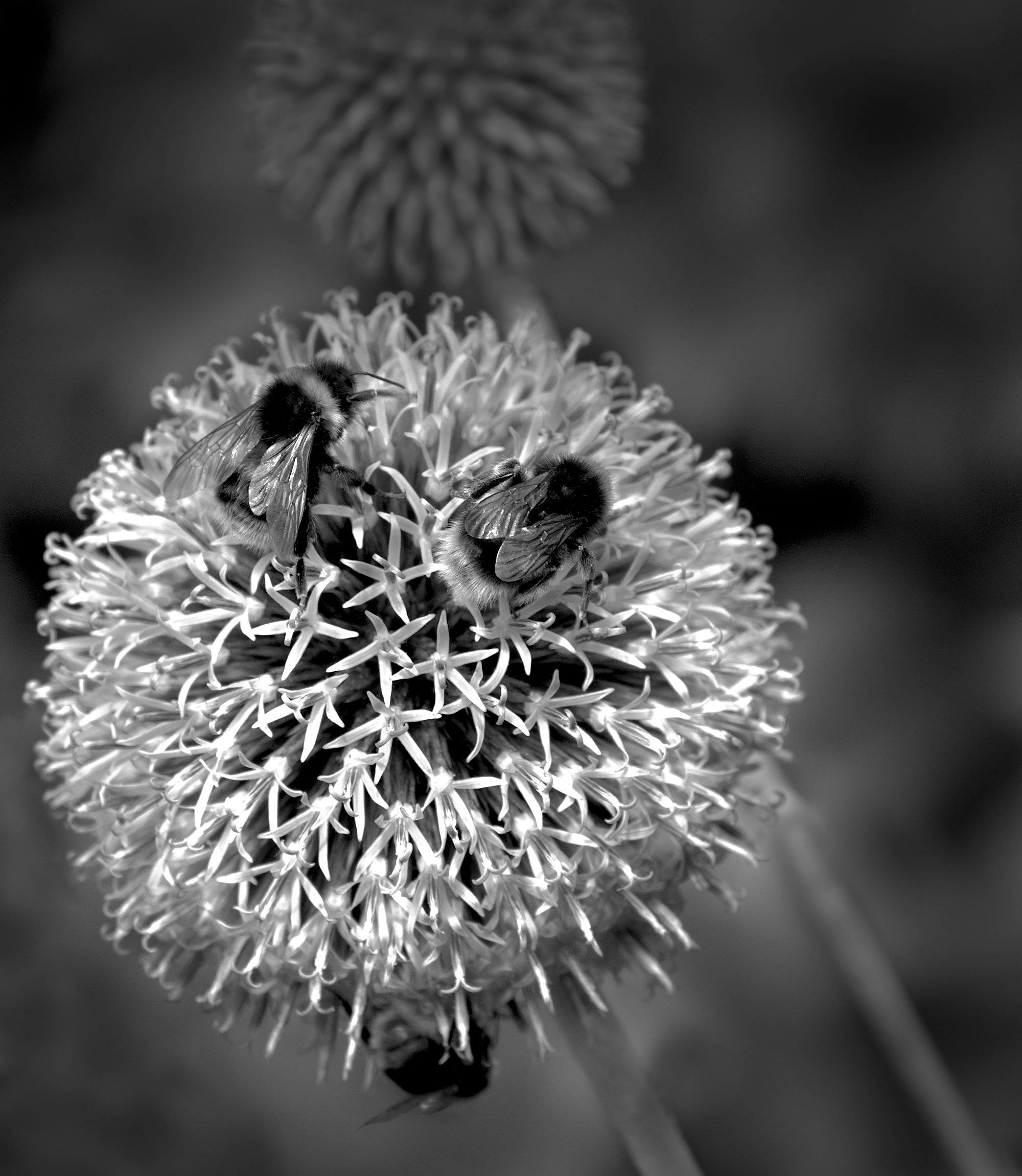
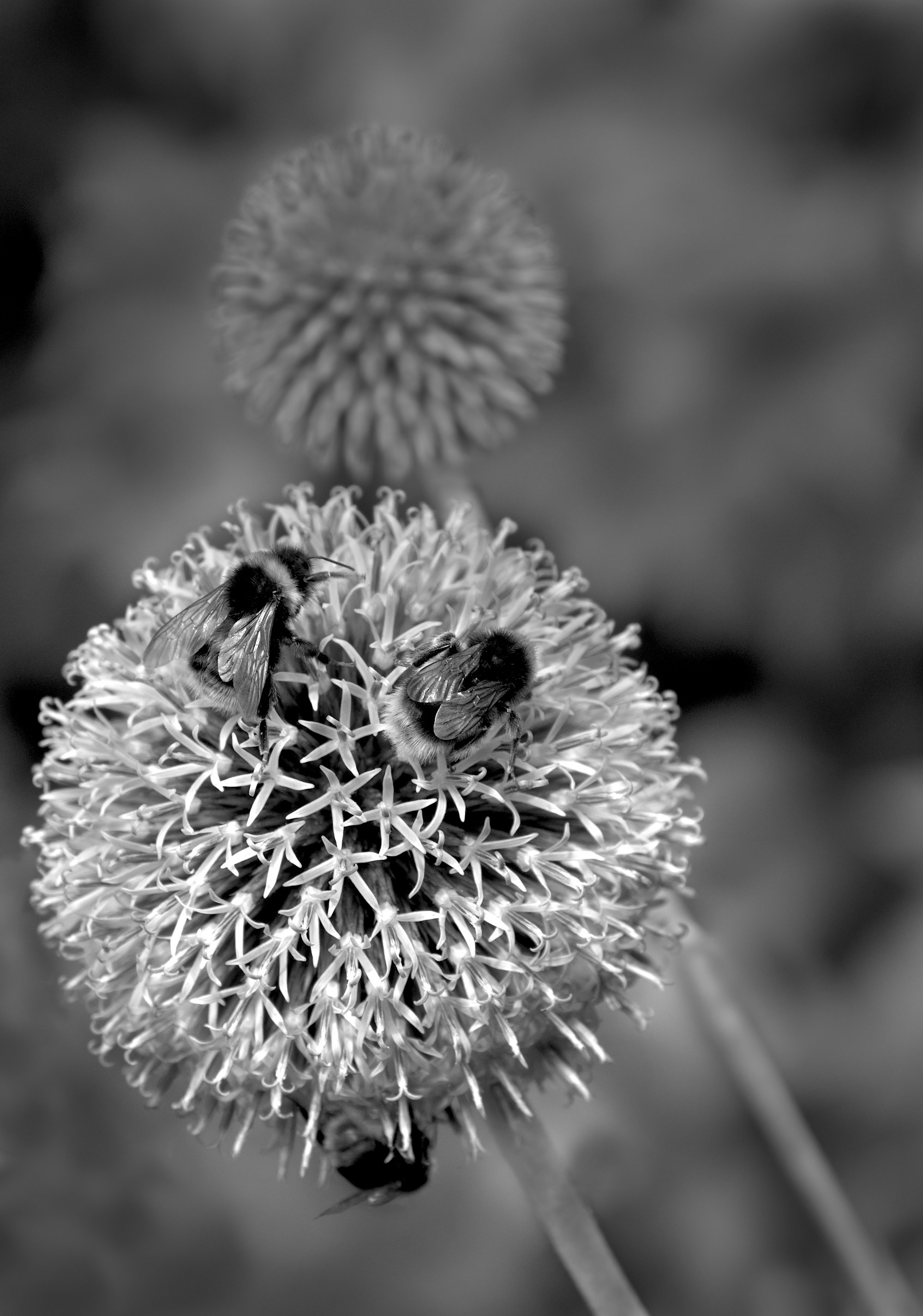
I like the cropping idea, Stan, as it retains the depth I was seeking and makes the rear flower more subservient again. I've darkened and vignetted a bit more, but the image was losing punch so I tried to lift the highlights a bit. |
Aug 31st |
 |
| 64 |
Aug 20 |
Reply |
Ah! Interesting. The patterns remind me of those left on the beach by the tide. |
Aug 16th |
| 64 |
Aug 20 |
Reply |
OK, I see what you mean. Here it is again with some burning in of highlights, local sharpening of the fronts of the bees, and darkening and blurring the rear blossom using Affinity. |
Aug 16th |
 |
| 64 |
Aug 20 |
Reply |
I agree, Jerry. Smartphones are becoming so good that making them more ergonomically functional for "real" photographers would make them compelling for me. Plus longer focal lengths, but I see there are attachments you can get and indeed some phones have several lenses built in. If the market is shifting due to phones as many say it is, then I think there is a potential marketplace for this worth the attention of mainstream camera companies. |
Aug 16th |
| 64 |
Aug 20 |
Comment |
A super shot, Helen, and very much better in the mono conversion as you've eliminated the glare in the blue at the top in the original. Also the reflections in the lighter area at the bottom are so much better in the mono.
Could I suggest cropping off a little of the right side to make the amount of the light area the same on both sides? I know it's not symmetrical and as you had to "shoot from the hip" there's no complaint here for that, but that is the part of the asymmetry that I find less attractive. It would also make it "vertical letterbox" (if there's such a thing) which would enhance the feeling of height. |
Aug 16th |
| 64 |
Aug 20 |
Comment |
The texture and lighting are delightful I think. Her dark dress did make me think she was in the water initially though....
12mm m4/3 (24mm full frame) isn't usually a good choice for "normal" portraits. Getting close to fill the frame, perspective is exaggerated greatly and the usual result is a huge nose! She must have a delicate small one as it doesn't look too bad to me (am I allowed to link that with a nationality??), but I wonder if she finds it flattering? 80-150mm full frame / 40-75mm m4/3 usually renders portraits more naturally.
|
Aug 16th |
| 64 |
Aug 20 |
Comment |
The light pattern is fascinating, I think. I'm struggling to see what the finer pattern is - my first thought was "ants", but it doesn't seem to be. I suppose for an abstract we don't actually need to know what it is, but somehow it seems compelling to know here.
I would prefer to crop out much of the darker area top and left edges to make it more uniform - these areas drag my eye away as they are different to the bulk of the pattern. |
Aug 16th |
| 64 |
Aug 20 |
Comment |
I like this capture and the composition. I would have liked to see more detail in his face - could that be dodged a bit? |
Aug 16th |
| 64 |
Aug 20 |
Reply |
Apparently it's a "Blue globe thistle", Helen. More info here - https://www.gbif.org/species/5392859. It's common in Europe but not in the USA.
|
Aug 16th |
| 64 |
Aug 20 |
Comment |
I have posted my photo of a blue globe thistle on another (non-mono dedicated) site and everyone said they don't like flowers in mono! Well we know better I think, and this is a good example of how removing the colour makes it easier to see and appreciate the lovely texture and gradation present. Super result. |
Aug 16th |
| 64 |
Aug 20 |
Reply |
Nothing to be sorry about, Jerry - eye of the beholder. I just think that isolated flowers are OK by and large, but to me it gets a trifle boring as a recipe. Some context can add, it's way our of focus to help avoid being too demanding, it's intended as more a peripheral vision thing. Blame Charles Needle if you don't like it! |
Aug 8th |
5 comments - 6 replies for Group 64
|
| 95 |
Aug 20 |
Reply |
I once read that photos that flow from left to right give a feeling of calm and tranquillity, whereas ones that flow the other way feel of tension and aggression. In the eyes of people whose writing goes left to right, anyway.
Makes sense to me! I often use this logic in deciding whether to flip a photo or not. |
Aug 23rd |
| 95 |
Aug 20 |
Reply |
Interesting point about the stem being partly in focus, Tom. I saw nothing wrong with that is that of course is how the camera saw it, but artistically I think you have made an improvement.
In my crop the flower is a bit central with equal space all around it, so again your version is more pleasing.
Thanks! |
Aug 22nd |
| 95 |
Aug 20 |
Reply |
I see Tom has added some good comments to help. In case you get bitten by the stacking bug, I would add use electronic shutter with the mirror up when you are ready. Don't bother until you are comfortable with making stacks and adjusting the stacking rail without the benefit of the viewfinder. You can decide the amoount of movement between shots before you start the sequence, and then repeatedly move the rack by the same amount of turn of the adjusting screw each time during the sequence. This will avoid any movement in the camera from the movement of the mirror. Oh, and use a cable or radio shutter release for the same reason. It will also reduce wear on your mechanical shutter - stacking piles up the shutter release count! |
Aug 22nd |
| 95 |
Aug 20 |
Comment |
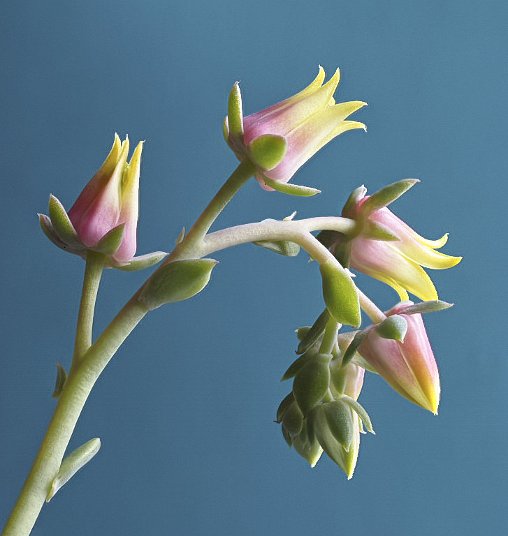
Oh, say you're a Beatles fan Carol and you're a friend for life! :-0 Very appropriate title.
I like this, it's similar to Barbara's photo in a way. Here I feel much happier with the clarity of the centre despite the softness at front and back. Again a smaller aperture would have given a little extra punch I think. Super light and pastel colours.
Colour-wise, I think a darker background would have enhanced the petals. The angle is a nice one although I think that you cropped off a little too much of the top and right - I'd have liked a little more space and to see all the stamens. I find macro a challenge just to find subjects small enough sometimes! |
Aug 16th |
| 95 |
Aug 20 |
Comment |
I think this is a nice, dramatic photo, Barbara. The lines in the petals lead to the centre which is really nice to me. Super little water droplets!
The foreground stamens are blurred which is a pity as they would really rise up to the viewer if they were sharp. It's a very 3D object at this magnification to get adequate DoF. If taking a single shot, I'd have thought that f16 or lower with a bit more flash power would be better, and focus closer to the front. As it's static, I'd definitely have stacked a selection of a big bracket to choose the DoF that appealed to me the most. |
Aug 16th |
| 95 |
Aug 20 |
Comment |
I'd suggest more spinach to get hairs on the backs of your hands!! ;-)
It looks quite soft, Tom, and we know your "toy" is capable of good sharpness, so I'm puzzled - the nature of the surface (as I'm sure you wouldn't get the focus off) or too slow shutter?
|
Aug 16th |
| 95 |
Aug 20 |
Comment |
I really like this photo. I would agree to a crop off the top improving it, but maybe only half as much off the top and bottom as your second version, Nilan, which I find too tight. Square would be good for me.
The depth of field is small, but despite this you've got both bugs nice and sharp! Excellent shooting I think. The background and flower stem flow together in a lovely way. As Carol says, the colours are super too. Well done! |
Aug 16th |
| 95 |
Aug 20 |
Comment |
Hi Bill,
I'm afraid I don't know the reason for the stripes. It might be that the canvas is bigger than the picture and so they are just parts of the file unfilled with proper data. Can you see what the canvas size is in PhotoShop? I don't use it, but I know Affinity would give me this information easily. Then, is this the same as your camera settings? I can't see why it should be different unless ACR has caused it somehow, but there's got to be a reason!
For getting rid, I'd have thought that a simple crop in PS would work.
Anyway, I like the photo. Good detail and not bad focus, a trifle short making the heads a bit soft. The main subjects are a bit central in the frame for me, but I don't think cropping would help due to the supporting actor which I like. |
Aug 16th |
| 95 |
Aug 20 |
Reply |
Hi Carol,
Thanks for your comments. Trying to stick close to 1:1 to maintain our "macro" name can be a nuisance, but I'm treating it as part of the challenge!
I suppose the stem in view is rather straight and less interesting. I'd not noticed that, but I do like out of focus elements in some macros to give context and depth. There's a PSA webinar done by Charles Needle which got me thinking this way - many of my photos follow some of his examples of the majority being out of focus. If you've not seen it, I think it's worth a look. Also he has a web site and a good book - https://charlesneedlephoto.com/creative-macro-photography.html
Anyway, copying this style is not easy or a recipe for a good picture, and I agree the stem is not a good example of the style. I was just wowed by the colour.I've tried cropping and removing the rear leaf and forward stem, but the main flower stem still appeared straight so I wasn't keen on it. Next time I'll look harder at the blurred bits! |
Aug 4th |
| 95 |
Aug 20 |
Reply |
Thanks, Barbara. There's a quality in the colour which is delightful I think. I've been trying to do it again with a different plant and failing! Sometime a nice photo seems to emerge. Just lucky I guess. I must practice more to get luckier! Here is the promised pic showing a bit more. |
Aug 2nd |
 |
5 comments - 5 replies for Group 95
|
10 comments - 11 replies Total
|


