|
| Group |
Round |
C/R |
Comment |
Date |
Image |
| 64 |
Jul 20 |
Reply |
Sounds to me like your "zoom lock" ring is a problem. It seems superfluous to me; I don't use it normally, but it's easy to nudge it accidentally so it makes the zoom ring stiff.
It's a lovely shot I think, they are behaving naturally, can't expect a pose! Yes, the whole world seems hostile at the moment. We humans think we are in control of things being at the top of the food chain, but we're not, nature is a force at all levels that we cannot tame. |
Jul 15th |
| 64 |
Jul 20 |
Reply |
I always remember that when in the dim and distant we were using slide rules (as calculators were still science fiction), then the reason slide rules were so accurate was that the human eye is very sensitive to errors in alignment. Same applies to vernier callipers. I wonder if we are seeing the same sort of thing here, because the difference between John's original and Stephen's edited version absolutely screams at me, Stephen's looks natural whereas the original looks - well - wrong. Sorry! But I am trying to be honest here. (Although I think Stephen's version is leaning to the right slightly!) Yet the actual difference, when I measure the screen, is quite small.
I think Stephen is right, it is a perceptual thing, our brains expect a little convergence. If you got a half-height viewpoint with the camera level, you should see convergence both towards the top and towards the bottom. A bit like standing beside a railway line and looking in both directions, there's a vanishing point both ways.
So for me, Stephen's version, a little rotated to the left (anti-clockwise), looks right.
Still a nice picture :-) |
Jul 10th |
| 64 |
Jul 20 |
Reply |
Good idea. Now you mention it, it does look suspiciously flat, more like float glass. If it's modern, it might not be true "stained glass" which are small panels held inside the lead within the whole frame. But it's owned by the National Trust which goes to great lengths to be authentic if the original is lost for some reason. Looking carefully, I suspect it's not one large sheet of glass with lead stuck on with adhesive, but individual panels. But they might be float, I'm not an expert on that. I need to go again for a look! |
Jul 9th |
| 64 |
Jul 20 |
Reply |
Thanks, Jerry, I hadn't thought of it that way. The building is small and getting to a position to make it less skewed was probably difficult, and I wanted the olde writing to be prominent. |
Jul 9th |
| 64 |
Jul 20 |
Comment |
I love the shapes, tones and textures here in the beach, and the contrast with the shape, tones and textures in the sea. Magical mono! The mono is way better in my view.
Is the beach very coarse? You describe it as "quartz" rather than as "sand". I'm not familiar with the place of course.
Nothing to suggest except the horizon - maybe it's an artefact of the pier, but it looks non-horizontal to me. |
Jul 9th |
| 64 |
Jul 20 |
Comment |
Yes, I agree, a nice picture, well taken.
I suppose if the chick had turned its head a little to the left.... working with children and animals is hard!
Great lens / body combo! I love mine. I did test an Olly 300mm prime which was great, but it was never quite the right focal length, and so I bought one of these - not disappointed! |
Jul 9th |
| 64 |
Jul 20 |
Comment |
I'd not heard of this monument, but a look on Wiki shows how dramatic an area this is. Is this part of the "White House Ruin"?
If so, your angle of view is different from the views shown on Wiki, which I like. No doubt lots of people photograph it, but I like the mono conversion too which makes if different. |
Jul 9th |
| 64 |
Jul 20 |
Comment |
Another interesting architectural photo.
The thing that catches my eye is that it seems to have diverging verticals. Yet if I look closely at the building sides and the frame, they are parallel. Did the conversion include correction of converging verticals, which of course the camera would "see" from this viewpoint? I'm thinking now that maybe my eye expects to see a little convergence! |
Jul 9th |
| 64 |
Jul 20 |
Comment |
Ouch! I wouldn't want to be on the wrong end of that.
I do like this. The detail and contrast is super. I think the change in the water reflection from "water" to black just behind the anchor is a shame, a bit more "water" would have been nice, but there's nothing you could have done about that without spoiling the viewpoint. Would a slight darkening of the water improve it? |
Jul 9th |
5 comments - 4 replies for Group 64
|
| 95 |
Jul 20 |
Reply |
I suppose you could mask the LEDS if you found it necessary. |
Jul 9th |
| 95 |
Jul 20 |
Comment |
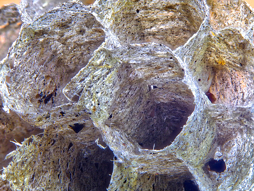
I'm not one for creepie-crawlies by and large, but I do like these little spiders!
The DoF emphasises its face which I think is great - pictorial as opposed to record.
Perhaps the dark line behind it would be better removed? And maybe a little of the left cropped off to make it less central and give a sense of movement?
I'm not familiar with the Zeiss lens. I use an Olly 60mm macro and even at 1:1 the working distance is good, about 4", and 6" for 1:2. Far better than a reversed lens. I've been trying a Novoflex retro adapter which allows a lens to be reversed and still electrically connect the camera to the lens, but the working distance can become vanishingly small, and I don't recommend it. It will appear on ebay soon!
Generally working distance goes up as the focal length increases, so as an experiment I've been trying my 100-400 Panasonic lens at 400mm. Closest focus is about 36", and magnification is about 1:4. With 52mm extension tubes in place I can get 1:2 (ie half size, the frame was filled by a 34mm subject). By adding a 1.4x teleconverter I got very close to 1:1 (1:1.12 actually) from a distance of 27 inches! But it was very tricky to set up using a tripod and macro rail. The internal lens focus had little scope so auto focus was more or less useless. I had to adjust the subject distance until I got focus. But I think it illustrated the point. |
Jul 9th |
| 95 |
Jul 20 |
Comment |
I think this is a nice picture, sharp and well exposed, with the background just enough there to be real.
Did you crop off the top? I think the lost petal tip is spoiling it a bit. If not and the tip is absent, then perhaps a tighter crop would even it up? |
Jul 9th |
| 95 |
Jul 20 |
Comment |
Fascinating, Tom. My wife Sue has never used her microscope for pictorial photos, just for details of handwriting samples. The whites look burned out here - does the sensor have a good latitude? Can you control the exposure from the software? |
Jul 9th |
| 95 |
Jul 20 |
Comment |
I posted a photo on another site which provoked a discussion about the technical names of flower parts. So I did bit of googling and found this page with a good diagram and definitions - https://www.amnh.org/learn-teach/curriculum-collections/biodiversity-counts/plant-identification/plant-morphology/parts-of-a-flower
Anyway, I agree with Carol about the crop, it's a bit tight, although my preference would be the cropped version with a bit more of the top left in.
I think it's well taken. The details on the rearmost petals are a bit blurred, but that's not criticism, I like the slightly soft background to emphasise the male bits. It's being picky, but it's a pity to me that the top anther is end on, and the next one down is behind the filament of the first one. But overall a very enjoyable photo.
|
Jul 9th |
| 95 |
Jul 20 |
Reply |
Thanks, Carol. Yes, it is almost monochrome direct from the camera. I did put a mono layer on it as I'd considered it for my entry to group 64 (a mono group) but decided that the subtle colour does add as you say. I don't use Lightroom.I did tweak the saturation sliders to get an idea of what that might do, so here is one with the overall saturation turned up to the limit (just preventing chronic colour distortion). What do you think?
|
Jul 5th |
 |
4 comments - 2 replies for Group 95
|
9 comments - 6 replies Total
|


