|
| Group |
Round |
C/R |
Comment |
Date |
Image |
| 6 |
Jan 20 |
Reply |
I've not used an EM-1 mk 1, Salvador, but the setting in the mk 2 is in the bracketting menu together with exposure bracketting etc |
Jan 21st |
| 6 |
Jan 20 |
Reply |
We are both learning here from the others, Sandra. Dick often mentions how important a tripod is in many macro situations, and certainly a tripod lets you slow down and check before exposure. I'm a bit lazy in that respect but this stack was done with a tripod and at ISO 200(I forgot to mention those important factors above). So with natural light not very bright, wanting low ISO for low noise etc, I was getting a slowish shutter speed even at f4.5, so the tripod was mandatory. The DoF at f4.5 was way too small so stacking was needed. The slowest but most foolproof way is using a rack and moving the camera manually between shots, but I like using my camera's inbuilt focus bracket function, which is a challenge because there's not much quantitative help available on what its settings do, and I goofed a bit here as discussed above. However that aside, the recipe came out well. I took raw files as usual. Sadly I was messing with several stacking programs at the time and I can't remember which one was used here. I used Affinity for (not enough) final tweaks. But the key things were tripod and DoF.
I took an instant dislike to the term "bokeh" when restarting photography about 10 years ago for some reason, but it's actually an interesting subject. The patterns you get from out-of-focus objects varies with the lens mechanical design (especially the shape of the aperture diaphragm) and how much out of focus the object it. Have a play with your camera to see! Take the same picture of something a couple of feet away with a distant background and alter the settings to get different apertures, and see how the bokeh changes. You can repeat for different subject and background distances, and maybe even change lens to see how that alters it. Different backgrounds also make a difference of course. All good fun. |
Jan 17th |
| 6 |
Jan 20 |
Reply |
And why not, they were good too. I've still got some vinyl and a turntable in the loft. Vinyl is having a rejuvenation here. It's true, it can be more musical than digital (although high definition with high sample rate and bits make the difference negative I think) but I still dislike the clicks and pops, especially at the volumes I like! |
Jan 14th |
| 6 |
Jan 20 |
Reply |
Thanks,Tom.
Bokeh and stacking fascinates me. The way I think of it, by stacking I can deliberately use a larger aperture so that the depth of field falloff rate in the stack is much steeper than it would have been had the picture been taken in 1 frame with a small aperture. So the stack can often gain a better bokeh, especially if the background is relatively close.
You know, it's amazing what I can fail to see when it's hiding in plain view. I completely missed the leaf. Yes, I agree completely, better out.
|
Jan 14th |
| 6 |
Jan 20 |
Reply |
The rear of the sepal (thanks for the noun and explanation, a new word for me!) is indeed blurred. I'd ignored it really,but you are right, it's a technical fault. Odd really with 60 images. However looking at the originals, the stack stopped with the sepal partly covered, but not all. I used the camera's automatic focus bracket facility with the differential set to 1, the smallest value. Olympus give little quantitative help on this topic, so I did a lot of work a month or two ago photographing a ruler to show me how much it was stepping the focus point for a whole range of parameters. Trouble is, I haven't yet had time to process the results into something of practical, on the hoof help! I need to get round to that. So perhaps had I set the differential to 2, I would have got all the sepal. Still learning! |
Jan 14th |
| 6 |
Jan 20 |
Reply |
So do I! They are fun and an insurance policy. Alas my shutter count is increasing rapidly. |
Jan 14th |
| 6 |
Jan 20 |
Comment |
Hi Tom,
I wonder what you are planning to work on, it looks fine to me. I like the crop, and the angle. The original beastie was a bit scruffy, but your cleanup and black background are great. The rim lighting on the legs and antennae are particularly nice I think. Has it lost the last section of its right antenna, or is it hidden behind the second (third?) section? The folds in the legs give me a great sense of depth. The simple colour scheme has bags of punch! Great result. |
Jan 13th |
| 6 |
Jan 20 |
Comment |
Hi Dick,
I suppose one byproduct of the super DoF and sharpness of your stack is that it flattens the picture, whereas having looked carefully (wondering "why did he need a stack?") I think the branches are not planar, they are coming out towards us, but all equally sharp. The brain can be cussed!
The polariser seems to have done a good job of stopping any highlights from reflections.
A nice change from the typical macro, I think! |
Jan 13th |
| 6 |
Jan 20 |
Comment |
Hi Janet,
Yes, the rear of its wing is starting to go softer, but to me it's still a very pleasing photo. The wing tips look a little soft too, so maybe it was a bit of shake at 1/250sec as well. The colour of the flower does compete a bit in my view, and perhaps the butterfly is a bit central laterally, but overall I like it! |
Jan 13th |
| 6 |
Jan 20 |
Comment |
Hi Sandra,
The flower on the right looks just right to me. It's sharp and the exposure is right, whereas for the dominant front flower, it's out of focus and over exposed so losing colour and detail. Your subject looks to be quite deep, and f10 just can't do that much at this distance.
If you fancy a techie approach, go to https://www.cambridgeincolour.com/tutorials/dof-calculator.htm and put your shooting data in there. If I put full frame, 100mm focal length, f11 (it doesn't do f10), and guess a subject distance of 30cm, then it says you are sharp from 29.79cm to 30.21cm , a total DoF of under 4mm. Only 2mm is sharp in front of the focus point - no wonder the front flower is out of focus! If you had gone down to f22, the DoF goes up to 8mm. If you had then focussed mid subject field, it might have been OK. I don't know how accurate this calculator is as if I put in f64 it increases the predicted DoF further, which is unlikely to be true as diffraction will be limiting the sharpness. Other online calculators give a similar results, apart from http://www.dl-c.com/DoF/ which does allow for diffraction, but his calculator takes effort to get your head round. However it's an indication.
For deep subjects, focus stacking is the best way to get a large DoF. Otherwise, keep your subject shallow!
That's my take on it. I'm sure the others will comment! |
Jan 13th |
| 6 |
Jan 20 |
Comment |
Great job, Salvador! It brings back memories to me of good old vinyl. I had several Shure cartridges over the years. As you comment, the records were dust magnets. I used to coat mine with an anti-static product and clean them with a tacky roller to reduce the clicks and pops.
I like the reflection and the way the grooves provide leading lines. I've been pondering about the framing, and about the little bright triangle on the top edge. I wonder if darkening it and showing more of the top surface of the arm would be better?
|
Jan 13th |
5 comments - 6 replies for Group 6
|
| 64 |
Jan 20 |
Reply |
Yes, I like both of these better than the first one. The graphic simplicity with the white concrete makes a really nice design. I prefer the first one, there's perhaps a bit too much sky in the second, and the shadows on the concrete on the second are drawing my eye too much. With these I think a further point of interest like a boat would detract. Yes, the first of these two is definitely my favourite! |
Jan 19th |
| 64 |
Jan 20 |
Comment |
Sorry for being a grump at the start of the year, but whilst I think this is a nice record of the bridge, I don't think it has your usual pictorial flair. A well-placed boat, or a large vehicle on the bridge, would have added interest and a story for me. The wispy clouds are just enough to be distracting, I would remove them. |
Jan 13th |
| 64 |
Jan 20 |
Comment |
Yes, happy - not! An excellent photo, enhanced by the crop and the reflection, especially of the teeth. Could you highlight an eye so that it looks like he's spotted you and fancies lunch? |
Jan 13th |
| 64 |
Jan 20 |
Comment |
I like the sense of depth which this gives, but sorry, this photo doesn't click for me. The black swirl looks like a shadow, but then it can't be as it's a different shape to the mid ground detail which I first thought was casting it. The foreground detail looks blurred in the mono, although I don't think it is. To me, the colour version is more pleasing as the colour gives separation and lets my brain understand the picture more easily. |
Jan 13th |
| 64 |
Jan 20 |
Comment |
It looks like something out of Affinity's "Liquefy persona"! Are the floors in there level?
That aside, it's a compelling mono to me. It's perhaps a pity that the trees on the left obscure the building. Perhaps there was no viewpoint to avoid that, and perhaps a change would lose the nice leading diagonal of the path. |
Jan 13th |
| 64 |
Jan 20 |
Comment |
I don't think I can add any useful comment, except to agree with you all. Super shot. Animal shots at the zoo here never look so very convincing! |
Jan 13th |
| 64 |
Jan 20 |
Comment |
I think all of these versions have charm. For my two penn'orth, I would go for the -2 stops, "sepia" (juvenile feathers, I presume), cropped from the left to just remove the rock which is slightly showing in your last crop, but with more height to give a square result. Street photography! As JF said, "beautiful". |
Jan 13th |
| 64 |
Jan 20 |
Reply |
Neither can I! I did upload it and then soon after deleted it again as I'd remembered your comment about dark eyes. I lightened the eyes and uploaded it again. However both pctures are identical here. Puzzled! I can only think that a human or computer glitch has been at work (more likely the former). |
Jan 10th |
| 64 |
Jan 20 |
Reply |
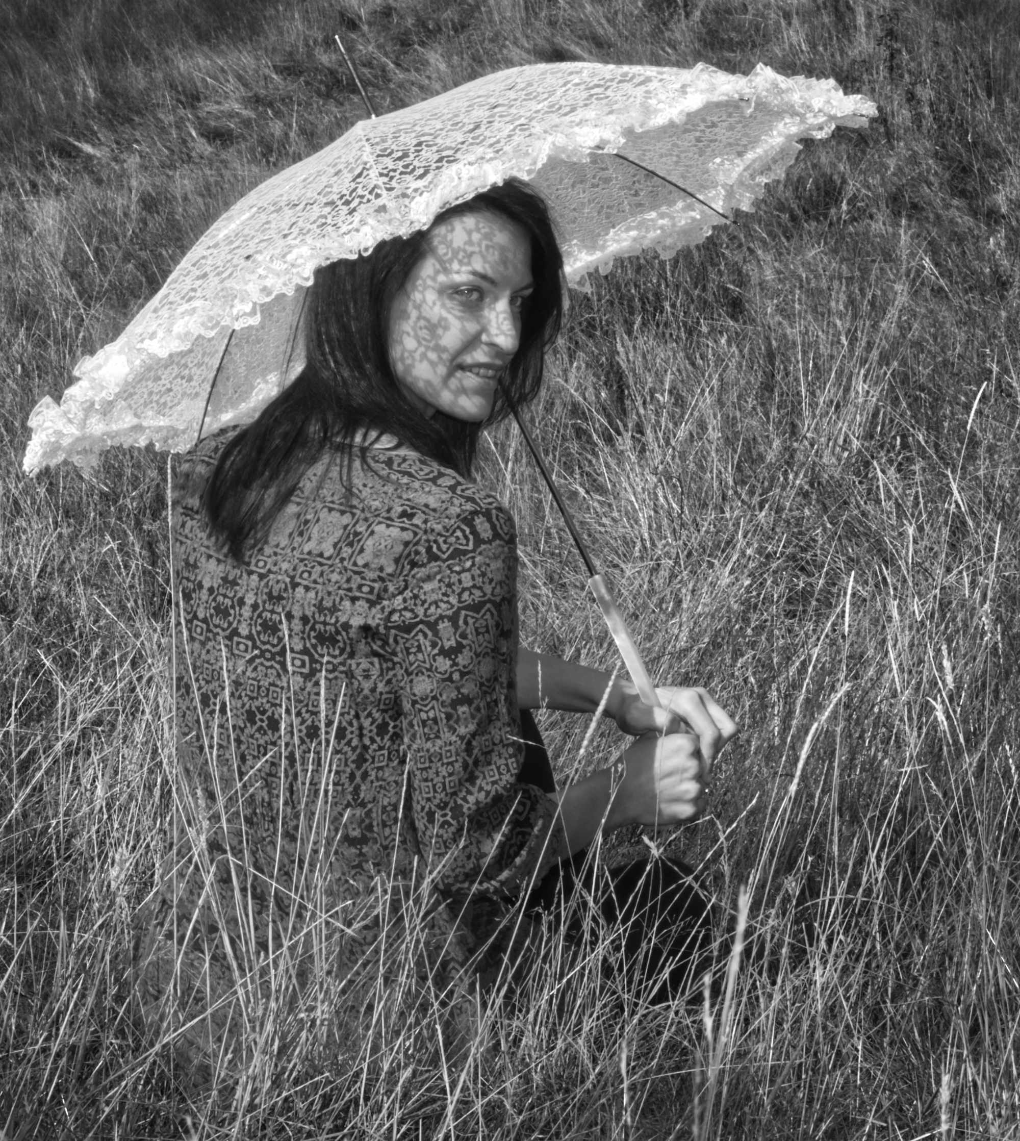
Or this! |
Jan 10th |
 |
| 64 |
Jan 20 |
Reply |
Or this! |
Jan 9th |
 |
| 64 |
Jan 20 |
Reply |
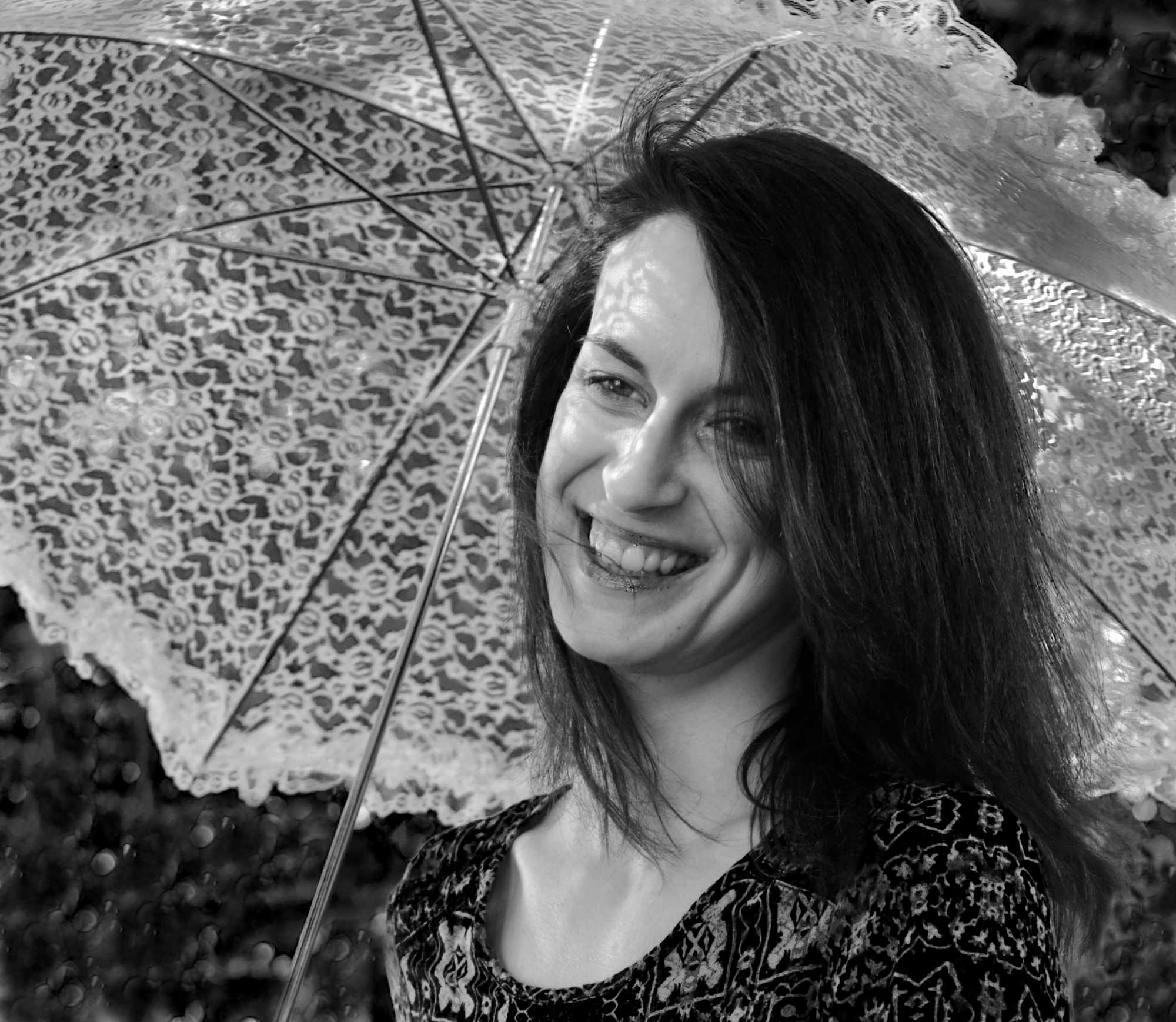
Well, I failed miserably at that. The "black" parasol actually has many shades of grey in it and my colour replacement skills weren't up to it.However I found pics of the other model who had a white parasol - hope you like this one! |
Jan 9th |
 |
| 64 |
Jan 20 |
Reply |
Yes, OK, a nice cream might work. I need to find some time to do it! I'll post the result if I manage. |
Jan 9th |
| 64 |
Jan 20 |
Reply |
Yes, it is odd! However it doesn't compete with her face for attention, being black. However, see below..... |
Jan 9th |
| 64 |
Jan 20 |
Reply |
An interesting idea, Jerry! My first reaction was "but the white would be distracting" and I'm sure a conventional judge would dislike it, but I often find conventional a bit boring, so I'll have a go at that. I'll need to re-crop the original so that it's not on the edge. Thanks. |
Jan 9th |
6 comments - 8 replies for Group 64
|
11 comments - 14 replies Total
|


