|
| Group |
Round |
C/R |
Comment |
Date |
Image |
| 6 |
Dec 19 |
Comment |
OK, I've had a go at that, what do you think now? I've also darkened the background a bit. I think it looks better than my original. |
Dec 19th |
 |
| 6 |
Dec 19 |
Reply |
Yes, I see your point. Perhaps just crop close to the bent-forwards petal ends, which then look as though they "hold in" the picture? |
Dec 19th |
| 6 |
Dec 19 |
Comment |
Well I was about to ask Tom if he'd asked for Madhusudhan for his RAW file to get that much improvement. But then I thought let's give it a go, and I'm amazed to find that I've got something similar albeit not quite as good as Tom's, using Affinity. Amazing, my first view of the original was "all the detail has gone in the shadows and highlight", but no, some can be recovered. How did you take it into ACR, Tom? (I presume you mean "Adobe Camera Raw") I found if I right click and "save image as" I get a jpg, which Affinity will not process with its RAW editor as far as I know.
Anyway, the original is another great take by Madhusudhan I think. It occurs to me that micrographers usually use transmitted light rather than incidenct light, so perhaps we should try this more for appropriate subjects. This picture isn't really successful for the reasons listed above, but I think it's a promising step in a new direction and another thing to go on my todo list. Alas such interesting subjects are a bit thin on the ground here. Still, why not small flowers, etc?
|
Dec 18th |
| 6 |
Dec 19 |
Comment |
Super work as usual, Tom. As for a suggestion, how about 10% off the top to make the centre off-centre? |
Dec 18th |
| 6 |
Dec 19 |
Comment |
I really like the light in this photo, it's soft so that there are no prominent shadows to be seen on the rear ears, yet there's plenty of detail contrast. I also like the golden colour, most attractive.
I've seen a number of examples of simliar composition recently - there's an upcoming webinar on PSA which I guess you've been told about. The lady doing it specialises in photos of church interiors, but also of flowers. I recommend you go and take a look at her web site https://www.padmasworld.com/close-ups and other pages.
As for the stem - I can't say I prefer it with or without. Perhaps a further single ear there would have filled the space nicely? |
Dec 18th |
| 6 |
Dec 19 |
Comment |
Very good, Janet, it's instantly attractive! I like the slight tilt to the right. I would agree that a little more space round the leaf would feel nicer to me, as would a slightly more contrasting background to make the lovely shape and detail stand out a bit more. |
Dec 18th |
| 6 |
Dec 19 |
Comment |
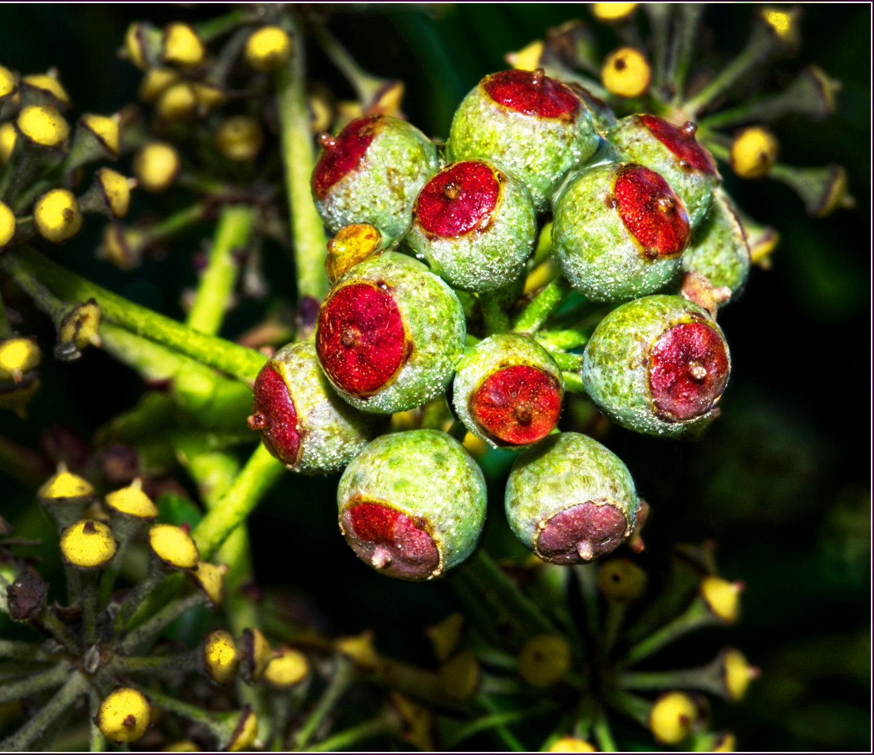
An interesting subject! They look like cod liver oil capsules to me.
Yes,lots of DoF with only 7 photos in the stack. I guess you had a small aperture as well.
I tend to agree with Tom, the original does glare a bit, and the toned down version seems more restful to me. However, Tom has been encouraging me to do a frequency separation to make it easier to edit out highlights, and I think that's still needed even on Tom's version. The one at the bottom left still glares a bit I think.
I might empty out some medication bottles and see what subjects they will make! |
Dec 18th |
| 6 |
Dec 19 |
Reply |
Thanks, Tom. I've had a go at it. It's magic! It might be different on other pictures, but I'm finding that retouching out these highlights is so much less critical than doing it on an unseparated pair of layers. Great tool! |
Dec 14th |
| 6 |
Dec 19 |
Reply |
Hi Tom,
I think yours is a big improvement. Yes, the hot spots were distracting. Flash is one technique I've used very little. I made a balsa wood structure that holds onto to my flash in the hot shoe, the structure holding an angled plate of balsa about 5" square with aluminium foil on it as the reflector. The angle is such that the flash points down roughly at the 1:1 focus distance. I guess I could scrunch up the foil a bit to make it reflect from lots of places to soften the light. I'll give it a try.
I like the background darkening and blurring too. Matter or taste I think, but good for me.
I've not done frequency separation. I think there's an Affinity tutorial on it online, I'll look it up. |
Dec 14th |
6 comments - 3 replies for Group 6
|
| 64 |
Dec 19 |
Comment |
Yes, a very attractive photo. I initially wondered if cropping a lot from the bottom would help as all the action is in the top half, but on hiding it with my hand I realised that the wet, reflective street is a big part of the picture and it's better uncropped. I would however remove the bright reflection in the pool at the front edge. Actually I think that cropping the bottom to just remove that bright reflection is the best solution for me. |
Dec 18th |
| 64 |
Dec 19 |
Comment |
I like this, too. Reading the comments, I think that the lack of reflection that Jerry noticed is a bit of a shame as once noticed it is more obviously a composite.
I wonder if lightening the group of people would add more impact to the scene? I missed them initially until I read your narrative, so this would make them clearer. I love the tone of the foreground and the hills in the distance making the whole photo very balanced and attractive. |
Dec 18th |
| 64 |
Dec 19 |
Comment |
Yes, I too think this is a battle between the two subjects (arches vs church). If the former, then just darkening down the church would retain context I think, and if the latter then using one arch as the frame (taking the photo from closer than the present one) sounds nice to me. Although I guess the angle of the arches relative to the church might make that difficult in this instance. |
Dec 18th |
| 64 |
Dec 19 |
Comment |
My original thought was that the colour version was better than the mono one. I still think that a little, but the latest mono version is more balanced and interesting to me. I'd be tempted to clone out the small part of the leaf on the very left which comes towards us, and perhaps put a little more room at the top. |
Dec 18th |
| 64 |
Dec 19 |
Comment |
Well I wouldn't have guessed that the original came from that photo. The result is far more interesting than its source! And that I think is the definition of good post-processing. I love it! |
Dec 18th |
| 64 |
Dec 19 |
Comment |
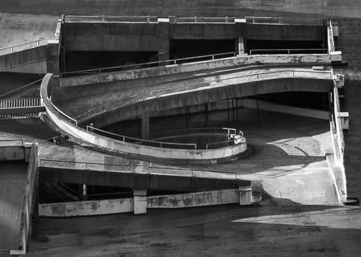
Yes, an interesting photo I think. The shapes and lines are pleasing.
I found my eye wandering around the central area, and then I realised that I was ignoring the peripheral area which when I looked I found to be distracting and reducing the impact. So I thought, let's crop it a bit and pinch Don's suggestion and I got this - what do you think? |
Dec 18th |
 |
| 64 |
Dec 19 |
Reply |
Yes, you're both right. It was a challenge! I wanted the mono because of the texture in the fireplace, but the fire wouldn't co-operate much. I could do a colour-in-mono shot and leave the fire in colour, but then of course it's no longer a mono picture. OK, I'll have another go at it! Maybe import some flames from a different picture. |
Dec 11th |
6 comments - 1 reply for Group 64
|
12 comments - 4 replies Total
|


