|
| Group |
Round |
C/R |
Comment |
Date |
Image |
| 6 |
Nov 19 |
Reply |
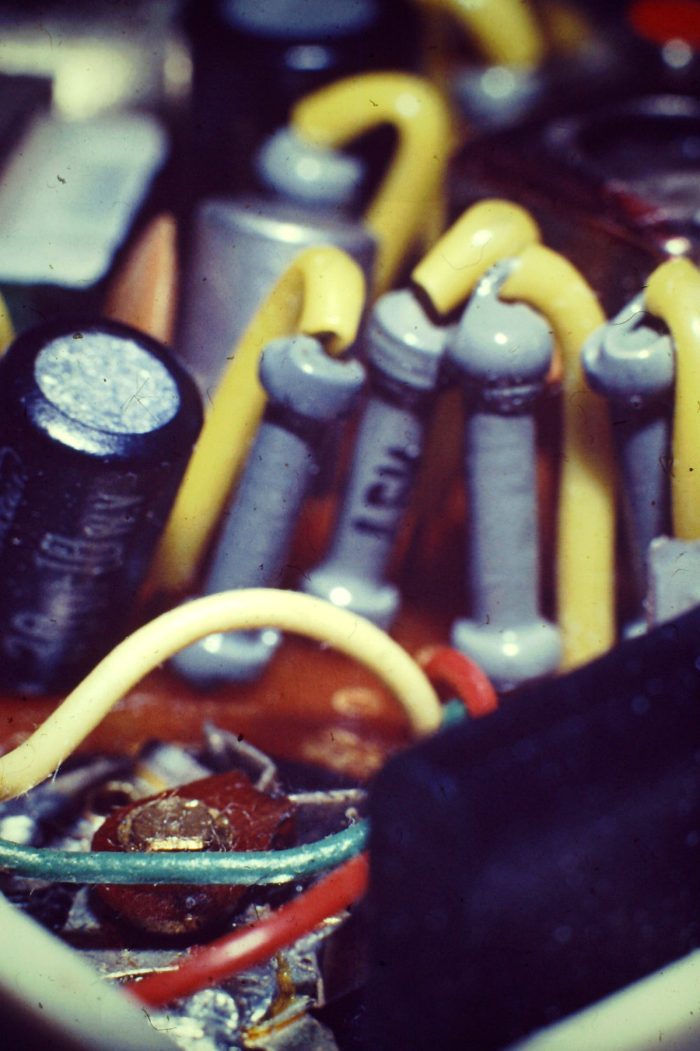
Your comment on slant is correct, Tom, I think. I was taught "Keep your verticals, vertical" and if you look at the side of the flat capacitor near the top and indeed the wires going into the PCB, they are leaning to the left so I failed there. The cylindrical capacitor is seen on a slant so is relatively OK.
My problem [well one of them anyway ;-) ] is that I don't like seeking out bugs and the like, so I'm usually looking for really small interesting subjects. This one always seemed a natural one to me, and this old one (below) taken about 1968 (when I was mid teens) appealed to me because it reminded me of a chemical plant, and I went on to become a chemical engineer. Probably Orwo or Ferrania slide film, Zenit 3M, 50mm extension tube, 58mm Helios lens, no idea of the settings or lighting, but I see highlights so maybe my first electronic flash on an extension lead, an unadjustable one made by a Japanese company whose name I forget (Starblitz? Sunagor??) It might be better than my new photo! (Pity about the black aerial in the foreground) |
Nov 22nd |
 |
| 6 |
Nov 19 |
Reply |
Yes, "lens diffraction" is a better search term. I didn't discover the Rodenstock pictures, but I did find enough to keep me reading for days! |
Nov 15th |
| 6 |
Nov 19 |
Reply |
Yes, I'd agree. I just meant artefact in the sense "misleading or confusing alteration.... resulting from flaws in technique or equipment" (This is one of several Wikipedia definitions). My technique wasn't so good. It's great the way other pairs of eyes spot things and I can watch out for this in future. One sadly lacking aspect of Olympus' stacking / bracketing system is they give no guidance on what the increments mean when setting it up to be done automatically. It's a good facility, just lacking any user guidance. I've found some web information where people have done their own experiments to clarify what the settings mean, I should follow those more carefully. Alternatively the tried and tested technique of physically moving the camera within the known or observed DoF is foolproof if a little more time consuming. Or more critical examinatin of the result and repeat until correct! As usual I'm in too big a hurry. |
Nov 15th |
| 6 |
Nov 19 |
Reply |
Thanks for the link, Dick! I've not seen Luminous Landscape before. Searching for "Rodenstock" didn't find anything, but I'm going to have fun finding it. And lots of other things, it seems. |
Nov 14th |
| 6 |
Nov 19 |
Reply |
The debate over f-stops is interesting I think. Most tests suggest that 2 stops less than maximum aperture is the start of the best region, and then for a couple more stops before it starts going downhill again. So we'd expect my f2.8 macro lens to come good at f5.6, down to f11, then falling off. Yet we've seen photos by Tom in particular which use f32, smaller than my smallest of f22, which you'd think would be poor due to this and yet they certainly weren't. Maybe that lens is unusual in its design. |
Nov 14th |
| 6 |
Nov 19 |
Reply |
I seem what you mean by the rows, Dick. I hadn't noticed before. It's a stacking artefact, and as you say I could have improved it by reducing my aperture so that each image had a greater DoF, or I could have used more and closer stacked images to that they would stack without including out-of-focus areas. Careless me.
I see now that Helicon is telling me that I have 14 days left, which I presume means it's on a lease and they'll want to be paid again. I'm not very happy with this selling philosophy, I guess I tried it because people extolled it. However generally I've found as good or better results with Affinity, albeit it has fewer controls, and I've not experimented that much with the various settings in Helicon. However I suspect I'll not renew Helicon and work on mastering Affinity better.
|
Nov 14th |
| 6 |
Nov 19 |
Reply |
Absolutely not! I shoot 99% in RAW (I occasionally shoot JPG when I know the pictures are say record shots needed for something such as sending to family or friends when I'm not going to be post processing them). I spent ages looking at the pros and cons of RAW vs JPG and spent a lot of time shooting both (despite it slowing the camera a bit) but now have decided RAW is best for me. (Although I know many good photographers who only use JPG. But I would say their style is not to take technically challenging images.) Passing a photo through the RAW converter in Affinity takes very little time if it doesn't need any RAW manipulation, but if you do need to, the benefits are there and not lost. Indeed I mainly make JPG files for sending to the PSA. My computer files are nearly all .ORF [Olympus RAW files] and .AFPHOTO [Affinity files]).
What I meant was, to send to Dick you convert whatever you work in to JPG (I presume, maybe he'd take TIFF etc as well?) but then you find the file is too big. OK, then you pass it through Fastone and adjust the settings to get it just small enough to satisfy the requirements. Or you export from Affinity (I presume Photoshop works in a similar way) having reduced the JPG quality a bit and hope to get the size needed. If not small enough, repeat at slightly lower quality!
Dick, please would you confirm the size needed? I have in my records from when I joined Digital Dialogue "Size 1024x768, 72 dpi, <1MB". Later I was told somewhere that only the "<1MB" criterion is important, so I see I've drifted a bit and this month's image I sent was 2000x1831 pixels, 96x96 DPI, 741 kB. Thanks. |
Nov 11th |
| 6 |
Nov 19 |
Comment |
It took me a while to see what I was looking at. Without the description I think I'd have failed to understand.
I used to be a strong affincionado of cropping hard to make the subject stand out, but I've started to realise that it can be counter-productive. So I'd not crop this any more. Far more important is what is in the background, and the background here is a bit fussy. It's hard to choose the background of course in many situations like this, but post processing can reduce the distraction. Now of course people entering Nature comps will say that's not allowed, but personally I go for pictorial quality not an accurate nature record, so it would be OK for non-nature comps. |
Nov 10th |
| 6 |
Nov 19 |
Comment |
Yes, I'm sure all will agree that's much better. It would be possible to do a background replacement using Affinity or Photoshop etc, could remove the shadows at the same time! |
Nov 10th |
| 6 |
Nov 19 |
Reply |
JPGs can be saved at various "qualities". 90% and above are barely distinguishable from each other, but you notice a drop in quality if it is set say to 50%. However saving it at 80% or 70% makes a big difference in file size (and none of this crops the image at all.) How to do this? I use Affinity and when exporting a picture say to JPG it asks what quality so you can set it there (it also tells you the estimated file size). Another great program to change the file size is Fastone Photo Resizer - google it, download it and install it. This can reduce the size of one or many photos very quickly. There are a variety of ways to tell it to reduce the size, none crop the photo. If you go this way I can give you more help, just ask. |
Nov 10th |
| 6 |
Nov 19 |
Comment |
Yes, whilst good in all the usual respects, it seem to lack punch and seems unsettled.
The subject in this crop seems to me to be the centre of the flower, yet there's much to distract from it. So, some thoughts...
- is the centre too close to the top and left? It's "looking out" of the picture to me.
- should the petals be darkened to make more emphasis on the cente, and the centre brightened a little?
|
Nov 8th |
| 6 |
Nov 19 |
Comment |
Another lovely picture, Dick, I like it.Simple, colourful, all the usual technical ticks.
I wonder if removing the leaf on the stem as it enters the picture so that we only see the stem might improve it? Also would a few degrees of rotation anti-clockwise make the unfurled flower a bit less horizontal without spoiling the angle of the main bloom? Darkening the end of that second bloom might help concentration on the main one. |
Nov 8th |
| 6 |
Nov 19 |
Comment |
Hi Janet, I'm early for once this month.
I do like this photo! Nice and sharp throughout, good composition, simple subject, lovely reflection which keeps the composition from being too symmetrical. The colour palette is limited yet complimentary to me. Well done! |
Nov 8th |
5 comments - 8 replies for Group 6
|
| 64 |
Nov 19 |
Reply |
Thanks, Jerry.
Well, some are octagonal, the same number are square, so I make that hexagonal on average!
:-)
|
Nov 11th |
| 64 |
Nov 19 |
Comment |
I think this is an interesting picture with its layers of distance. The texture is nice, good sharpness and tones as usual.
However I find it a bit confusing still. I think I'd be ruthless with the clone tool and reduce it to 3 or even 2 layers of arches, maybe a bit of the right to give some diagonal perspective, but getting rid of trees, the dissimilar background building, the square dark pieces on the second row of arches, etc. That would allow the texture and shapes to be more prominent. |
Nov 8th |
| 64 |
Nov 19 |
Comment |
I do like this photo. It might be said that if he were approaching so that we could see his face it might be better, but as it is it looks like he's an intrepid traveller going out into a mysterious journey.
I love the tones and the reflection, and the horizon well off-centre. The ripples and reflection bring my eye to the subject, and the background is very complimentary I think.
Interesting frame! I like that, too, in this picture.
My only niggle would be the light area towards the top right. I don't know what it is, but I would clone it out as it doesn't seem significant enough to be something he's paddling towards. |
Nov 8th |
| 64 |
Nov 19 |
Comment |
Very interesting, but totally confusing I found, without the explanation. I think it's very much two pictures in one, both the colour and the mono versions, which I don't find sit well together having never seen the original. Obviously they are intimately linked in reality, but in the photo, not happy in my view. Perhaps just concentrate on one or other element? They seem to be nice abstracts in their own right. |
Nov 8th |
| 64 |
Nov 19 |
Comment |
I like the viewpoint which makes the ship tower majestically over its surrounds. Lovely tones as usual and nice composition, overall a very likeable picture I think.
Pity about the featureless sky, and a bit of interest there, being such a large area, would improve it I think. But doing a sky replacement with all those rigging lines looks like a big job. |
Nov 8th |
4 comments - 1 reply for Group 64
|
9 comments - 9 replies Total
|


