|
| Group |
Round |
C/R |
Comment |
Date |
Image |
| 6 |
Sep 19 |
Comment |
I'm no lover of spiders, but this is certainly an unusual one. I'm much impressed by the sharpness of the eyes, but the fuzziness of the rest leaves it more a puzzle than a picture for me. The plan view with less DoF demands does make more sense to me, albeit less impact. |
Sep 24th |
| 6 |
Sep 19 |
Comment |
A smartphone has a physically tiny sensor which leads to the uncanny DoF even at f1.9. They are almost approaching pinhole camera properties! Not much good for selective focus, but handy for macro.
Did you use a clip-on lens for this, Tom? (I've followed your link and been amazed at how cheap these add-on lenses are. I use a budget smartphone, and rarely take photos on it, but this is an avenue to pursue.) If you did use one, do you think the combination aperture was a bit smaller than f1.9? However I'm mightily impressed. Topaz said in one of their presentations that I saw, that in future they believe that software processing will shape the physical design of future cameras, and in some ways I can see the logic in that, but not for all situations I think.
Anyway, for this picture, it's interesting how the crops and rotations alter the feel of the photo which has no natural orientation (apart from not liking it upside down!) and I can see the merit in all of them. |
Sep 24th |
| 6 |
Sep 19 |
Comment |
Yes, I can't add much to those comments, except perhaps that the stalk is a close to horizontal, a rotation as suggested would improve it for me. |
Sep 24th |
| 6 |
Sep 19 |
Comment |
Yes, I was going to comment on the lack of space at the bottom, but then I noticed that you've spotted it already! Personally I find it has a bit more inpact if I crop the top say 25%, focussing attention more on the yellower parts. |
Sep 24th |
| 6 |
Sep 19 |
Comment |
I think this is a good result. The limited pallette does lead to a calm photo, and the light is soft enough to maintain that mood. Is the far end of the stalk just going slightly out of focus? The rest is so sharp that this area keeps drawing my attention. |
Sep 24th |
| 6 |
Sep 19 |
Comment |
I remember taking pictures of marquetry veneers when I was in my teens with my Zenit and extension tubes which looked a bit like this. I put a contrasting colour material behind the holes to show their shape. I think the leaf's texture when viewed at this range is less interesting than wood. A worthy try, but the subject matter is letting it down in my view and no amount of processing can resolve that. |
Sep 24th |
| 6 |
Sep 19 |
Reply |
That's a good point, Salvador. I suppose it's partly because I'm more interested in the shape and colours of their wings, and partly because I've had little success with photographing insects so I tend to grab a top shot and be grateful if it's half decent. From above also reduces the depth of field needed and even at f22 here the tips are less sharp than the body, although I dare say part of that is due to hand holding. I've seen some very good photos of insects here and will try to emulate them! We've had many butterfiles in the garden recently, I need to organise myself better before they are gone as it's autumn here now, albeit quite warm at the moment. We're off on a motorhome trip today for a few days - I'll pack my macro lens and tripod! |
Sep 15th |
| 6 |
Sep 19 |
Comment |
I agree with you both. Tom's change is good, although having started down that track, he's left a bit of a bud at the right of the wing and some traces of yellow at the top left. I had problems doing this without trace elsewhere. Moral - choose my background better!
This lens isn't a macro lens. I probably had a small extension tube on but the EXFF didn't record that, so I'm not sure. However it is an expensive PRO lens and usually pin sharp, so I guess the lack of good sharpness is due to the shutter speed and hand holding. It was an opportunistic shot, I didn't have my tripod with me; second lesson is obvious here.
I looked at some online resources to decide it is probably a Mallow Skipper. |
Sep 11th |
7 comments - 1 reply for Group 6
|
| 64 |
Sep 19 |
Comment |
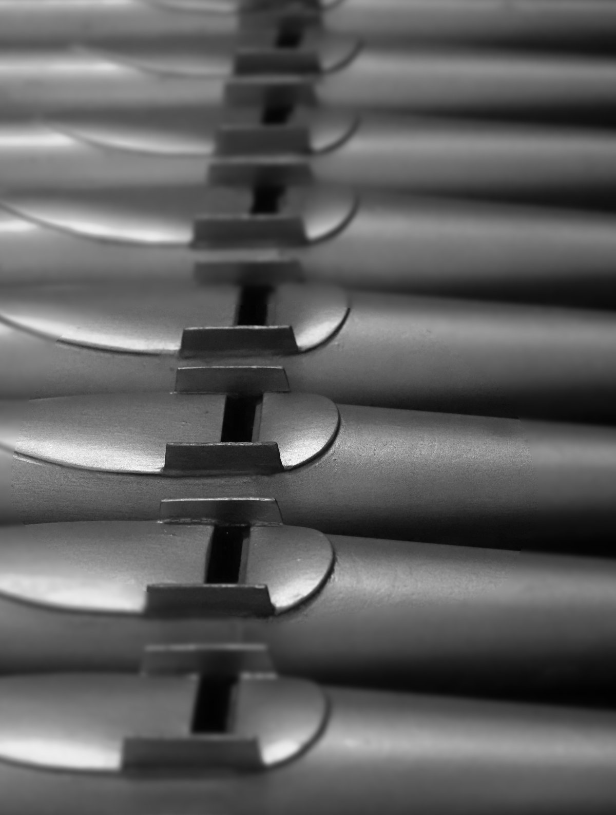
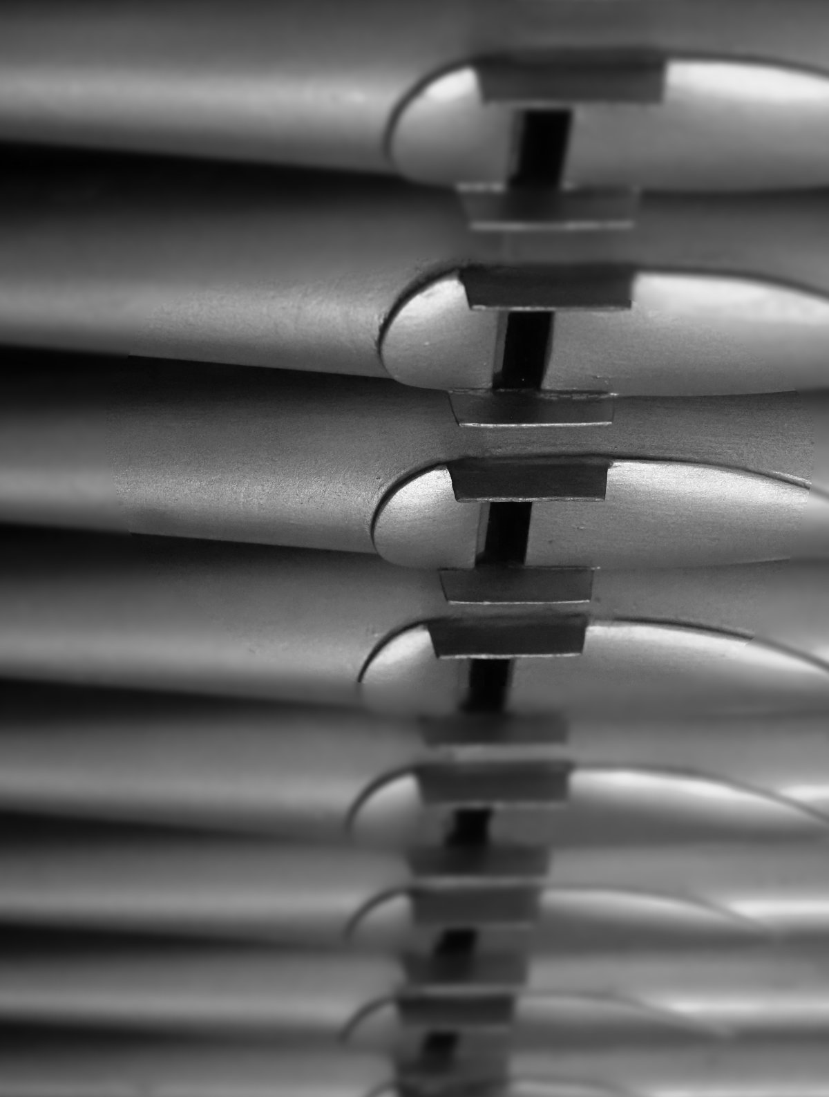
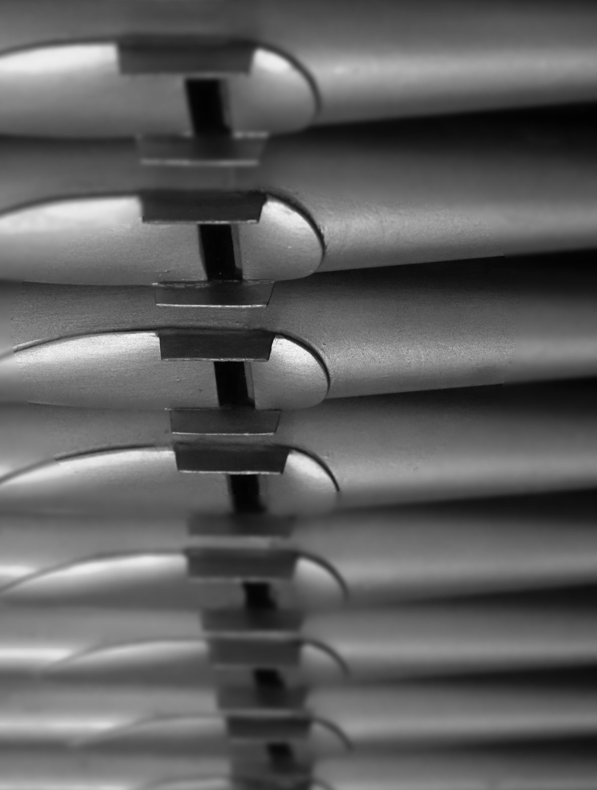
Yes, lots of potential in this photo I think. I agree, a boost to the shadows to reveal a little detail would be good, and also a 2 px white border to show the extent of the photo when projected or here is helpful for a photo with a very dark border. |
Sep 30th |
| 64 |
Sep 19 |
Reply |
...but flipping the other way looks a bit more natural to me... |
Sep 18th |
 |
| 64 |
Sep 19 |
Reply |
OK..... |
Sep 18th |
 |
| 64 |
Sep 19 |
Reply |
How much - do you mean 90�? |
Sep 17th |
 |
| 64 |
Sep 19 |
Reply |
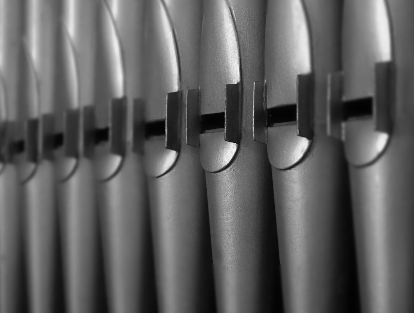
Yes, now you point it out, I agree, John. Unfortunately I've cropped it when taking it, not in post. I'll remember that and do it again sometime. Alas this organ isn't close to home, but there are lots of churches with similar organ pipes. |
Sep 17th |
| 64 |
Sep 19 |
Reply |
Thanks, Jerry. Would you like to say why you prefer the limited DoF version? |
Sep 13th |
| 64 |
Sep 19 |
Reply |
Ah, OK! Thanks for telling me, Jerry. Alas I've hardly set foot in the USA and whilst I've seen photos of Monument Valley, I was unaware of how desolate and how generally flat this particular region is. So my comments were my reaction to the photo, that's all. I appreciate now that my suggestion of people is not possible. I certainly wouldn't clone things in that weren't there as everyone knowing the scene would dislike that. If you were to add some of the scrub land to show this context then it would reduce the impact of the mountain in your photo, so I won't suggest that. I do like the photo, although I stick with my comment about the clouds. Now I'm wondering where cumulus clouds are coming from in such an arid area, but obviously they do! Very different weather than in the UK. I'll revise my other comment - I have no preference between the versions now, they both have their own attractive features. |
Sep 12th |
| 64 |
Sep 19 |
Comment |
I would agree with Stan. I often find that my brain gets in the way of my photos, as it sees what it wants to see and ignores what it doesn't want to see. So here you probably were impressed and drawn by the greenhouse lines, as I would have been, but paid little attention to the trees. The camera of course is not selective in this way. Hmm, a camera with a brain....heaven forbid! |
Sep 11th |
| 64 |
Sep 19 |
Comment |
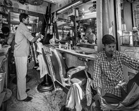
Many judges would say this is too fussy I think. But I never agree with judges, and I think it's a great starting point. Personally I'd try to focus the viewer's attention a bit, and whilst they are small elements, the barber and his "victim" are the main focal points to me, so I'd lighten these and the reflection as Jerry says, but I'd also darken the foreground figure a bit. Unless you want him as your subject, but his toes cut off are a bit distracting then.
Your camera is full frame so 12mm is very wide - my widest is 7mm m4/3 (14mm FF equivalent) so this sort of perspective distortion is normal. All the mirrors are causing all sorts of perspective shifts! I've tried adjusting it in Affinity, but it's warping tool is unfamiliar to me, I've just used the perspective tool. With some lightening and darkening and cropping made necessary by use of the perspective tool, I got the attached. Sorry it's very low resolution |
Sep 11th |
 |
| 64 |
Sep 19 |
Comment |
As I only use micro 4/3 (crop factor=2), I can say for certain that 12mm m4/3 is equivalent to 24mm full frame. APS-C crop factor varies between manuacturers according to Wiki, but typically is 1.6, so the equivalent focal length would be 15mm as you say, Stan.
I don't know this area of course having never been to the USA apart from a land/depart at JFK many years ago, but we have similar places here that get often photographed. The challenge then is to do something a bit different to get it noticed. This is a beautiful reflection and the foreground makes the most of the depth. The field of view and viewpoint does enhance it.
Perhaps the vertical shoots on the very left spoil the impact of the midground left mountain?
I'm puzzling over the clouds. On the one hand, if I look at the clouds alone, I think that more detail would be nicer. But given the abundance of detail in the foreground and midground, perhaps too much detail in clouds would be a bit too much. How about some cirrus clouds as in Jerry's picture? They have gentle detail which might go well here.
|
Sep 11th |
| 64 |
Sep 19 |
Comment |
Gritty seems to me to be a good adjective here. I'm surprised it's not swarming in climbers! But I guess there's lots to climb in that area. Even so, I wonder if a bit of human interest would have improved it?
The Cirrus clouds give a nice backdrop, but the cumulus clouds to me are a bit of a distraction, they pull my attention away from the mountain.
I like the way the mono has lost the distracting darkening of the bottom green in the colour. However, sorry, I prefer the colour version!
|
Sep 11th |
| 64 |
Sep 19 |
Comment |
Yes, a nice photo, but I swing both ways on the versions here. The mono suffers I think from the lack of contrast between the upper leaves and the flower, whereas the colour provides that contrast in the colour version.
The shadow of the upper petals seems less dense to me in the mono than the colour, the colour one would need those shadows lightened in my view.
I would have removed the distant greenery, bottom left, as again it is not clear in either version.
I've posted photos before with leaves partly cut off and received negative comments on that. Personally I've have preferred to see the end of the leaf on the left and the bottom of the leaf on the bottom. |
Sep 11th |
| 64 |
Sep 19 |
Comment |
Thanks, Stan. my eye is drawn to repetitive patterns too!
OK, now we are up and running, here is the alternative version. |
Sep 8th |
 |
7 comments - 6 replies for Group 64
|
14 comments - 7 replies Total
|


