|
| Group |
Round |
C/R |
Comment |
Date |
Image |
| 6 |
Aug 19 |
Reply |
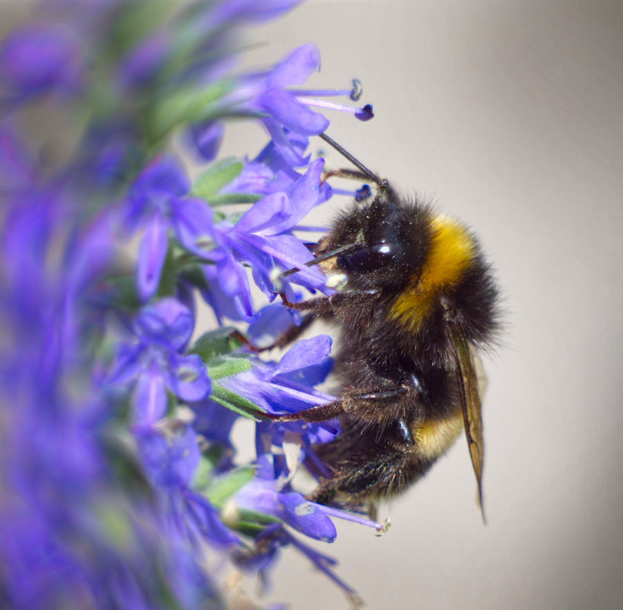
Thanks, Madhusudhan, very kind comments. I like the blurry effect too. Seems to me that macro is all about DoF, but not necessarily to make it as large as possible. Shutter speed and iso - yes, I sometimes err to much on the safe side! Alas those flowers have now died and the bumblebees have gone elsewhere, so I need to look for another subject. |
Aug 22nd |
| 6 |
Aug 19 |
Reply |
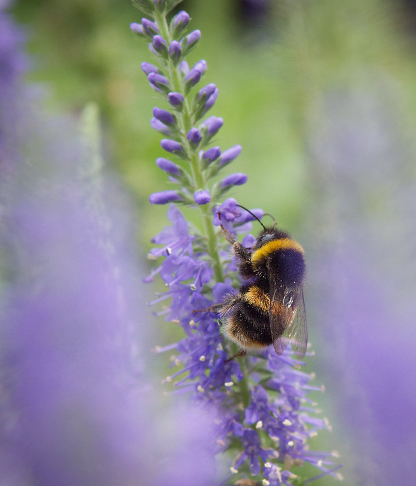
Yes, very nice. I'm always wary of cropping too hard if I see a print on the horizon as I'm "only" starting with 21 MPx, although no problem for a PDI of course. I was also reluctant to crop hard as the whole point was the blurred border, and I didn't want to lose that too much. However I think Tom has got a good compromise, there's enough of the foreground flower to give a nice effect. I might have included a tad more on both left and right, but that's splitting hairs.
What a difference a crop makes!
Thanks for all your comments, it's so interesting to see other people's views.
As a matter of interest, how are you (all) getting the image to modify and re-submit? When I do it, I take the enlarged picture (click the main picture or zoom in) then screen print with a tool (I use Lightshot), paste into Affinity as a new file, then do whatever I want to do, export and upload that file. Is there a better way to do it? |
Aug 21st |
| 6 |
Aug 19 |
Reply |
Or how about this. Here the flower was sharp with no foreground flower to give the shoot-through, but I blurred it with the smudge tool... |
Aug 13th |
 |
| 6 |
Aug 19 |
Reply |
Thanks, Janet. That's an interesting change. I think I should re-take the photo if that is the preferred crop as the number of pixels will be getting small! Alas the flowers and the bumblebees have gone now for this year. The thing I don't like about the closer crop is that the wing is blurred by the flower on the right. So I've been looking through the original photos to see if there's a better one for this treatment, and been disappointed by an large (despite having had hundreds of photos!). This one seems marginally better for your treatment. I usually just use the burn tool to vignette in Affinity as I find the inbuilt ones are a bit too symmetrical. It doesn't add grey but just burns the colour where I choose, ie the corners and sides, and is less obviously a vignette. As for nature to open, yes I suppose so, but I'm not a nature photographer in the sense that competitions specify, so it's no problem to me. Pictorial nature s better in my view! |
Aug 13th |
 |
| 6 |
Aug 19 |
Reply |
Thanks, Dick.
Yes I did wonder about that crop as presently it is a second area of interest but I was chickening out of having so much out of focus if I did it. Charles Needle's photos are often more OOF than in focus, but I thought "walk before you run". If I just take off the right hand flower the bee becomes central, so here I've taken off a bit more to make it off centre again. |
Aug 12th |
 |
| 6 |
Aug 19 |
Reply |
DoF is relatively small at such distances even at f14. Your photo after post production has more impact than the original. However some of the impact comes from the soft background, in my opinion. |
Aug 9th |
| 6 |
Aug 19 |
Comment |
Another powerful picture I think, beautifully exposed and composed, taking full advantage of the advancing red and yellow and retarding dark green. Lovely and sharp over the important parts, yet nicely soft in the background.
Would a left-right flip improve it? By my normal guidance I'd have said yes as it's a tranquil picture, and a left to right flow is soothing, but actually I like it the way it is - perhaps it's an assertive hybiscus! |
Aug 9th |
| 6 |
Aug 19 |
Comment |
Well I've been extolling a nice, blurred background and/or foreground in macros, and this is the opposite. There's plenty of straight impact from this with its black background. I love the HDR, which to my mind is HDR done properly, enhancing the image without screaming "false colours". This is a lovely picture. I'm still jealous of your lens with such a small aperture yet good sharpness.
A thin white border would improve it, I think. |
Aug 9th |
| 6 |
Aug 19 |
Comment |
I think this is splendid. Personally I love the small depth of field as it focusses my attention of the spider's eyes and mandibles as he gets hiss reward. I suppose it's depends on what was the aim - a record of the event, when a full depth of field is needed to show it all as Salvador says, or a pictorial photo where the emphasis is on the story.
I like the background too, striking and simple so it pulls the eye in yet doesn't then demand attention which the viewer can give fully to the action. |
Aug 9th |
| 6 |
Aug 19 |
Comment |
The most striking thing to me is the composition, with the triangular lily filling one corner and erupting into the picture. I really like that.
The water drops are very pleasant as well I think. Charles Needle said that he always take a couple of pictures without water drops, then sprays the bloom and so can choose either, although it sounds like they were natural drops here.
The texture and colour are lovely I think.
Less attractive to my eye is the tip of the petal on the right which is touching the frame. I don't mind the significant amount left out of the top petal, but the one on the right looks accidental.
Personally I would still have lightened the bloom a little. |
Aug 9th |
| 6 |
Aug 19 |
Comment |
I really like the way the butterfly is standing out from the background. In a way, this is in the style of Charles Needle that I've been discussing, in that advantage is taken of a small depth of field and its habitat is included to give context. To my mind, the flower has lots of contrast and presence and tends to detract from the insect, perhaps it would be better blurred a little? I would also suggest that the background along the top (rear edge of the wings)looks a bit distracting too. |
Aug 9th |
| 6 |
Aug 19 |
Comment |
Hi Sandra,
You are struggling womanfully! Not to worry, I'm sure it will improve soon.
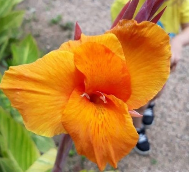
You're asking the wrong person here to identify a plant. So much so, I've found this site that I use - https://identify.plantnet.org/
You don't need to register, I just clicked on "World flora" then "Identify". It asks you to drag a photo over the page, so I took a screen shot of your photo and dragged it onto the site. It gave me photos of a number of possibles, but to my eye the first one "African Arrowroot" (Canna indica L) looks pretty similar. I'll upload it below.
Anyway, regardless of what it is, it's a pleasing picture. It seems a bit soft to me, maybe f2.8 wasn't ideal, perhaps a few stops down would be better. Don't want a slow shutter speed with that wobbly grip, so higher ISO is needed. The stem in the background is a bit distracting I think, and the green out of focus leaves - a bit of toning down would helpin my view. |
Aug 9th |
 |
6 comments - 6 replies for Group 6
|
| 64 |
Aug 19 |
Reply |
PS, is it slightly leaning to the right? |
Aug 9th |
| 64 |
Aug 19 |
Comment |
Yes, I'd agree that the swans being bright gives it impact, and the misty background helps with that. To me, it's the whole scene that is interesting, I'm not bothered in examining the details of the birds. Mind you, I'd have slightly preferred it if the one flapping his wings had been on the 1/3! Although he's not far off. The swans in the background give nice depth. Super, I love it.
|
Aug 9th |
| 64 |
Aug 19 |
Comment |
Whoa! I feel dizzy now. Fabulous expression on his face! Lovely light, composition and conversion (way better than the colour I imagine) to super tones and textures. Great!! |
Aug 9th |
| 64 |
Aug 19 |
Comment |
I like this! It reminds me of some fine art composites I've seen with this sort of background. The stone arch has been diminished in impact with the conversion, so the tree stands out which I think is the rightful subject. The trunk is a nice diagonal lead-in. The foreground bush might be said to be distracting, but without it the foreground would be a bit dull, so altogether I think it goes well. I like the sky, too! It just seems to be lacking a bit of punch for me, maybe a midground figure would have been good. |
Aug 9th |
| 64 |
Aug 19 |
Comment |
Yes, I agree the texture is super, and the reflection too. I think there's a bit too much reflection, maybe 1/4 to 1/3 of the photo could be removed from the bottom to accentuate the tree? |
Aug 9th |
| 64 |
Aug 19 |
Comment |
Oh dear, sorry, as I might have said before, IR always leaves me cold. Unless I pretend that it's snow on the trees! Then it's quite pretty.
Taking that stance, I agree with Don, the white is a bit overpowering. The tree trunks on the left are nice and give interest for me, but the trees on the right are a bit less interesting and I would crop them to put the houses on the 1/3. |
Aug 9th |
| 64 |
Aug 19 |
Reply |
Thanks, Georgianne! It was taken in a club "table top" session in the winter, I only took half a dozen photos of it with different lightings, and this one worked. I don't actually know what the implement is, there have been various suggestions from an egg beater to a drinks mixer. |
Aug 5th |
5 comments - 2 replies for Group 64
|
| 80 |
Aug 19 |
Reply |
You're welcome, it's the sort of street photo that I like to take too.
Personally I use any lens for street, although I usually prefer a small zoom. My Olympus 14-150mm is good for this (28-300 in full frame terms) although their 14-42mm (28-84mm) is probably better as it's much smaller and less "photographer" looking. But I'm forever buying lenses, I can't carry them all! I think it depends on your style - some people like to shove their camera into people's faces, but I don't like to do that, so very wide angle is not usually what I use. If shooting candidly (especially if from the hip), 30 to 50mm full frame seems useful - any more and I'm always chopping off people's heads etc. But sometimes you see something interesting at the other side of the street and a longer lens is needed. I recently took a nice pic of a guy in a street with 800mm! So my view is, if it works, then it's the right lens. Your present picture is a great example of that. You need enough of the full scene in to show your story, and no more. |
Aug 29th |
| 80 |
Aug 19 |
Comment |
An interesting thread! Perhaps I can add some observations?
Use of a macro lens - why not? I use Olympus and my 60mm macro (120mm full frame equivalent) performs well at longer focus distances even though that's not it's primary function. Other lenses can better it, but if in a storm, it's a safe port to land at.
Straightening - I suspect any full photo editor would solve this problem. I use Affinity Photo and it would have no trouble doing what Isaac has done in PS / ADR. However, as street photography, I'd have left it as it was.
The story - I think it's a good social commentary on several levels - grubby window, heavily overweight person in a cafe, people sitting close but ignoring each other, preferring their phone - sad but so often seen these days.
A good capture in my opinion! |
Aug 29th |
1 comment - 1 reply for Group 80
|
12 comments - 9 replies Total
|