|
| Group |
Round |
C/R |
Comment |
Date |
Image |
| 6 |
Jun 19 |
Reply |
Thanks for your comment. It was an interesting project for me but I see it confuses many others. The water-filled glass tube acts as a strong, 1-dimensional lens and so the edges of the globes weren't all visible. Never mind, I'll search out something more ordinary for July! |
Jun 26th |
| 6 |
Jun 19 |
Reply |
You're welcome. I was a bit short last night, in a hurry as I was late. But looking again, the scale issue is interesting. If the leaf were an oak one say, the millipede would be enormous! SO maybe it is misleading in that sense, although as a graphical artifact I think it adds to the picture. The brighter spiral on the millipede is also good I think, it emphasises the shape. The only thing I'd change would be the highlights on the surface that it's on (leaf, bark?) - they are distracting for me. |
Jun 25th |
| 6 |
Jun 19 |
Reply |
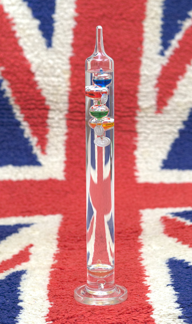
Yes, it is more understandable taken from further away. Here is is with a rug containing the Union Jack in the background - look at that lens effect! However it's not really macro... |
Jun 24th |
 |
| 6 |
Jun 19 |
Comment |
I don't think I can add much here. Nice picture overall. Thanks for the polariser tip Dick, mine stay in my bag most of the time..... |
Jun 24th |
| 6 |
Jun 19 |
Comment |
I agree, my first reaction after moving on from Dick's photo is that this lacks punch and brightness. I understand, blowing out any of the whites would not be good, so lightening has to be done judiciously.
In terms of sharpness, I've commented on Tom's f32 before, he has used it to good effect before to eliminate DoF limitations when stacking is impractical. But is anyone else wary as I am of making sharpness comments on this web site due to the low resolution photos we have to submit? As I enlarge the photo on my computer, most photos here are less sharp than I would expect of the cameras and lenses being used, and I always attribute it to this limitation. I've got both Tom's and Dick's photos enlarged on my screen now in separate windows, and I've got to say that to my eye the sharpnesses are not very different, yet we know that Dick's original must be much sharper due to the very different technique used. |
Jun 24th |
| 6 |
Jun 19 |
Comment |
What struck me first about this photo is the beautiful pastel colours. The previous comments about composition, sharpness and so on are all true, but the picture just shouts the beauty of this delicate flower.
Thanks for the info about your stacking, Dick. Perhaps I keep needlessly looking for something different all the time, when something so simple can be so rewarding when photographed well.
I've downloaded the DoF calculator. Very good! |
Jun 24th |
| 6 |
Jun 19 |
Comment |
A successful experiment I think. It's an interesting "different" viewpoint. Your f29 has done a good job of the sharpness, and any noise there might be from 1250 ISO is well disguised by the pollen! I feel it looks like the stigma is an observer looking into the depths of space.... I've had a whisky, my imagination is working well! But I'm not imagining that this is a very nice picture in my view which grows on me the more I look. |
Jun 24th |
| 6 |
Jun 19 |
Comment |
Hi all,
My apologies for being so late this month, it's been very hectic here. Busy with work, computer failures and a demanding garden, even before thehobbies start! Now we are away in our motorhome in Bonnie Scotland (bonnie apart from the fact that it's rained cats and dogs here today) for a couple of weeks so I've got time for photography and online interests again.
I think it's an interesting photo and I'll stay firmly on the fence by saying I think it depends what Salvador's aim was when composing the picture as to whether the fly is an improvement or a detriment. I like the crop on the left, we all seem agreed on that. The fly I like for a fun photo, but I can see that Tom's edit is more likely to impress a judge, if that was the aim. Both are pleasing to me. |
Jun 24th |
| 6 |
Jun 19 |
Reply |
You're not wrong, Dick! I have put (other) pictures of this thermometer into comps and not done well, although I like them - story of my life. It would be a stretch to call those "macro" so I chose this closer one. |
Jun 16th |
5 comments - 4 replies for Group 6
|
| 64 |
Jun 19 |
Reply |
I thought it was one tree. How unusual. Yes,the second photo is more straightforward and so is less interesting now I've seen it. Great job! |
Jun 25th |
| 64 |
Jun 19 |
Comment |
What an interesting tree!
I can understand Jerry's last comment. In that case, would a viewpoint to the right be better, such that the building is not obscured by the tree? That might also separate the foreground tree from the one behind it as well. |
Jun 24th |
| 64 |
Jun 19 |
Comment |
I think it's a photo well worth taking again for the various reasons made above. Mirrors, lights, the ghost hand, cropped off legs, all detract from what could be a lovely classical portrait I think. |
Jun 24th |
| 64 |
Jun 19 |
Comment |
The photo seems a bit too "busy" to me, although there's nothing you could have done about that of course. It's a super record of the scene, I bet it was impressive. |
Jun 24th |
| 64 |
Jun 19 |
Comment |
Personally I like it as it is. I agree with the comments, the mono is 500% better than the colour and for me the original crop is fine, the bottom gives it some context. Well done. You managed to take a great record shot in what sounds like difficult circumstanes.
One day soon I must give myself the opportunity to trek down the Grand Canyon before my body decides it's too much (it might have done already!) |
Jun 24th |
| 64 |
Jun 19 |
Comment |
Ah, home from home for me! (I'm a chemical engineer). I think there's a similar picture on my web site!
Overall I think this is super, no technical adjustment is needed in my view. I regret the floodlight at the top which seems to spoil the flow for my eye. Could you clone it out? |
Jun 24th |
| 64 |
Jun 19 |
Comment |
I do like repetitive patterns like this. But to me, the closer sign is spoiling the picture. The sign on the left wall could have been an original, so I hadn't really noticed it. I think I'd have preferred it taken from a few steps forwards to avoid the sign and keep the landscape format. |
Jun 24th |
| 64 |
Jun 19 |
Reply |
Thanks, Don. You are correct of course, but generally I don't bother with these aspects too much in street work unless they really spoil the picture. If it were a photo I saw serious potential in I think I would tone down the arm, and the doorway behind, but the blur is part of the picture I think. A bit less blur wouldn't have spoiled it though. |
Jun 10th |
| 64 |
Jun 19 |
Reply |
Thanks, John. Whilst I'd never use the fact that it's a street photograph to excuse poor technical standards, to me it's the story or comment on life that matters in street work. By and large I don't like retouching street photos too much, following a sort of nature photography philosophy. |
Jun 10th |
| 64 |
Jun 19 |
Reply |
That's the beauty of street I think, two exactly opposed views! (re the bottle) and both are quite valid. To be honest, I have a third view - as I hadn't noticed the bottle especially! To me it was all about the customer, the server and the workers behind - although I didn't get enough of the latter in. Whilst I have got on well with Liverpuddlians, I don't feel comfortable standing in the shop taking many pics. Motion blur wise, I got it exactly wrong - a sharp customer and blurred background workers would have worked better. I think I'll try again sometime.
The size of the burgers is why many people like McD here too. I've taken pics of dare I say people of a certain tummy size near McDs, but not all people like them. I'll look in my past pics and post one if I've not shared one here. Personally, I like some of the smaller McD offerings, especially their McFlurry! |
Jun 7th |
6 comments - 4 replies for Group 64
|
11 comments - 8 replies Total
|


