|
| Group |
Round |
C/R |
Comment |
Date |
Image |
| 6 |
Mar 19 |
Reply |
Thanks, Dick. Yes, I must aproach my macros more systematically. As I've said in my reply to Tom, I rely on the clever camera a bit too much and also don't often sit down and repeat a shot until it's right, and the only way to judge is on the computer, not on the camera screen. Olympus have a tether system to link the camera to the computer continuously and I must try that to make sure that soft beaks etc get rejected at the post-photo inspection stage.
Great learning for me, it's why I came here in the first instance! |
Mar 23rd |
| 6 |
Mar 19 |
Reply |
Thanks Tom. Actually I do have one, and several tripods, and they gather dust usually. As the camera has an inbuilt system, I've been trying to master it. Unfortunately Olympus have not offered quantitative help to users of this camera - they tell you what the various parameters are for in a qualitative way, but do not provide any help with what they do in the real world. There are some articles on the net about this and I use these to help. But at the end of the day I think you are right, this method whilst slower at first sight is clearly under user control, and I must start to use it. I'll start with the April picture! |
Mar 23rd |
| 6 |
Mar 19 |
Reply |
Thanks! I like focus merging and try to get "impossible" shots which couldn't be done without it. However I've sometimes noticed that the closest one is still soft. I need to do more experimentation with my camera! When in "focus stack" mode, my camera focusses then takes the first shot focussed closer then the remaining 7 from progressively further away, before it merges them in-camera. It only does this for 8 images, so if I want more I have to use focus bracket mode which does not merge in-camera. In focus bracket mode, it doesn't seem to do this initial step back, it starts at the focus point and moves further away (I think - now the seeds of doubt will make me look more carefully!). If so, maybe I need to focus and then pull it back slightly before taking the sequence. Thanks for pointing it out. |
Mar 20th |
| 6 |
Mar 19 |
Reply |
No, I'm not allowed to get it dirty or marked! It's a show stick really, not a utilitarian one.
I guess I'm a frustrated 3D photographer! Perhaps I should have left the far ground a bit more blurred to achieve that effect. |
Mar 8th |
| 6 |
Mar 19 |
Comment |
I agree with those comments, although personally I'd have cropped the right and the top a little, to get it more off-centre. I wish I could get pics like this, I must try this summer! |
Mar 8th |
| 6 |
Mar 19 |
Comment |
Super picture, Tom. Despite the low resolution we have to use here, you seem to have got it very sharp.
How about a 2 px white border to clarify the black edge? |
Mar 8th |
| 6 |
Mar 19 |
Comment |
I don't have one either, so I looked on their website. Lensbaby has a tilting front element so you can blur the image on either side of a diagonal, imposed over the usual depth of field, as far as I can make out. It looks a bit like the diorama effect in Affinity to me. Interesting! |
Mar 8th |
| 6 |
Mar 19 |
Comment |
Beauty is in the eye of the beholder! I'd vote for the flipped version as the left feather gives a nice diagonal lead-in to the main group. But either way I think it's very successful, well done. |
Mar 8th |
| 6 |
Mar 19 |
Comment |
I've got to agree with the above. Interesting textures and colours, and the cropping has simplified the picture, which I like. But the interest is in the detail, and so it has to be much sharper in my view. The sharpness does seem to vary with distance, so I'd suggest it's not a shutter speed issue, more a focus error. |
Mar 8th |
| 6 |
Mar 19 |
Comment |
Yes, my initial thoughts went the same way as Janet's. I think I'd also clone out the little green leaves left on the edge of the petals as they are distrcting to me. I like the nice diagonals, nice composition. |
Mar 8th |
6 comments - 4 replies for Group 6
|
| 64 |
Mar 19 |
Reply |
I was using this blog as part of a demonstration of blogs to my local Photographic Society on Tuesday as many had never seen one in action. I think they were impressed! They would have spent hours browsing here (all of it I mean, not just this one photo) but we had to go home something.... Everyone liked this photo, and generally the Jerry S crop was preferred. I like it too, now I've seen it!
|
Mar 15th |
| 64 |
Mar 19 |
Comment |
I think I agree with Jerry, although the original does have a little more sky than foreground, so you'd need to chop off quite a bit to make the foreground dominate which I think would be a shame. At the same time I think the foreground is also very interesting, but a little could be lost, leaving in a little of the vegatation on the bottom left, and the effect is improved a little in my view. But either way I think it's a grand day out. As long as you keep the crocs at bay. One of those in the foreground would have made it really primordial! |
Mar 8th |
| 64 |
Mar 19 |
Comment |
I was wondering about the converging verticals too, but correcting that doesn't work in my eye - |
Mar 8th |
 |
| 64 |
Mar 19 |
Comment |
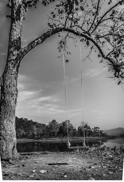
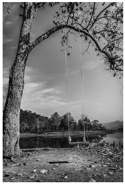
This month is a good month, I love all the pictures! I think this is so well seen. The seat is well placed so that it stands out, the felling of depth is great, the curved branch frames it well. Maybe someone would suggest flipping it...but it's very attractive to me.
I've flipped this and upped the contrast a bit - what do you think? |
Mar 8th |
 |
| 64 |
Mar 19 |
Comment |
What a striking picture. It has lots of depth with the tiles and their gradation leading the eye into the gate. I would guess that it's a picture that has been taken (or attempted) by many tourists, but I love it! |
Mar 8th |
| 64 |
Mar 19 |
Comment |
An interesting original, and an even more interesting conversion.
I'm wondering if cropping off the top edge to leave just a little of black triangle left might concentrate the eye on the pattern? |
Mar 8th |
| 64 |
Mar 19 |
Comment |
Wow! Mesmerising.
I struggle to understand it. Are the "top" glasses on a glass shelf?
To me it's just too busy, but being of simple mind, I like simple things! |
Mar 8th |
| 64 |
Mar 19 |
Comment |
#2 |
Mar 8th |
 |
| 64 |
Mar 19 |
Comment |
#1 |
Mar 8th |
 |
| 64 |
Mar 19 |
Comment |
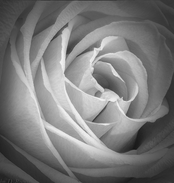
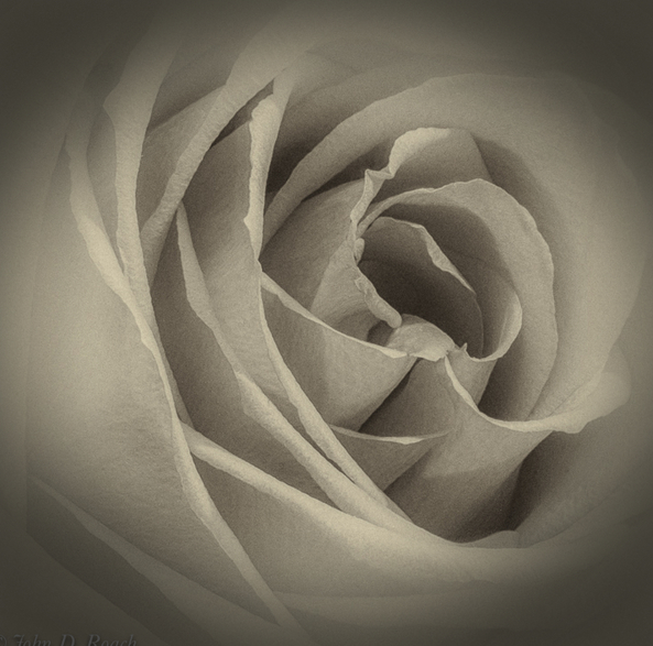
And a very pretty pinkish rose, if I might say so. But the mono is more interesting to us photographers, I think, as the textures and shapes in the original are lost to the colour, so for me the mono is the more satisfying picture.
I love the texture and soft tone.
The petal on the left edge looks normal in the colour, but in your mono it looks a bit odd to me perhaps because the white vignette has taken away its texture. I would crop off the left edge by about 10% to remove it. The mitre at the bottom left corner is similar, and even the top left too. I wonder if the vignette is a problem. I tried to do a dark vignette but I think that adding it over the existing white vignette doesn't seem to work. So I tried it on original 2. (I love your frame on that with the rounded corners!) That seems to work better. What do you think?
|
Mar 8th |
9 comments - 1 reply for Group 64
|
15 comments - 5 replies Total
|


